News Round 4, 2015: Footy Jumper Discussion (ANZAC Round)

Remove this Banner Ad

really?
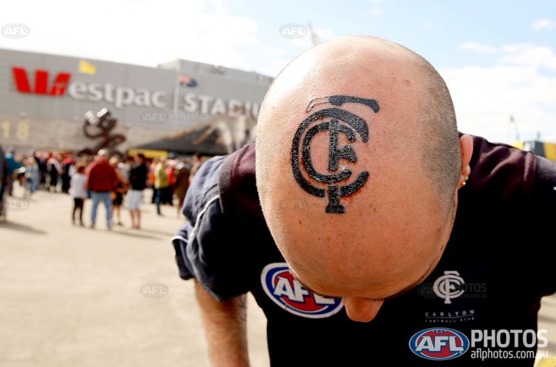
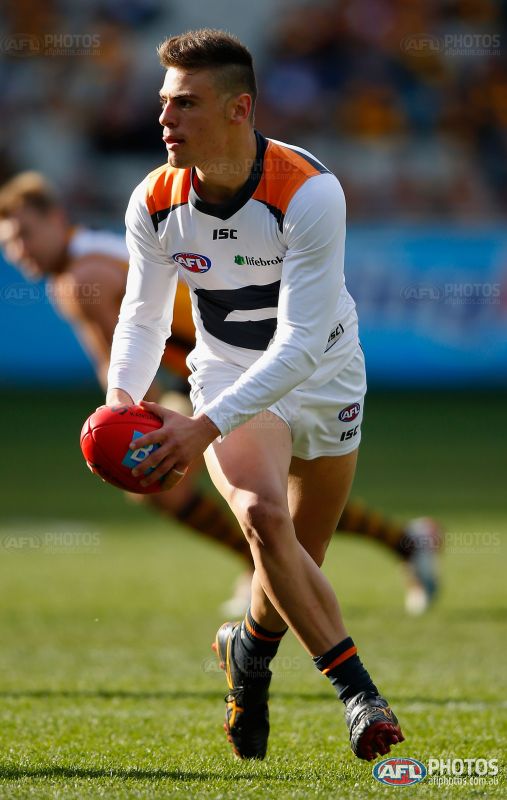
i think it's ok, but on a wide shot it looks solid black (at least on my shitty TV) and i don't like that it doesn't reach close to the bottom.
i do like how curved it is though, so maybe just drop it a little lower and make it a little thicker to stand out more then i'd be all for a permanent change, but ATM, i like their current kit better.
 
This sash really doesn't look good on a bloke as tall as Fletcher. The low end of the sash is nowhere near his hip, looks horribly misfitting.
They can't really "stretch out" the sash downwards for him, though, can they? Unless they stretch both sides and then he'll get a sash the same thickness as the 2015 home.
 

Log in to remove this ad.

They also can't alter the shape of the sash because of the poppies. It'd be the exact same sash on every player, no matter the size of their guernsey, whereas usually (and I have nothing to back myself up on this) the sash would be more adaptive to the size of the jumper.
 
Love that I found this thread/forum in general; always been interested in the changes/variations in guernseys, now have somewhere to look at and discuss!
Anyway, in regards to St Kilda's guernsey today, interesting to note that they have the poppy on them above the AFL logo, however it seems to be an after thought (seemed slightly shiny), and isn't shown on the ones available for fans to purchase:

41212-st-kilda-saints-2015-adults-anzac-guernsey-2000.jpg


I also wonder why the Ledified logo didn't feature on the back; definitely looked different on tele!
Hi mate. Welcome to the graphic design board!

That is pretty interesting to see. Good pick up. It could have been something to distinguish a player issue and a retail jumper. Does anyone know more regarding this?
 
I also wonder why the Ledified logo didn't feature on the back; definitely looked different on tele!


Probably something to do with NZ laws.


Same thing happened when centrebet was a sponsor but that was because it was a betting agency iirc.
 
I also wonder why the Ledified logo didn't feature on the back; definitely looked different on tele!
NZ laws have some rule about sponsors. Same happens with Storm when they travel over the ditch.
 
Thanks all for the quick replies; the thing that gets me is that last year St Kilda had Ledified on the front and back, and in 2013 featured a one game sponsor (Presidan) on the front (instead of the betting company Centrebet), with Ledified on the back. All I can think of is it was to make sure the feature on the back of the guernsey was more prominent.

Hope we haven't lost another sponsor!
 
GWS could've done without the soldier on their Canberra tower. It's hard to see, especially with the camo around it
Thanks for the welcome, and yes, agreed!

Gold Coast appear to have a smaller Anzac logo on their guernsey; wish the AFL regulated the size of these!
 

(Log in to remove this ad.)

I was thinking this morning about how many times Carlton have worn their clash against one off designs recently. St Kilda and Port's heritage jumpers (both times Carlton would have been better in their home) and then again today.

Milney used to wear long sleeves in pretty much every game. Towards the end, though, he'd only really pull them out when we wore a one off jumper. It was like he was challenging ISC to come up with suitable sleeves.
 
Long sleeves do look nice, but in cases like the one you've posted, they should extend the design. It just gets cut off
Nah that one looks bloody brilliant. Actually that long sleeved clash is the only GWS kit I've liked.

Re: the cutting off of the design - look at Brisbane's long sleeve this season. Blue sleeves as per the yoke but the old maroon sleeves were heaps better.
 
players in boots that match the socks look great!
J. Cameron and Prestia (?) doing so.

also, those giants shorts look great, but the charcoal shorts with the orange guernsey from the back looks poor.
 
They can't really "stretch out" the sash downwards for him, though, can they? Unless they stretch both sides and then he'll get a sash the same thickness as the 2015 home.
They also can't alter the shape of the sash because of the poppies. It'd be the exact same sash on every player, no matter the size of their guernsey, whereas usually (and I have nothing to back myself up on this) the sash would be more adaptive to the size of the jumper.

Yeah, there's no real way to scale a design like that effectively, short of creating a longer sash design for blokes in the largest jumpers.

Either players would have varying sash widths (same design, sized up to match), or you get the Fletcher situation (same design and width, doesn't really match the sizing of the jumper).
 

Remove this Banner Ad

Back
Top