


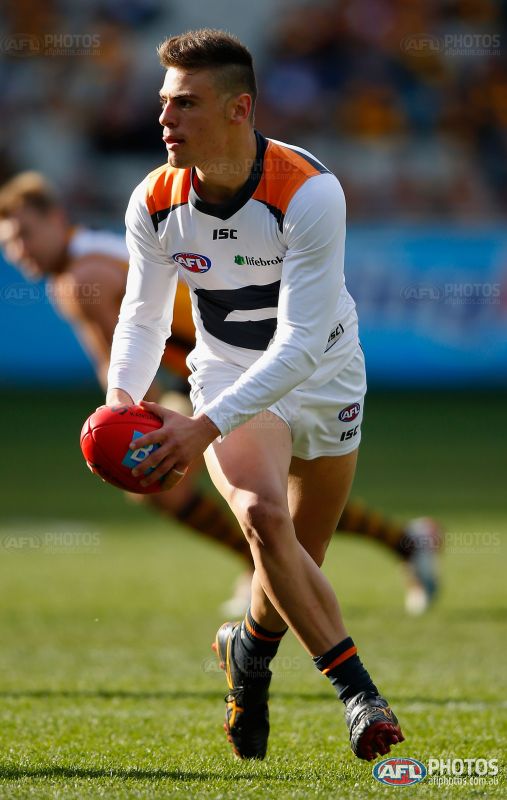
That is what a Carlton long sleeve clash would look like if they went the clean all white / blue monogram look. Brilliant.That full white GWS kit looked fantastic imo.
Navigation
Install the app
How to install the app on iOS
Follow along with the video below to see how to install our site as a web app on your home screen.
Note: This feature may not be available in some browsers.
More options
You are using an out of date browser. It may not display this or other websites correctly.
You should upgrade or use an alternative browser.
You should upgrade or use an alternative browser.
News Round 4, 2015: Footy Jumper Discussion (ANZAC Round)
- Thread starter Greater Gattsby
- Start date
- Tagged users None
mcgarnacle
Norm Smith Medallist
- Dec 2, 2003
- 9,809
- 4,212
- AFL Club
- Sydney
Looks so nice. I am a huge advocate of long sleeves even if it's 40º and balmy.
How nice:

They should have a short sleeves option too.
mcgarnacle
Norm Smith Medallist
- Dec 2, 2003
- 9,809
- 4,212
- AFL Club
- Sydney
That full white GWS kit looked fantastic imo.
Yep. Clubs have not got to be afraid of all-white.
No they shouldn't,They should have a short sleeves option too.
you can just roll up the long sleeves. Plus with most AFL guernsey designs it'd just look obscure
E92_
Premium Platinum
Players over the last few years have worn 3/4 sleeves.

Jack Stevens
#2 Ticket Holder
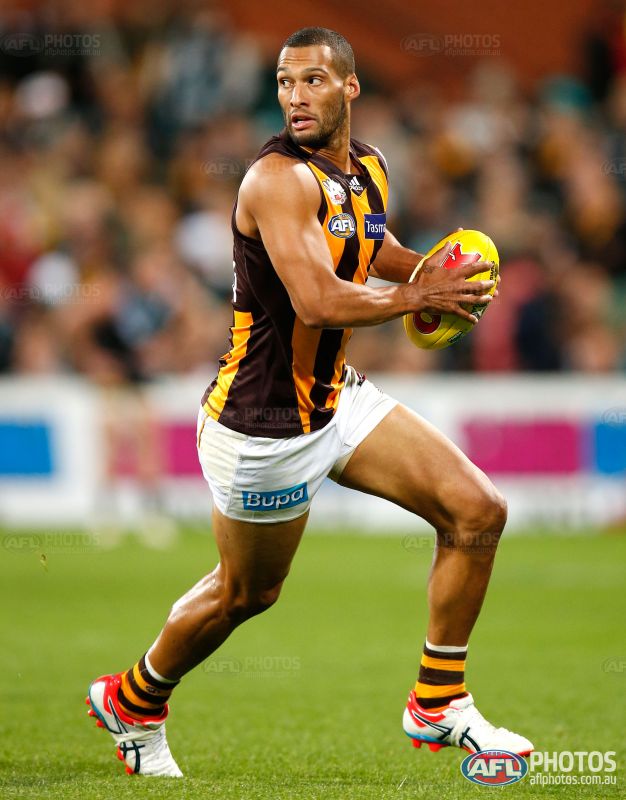
There's definitely a maroon tinge to Hawthorn's brown.
Port's guernsey is more balanced with the ANZAC logo, which says to me that they should ditch the Port logo.
Port's guernsey is more balanced with the ANZAC logo, which says to me that they should ditch the Port logo.
Marlowe
𝓤𝓷𝓽𝓸𝓾𝓬𝓱𝓪𝓫𝓵𝓮
- Mar 12, 2012
- 29,928
- 53,376
- AFL Club
- Melbourne
- Other Teams
- Gold City Royals
Back of Essendon's jumper is ruined by the position of the sponsors logo. Sitting lower so it's not on the sash, due to its position it's creating fold/crease through it.
Disagree. It looked fantastic and well integrated. It definitely beats their current look, poppies and all.
I can't remember who was wearing a long sleeve, but last week a Geelong player (Blicavs?) was wearing a long sleeve. So beautiful. Hoops running down the sleeves as well.Long sleeves do look nice, but in cases like the one you've posted, they should extend the design. It just gets cut off
MKMatty
Busy Vibin’
when was the last time we all saw a long sleeve wings? I don't think its appeared since the last template update.Looks so nice. I am a huge advocate of long sleeves even if it's 40º and balmy.
How nice:
mcgarnacle
Norm Smith Medallist
- Dec 2, 2003
- 9,809
- 4,212
- AFL Club
- Sydney
yeah, they should.No they shouldn't,
interesting approach.you can just roll up the long sleeves.
i'm sure that in the professional era, a club can get their apparel provider to sew a few short-sleeves in their sweat shops in asia, or fiji in the case of Port.
most AFL guernseys look naff as it is.Plus with most AFL guernsey designs it'd just look obscure
short-sleeves has been done for the international rules games and hasn't seemed to be an issue for the players.
it may also be a boon for merchandising.
Klim
Brownlow Medallist
- Sep 17, 2013
- 12,532
- 10,363
- AFL Club
- Sydney
Adidas have done it again. How do you **** something up like this?
- Oct 1, 2012
- 3,245
- 3,035
- AFL Club
- West Coast
- Other Teams
- Los Angeles Lakers, Perth Wildcats
Adidas have done it again. How do you **** something up like this?
Dare say there was only one set of ANZAC day jumpers made, if a replacement was needed it was most likely the regular set that was the back ups. Not surprising really. I could be wrong but I doubt they would have 2 sets made up for a one off.
E92_
Premium Platinum
Yellow side panels on the Brisbane jumper actually look pretty nice.
- Oct 1, 2012
- 3,245
- 3,035
- AFL Club
- West Coast
- Other Teams
- Los Angeles Lakers, Perth Wildcats
Agree, not sure what it is, but breaks up the Maroon nicely without being too much.Yellow side panels on the Brisbane jumper actually look pretty nice.
i'll give it to Canterbury, our clash kit looks much better than last year with the new shade of blue and no NMFC.
the numbers even look good down that low, except it seems that the bottom is being folded into the jumper when it's being worn.
the numbers even look good down that low, except it seems that the bottom is being folded into the jumper when it's being worn.
The ANZAC logo was obviously put onto one set of jumpers, with Gibbo/Roughy etc. choosing to change guernseys at half time (which alot of players do nowadays). Check yourself before making such a rash comment.Adidas have done it again. How do you **** something up like this?
mcgarnacle
Norm Smith Medallist
- Dec 2, 2003
- 9,809
- 4,212
- AFL Club
- Sydney
i'll give it to Canterbury, our clash kit looks much better than last year with the new shade of blue and no NMFC.
the numbers even look good down that low, except it seems that the bottom is being folded into the jumper when it's being worn.
i don't get the infatuation with clubs merely reversing their guernsey.
in North's case, a predominantly royal blue guernsey front and back would be much better as an alternate for the fixtures where they have similarity to the opposition, i.e., away to Geelong and Collingwood. The reversed guernsey has plenty of white on the front just like the striped/hooped clubs they're meant to avoid similarities with.

source: mero.
they wore this in their early years in the VFL and it would be suitable as they're modern day alternate (minus the V on the back and a few shades lighter for their current blue). It would offer something different to white and blue stripes too. at the moment, they're just like Collingwood, only blue. Why can't clubs in the AFL develop some sort of uniqueness?
btw, have I mentioned on these boards how classy Geelong's white kit is? no club has a full-white main kit in this League. they should make it theirs go to it full-time.
on North, white guernsey and shorts doesn't look as good. It's the 'thick' stripes and solid blue socks, it doesn't flow with white shorts. The white guernsey with royal blue shorts and solid blue socks works very well for them as a main kit. And this is different to just about every other club in the League (except Hawthorn & GWS) who have the same colour shorts as the predominate colour of the guernsey. This league is becoming generic as it is in other areas and kits has been one of them.
Last edited:
- Aug 21, 2007
- 31,669
- 99,019
- AFL Club
- Port Adelaide
- Other Teams
- Aston Villa, San Antonio Spurs
I don't mind the fangs on the Hawks jumper, but it's a bit offputting that the gold stripes seem to be a lot wider than the brown on most players. It effectively looks like a gold front panel with 2 brown stripes on it instead of looking like 3 gold stripes.
wing it
Club Legend
- Jun 6, 2013
- 2,427
- 3,917
- AFL Club
- West Coast
i don't get the infatuation with clubs merely reversing their guernsey.
I think it's because the club keeps its exact same design AND colours . It's a total win.
In North's case, they only need it against Geelong, and in my view it works fine as a clash in that fixture. Versus Collingwood, they go the full white. Again, just fine.
- Aug 21, 2007
- 31,669
- 99,019
- AFL Club
- Port Adelaide
- Other Teams
- Aston Villa, San Antonio Spurs
i don't get the infatuation with clubs merely reversing their guernsey.
in North's case, a predominantly royal blue guernsey front and back would be much better as an alternate for the fixtures where they have similarity to the opposition, i.e., away to Geelong and Collingwood. The reversed guernsey has plenty of white on the front just like the striped/hooped clubs they're meant to avoid similarities with.
source: mero.
they wore this in their early years in the VFL and it would be suitable as they're modern day alternate (minus the V on the back and a few shades lighter for their current blue). It would offer something different to white and blue stripes too. at the moment, they're just like Collingwood, only blue. Why can't clubs in the AFL develop some sort of uniqueness?
btw, have I mentioned on these boards how classy Geelong's white kit is? no club has a full-white main kit in this League. they should make it theirs go to it full-time.
on North, white guernsey and shorts doesn't look as good. It's the 'thick' stripes and solid blue socks, it doesn't flow with white shorts. The white guernsey with royal blue shorts and solid blue socks works very well for them as a main kit. And this is different to just about every other club in the League (except Hawthorn & GWS) who have the same colour shorts as the predominate colour of the guernsey. It's good to have some clubs that are different and have a contrast. This league is becoming generic as it is in other areas.
Agree totally with this.
While I quite like the royal based stripes, North have a perfect clash option in their arsenal which is incredibly popular amongst fans, is historically important, and looks amazing.
E92_
Premium Platinum
I think North's inverse actually looks better than the home.
Jones2ByrneJones
Hour of Pessimism
- Jul 27, 2012
- 15,820
- 27,995
- AFL Club
- Port Adelaide
True. However, I think, sometimes, foregoing aesthetic in favor of tradition, particularly when the aesthetic appeal is only marginally superior, is the way to go. So kudos to North for sticking with it.I think North's inverse actually looks better than the home.
Klim
Brownlow Medallist
- Sep 17, 2013
- 12,532
- 10,363
- AFL Club
- Sydney
Sorry mate. I'll tone it down next time.Check yourself before making such a rash comment.
Don't apologise, I hate when people apologise.Sorry mate. I'll tone it down next time.
Just think before you post, innit.
Similar threads
- Replies
- 113
- Views
- 3K
- Replies
- 37
- Views
- 2K
