- Sep 23, 2012
- 1,979
- 1,396
- AFL Club
- GWS
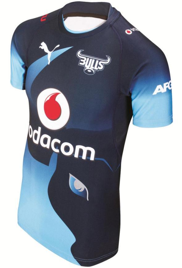
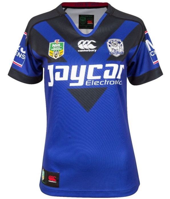
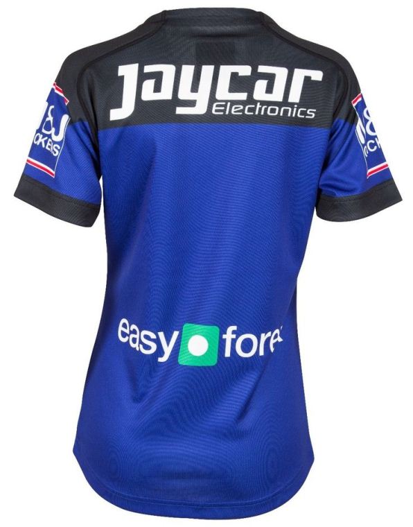
What's with a) the sleeves; and b) the funny looking white flashes in the navy stripes?
Follow along with the video below to see how to install our site as a web app on your home screen.
Note: This feature may not be available in some browsers.
LIVE: Richmond v Melbourne - 7:25PM Wed
Squiggle tips Demons at 77% chance -- What's your tip? -- Team line-ups »
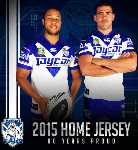
Only just saw 80 years bit at the bottom of the V. Very nice touch. And that logo is beautiful

To make it look even more AMAZINGWhat's with a) the sleeves; and b) the funny looking white flashes in the navy stripes?
To make it look even more AMAZING
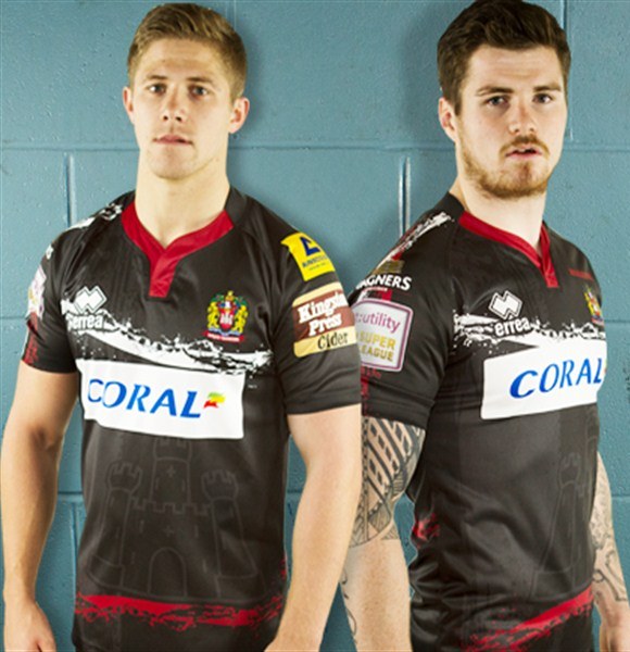
I didn't realise ugly Christmas sweaters were back in fashion?
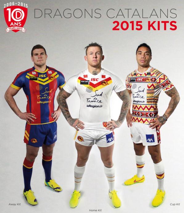
Would have loved to have seen a red-yellow hooped kit for the home if they're trying to stay light. Away looks terrible, double chevron looks too Australian and is placed so awkwardly and is completely unnecessary. Home way too bland, that's a Souths 2013 alternate jersey. My favourite of all 3 is the Cup kit purely because it looks Catalan, and is unique.


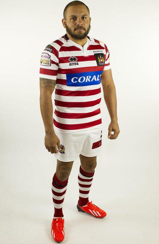
Wigan by the looks of the crest, I'd guess that's the away companion to the cherry hoopsWho? what? when? where? why?
Images need a description, voltski.