Portfolio SAAFL Redevelopment

Remove this Banner Ad

Damo Crows Fan

Club Legend
Oct 28, 2009
1,845
1,211
Radelaide
AFL Club
Adelaide
Been a while since I've filled in a full portfolio worth of work, so I've put a bit of work into a labour of love here.

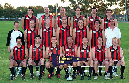
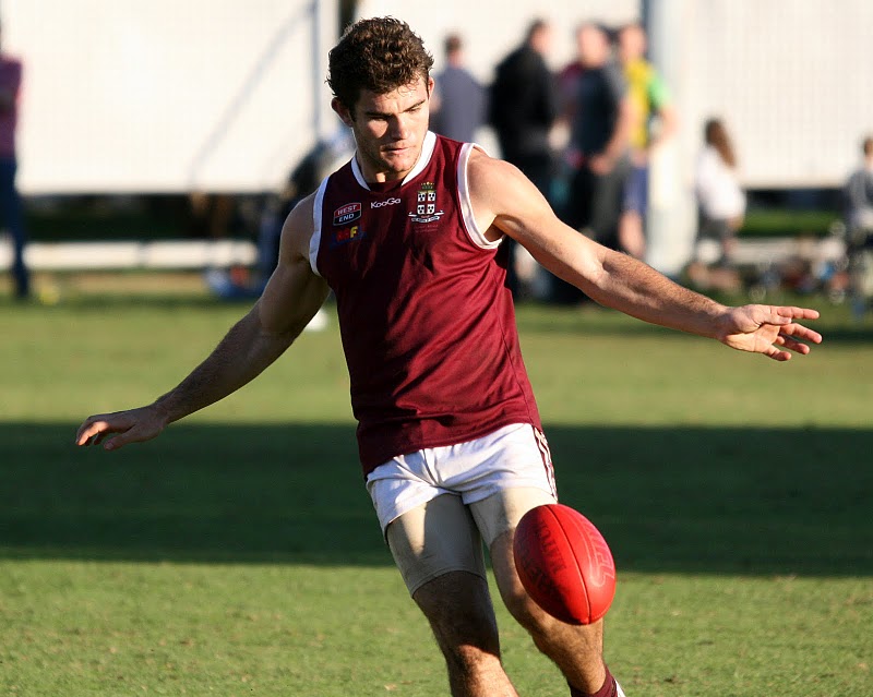
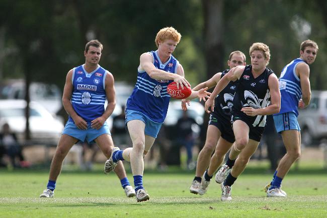
I've gone through and redeveloped the South Australian Amateur Football League. In each post I'll include a pic of the current jumper, and my own take on the clubs look.
 
DIV 1

Goodwood Saints

goodwood_saints_guernsey_1.jpg


As alot of you know, I HATE the panels design, so I gave Goodwood the heritage treatement.


Log in to remove this ad.

Tea Tree Gully

images

The Gullies play in a design pretty close to the Essendon sash, and have a grey alternative. I've simplified it slightly, but really this kit is a classic design so I don't think It needed heaps of work.

 
Salisbury North

salisbury_north_guernsey__front_copy1.jpg


Yeeeeeeeeeeeeaaaaaaaaaaaaaaaaah....... that away...... too busy. And gradients.... urgh..... lets just keep it simple, fellas....

 
Portland

p1010459_resized.jpg


The SBS Logo design belongs back in the 90's. It's been done, it's dated, and I hate it. But, Portland do have another design, which is friggin AMAZING.
fixture-image.jpg


(Log in to remove this ad.)

The remake, I know it's you designs and portfolio, but it's my take on it, I've got mate who play for goodie saints (underage) but they love there jumper, and a big cartoon saint seems to make it look 'kiddie'. But just my take on it, it is your portfolio
Which, the original or my remake?
 
Div 2

Payneham Norwood Unions

payneham_nu_guernsey_1.jpg

I can't tell you what the original teams in this union looked like, but man, they have a classy kit and colour scheme. Missing in this pic is the Maroon they use as a third colour

 
Div 2

Payneham Norwood Unions

payneham_nu_guernsey_1.jpg

I can't tell you what the original teams in this union looked like, but man, they have a classy kit and colour scheme. Missing in this pic is the Maroon they use as a third colour

I thought Payneham were dark green
 
Prince Alfred OC

IMG_9921.JPG


I like a good, all red/maroon design as much as the next guy, so I kept the home the same, and gave them an away inspired by there logo.

 
Broadview Football Club

10447754_659314840813128_3773540666577310539_n.jpg


Pretty much a straight up tigers design. So I used my Tigers home and Away kit that I'v used for a few teams.

 
Sacred Heart OC

642148-henley-v-sacred-heart-kick-.jpg


Sacred Heart OC have a great kit, with the two tone blue and thin hoops, but I felt the different toned shorts were a bit much, as was the tiny logo on the belly.


Remove this Banner Ad

Back
Top