Discussion Soccer/Association Football New Kits

Remove this Banner Ad

Status
Not open for further replies.
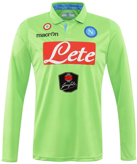
This is the new Napoli 2014-2015 Goalkeeper Home Shirt. Based on the same template as the Home and Third Kits, the new Goalkeeper Jersey is light green with light blue accents and a classical collar.
Napoli-14-15-Goalkeeper-Kit.jpg
 
This is the new Puma Leicester City 2014-2015 Home Jersey.
Leicester-City-14-15-Home-Kit-2.jpg
Leicester-City-14-15-Home-Kit-1.jpg
Leiceser-City-14-15-Home-Kit+(2).jpg
Leiceser-City-14-15-Home-Kit+(3).jpg
Leicester-City-14-15-Home-Kit.jpg

This is the new Leicester City 2014-2015 Away Jersey. The Gold colour was introduced to the 13-14 Home Kit and again appears for the 14-15 one, and now it is the main colour for the Away Kit.

Leicester-City-14-15-Away-Kit.jpg

This is the new Leicester City 14-15 Third Shirt. Leicester City will use a red alternative shirt for away matches, for the first time since 1992. The new Third Shirt features black shoulder and side panels.
Leicester-City-14-15-Third-Kit.jpg

Leicester City Keeper Kits
Leicester-City-14-15-Goalkeeper-Kits+(1).jpg
Leicester-City-14-15-Goalkeeper-Kits+(2).jpg
 
Great effort by Macron after 2 very average seasons of Leeds kits. Matched the football on display I guess. Classy home and away kit. Prefer royal blue but no real complaints about this.

Next season if we get this kit in yellow with royal blue trim it'll be 3 from 3.

10561556_357645431053641_975827555294944934_n.jpg
 

Log in to remove this ad.

Huddersfield Town Away Kit, interesting variant on a hoop design.

Huddersfield-Town-14-15-Away-Kit+(2).jpg

Huddersfield-Town-14-15-Away-Kit-1.jpg
Huddersfield-Town-14-15-Away-Kit.jpg
Trying to copy Nike's Celtic design but without the class. Look at this kit:

10480092_744166122314058_1864384918647065886_o.jpg

Clean. Simple. Easily wearable as everyday fashion and it stands out. I think a lot of clubs in a lot of codes could learn from this. I never wear white but I love the away kit WSW have after seeing this pic. I may actually buy one of these shirts.
 
This is the new Adidas Belgium 14-15 Home Shirt. Based on the Adidas Condivo 14 template, the new Home Jersey is red with bright red and white accents. The v-collar of the Home Shirt is half light red and half white, same for the sleeve cuffs. The Belgian flag is placed on the back below the iconic 2014 Adidas line in white. The Home Kit shorts and socks are also red / white, based on the Adidas Condivo 14 line.
Belgium-2014-15-Adidas-Home-Kit.jpg
Belgium-2014-15-Adidas-Home-Kit-1.jpg

This is the new Belgium 2014-15 Away Shirt by Adidas. The new Away Kit is mainly black with white as secondary color, based on last year's Adidas Toque 13 template. The Away Shirt features a big white zig-zag design at the upper half, surrounding the black Adidas logo and stripes. The shorts and socks of the Belgium 14-15 Away Kit are both black with white applications.
Belgium-2014-15-Adidas-Away-Kit.jpg
Belgium-2014-15-Adidas-Away-Kit-1.jpg
 
Trying to copy Nike's Celtic design but without the class. Look at this kit:
Clean. Simple. Easily wearable as everyday fashion and it stands out. I think a lot of clubs in a lot of codes could learn from this. I never wear white but I love the away kit WSW have after seeing this pic. I may actually buy one of these shirts.

The whole way the Wanderers have branded themselves has been fantastic. It just shows that new franchises don't need to be cutting-edge and try to stand out. People (including kids) still like the classy and traditional.
 

(Log in to remove this ad.)

Supporters are livid. You look at the Facebook post when they announced it and very few fans actually like it. Me personally, I'd rather it have something...more. To me it lacks something.
I reckon it needs more detail on the lion. Or they need to fill up the left over orange at the top of the crest somehow.
 
I like the design but I have an image of it looking really flat on the strip. The Wanderers one looks bold and the shape makes it... heavy looking. It gets attention but isn't oversized or OTT, it just somehow works and there's no way you can describe it – it's like how Stoke City's looks good but Crystal Palace's new one doesn't. So as decent as it is and I like how they've tried to buck the Aussie sports design trend of living in 2007, I think it won't be too great on the shirts. Maybe it needs thicker lines and less going on?

Can't complain too much, though. The old one was actually one of the worst logos still getting a go in world soccer. The font was so bad, the design so complex and convoluted that it looked bad even on a black white background, and I hated how the main element – the lion's head – wasn't even in the middle of the design. When you looked at it, your attention went nowhere and if it did, it was on the mane. It was a botched job. And that's not mentioning it had two redundant colours on it, too.

Also, a few people were trying to rally a name change to 'Brisbane FC,' called 'Brisbane' as opposed to 'Sydney FC.' I'm happy they didn't. The Lion has lineage and relevance. It's like the Seattle Sounders or Portland Timbers. Pretty naff names in isolation but they have history and actually represent something about their city. The Roar is the same. I like the rejigging of the Lion > Roar name too.
 
Brisbane Roar new logo.jpg
I tried to edit the logo slightly. Necklines and arms now pointy instead of just a line, and the tail (don't like that, but I tried)

Also, with the empty space at the top, I added a soccer ball pattern (a dodgy one at that) and lines to continue with the whole diagonal kit design.

Meh.
 
Status
Not open for further replies.

Remove this Banner Ad

Back
Top