


LOL first the Mariners, now Victory. When will clubs learn that kits inspired by their stadia simply don't work?
Navigation
Install the app
How to install the app on iOS
Follow along with the video below to see how to install our site as a web app on your home screen.
Note: This feature may not be available in some browsers.
More options
You are using an out of date browser. It may not display this or other websites correctly.
You should upgrade or use an alternative browser.
You should upgrade or use an alternative browser.
Discussion Soccer/Association Football New Kits
- Thread starter Silent Alarm
- Start date
- Tagged users None
- Status
- Not open for further replies.
I love that clash but that Home is just plain hideous!
Still doesn't make what they are doing right.
Never said it did.
Horrible!
The V on the home is not bad, but it needs to be higher up in the proper position. Looks ridiculous where it is. At least there is no unnecessary white side panels any more.
That away.... Geez. Its not bad in theory but in execution just looks terrible. Would be better with the V centred and the pattern only just visible - like a watermark or something.
Almost makes me not want to win the Championship this season. Almost.
- Sep 23, 2012
- 1,979
- 1,396
- AFL Club
- GWS
Away looks more like Melbourne City with the white/sky blue... at least to me it does.
- Moderator
- #4,133
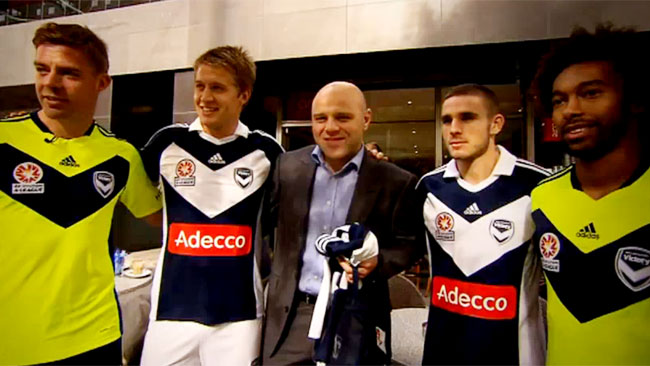
Yeah look not a fan at all. Looks like I'll be sticking with my Reebok/Samsung kit for another year!
If the vee on the home was any less angled it'd be flat, I honestly wouldn't have minded if there was no vee on there at all. I actually like the away kit.
If the vee on the home was any less angled it'd be flat, I honestly wouldn't have minded if there was no vee on there at all. I actually like the away kit.
Klim
Brownlow Medallist
- Sep 17, 2013
- 12,532
- 10,363
- AFL Club
- Sydney
s**t. Just s**t.Melbourne Victory kits.


Yeah look not a fan at all. Looks like I'll be sticking with my Reebok/Samsung kit for another year!
If the vee on the home was any less angled it'd be flat, I honestly wouldn't have minded if there was no vee on there at all. I actually like the away kit.
Is that the season 1/2 vee-less kit or season 3/4 kit with the vee?
And FWIW I think the new vee is great! Its just in no mans land!
Jesus. That chevron is Hawthorn polo gaffa tape tier. Adidas must have replaced creative with a bunch of handymen.
- Moderator
- #4,138
Is that the season 1/2 vee-less kit or season 3/4 kit with the vee?
And FWIW I think the new vee is great! Its just in no mans land!
Season 4 kit
The reason for the new vee being as low as it is is surely because Adidas figured it looks silly underneath the logos as it'd be overlapped on both ends by some margin. I have a feeling that if the A-League logo was still not be bound by those stupid requirements of being on the front of the kit, that Adidas might have been able to do something a bit more inventive with it all.
I would have been rapt with something similar to this minus the names, it looks great I reckon.
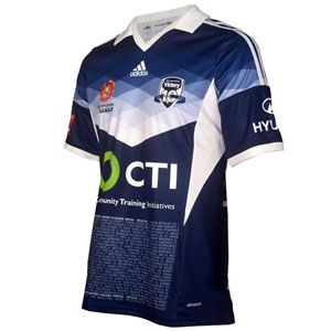
Shame about CTI as a sponsor, I'm sure they're a great company but their logo is bog ugly.
The KFC logo on the sleeve is so darn hideous; prevented me from buying a MV kit when I was a teenager/shirter.
Not to mention the crap designs, worsened by OCTI and Oliana, the most average appearing shirt sponsors.
Adidas' first ever efforts (2011-12) remain the only half-decent kits in the post-Reebok era.
Not to mention the crap designs, worsened by OCTI and Oliana, the most average appearing shirt sponsors.
Adidas' first ever efforts (2011-12) remain the only half-decent kits in the post-Reebok era.
Great call, that joke is still funny.....with some Fed Square inspiration....
Season 4 kit
The reason for the new vee being as low as it is is surely because Adidas figured it looks silly underneath the logos as it'd be overlapped on both ends by some margin. I have a feeling that if the A-League logo was still not be bound by those stupid requirements of being on the front of the kit, that Adidas might have been able to do something a bit more inventive with it all.
I would have been rapt with something similar to this minus the names, it looks great I reckon.
Shame about CTI as a sponsor, I'm sure they're a great company but their logo is bog ugly.
The logo overlapping seems to be their reason for it. This - without the red trim - would be perfect.
A higher vee would also allow the sponsor to be in a better spot and not down on the torso which would make it look less s**t.
The KFC logo on the sleeve is so darn hideous; prevented me from buying a MV kit when I was a teenager/shirter.
Not to mention the crap designs, worsened by OCTI and Oliana, the most average appearing shirt sponsors.
Adidas' first ever efforts (2011-12) remain the only half-decent kits in the post-Reebok era.
Nah that vee was way too fat! Coupled with the massive white sidepanels and the kit was just too white.
Their second effort - the 13/14 kit - was the best. Narrower, shallower vee. Sidepanels became underarm "blades" that weren't too noticeable. Only problem was the retail versions were botched and had a black stroke around the A-League logo.

They were essentially the same for 14/15. but were fully sublimated instead and had the ugly CTI logo which made it look worse overall. Incidentally, those light blue shorts never got a run. That was supposed to be the away kit, with the white shorts as an "alternate".
Oh god, that's bad. And the players don't look that impressed either.
Go home kit designer, you're drunk. That's a terrible kit. Champions of Australia....early contender for worst kit of the year.
Am I the only one on here that really does like the Victory Away?
Their second effort wasn't actually a vee, though.Nah that vee was way too fat! Coupled with the massive white sidepanels and the kit was just too white.
Their second effort - the 13/14 kit - was the best. Narrower, shallower vee. Sidepanels became underarm "blades" that weren't too noticeable. Only problem was the retail versions were botched and had a black stroke around the A-League logo.
They were essentially the same for 14/15. but were fully sublimated instead and had the ugly CTI logo which made it look worse overall. Incidentally, those light blue shorts never got a run. That was supposed to be the away kit, with the white shorts as an "alternate".
And the sidepanels did go well with the white shorts.
It's mediocre, not as bad as suggested but it isn't exactly good. Way too many decals and stripes from Adidas, as well as that hideous sponsor logo which may well be the worst soccer shirt sponsor I've ever laid eyes on.Am I the only one on here that really does like the Victory Away?
Their second effort wasn't actually a vee, though.
And the sidepanels did go well with the white shorts.
I really liked the white shorts, but again, with those sidepanels, the whole kit was more white than navy.
And I'm not sure what you mean by "not a vee". What would you call it?
A strong club which has an identity beyond their away jersey?I think it would work for a fantasy side, but when you are trying to represent a strong club, I don't think it's right for them.
I fail to see the problem with the logo myself but each to their own I guessIt's mediocre, not as bad as suggested but it isn't exactly good. Way too many decals and stripes from Adidas, as well as that hideous sponsor logo which may well be the worst soccer shirt sponsor I've ever laid eyes on.
- Status
- Not open for further replies.
Similar threads
- Replies
- 41
- Views
- 2K
- Replies
- 2
- Views
- 238
