
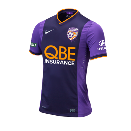
Words cannot express how much better shirts look with the competition logo on the sleeve. Needs to happen in the A-League.
Navigation
Install the app
How to install the app on iOS
Follow along with the video below to see how to install our site as a web app on your home screen.
Note: This feature may not be available in some browsers.
More options
-


LIVE: St Kilda v Western Bulldogs - 7:30PM Thu
Squiggle tips Saints at 51% chance -- What's your tip? -- Team line-ups »
You are using an out of date browser. It may not display this or other websites correctly.
You should upgrade or use an alternative browser.
You should upgrade or use an alternative browser.
Discussion Soccer/Association Football New Kits
- Thread starter Silent Alarm
- Start date
- Tagged users None
- Status
- Not open for further replies.
- Jul 9, 2010
- 24,163
- 26,536
- AFL Club
- Fremantle
- Thread starter
- #2,077
Mismatching front and backs have come to soccer. Probably less overt than the Catters' one, but this is frustrating because they could've maintained the numbers sit on a blank blue panel, but have some continuity between front and back. Why didn't they keep the pinstripes going right up until that white bar across the back? That panel seems to be the new Adidas element of continuity (ala Nike's old fetish with massive cuff bands), so they've actually had that dilemma solved inadvertently. Instead the whole thing just looks incongruous.

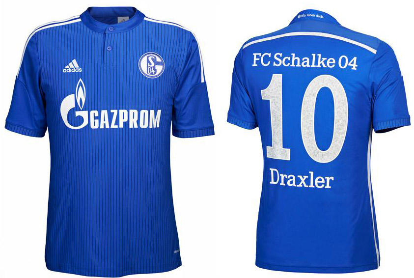
Yes the pattern isn't continued, but the adidas stripes and the stripes down the side break up the front from the back, so I think that is fine in terms of continuity and it will still look great in action

The Cats away is definitely much worse than this.
lmach
Naitanui2Yeo
It isn't the same at all:


lmach
Naitanui2Yeo
And I'm guessing that's their ACL kit.
Their ACL kit is the hoops with different locations for number and sponsors, maybe a 2014'15 kit or FFA Cup kit?And I'm guessing that's their ACL kit.
Sent from my GT-I9300T using Tapatalk
____
.
- Sep 1, 2009
- 7,496
- 8,950
- AFL Club
- Brisbane Lions
- Other Teams
- Everton, Brisbane Bullets, Thai Port FC
Looks like a training shirt to meCan someone please explain the meaning of this jumper, except the fact that it is the same design and the AFL U18 NSW/ACT Rams design.
New teamwear template for sure thoughLooks like a training shirt to me
Sent from my GT-I9300T using Tapatalk
blktreacle
Club Legend
when does ny city kick off?
Groupie_
time to return the traditional Richmond yellow
Not sure if this has been posted, Brazil third kit for the World Cup. So much win

- Aug 21, 2007
- 31,649
- 98,912
- AFL Club
- Port Adelaide
- Other Teams
- Aston Villa, San Antonio Spurs
It's nice but why does a team need a third kit in a world cup? They play like 6 games
Groupie_
time to return the traditional Richmond yellow
It's nice but why does a team need a third kit in a world cup? They play like 6 games
$$$$$$$$$$$$$$
- Jul 9, 2010
- 24,163
- 26,536
- AFL Club
- Fremantle
- Thread starter
- #2,092
And it looks bad too. Never got the love for all black kits. I never get on the "looks like a polo with a swoosh!" platform but honestly, that kit is just so bland and has no distinguishing marks – no interesting collar, bupkis.
It's more on the green side of things, but I agree with you silent alarm; way too bland.
It's weird that nike chose that the only design element on what really is a cash-grab kit, is on the shorts seen here..
http://www.footyheadlines.com/2013/12/exclusive-brazil-2014-third-kit-leaked.html
It's weird that nike chose that the only design element on what really is a cash-grab kit, is on the shorts seen here..
http://www.footyheadlines.com/2013/12/exclusive-brazil-2014-third-kit-leaked.html
cannavo
LFG #16
http://www.footyheadlines.com/
More world cup kits released this month
Here's a few
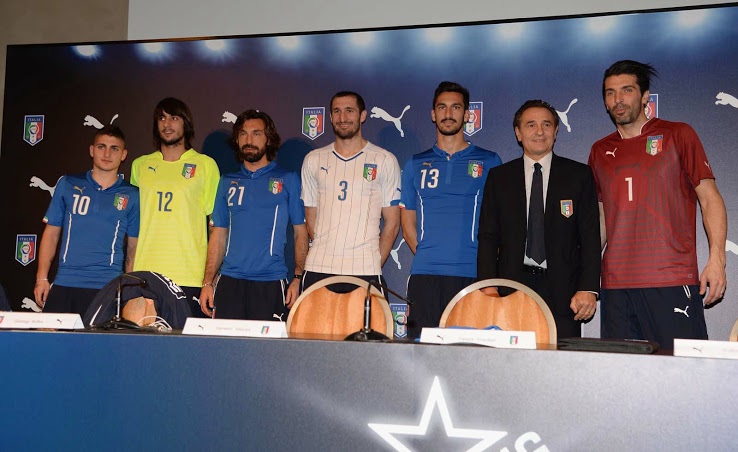
Italy. A real improvement from the Confed Cup one
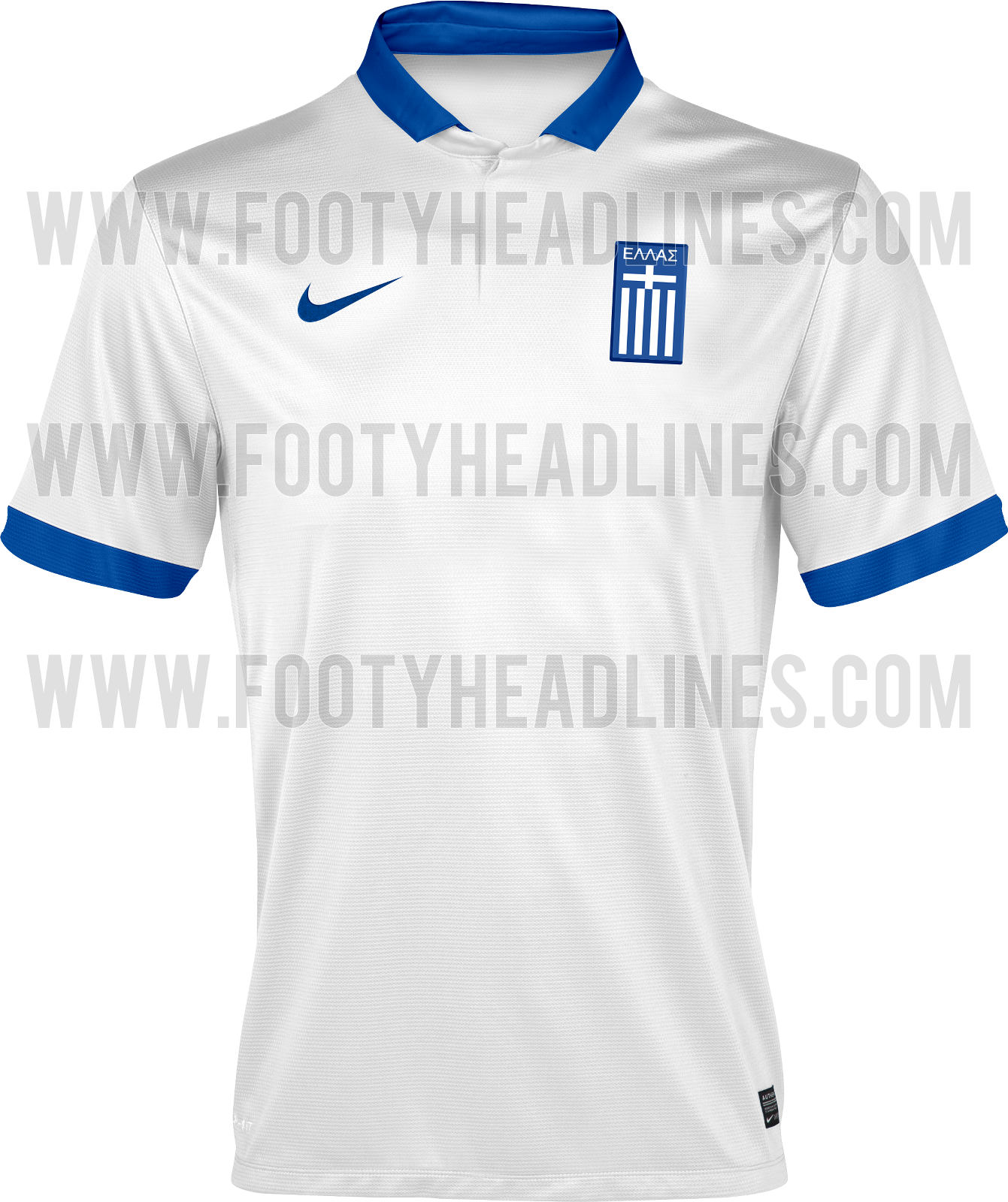
Greece. Boring.
Netherlands Home and Away. Leaked home version looked better at least the gradient is in the away.
[URL='http://2.bp.blogspot.com/-3zgkf7rUgWU/UoeFOVYMdhI/AAAAAAAAVtg/vl_8ZPrZyxw/s1600/Netherlands+2014+World+Cup+Away+Kit.jpg']
[/URL]
Croatia. Only difference with the home is red sleeves instead of smaller checkerboard. Love the checkers on the away.
USAs homejersey Polo top. Nike really abused the "class" in their collar
More world cup kits released this month
Here's a few
Italy. A real improvement from the Confed Cup one
Greece. Boring.
Netherlands Home and Away. Leaked home version looked better at least the gradient is in the away.
.jpg) [URL='http://2.bp.blogspot.com/-3zgkf7rUgWU/UoeFOVYMdhI/AAAAAAAAVtg/vl_8ZPrZyxw/s1600/Netherlands+2014+World+Cup+Away+Kit.jpg']
[/URL]
[URL='http://2.bp.blogspot.com/-3zgkf7rUgWU/UoeFOVYMdhI/AAAAAAAAVtg/vl_8ZPrZyxw/s1600/Netherlands+2014+World+Cup+Away+Kit.jpg']
[/URL]Croatia. Only difference with the home is red sleeves instead of smaller checkerboard. Love the checkers on the away.

USAs home


Groupie_
time to return the traditional Richmond yellow
http://www.footyheadlines.com/
More world cup kits released this month
Here's a few
Italy. A real improvement from the Confed Cup one
Greece. Boring.
Netherlands Home and Away. Leaked home version looked better at least the gradient is in the away.
Croatia. Only difference with the home is red sleeves instead of smaller checkerboard. Love the checkers on the away.
USAs homejerseyPolo top. Nike really abused the "class" in their collar
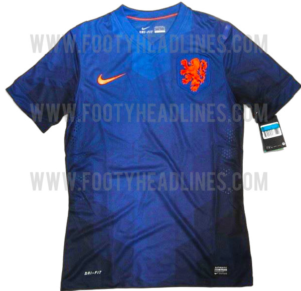
That Holland home is awesome
- Jul 9, 2010
- 24,163
- 26,536
- AFL Club
- Fremantle
- Thread starter
- #2,096
They're back in white shorts too, which I think suits them a heap more.That Holland home is awesome
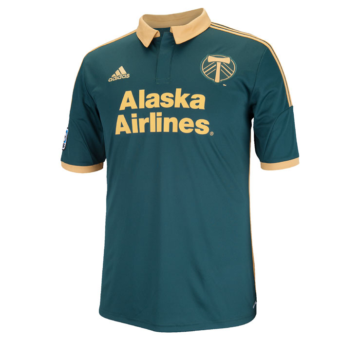
Portland Timbers just brought out their strips. I've always loved their colourway but just hated the execution (Adidas – I would've been about four shirts deep if they were made by Nike or Umbro), but this thing is really nice. It shows how three-striples can complement and not clutter shirts. If anything it should be Adidas sticking to Nike-lite templates and just changing colour ways. How many clubs and countries would look bad in a recoloured version of this?
Last edited:
Riccardo11
Cancelled
I'm going to need that Timbers secondary kit!
Riccardo11
Cancelled
They're back in white shorts too, which I think suits them a heap more.
Portland Timbers just brought out their strips. I've always loved their colourway but just hated the execution (Adidas – I would've been about four shirts deep if they were made by Nike or Umbro), but this thing is really nice. It shows how three-striples can complement and not clutter shirts. If anything it should be Adidas sticking to Nike-lite templates and just changing colour ways. How many clubs and countries would look bad in a recoloured version of this?
There has been a lot of hate for the last seasons home shirt, a lot of supporters found it far too apron like:
 Hopefully a positive change is made, most of the Timbers kits are unreal.
That "two sided chevron design" just looks like a baseball stitching from a distance
- Status
- Not open for further replies.
Similar threads
- Replies
- 41
- Views
- 2K
- Replies
- 1
- Views
- 130
- Replies
- 42
- Views
- 2K
