


Cartoon with shield?True, people just keep coming up with cartoon logos I just don't find the appeal in them, Adelaide needs a shield instead.
")

Follow along with the video below to see how to install our site as a web app on your home screen.
Note: This feature may not be available in some browsers.
Cartoon with shield?True, people just keep coming up with cartoon logos I just don't find the appeal in them, Adelaide needs a shield instead.
I like a shield yes, but still... that one, no. (lol) I like their heritage shield and think that should be their logo! but I don't think others agree.
This or plain hoops in my opinion.
View attachment 87967
I love this. I think the wings could be slightly scaled down to retain the detail in the centre of the image when it's a smaller version.
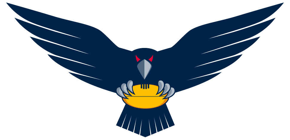

This is great but black might look better and maybe put modern home hoops on the crow's chest and incorporate it within a shield or border.
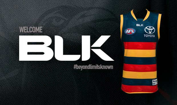
No reply from the club when questioned about the logo in the fixture photo... I'm taking that as a good sign. Hopefully Monday brings a string of announcements!
Whatever we go with I hope we drop the "crows" as part of our "official" name and just refer to ourselves as Adelaide, including not having the word "crows" on our logo. Not needed and cheapens it in my opinion.
See the 2015 draw. You have some clubs listed as e.g. Essendon, not Essendon bombers. Whereas we (and West Coast, Bulldogs and others) are Adelaide Crows. Should just be Adelaide. Full stop.
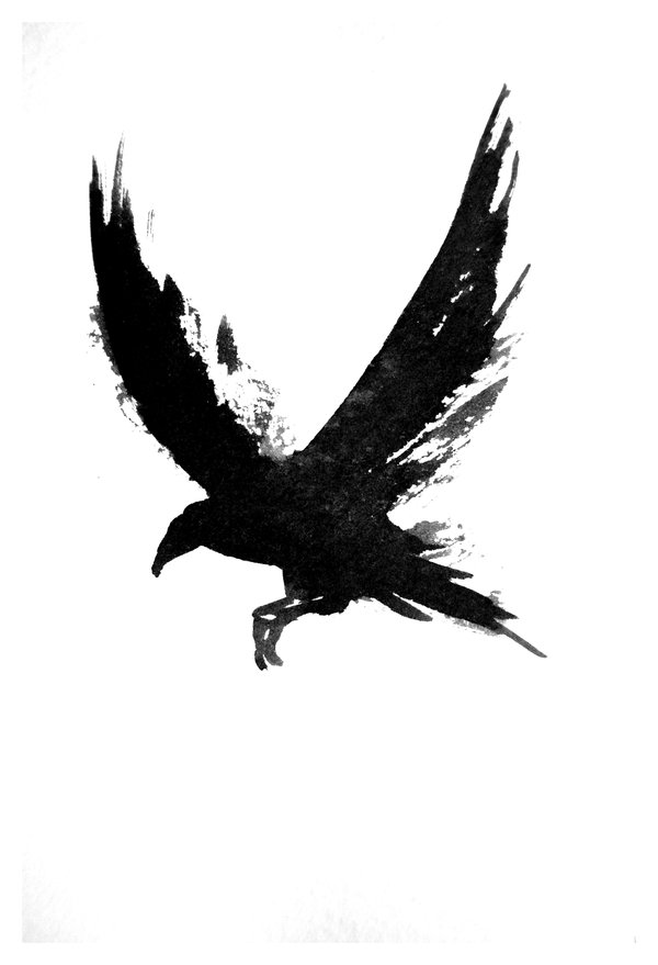
The mysterious new crow appears on afc.com again...
Show yourself, damn you.

