Navigation
Install the app
How to install the app on iOS
Follow along with the video below to see how to install our site as a web app on your home screen.
Note: This feature may not be available in some browsers.
More options


You are using an out of date browser. It may not display this or other websites correctly.
You should upgrade or use an alternative browser.
You should upgrade or use an alternative browser.
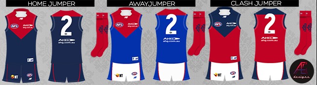
The jumper - It was a bloody mess
- Thread starter ManWithNoName
- Start date
- Tagged users None

They look good but I don't think they fit the AFL requirements for a clash. I think both the royal blue and red would be classified as 'dark' colours. It's stupid I know.
Tbh I don't mind the white clash all that much. I think it's simple and does the job. A necessary evil. In a weird way it makes you appreciate our home guernsey more as well.
Didn't Essendon have a Red clash jumper at some stage? The 'Royal' blue we may not get away with (as much as Hazzah Lampost would love it) I would like to see us with the Red jumper with the Navy Yoke.
ManWithNoName Can you confirm Essendon had a Red jumper?
Mero
Norm Smith Medallist
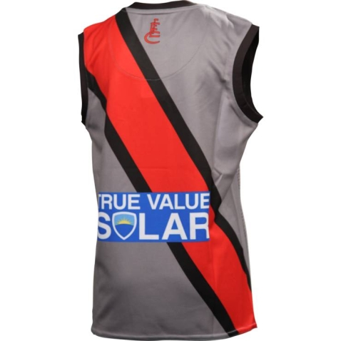
Essendon had a jumper with an enormous sash, which they argued made the jumper mostly red.Didn't Essendon have a Red clash jumper at some stage? The 'Royal' blue we may not get away with (as much as Hazzah Lampost would love it) I would like to see us with the Red jumper with the Navy Yoke.
ManWithNoName Can you confirm Essendon had a Red jumper?

ManWithNoName
TheBrownDog
- Thread starter
- #54
We had the jumper Mero posted above that was 51% red and therefore a light jumper.Didn't Essendon have a Red clash jumper at some stage? The 'Royal' blue we may not get away with (as much as Hazzah Lampost would love it) I would like to see us with the Red jumper with the Navy Yoke.
ManWithNoName Can you confirm Essendon had a Red jumper?
Bluelegs
Celebrating what we're good at
Essendon had a jumper with an enormous sash, which they argued made the jumper mostly red.

So horrid.
Marlowe
𝓤𝓷𝓽𝓸𝓾𝓬𝓱𝓪𝓫𝓵𝓮
- Mar 12, 2012
- 29,928
- 53,376
- AFL Club
- Melbourne
- Other Teams
- Gold City Royals
Prefer the Fuchsia.
Benwah83
Got a light?
- Oct 15, 2011
- 5,809
- 28,251
- AFL Club
- Melbourne
- Other Teams
- Tottenham
Heritage Round strip for 2015?
stretcharmstrong
Norm Smith Medallist
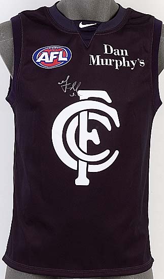
Submit to club please dude. But don't ask for money, unless somehow it comes out of the salary capI ******* hate that logo - love the monogram, dislike the trident, the southern cross and all that other crap. Also adamantly against the white jumper. Not a fan of Melbourne in white, looks wrong.
Preferably, I would be for something like this:
It really does look like he's done a football shaped poo.
I agree we need to lose the logo, get the away / clash jumper to be a variant on the training guernsey, which is a ripper.
melbournemartin
Brownlow Medallist
The watermark is stupid since you can only ever see the top of it on the yolk. I don't think the logo is needed either. Remove those two things and then the sponsors, which we have less input over, will be less intrusive.

Gysberts2Bate
Brownlow Medallist
No that's a red jumper with two black sashes.Essendon had a jumper with an enormous sash, which they argued made the jumper mostly red.
No that's a red jumper with two black sashes.
I prefer to think of it as a genuine white clash guernsey with red and black highlights that create the player numbers
Tulip
Hall of Famer
- May 3, 2009
- 37,249
- 34,495
- AFL Club
- Melbourne
- Other Teams
- Tottenham
If we kicked up a fuss and showed them that there are no clashes - I think the AFL would cave.
Problem is Adelaide, I don't know if the away would really do it.
Problem is Adelaide, I don't know if the away would really do it.
Gysberts2Bate
Brownlow Medallist
Can confirm. When I purchased my last guernsey they painted red and blue on it to form the #12.I prefer to think of it as a genuine white clash guernsey with red and black highlights that create the player numbers
- Jan 9, 2004
- 7,322
- 5,608
- AFL Club
- Melbourne
- Other Teams
- Kawasaki Racing, Falcons, Pelicans
Sponsors don't want their logos to blend in - otherwise what's the point of paying for the exposure? As an opposition fan I've always liked your jumper especially with the navy blue. Agree with the comment about removing the ahg website.
As for a clash jumper have you considered red with a blue yoke?
They want it to be bold and noticable. I'm not talking about it blending into obscurity but to look integrated as part of the jumper - ie. it looks like it's supposed to be there not whacked on as an afterthought.
I ******* hate that logo - love the monogram, dislike the trident, the southern cross and all that other crap. Also adamantly against the white jumper. Not a fan of Melbourne in white, looks wrong.
Preferably, I would be for something like this:
Swapping the colours around to make a clash jumper is simple but brilliant. It's also slightly more effective than when the Pies do it..
Somebody make it happen.
It can be our bring back em wings campaign. The mods can make us badges.
I mostly just want a badge.
Why can't we keep our clash jumper IDENTICAL to our home jumper, except that;
We make the dark blue a faded blue (grey/blue) like the essendon jumper. They managed to keep the red, so why not we do the same..
He's my attempt at photoshopping... I cant see why we can use it (perhaps even with a little bit more blue too)
Bombers clash jumper for comparison (ie what is allowable by AFL standards):
Also added the current Carlton Home jumper to demonstrate just how much they "clash"..
Last edited:
d33my
Club Legend
That actually looks pretty good.
- Jan 9, 2004
- 7,322
- 5,608
- AFL Club
- Melbourne
- Other Teams
- Kawasaki Racing, Falcons, Pelicans
Considering the outright hatred for the silver monstrosity we had a few years ago, that's surprisingly acceptable!
Tulip
Hall of Famer
- May 3, 2009
- 37,249
- 34,495
- AFL Club
- Melbourne
- Other Teams
- Tottenham
Main problem with the white jumper is that the sponsor always looks s**t in a box on the yoke.
Would be good to have a red yoke, blue chevron and then a white jumper. Don't like grey or silver for us.
Would be good to have a red yoke, blue chevron and then a white jumper. Don't like grey or silver for us.
LeverPuller
BigFooty Tanker
- Jun 23, 2011
- 35,101
- 40,614
- AFL Club
- Melbourne
- Other Teams
- Newcastle United Seattle Seahawks
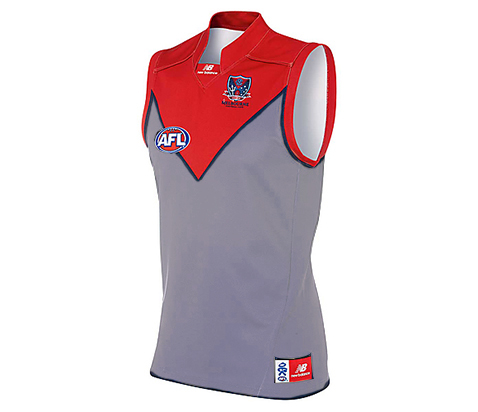
Flashback to silver
melbournemartin
Brownlow Medallist
View attachment 88216
Found this on google so no idea who to credit, I think it would look better without the monogram and would fit in with having to have a white jumper.
Maybe this is just the template, but I don't like the metallic white. I'd just want it a flat white. That colour looks too much like the silver monstrosity of a few years back.
Yeah no idea mate, my guess is it's just shadow. I think it would make a good jumper as It incorporates the red Yoke, the navy blue and the requirements of a white jumper.Maybe this is just the template, but I don't like the metallic white. I'd just want it a flat white. That colour looks too much like the silver monstrosity of a few years back.
Gysberts2Bate
Brownlow Medallist
Am I the only one who thinks that our current clash top looks fantastic? Don't fix what ain't broke.
Similar threads
- Replies
- 385
- Views
- 14K
- Replies
- 21
- Views
- 662
- Replies
- 76
- Views
- 3K
- Replies
- 46
- Views
- 1K
- Replies
- 305
- Views
- 10K
- Replies
- 165
- Views
- 5K
