

Am I the only one who thinks that our current clash top looks fantastic? Don't fix what ain't broke.
You might be
 Nah my Brother likes its as well, I just think it looks pretty crap but that's just my opinion.
Follow along with the video below to see how to install our site as a web app on your home screen.
Note: This feature may not be available in some browsers.
Am I the only one who thinks that our current clash top looks fantastic? Don't fix what ain't broke.
Nah my Brother likes its as well, I just think it looks pretty crap but that's just my opinion.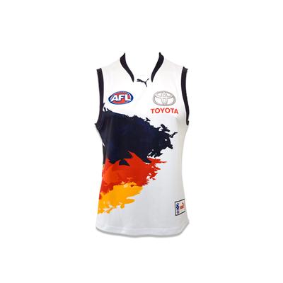
Full disclosure, I actually really like this one too.Yeah I quite like the white. Definitely better than some of the alternatives out there. E.g. I prefer its simplicity as opposed to some sort of abstract piece of art like the Adelaide clash
Wouldn't say I like it, but I don't get the hate personally. Decent strip.Full disclosure, I actually really like this one too.
Yeah I quite like the white. Definitely better than some of the alternatives out there. E.g. I prefer its simplicity as opposed to some sort of abstract piece of art like the Adelaide clash
Am I the only one who thinks that our current clash top looks fantastic? Don't fix what ain't broke.
Am I the only one who thinks that our current clash top looks fantastic? Don't fix what ain't broke.
#GetShitDoneI was about to post this when my internet crashed. Damn it. quick on the money ManWithNoName
I don't have any problems with the jumper, is far better than our old clash strip.
You mad Carlton?
(and no fxckin black box behind the ahg logo!  )
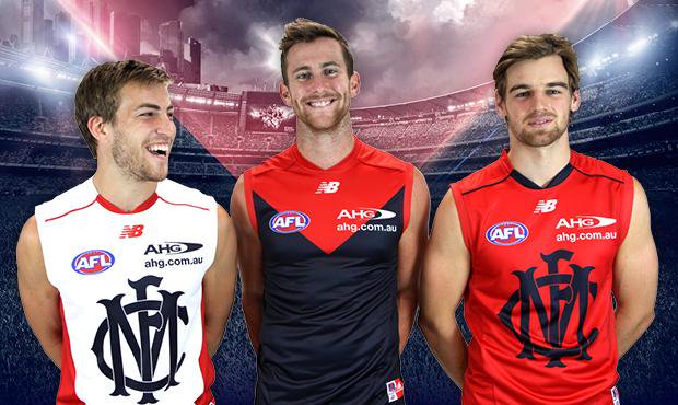
)Going against the grain here, not a huge fan of the new clashes. Monogram is too big -- looks a bit comical.
Don't get me wrong, I don't think they're terrible, but I preferred the old one.


