
dogs105
Sweet Kennels Proprietor
I like this:

Follow along with the video below to see how to install our site as a web app on your home screen.
Note: This feature may not be available in some browsers.
LIVE: St Kilda v Western Bulldogs - 7:30PM Thu
Squiggle tips Saints at 51% chance -- What's your tip? -- Team line-ups »
that logo is goodSomething like these type of logos, please..
And the white with red/blue/gold hoops away guernsey designs that have been getting around to stay permanently, so we have an away identity..
Get away from the plastic crap and get some strength in to our whole look..
I like Sando - he is likeable, but he HAS TO BECOME LESS LIKEABLE. LESS FRIENDLY TO THE MEDIA.
Love these logos! Email it to the club immediately!I don't mind the Austin logo but I would do something a little more intimidating than that.
Fix the logo, tinker with the away jumper but keep hoops. Ohh, and Crows are black, not french navy and sonic the hedgehog royal blue, don't be scared of it, it still goes with our colours, you can make it work.View attachment 81676
I tweeted it to Fages.Love these logos! Email it to the club immediately!
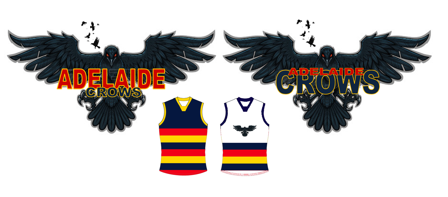
Something like these type of logos, please..
And the white with red/blue/gold hoops away guernsey designs that have been getting around to stay permanently, so we have an away identity..
Get away from the plastic crap and get some strength in to our whole look..
I hope you're serious. It's seriously good.I tweeted it to Fages.
Yeah I did. I've randomly sent clash jumpers and the like to the club over the years as well but thought I would send it straight to the manI hope you're serious. It's seriously good.
Yeah I did. I've randomly sent clash jumpers and the like to the club over the years as well but thought I would send it straight to the man
Did it a week ago.Just tweeted the whole thread to him from the @bigfootycrows. Let's hope he comes and has a look.
I hate triggy for what he did to the fanbase in his tenure.Sounds like Fagan genuinely wants to engage with us supporters! Good to see!
Love the logo, not so keen on that clash. Logo on an all white guernsey with blue shorts would look better.I don't mind the Austin logo but I would do something a little more intimidating than that.
Fix the logo, tinker with the away jumper but keep hoops. Ohh, and Crows are black, not french navy and sonic the hedgehog royal blue, don't be scared of it, it still goes with our colours, you can make it work.View attachment 81676
Why? There's still a large percentage that wish he was still there.I hate triggy for what he did to the fanbase in his tenure.
ar mock up
Best to keep the crow distinct from the hoops.
Well done. Now footysa and a few others who may not follow you can spare it too.Did it a week ago.
I don't mind the Austin logo but I would do something a little more intimidating than that.
Fix the logo, tinker with the away jumper but keep hoops. Ohh, and Crows are black, not french navy and sonic the hedgehog royal blue, don't be scared of it, it still goes with our colours, you can make it work.View attachment 81676
I suspect not to be honest. Clubs often pay big money for design companies to do this stuff, a very pleasant thanks for your ongoing interest and support of the club is the general thread of the response.Have any of your designs come close? Didnt mind some of yours.

