


No it isn't - West Tigers NRL play in these colours, have done for ages.... its an original colour to the afl and any other sporting team in west sydney...
Navigation
Install the app
How to install the app on iOS
Follow along with the video below to see how to install our site as a web app on your home screen.
Note: This feature may not be available in some browsers.
More options
You are using an out of date browser. It may not display this or other websites correctly.
You should upgrade or use an alternative browser.
You should upgrade or use an alternative browser.
When are GWS gonna get serious and change their colours?
- Thread starter Bully187
- Start date
- Tagged users None
SM
Bigfooty Legend
No need to worry about having to intermingle with westie bogans. There are plenty of Centrelink offices in the west to handle the workload. That means the only contact you'll have to have with us baser sorts is at the footy
A 50 point thrashing will have me worried that you lot will want to start a riot or something.
And baja, cheers on the team spirit on that one mate.
UrLordUnbeliever
Club Legend
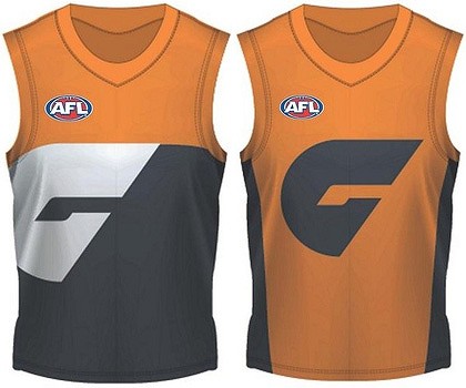
Took me a while to get used to them, but I do like the colours.. And they do have more than just the 2 designs available as well:

To be honest by least favourite, but I thought it'd be worth you all seeing what it looks like in action as well.
A weird stip.. No Orange at all.. This was the Giants' 2011 Clash strip.
The more contraversial one as it is a mirror of the Saints, and a more traditional design. One of my favourites TBH.
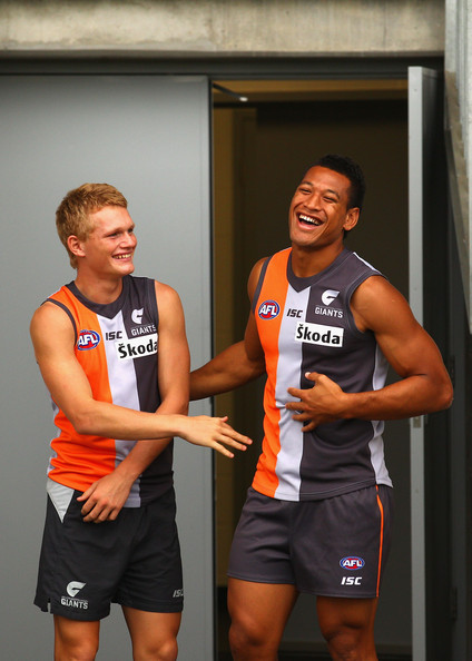
A decent 'action' shot of the main GWS Jumper.. Not too bad at all actually... Still would prefer a more traditional strip, but i don't mind it at all.

To be honest by least favourite, but I thought it'd be worth you all seeing what it looks like in action as well.

A weird stip.. No Orange at all.. This was the Giants' 2011 Clash strip.
The more contraversial one as it is a mirror of the Saints, and a more traditional design. One of my favourites TBH.

A decent 'action' shot of the main GWS Jumper.. Not too bad at all actually... Still would prefer a more traditional strip, but i don't mind it at all.
s_cranberry
Club Legend
- Aug 5, 2011
- 1,059
- 12
- AFL Club
- Essendon
Should wear state colors as their clash strip against the swans... Could gain them a few supporters
Colours are fine, but the design is shite just like the GC one.
Why can't they have stripes or hoops like normal people. The giant GC and G in the middle of the jumpers looks silly.
Why can't they have stripes or hoops like normal people. The giant GC and G in the middle of the jumpers looks silly.
s_cranberry
Club Legend
- Aug 5, 2011
- 1,059
- 12
- AFL Club
- Essendon
Colours are fine, but the design is shite just like the GC one.
Why can't they have stripes or hoops like normal people. The giant GC and G in the middle of the jumpers looks silly.
Stripes and hoops have been done to death... Designers were probably trying to go for something original and iconic....
Lord Nicholson
El Supremo
- May 30, 2011
- 13,891
- 19,885
- AFL Club
- Essendon
- Other Teams
- Our Lady of the Worthless Miracle
Stripes and hoops have been done to death... Designers were probably trying to go for something original and iconic....
Like the Dogs and their robopuppy?
Gimmicky designs don't last. Port Adelaide's SBS logo thingo didn't, and has been replaced with a more conventional strip.
Western Bulldogs have turfed the robopuppy for their classic premiership strip.
The Brisbane Bears started out with something "original and iconic," before switching to something far more traditional in style and, at least in my opinion, something more iconic. (Sad, though, that the Lions have gone the other way).
Freo have ditched the anchor for a throwback to a heritage strip.
Even the Eagles have tried for something more straight-laced (har har), but have... gone about it ultimately, and now, in an odd sort of way, the old "wings" design feels much more simple and even traditional. For that club, anyway.
These gimmicky designs die out more often than not, and give way to something much more simple, that a kid could draw in school or whatever. Full credit to Adelaide, BTW, for coming into the comp wearing something that really looks like a footy guernsey.
juddy_Like
Norm Smith Medallist
Like the Dogs and their robopuppy?
Gimmicky designs don't last. Port Adelaide's SBS logo thingo didn't, and has been replaced with a more conventional strip.
Western Bulldogs have turfed the robopuppy for their classic premiership strip.
The Brisbane Bears started out with something "original and iconic," before switching to something far more traditional in style and, at least in my opinion, something more iconic. (Sad, though, that the Lions have gone the other way).
Freo have ditched the anchor for a throwback to a heritage strip.
Even the Eagles have tried for something more straight-laced (har har), but have... gone about it ultimately, and now, in an odd sort of way, the old "wings" design feels much more simple and even traditional. For that club, anyway.
These gimmicky designs die out more often than not, and give way to something much more simple, that a kid could draw in school or whatever. Full credit to Adelaide, BTW, for coming into the comp wearing something that really looks like a footy guernsey.
But isn't GCS and the non-white GWS jumpers the same as Carltons?
They play out at Campbelltown! How west do you want?Wests Tigers are a merged team from a very inner Sydney club, and a South-West suburbs club. Not the area that GWS is aiming at.
The colours are OK but it's a clumsy design - it looks like a training jumper. The big G is gimmicky and naf looking - I doubt it will last.
My suggestion is some white lines separating the two colours, and a smaller, normal looking G, offset to the left.
Lord Nicholson
El Supremo
- May 30, 2011
- 13,891
- 19,885
- AFL Club
- Essendon
- Other Teams
- Our Lady of the Worthless Miracle
But isn't GCS and the non-white GWS jumpers the same as Carltons?
Not really. There's a lot of difference between a monogram that has evolved over the course of a century, and a logo that's been drawn up last week. Carlton's monogram is timeless, but these other logos will date. Quickly.
Not really. There's a lot of difference between a monogram that has evolved over the course of a century, and a logo that's been drawn up last week. Carlton's monogram is timeless, but these other logos will date. Quickly.
You can't really group Gold Coast's logo and GWS's logo into the same category. The Giant's logo is a lot simpler and has potential to be a strong, recognisable logo. Gold Coast's logo relies too heavily on gradients and doesn't look very strong at all.
It's probably also worth mentioning that Carlton have changed their monogram a few times now.
mcgarnacle
Norm Smith Medallist
- Dec 2, 2003
- 9,812
- 4,213
- AFL Club
- Sydney
Wests Tigers are a merged team from a very inner Sydney club, and a South-West suburbs club. Not the area that GWS is aiming at.
The joint venture is a merger of two clubs that both had territory in the inner west - an area which has large Swans supports, but will probably have newer football supporters decide to support GWS as well as it extends out to the Showgrounds.
- Balmain Tigers had a district extending from the city and everything north of parramatta rd and south of epping road, and east of carlingford and silverwater roads.
- Western Suburbs Magpies could traditionally claim a smaller inner west territory south of parramatta road & north of liverpool road/georges river rd from ashfield out to lidcombe. There was pressure on this though due to the regular premiership successes of the neighbouring Canterbury Bulldogs and its support spreading through the Western Suburbs inner-west region.
Both Balmain and Western Suburbs can claim the venue of the Olympic Park precinct (where GWS will be playing all their matches) as their territory, and so it is very much Wests Tigers territory.
Due to Canterbury's long era of successes as mentioned before and its impact on the Magpies dwindling support, the Magpies shifted out to the greater south-west in the search of new and greater territory. As part of the Greater Western Sydney, this is definately a region the Giants are targeting - the corrider from western sydney down to Canberra. It's definately not Swans turf which, who have more successfully attracted support from the Eastern Suburbs, Lower North Shore, Inner West and Southern Areas of the Sydney's Metro Area. It is on the GWS radar.
Rack Watts
Here's MASON
LOOX GOOD IMO.
Nothing wrong with a bit of charcoal.
Nothing wrong with a bit of charcoal.
NobleBlood
Team Captain
The colours arent the problem, its that terrible design which I hope to god is temporary. I saw them training in what was essentially St Kilda's design with orange instead of red and grey instead of black. They should do that. St Kilda will whinge about them "stealing" the design but there are obviously a number of teams, past and present, that were sharing one.
Its good to have a bit of continuity and a bit of tradition in the jumpers, even if the teams are new.
EDIT: Found it
Its good to have a bit of continuity and a bit of tradition in the jumpers, even if the teams are new.
EDIT: Found it

Lord Nicholson
El Supremo
- May 30, 2011
- 13,891
- 19,885
- AFL Club
- Essendon
- Other Teams
- Our Lady of the Worthless Miracle
You can't really group Gold Coast's logo and GWS's logo into the same category. The Giant's logo is a lot simpler and has potential to be a strong, recognisable logo. Gold Coast's logo relies too heavily on gradients and doesn't look very strong at all.
I agree that the GWS "G" is much stronger than the GC logo. I still don't think either will last longer than 4 or 5 years max.
It's probably also worth mentioning that Carlton have changed their monogram a few times now.
Hence "evolved". The most drastic change to the composition of it was in 1927. Fair effort.
I like the GWS yoke, though. Maybe they'll centralise the "G" after a while, a la the old Fitzroy jumper. Maybe someone could mock something up to that effect in the Graphic Design forum.
mcgarnacle
Norm Smith Medallist
- Dec 2, 2003
- 9,812
- 4,213
- AFL Club
- Sydney
nah. i reckon the SK & WCE home-strip style tri-panel is should be left alone. come up with another design. besides, it looks as though the back of Folau's jersey is white. They **** it up be making the front & back look totally different.
it's pretty hard to make any football strip look decent. AFL and sponsors logos, designs you wont see anywhere else but on a football field, sleeveless jerseys, short shorts, and many players play 'socks down' tends to make them all look gay anyway.
not that there's anything wrong with that, ofcourse. just sayin'.....looks gay.
Hmmmm. What about Hawthorn? Our primary is yellow, despite our description of it as gold. Gold-flavored yellow.
Everyone has always hung s**t on our colours (reverting to kindegarten taunts) but I've always loved them for the same reasons that many in this thread like West Sydney's orange and charcoal. The Hawks have always stood out amongst a sea of boring black or blue colored uniforms.
My problem with the Giants uniforms is that Hawthorn will no longer be as distinctive as they once were. Up until now, we haven't really needed to wear a clash jumper. Hopefully the AFL tells these GWS interlopers to have another clash jumper ready for when they play Hawthorn, as neither of those designs they have will provide a "different" enough contrast from our jumpers.
But the Adrian Anderson couldn't organize a root in a brothel. The AFL are obsessed with dollars but lack any sense, so stand by for confusion when Hawthorn play GWS.
My apologies Chewy. Hawthorn ARE the only current club (not counting GWS) who use yellow as their main colour. Well, if not main then 50-50.
I actually like Hawthorn's colours too and I think they should go back to the all yellow back with the brown number. That looked good. This current stupid amateurish 1971 style white number box looks bloody stupid.
Hawthorn get mocked for their colours because of the whole "poo and wee" thing, but why does that make brown and gold "bad." Isn't the sun also yellow? And daffodils?
And isn't brown the colour of trees? And houses? When people were choosing their brick colour for their house, the answer was usually "mission brown." The hair on our heads is brown and when it turns white, we colour it to turn it brown again.
Hawthorn fans look way better than the boring blue/white/black teams when you see a sea of yellow in the crowd. Have a look at the 2008 Grand Final and how much better and more appealing the Hawthorn fans look in the crowd compared to the dull blue and white of Geelong.
What are you basing that on?St Kilda will whinge about them "stealing" the design but there are obviously a number of teams, past and present, that were sharing one.
The St Kilda design is easily the best looking of their jumpers, you seem to forget WCE already 'stealing' it. I doubt any StK supporters care.
Essendon are the ones that whinge about trivial things like an NRL team in Brisbane calling themselves the Bombers
.They will need a clash for our home games if that's the design they choose.
I do have a bit of a theory about club colours and it goes back to my own choice to barrack for Essendon.
I actually chose Essendon because I loved the colours. That was the sole and only reason. I liked red. But other teams also have red. So, why Essendon? I guess it's because when you contrast the red with the dark black, it is more visually appealing (I think) than combining red with blue or green or anything else.
I think, essentially, the "warm" colours....
...are the most appealing and visually striking colours
And the "cool" colours....
..... are the most boring and least visually appealing.
But the "warm" colours work better when matched up to a dark colour which really bring out their striking advantage.
Hawthorn match up their yellow with brown so that works. Richmond and Essendon match up their yellow and red with black, which works. GWS match up their orange with charcoal which works.
But lets look at West Coast as an example. Their "blue and gold" are okay. I'm not saying blue and gold is bad. But is it as good as the "black and gold" of Richmond? No. Richmond looks better because the yellow contrasts amazingly with the black and stands out more. Yellow stands out more with black than it does with blue.
I reckon if you are using red, yellow or orange and are looking for a second colour to really bring those colours out, it it is better if you use a dark colour, like back, charcoal, etc, or in Hawthorn's case, brown.
I think that blue is the least striking colour to the eye (yellow is the most receptive to the eye) and blue is the most boring colour for a team to use. When you combine blue with white, its not appealing, imaginative, or receptive to the retina at all.
The Cincinatti Bengals have, I think, the most marketable, and appealing colours of any of the US sports teams.
I actually chose Essendon because I loved the colours. That was the sole and only reason. I liked red. But other teams also have red. So, why Essendon? I guess it's because when you contrast the red with the dark black, it is more visually appealing (I think) than combining red with blue or green or anything else.
I think, essentially, the "warm" colours....
- red
- orange
- yellow
...are the most appealing and visually striking colours
And the "cool" colours....
- green
- blue
- purple
..... are the most boring and least visually appealing.
But the "warm" colours work better when matched up to a dark colour which really bring out their striking advantage.
Hawthorn match up their yellow with brown so that works. Richmond and Essendon match up their yellow and red with black, which works. GWS match up their orange with charcoal which works.
But lets look at West Coast as an example. Their "blue and gold" are okay. I'm not saying blue and gold is bad. But is it as good as the "black and gold" of Richmond? No. Richmond looks better because the yellow contrasts amazingly with the black and stands out more. Yellow stands out more with black than it does with blue.
I reckon if you are using red, yellow or orange and are looking for a second colour to really bring those colours out, it it is better if you use a dark colour, like back, charcoal, etc, or in Hawthorn's case, brown.
I think that blue is the least striking colour to the eye (yellow is the most receptive to the eye) and blue is the most boring colour for a team to use. When you combine blue with white, its not appealing, imaginative, or receptive to the retina at all.
The Cincinatti Bengals have, I think, the most marketable, and appealing colours of any of the US sports teams.
juddy_Like
Norm Smith Medallist
What are you basing that on?
The St Kilda design is easily the best looking of their jumpers, you seem to forget WCE already 'stealing' it. I doubt any StK supporters care.
Essendon are the ones that whinge about trivial things like an NRL team in Brisbane calling themselves the Bombers
They will need a clash for our home games if that's the design they choose.
I don't think Saints supporters care because we butcher our jumper with large birdheads and other god know what designs.
I think their colours look fantastic. Am I alone ?
I like the orange, but as for the charcoal/grey meh. It looks washed out and boring.
Also, given that they were designing this strip from scratch with the finest graphic designers money could buy, it is pretty uninspiring.
I bet that little PAFC girl supporter could come up with something better in 5 mins with a set of crayons.
I do have a bit of a theory about club colours and it goes back to my own choice to barrack for Essendon.
I actually chose Essendon because I loved the colours. That was the sole and only reason. I liked red. But other teams also have red. So, why Essendon? I guess it's because when you contrast the red with the dark black, it is more visually appealing (I think) than combining red with blue or green or anything else.
I think, essentially, the "warm" colours....
- red
- orange
- yellow
...are the most appealing and visually striking colours
And the "cool" colours....
- green
- blue
- purple
..... are the most boring and least visually appealing.
But the "warm" colours work better when matched up to a dark colour which really bring out their striking advantage.
Hawthorn match up their yellow with brown so that works. Richmond and Essendon match up their yellow and red with black, which works. GWS match up their orange with charcoal which works.
But lets look at West Coast as an example. Their "blue and gold" are okay. I'm not saying blue and gold is bad. But is it as good as the "black and gold" of Richmond? No. Richmond looks better because the yellow contrasts amazingly with the black and stands out more. Yellow stands out more with black than it does with blue.
I reckon if you are using red, yellow or orange and are looking for a second colour to really bring those colours out, it it is better if you use a dark colour, like back, charcoal, etc, or in Hawthorn's case, brown.
I think that blue is the least striking colour to the eye (yellow is the most receptive to the eye) and blue is the most boring colour for a team to use. When you combine blue with white, its not appealing, imaginative, or receptive to the retina at all.
The Cincinatti Bengals have, I think, the most marketable, and appealing colours of any of the US sports teams.
They had a documentary on Foxtel several weeks back about colours - fascinating stuff.
It claimed that red is the number 1 colour that appeals to humans full-stop and this goes back to the early humans. It symbolises blood etc. and it apparently creates like a primeval response in humans.
That was the reason given for it's popularity around the world as sporting clubs colours.
Similar threads
- Replies
- 35
- Views
- 841
- Replies
- 80
- Views
- 3K
- Replies
- 37
- Views
- 1K
- Poll
- Replies
- 251
- Views
- 14K
