When are GWS gonna get serious and change their colours?

Remove this Banner Ad

They had a documentary on Foxtel several weeks back about colours - fascinating stuff.

It claimed that red is the number 1 colour that appeals to humans full-stop and this goes back to the early humans. It symbolises blood etc. and it apparently creates like a primeval response in humans.

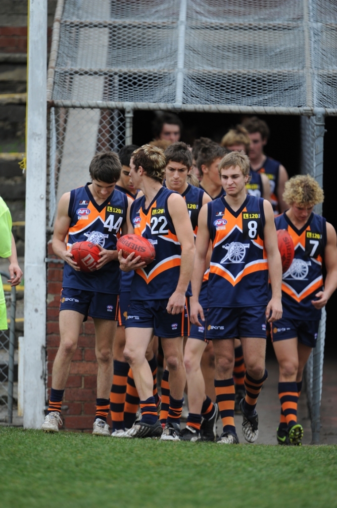
That was the reason given for it's popularity around the world as sporting clubs colours.

Yes, and I can speak from experience. I chose Essendon as my club when I was 5 BECAUSE of the red. At the time, I wouldn't have known why, but research shows that it's an appealing, powerful colour. Almost a scary colour that you would subconsciously want on your side, hence why people choose it. Primeival might be a good way to put it, as as you say.

The three most successful EPL clubs historically (ManU, Liverpool, Arsenal) all wear red.
 
Color scheme is fine, jumper needs rework, create a new design ready for 2012 season.

Although, I personally hate the name, I think its fine(would of gone wolves). They need to drop the word "Greater" and just call the club Western Sydney.
 

Log in to remove this ad.

I think that blue is the least striking colour to the eye (yellow is the most receptive to the eye) and blue is the most boring colour for a team to use. When you combine blue with white, its not appealing, imaginative, or receptive to the retina at all.

Cheap shot.

...

I don't mind gold coast's or GWS' colours but i reckon the design could be better. They should go with some classic pattern or stripes like the rest of the AFL. Something like the Calder Cannons jumper would be original and also looks awesome.

450271_1_O.jpg
 
Yes, and I can speak from experience. I chose Essendon as my club when I was 5 BECAUSE of the red. At the time, I wouldn't have known why, but research shows that it's an appealing, powerful colour. Almost a scary colour that you would subconsciously want on your side, hence why people choose it. Primeival might be a good way to put it, as as you say.

The three most successful EPL clubs historically (ManU, Liverpool, Arsenal) all wear red.

as a kid growing up in sydney in the 80s, i selected the bombers in rd 2 of the 1986 supporters draft because of the 'satanic' colours. the round 1 pick was used on collingwood, but it was a bust after i was attacked by a magpie at the local park.
 
ipad-art-wide-Kevin-Sheedy-420x0.jpg


Coach's gear looks good. cut the sleeves off and you'd have a decent jumper.
 
Much prefer the GWS jumpers to the GC jumpers.

GC managed to take a hugely successful combination of colours in terms of marketing and turn it into something deeply forgettable and benign. That said, they can always change at this stage and supporters won't care too much until they find a winning formula.

GWS on the other hand... The orange, slate and white (or whatever we're calling it) is distinctive, memorable and (imho) fairly modern. I like it.

As for the Calder Cannons, the colour combo is a big winner (especially with the striped socks - looks good), but the design is a bit of a mess. Looks like it belongs on a toddler's romper suit. Just a bit of simplification and it would be a blinder.

Overall I think the problem with some modern jumpers is that designers are given IDIOTIC briefs from their clients.

You know, what we're looking for is something simple really... make it edgy, but with a hint of timelessness and the essence of success and passion. Make it strong and bold, just like our mighty new club, but not too over the top. And it must project the inner of beauty and power the club mascot whilst also projecting our inner harmony and diversity meshed with our relentless forward thinking. Oh, and throw the name in there as well. In funky lettering. But not too funky.

Like I said, something simple.
 
Well, the OP seems to be quite off the mark based on opinions here, and I agree - their jumper/colours look great.

It is streets ahead of that crap Gold Coast are calling a guernsey, and far better than a lot of teams away and clash jumpers. I'd be happy if the crows could design something that good for a clash!

Maybe it will look dated in a few years, but almost every team has jumpers that just ten years ago looked dated. Nothing a revamp can't fix. It helps that they already have strong colours to work with.

Wasn't my first choice but they seem natural now .
 

(Log in to remove this ad.)

Cheap shot.

...

I don't mind gold coast's or GWS' colours but i reckon the design could be better. They should go with some classic pattern or stripes like the rest of the AFL. Something like the Calder Cannons jumper would be original and also looks awesome.

450271_1_O.jpg
Actually. If GWS used the Cannons jersey. It wouldnt be original anymore. It'll be used. Original suggests that its new and never been used by another team. But this has... Just to let you mull over it. If anything I dont mind the colours, it has some promise, but id tweak the jersey. There are grey panels that go up the sides of the strip (Just under the armpits) and it ruins the effect. Id remove them to show the grey part slope down as it already does...
 
GWS colours are okay, however it would've made way more sense to go with black and blue, considering Sydney is red and white.

The jumper needs change though, can see it being changed within the next few years. Second worst jumpers in the league after our ones.

GC's jumper I can imagine them virtually wearing the same jumper in 50 years, albeit with a different monogram.
 
Quite enjoy the GWS colours, gear looks good, and, from a design perspective, the jumpers are generally well done.

I'm a big fan of the orange and charcoal together.
 
GWS's colours are fantastic

not a fan of the Sun's guernseys though. needs to be more of a traditional design. history has shown that a substantially different design usually doesn't last that long
 
Carlton have the best guernsey (home guernsey, that is - not that light blue travesty) in Australian sport. End of discussion.

As for the Giants, its odd, because I like their guernsey - and absolutely love their theme song - but regard the team itself as a souless, cynical, marketing engineered, McDonald's type franchise which the AFL would be better off without.

Stop taking the piss, this is a serious thread
 

Remove this Banner Ad

Back
Top