Certified Legendary Thread Winged Guernsey Petition/Letter - #ReturnTheWings: WINGS RETURNED, PERIL RETURNED - JOB DONE!

Remove this Banner Ad

Status
Not open for further replies.
ive made some comments here and there regarding the branding and jumpers,
i am an art director and work with branding for a living and im avid fan of the wings but understand the realities of how the system works.

i want to break it down a little in the faded hope it reaches the club.

westcoast-logo-evolution.jpg


these are a timeline of our logos.
the first few were standardised designs for most clubs in that era with the shield, layout and fonts.
when the clubs started to split from that standardised design they updated the font and we didnt, but it became synonymous with our club because we had it on our jumpers.

although i love the nostalgic side of it, in the design world that font just screams 80s.
its not very corporate friendly and its not aggressively sporty either.

the current logo is a design shambles.
the main focus of the logo is the eagle head, yet it only occupies 15% of the total logo size!
in this day and age when everything is basically thumbnail size on a mobile phone, or used on tv scores and stats.

the fonts are also horrible. the word eagles is illegible and it looks like an accounting firm.

i believe we can find a happy medium and scrap the huge wing and focus purely on the eagle head.
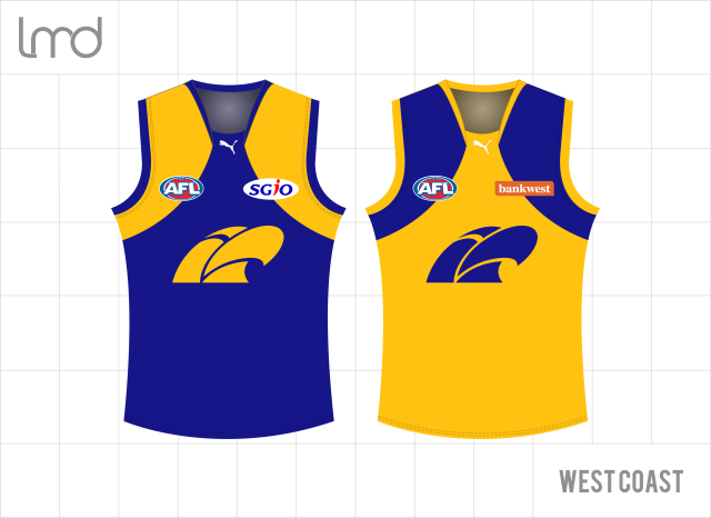
the blue border around the outside too causes nightmares when applied to the jumper.

135147-9e5f7f50-0ff0-11e5-b871-8bd281a5dd0b.jpg


our current wings jumper logo looks slapped on because of the solid border.
part of what made the old jumper so good was the simplicity of the all yellow logo.
i also dont like the large chunk missing out of the side of the eagle head.

i feel alot of these jumper changes recently have really been a slave to the logo and its providing problems for any designer.

33c9pph.png


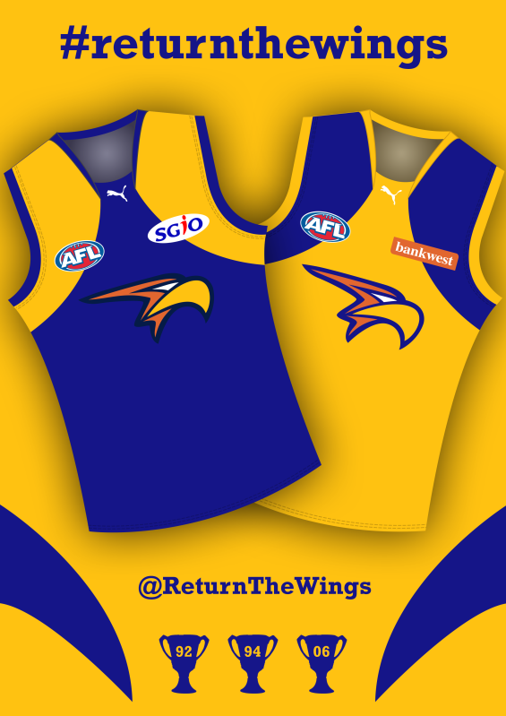
a previous poster posted this design and that would be the absolute dream scenario, with a navy version for home.
then royal blue for away games and the yellow one for any clash games.
maybe with a slight update to the eagle head shape, maybe a little more aerodynamic.

2pytie8.png


if you look at the proposed design for the 'return the wings' campaign, the logo fits very well on the yellow peril because its only 3 colours.
having to introduce the 4th colour navy for the border on the royal blue is very contrasting. adding white would do the very same thing.
remove the navy border from that logo though and you lose alot of the shape,
the same problem will arise on a navy version also, so there is a flaw with the eagle head.

if the club can simplify the eagle head again somehow then it will work in harmony with the jumper,
scrap the big wing in the logo, tidy the fonts up and we'll have a logo and jumper that we wont have to hopefully change ever again!

After seeing Lmach's design, every other eagle head just looks crap in comparison.
 

Log in to remove this ad.

It will be interesting to see how they define the eagle head on a navy jumper. Needs an outline or it'll look weird, but anything the use will look s**t and stand out.

I fear for the return on the white outline.

TBH I hadn't really thought about how the current head would work on the navy, and now that you all mention it, it will be hard to get it to stand out. Surely though they wouldn't bring back the white outline so soon after ditching it??
 
From an outsider's perspective I think the club has used up all the patience of the supporters by dragging this out for such a long time. Any goodwill earned by conducting the guernsey poll has been lost by their tardiness in providing any information since.
I think currently that's true but when (if) they announce the wings are returning the wait will be mainly forgotten.
 
How hard would it be just to publish on the website or in Eagle Eye - 'our members have voted to return the wings, we are now just working with the AFL to ensure that this happens.' ?

I mean, this time last year, we all knew that Brisbane had locked in a change. So why we drag our feet on this I do not know.
 

(Log in to remove this ad.)

How hard would it be just to publish on the website or in Eagle Eye - 'our members have voted to return the wings, we are now just working with the AFL to ensure that this happens.' ?

I mean, this time last year, we all knew that Brisbane had locked in a change. So why we drag our feet on this I do not know.


Potential lost tripanel sales.
 
How hard would it be just to publish on the website or in Eagle Eye - 'our members have voted to return the wings, we are now just working with the AFL to ensure that this happens.' ?

I mean, this time last year, we all knew that Brisbane had locked in a change. So why we drag our feet on this I do not know.

They want to milk as much out of the tripanel as they can first. Will probably have a half price sale on home guernseys at end of season and then we know the announcement will be soon.

Or maybe on grand final day the boys will run out in the Navy Wings and surprise everybody. The opposition will be so distracted by their beauty that we will kick 20 goals in the first quarter.
 
Well they've certainly botched the communications on this mess.

This. Why have they gone so quiet on it?? As someone posted earlier, Brisbane announced mid season that they'd be changing, although we didn't see the actual new guernsey until the off season, but still, they were told it was happening. It has to be because of tri panel sales, otherwise why wouldn't they at least tell us it's happening??
 
Status
Not open for further replies.

Remove this Banner Ad

Back
Top