WLD42
Debutant
Hey, everyone! It’s been a lot of fun getting acclimated to the BigFooty boards and the design section over the past few weeks, entering a few competitions and getting to see everyone else's work and all that. Now I'm finally able to share the concept series that actually prompted me to join the boards, and it’s the perfect time to do it, to be honest, with the AFL season having just wrapped up and the NHL season just getting underway.
Making these 49 sets of jumpers has been quite a project, as I’m sure you can imagine, with quite a bit of re-doing and fine-tuning along the way. The transition from hockey to footy has also been particularly fun, though, since the aesthetics of a hockey sweater and a footy jumper are vastly different. I'd say what I tried to accomplish was to create designs that are true to the look of jumpers, while retaining the character of the respective teams. So, if a team is noted for traditional, conservative jerseys, I tried to create something that is more of a traditional jumper, and the same goes for teams with a history of modern (dare I say strange?) jerseys.
Anyways, what to expect from this portfolio. Each team has between two and four jumpers: A home and a clash for everyone, and then some teams have third jumpers designated as either heritage or a second clash, the former being somewhat equivalent of a "throwback" hockey jersey, and the latter being somewhat equivalent to a "third jersey." A very small number of teams have one-off heritage jerseys that bump them up to four; these are generally based off of one-off jerseys the teams have worn for anniversaries or outdoor games. I think it's worth noting that I've also chosen shorts colors purely based on my aesthetic preferences, as I think that my clash designs keep them from being particularly important in that regard.
With so many teams to get through, I thought it would be fun to present them in chronological order, giving a bit of a history of the NHL alongside my designs. Every team I've done can be found on the NHL Uniform Database, which was an invaluable resource for me and which will hopefully provide some insights into my design inspirations if you choose to take a look. Finally, here's another link to the timeline of the NHL that I’ll be following.
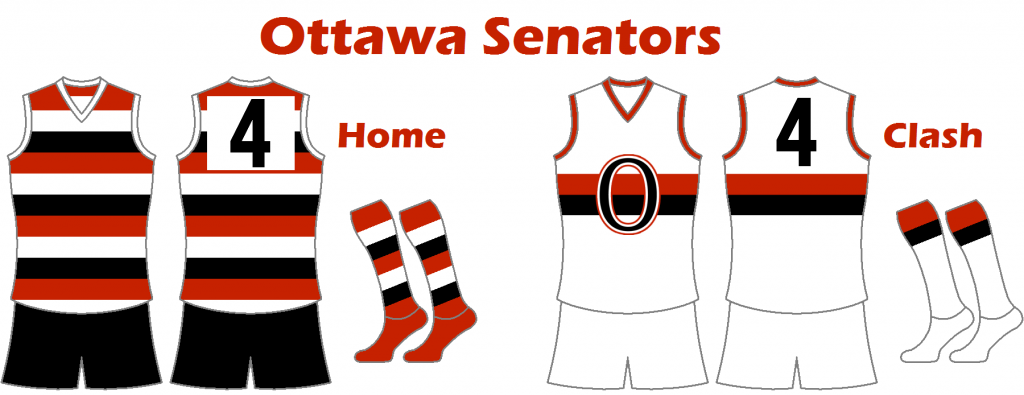
Ottawa Senators
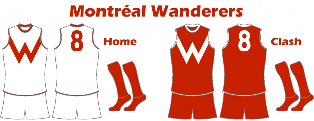
Montréal Wanderers
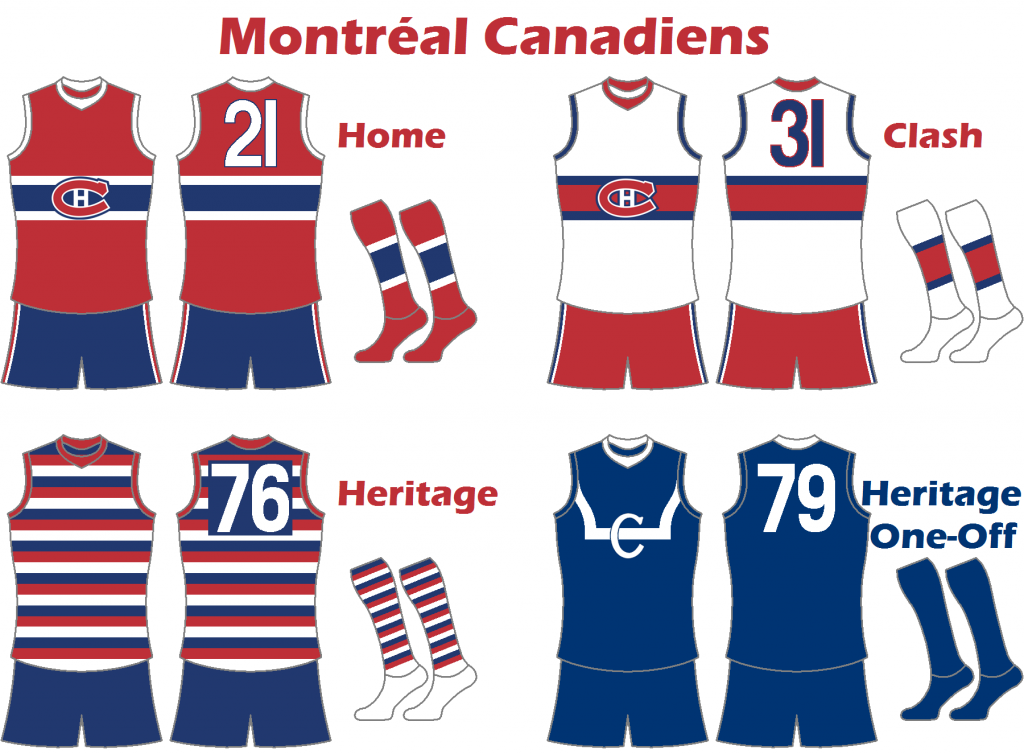
Montréal Canadiens
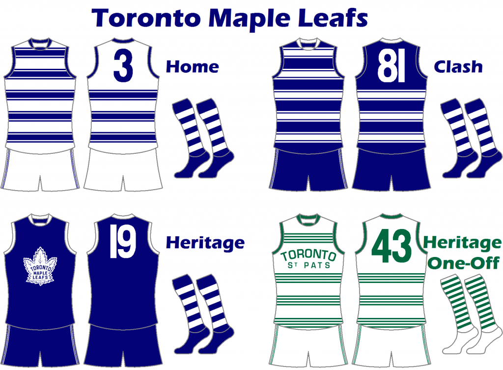
Toronto Maple Leafs
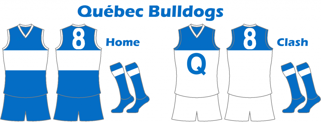
Québec Bulldogs
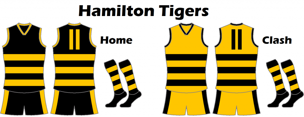
Hamilton Tigers
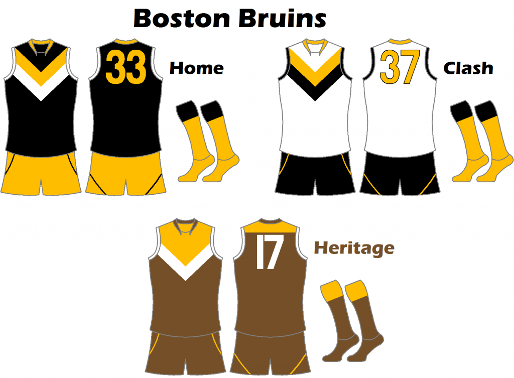
Boston Bruins
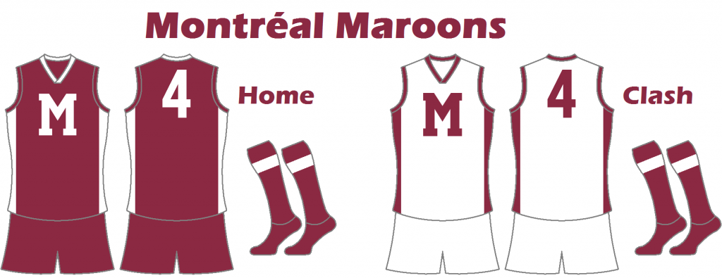
Montréal Maroons
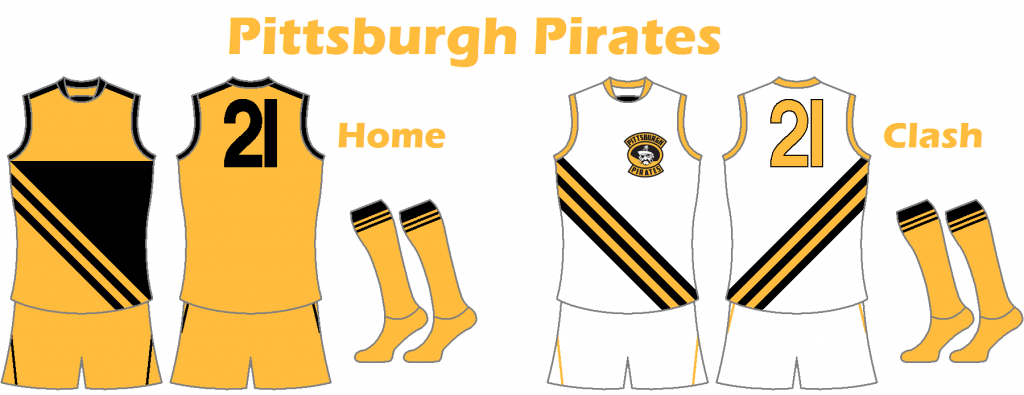
Pittsburgh Pirates
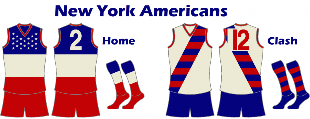
New York Americans
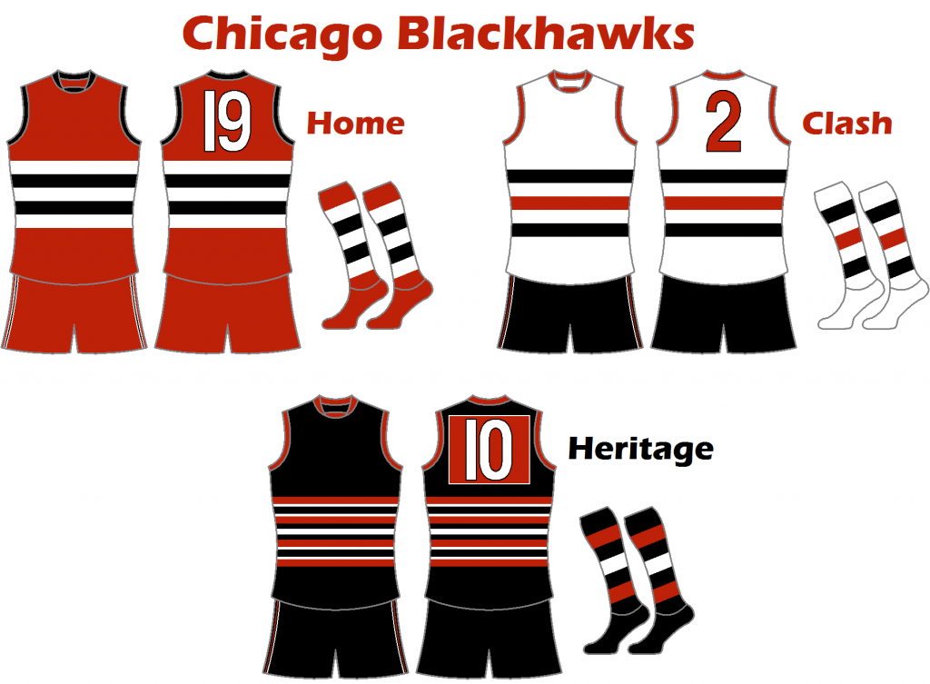
Chicago Blackhawks
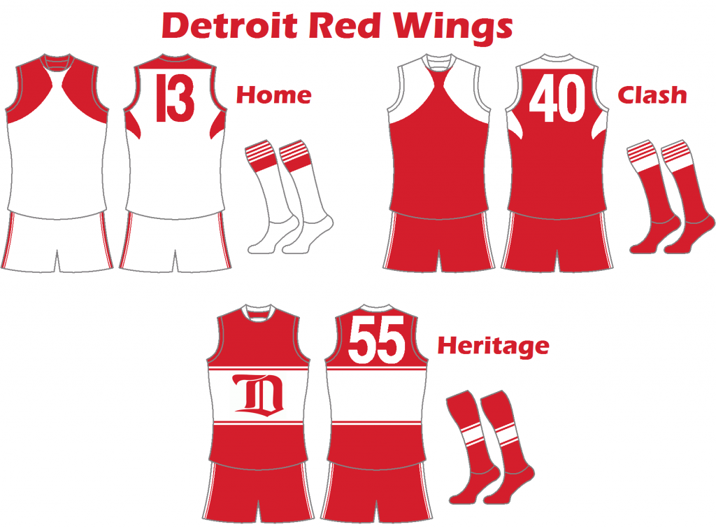
Detroit Red Wings
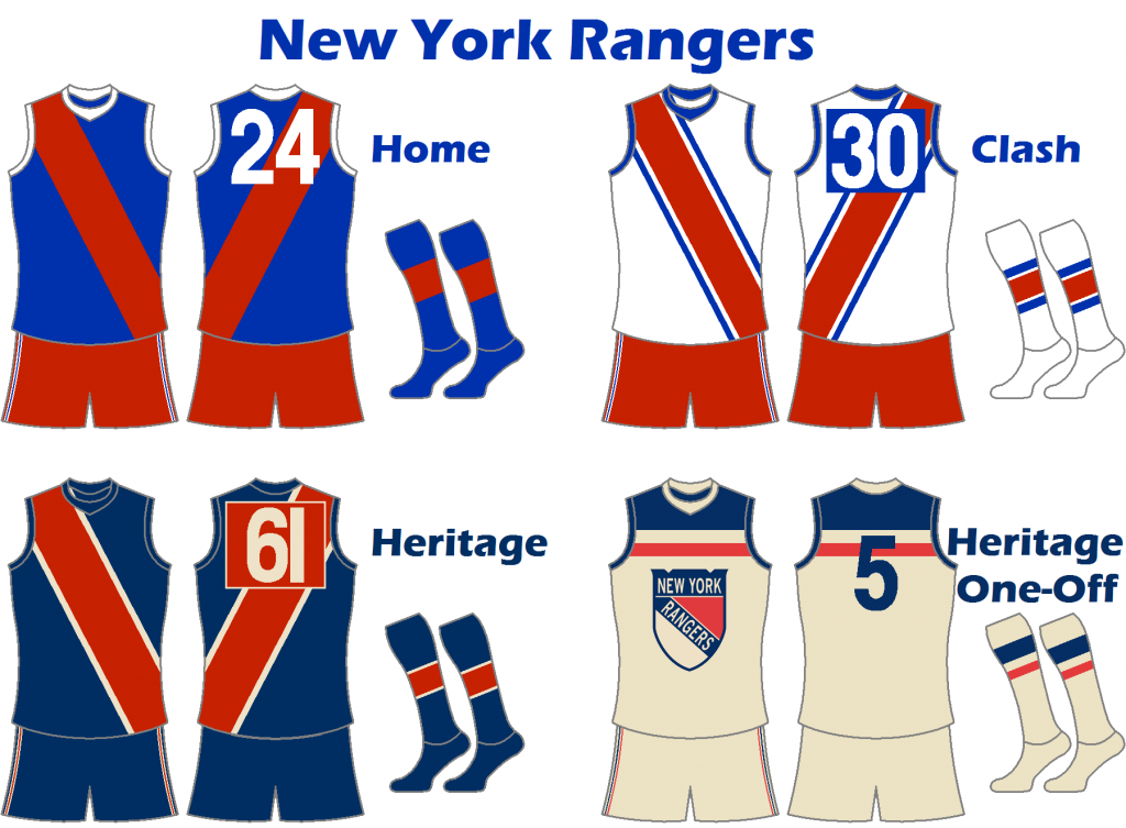
New York Rangers
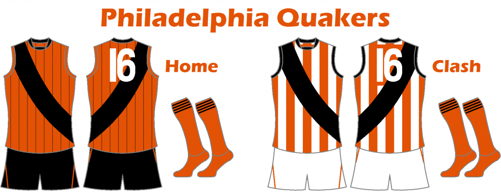
Philadelphia Quakers
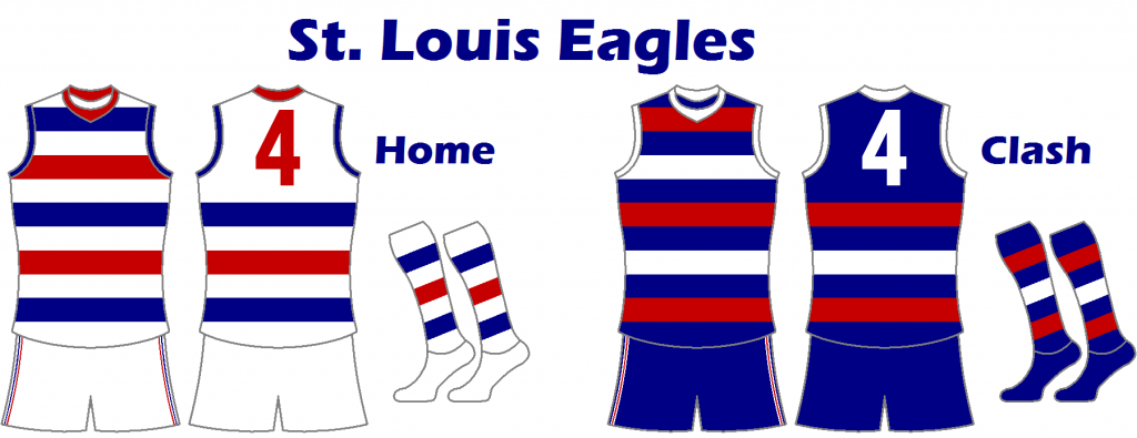
St. Louis Eagles
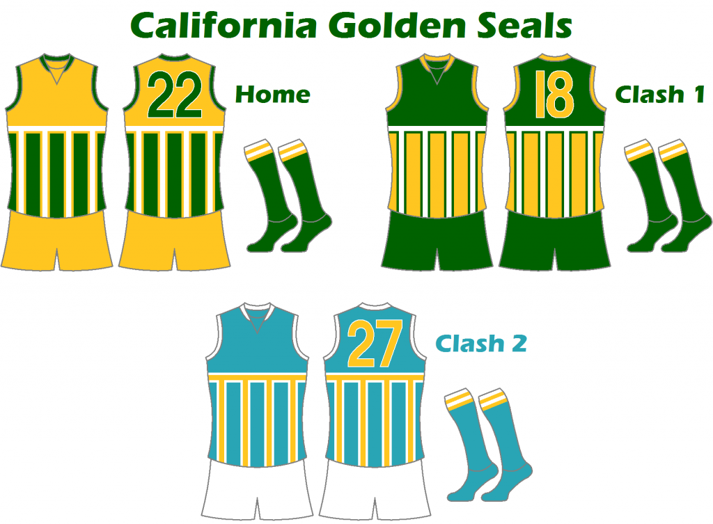
California Golden Seals
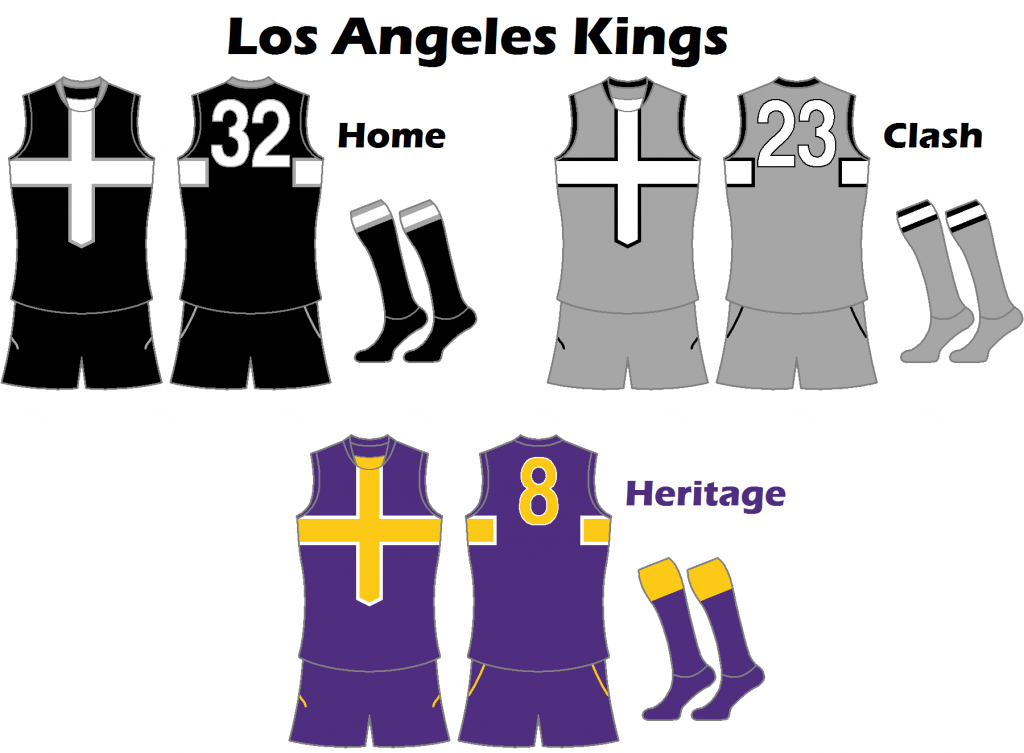
Los Angeles Kings
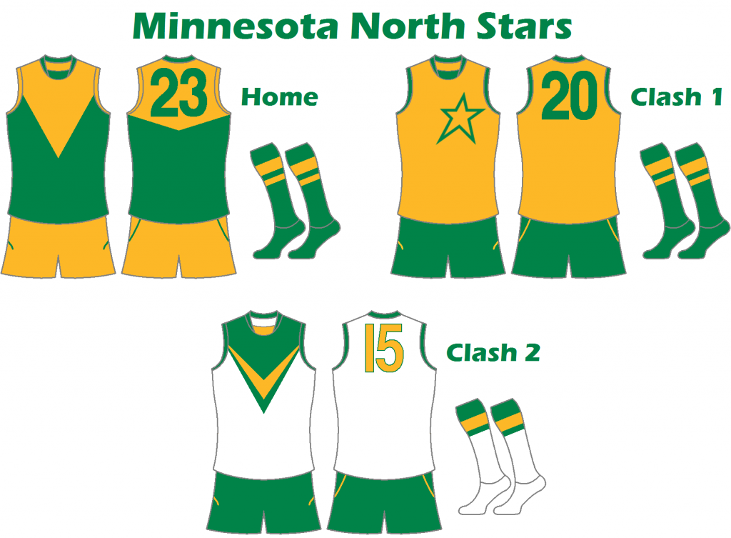
Minnesota North Stars
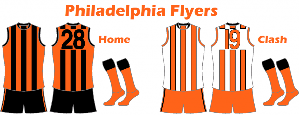
Philadelphia Flyers
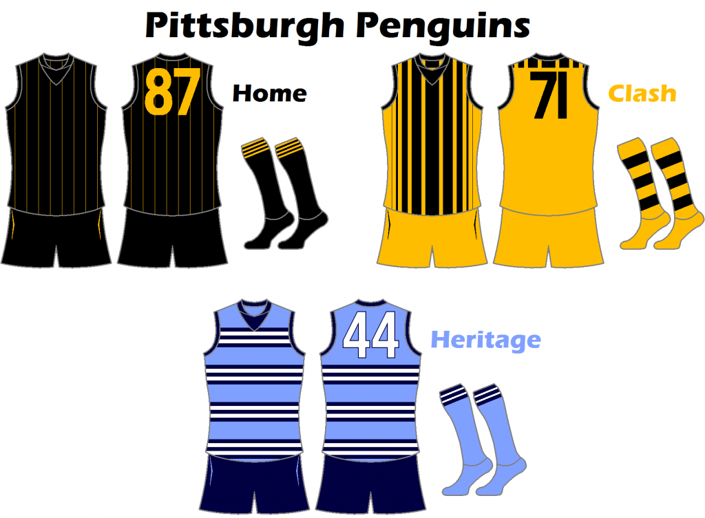
Pittsburgh Penguins
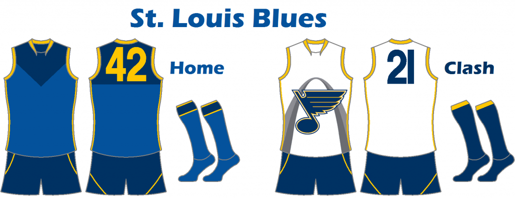
St. Louis Blues
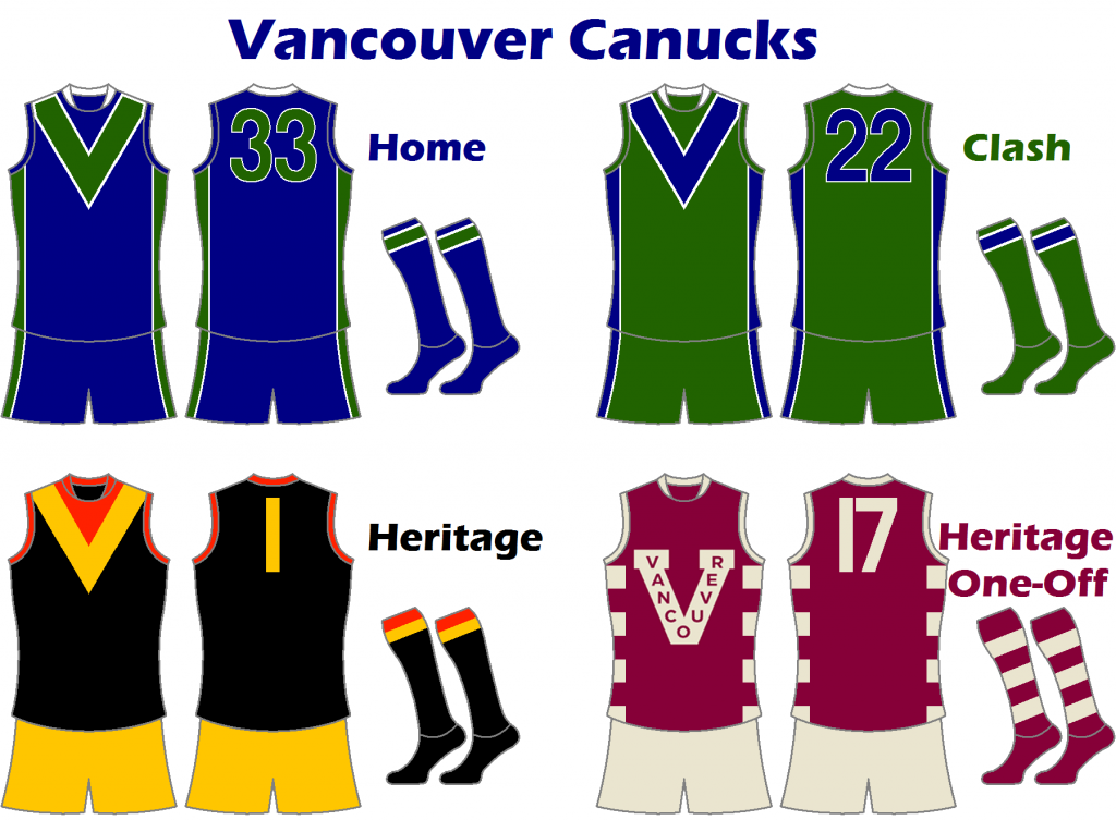
Vancouver Canucks
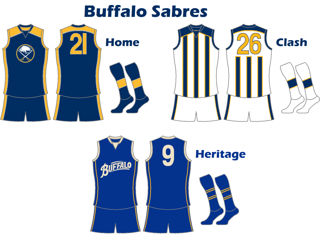
Buffalo Sabres
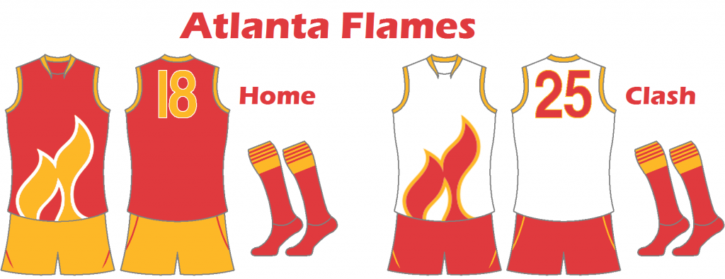
Atlanta Flames
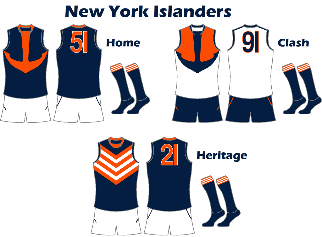
New York Islanders
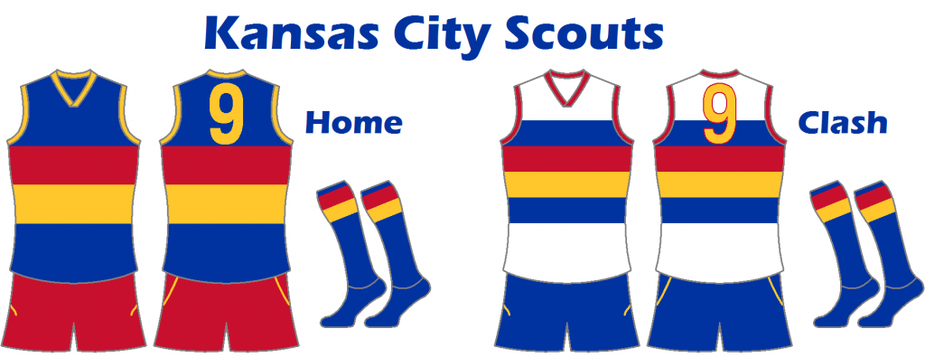
Kansas City Scouts
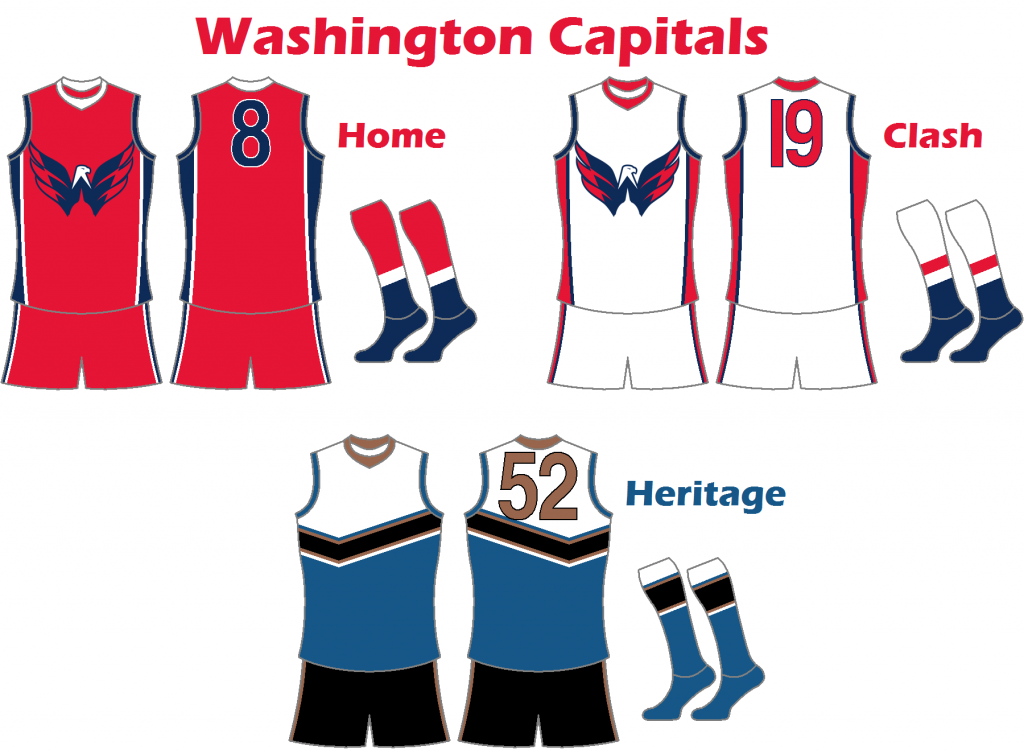
Washington Capitals
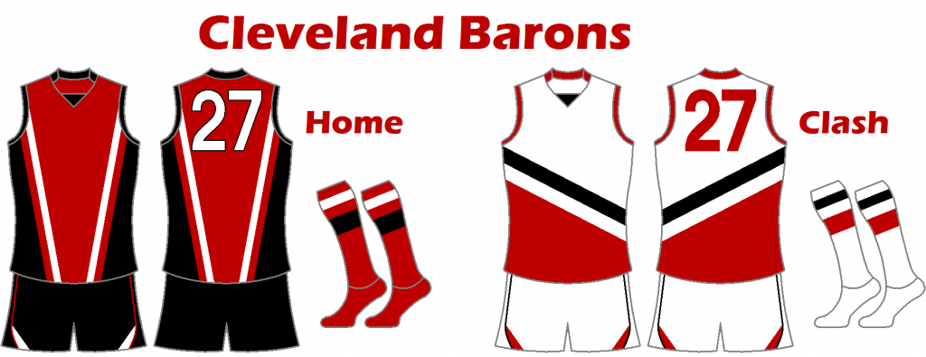
Cleveland Barons
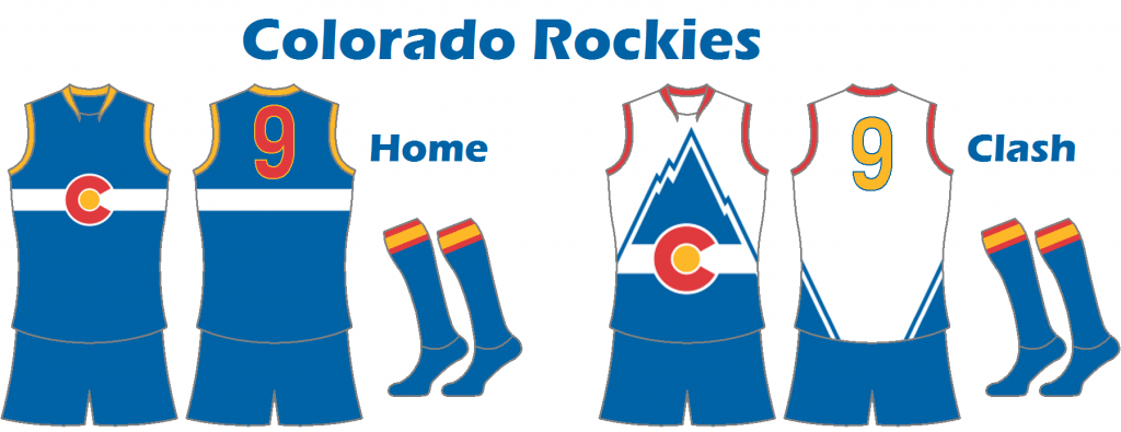
Colorado Rockies
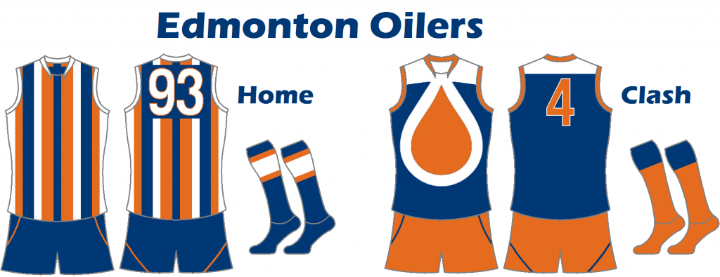
Edmonton Oilers
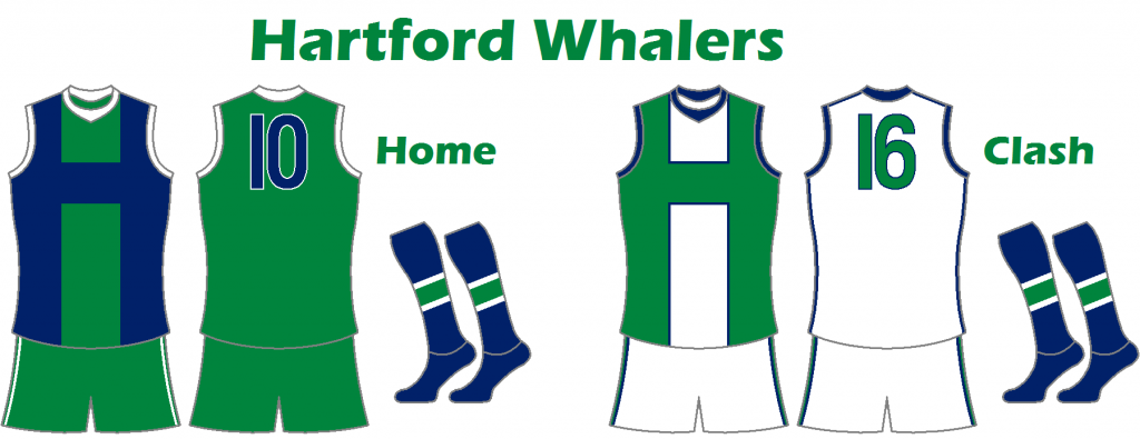
Hartford Whalers
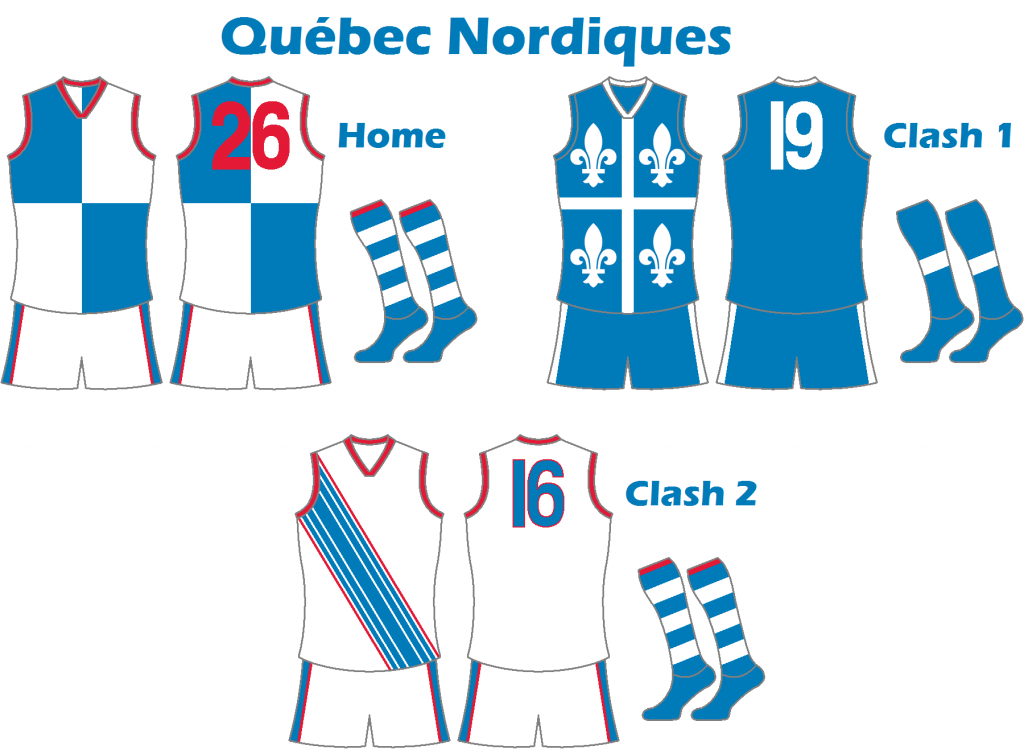
Québec Nordiques
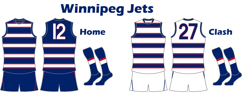
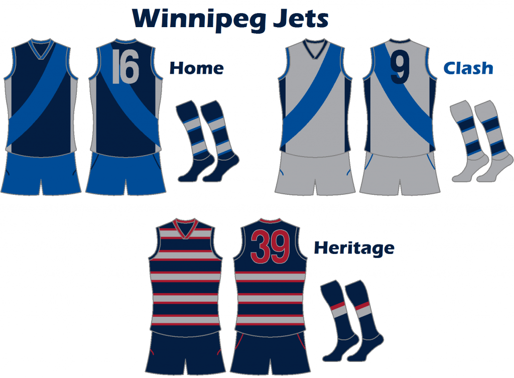
Winnipeg Jets
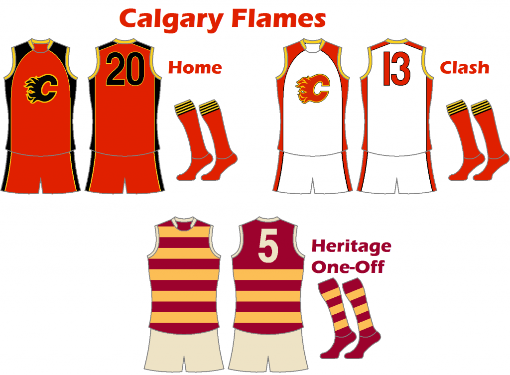
Calgary Flames
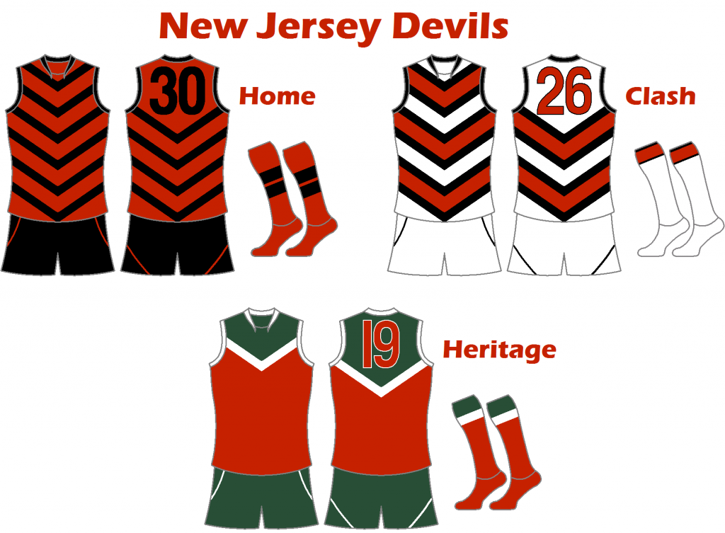
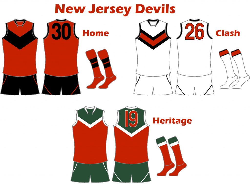
New Jersey Devils
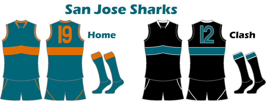
San Jose Sharks
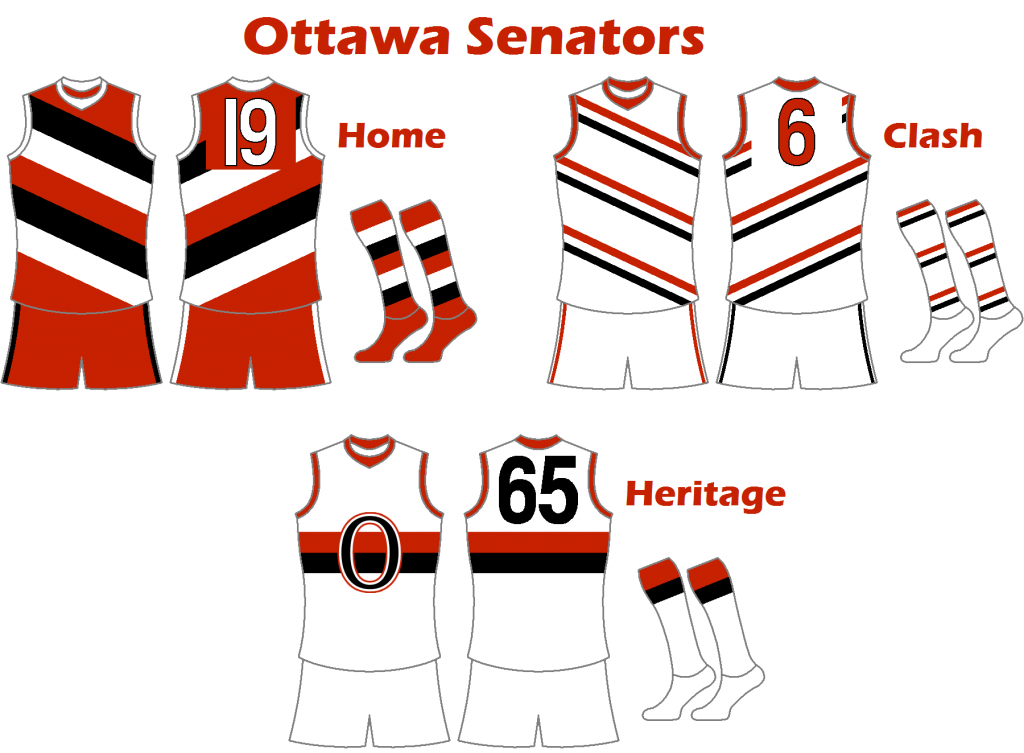
Ottawa Senators
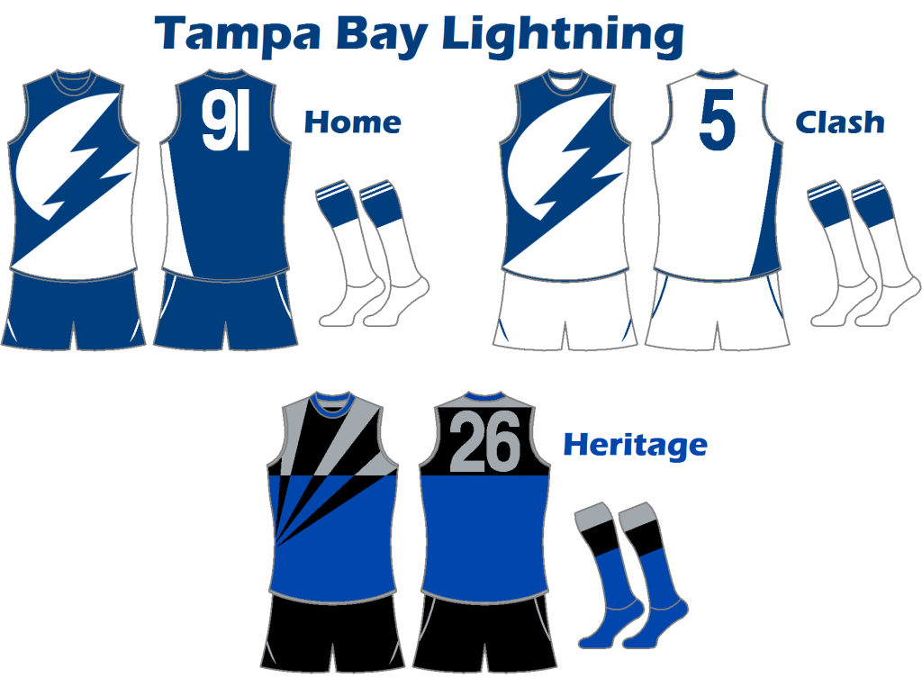
Tampa Bay Lightning
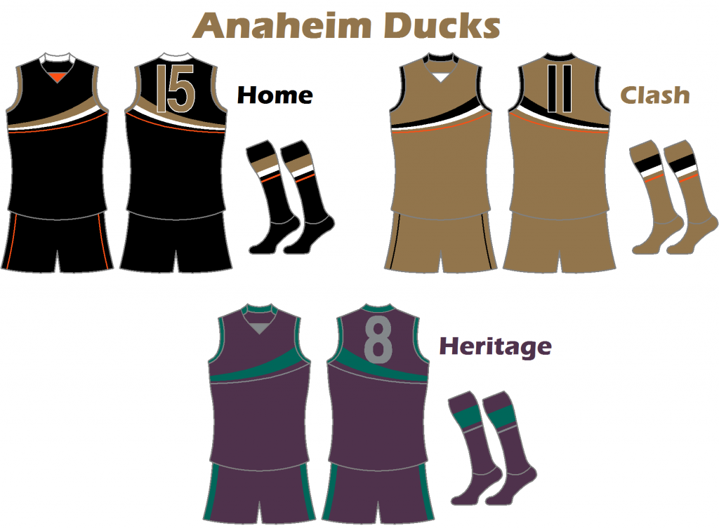
Anaheim Ducks
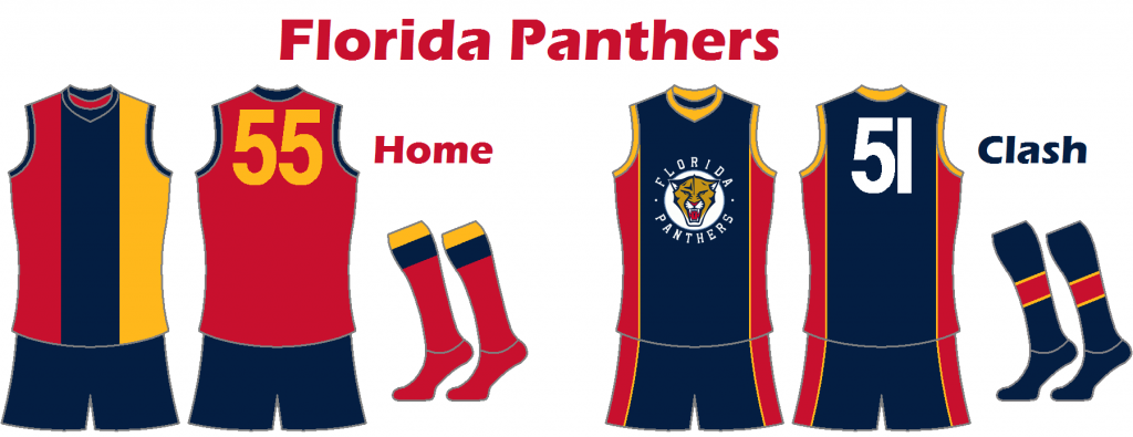
Florida Panthers
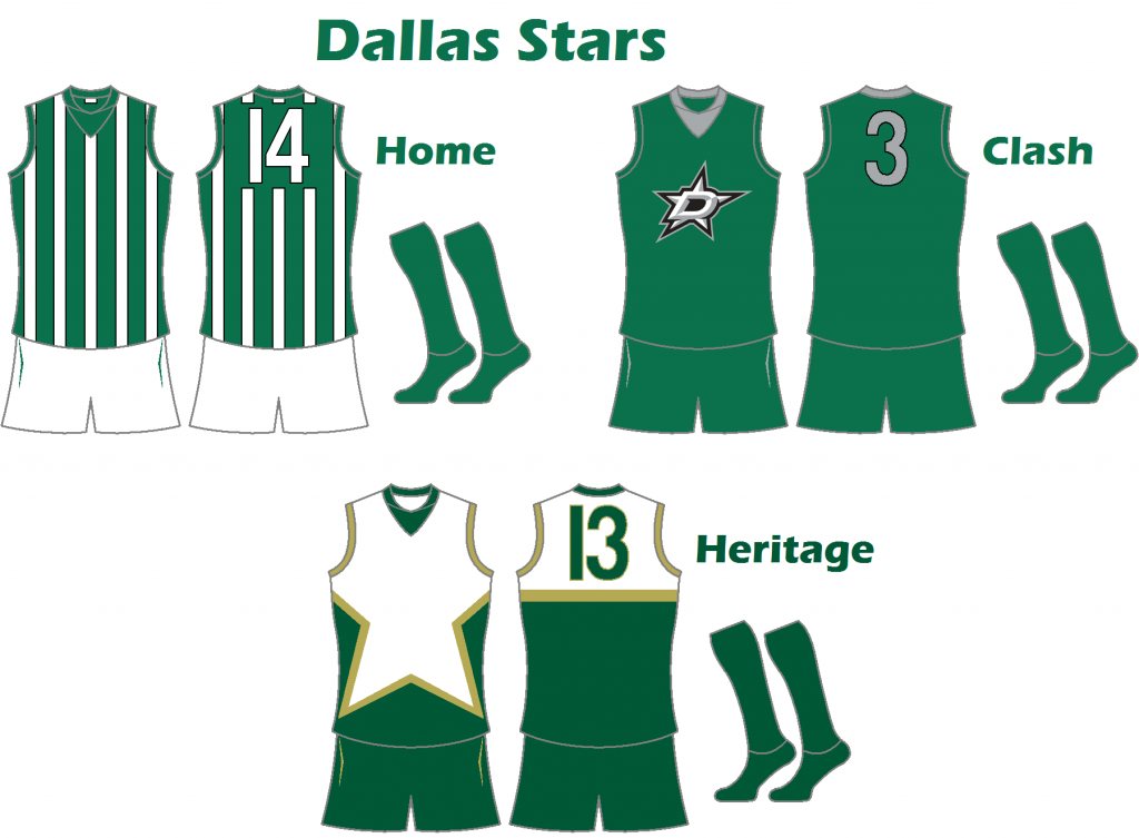
Dallas Stars
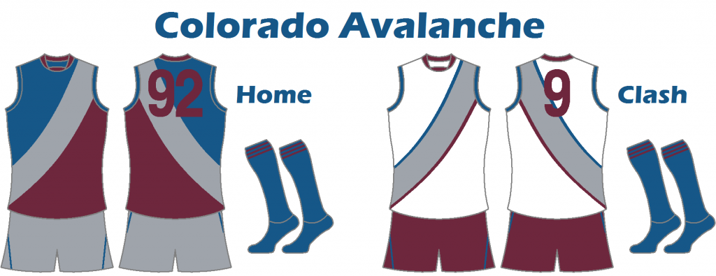
Colorado Avalanche
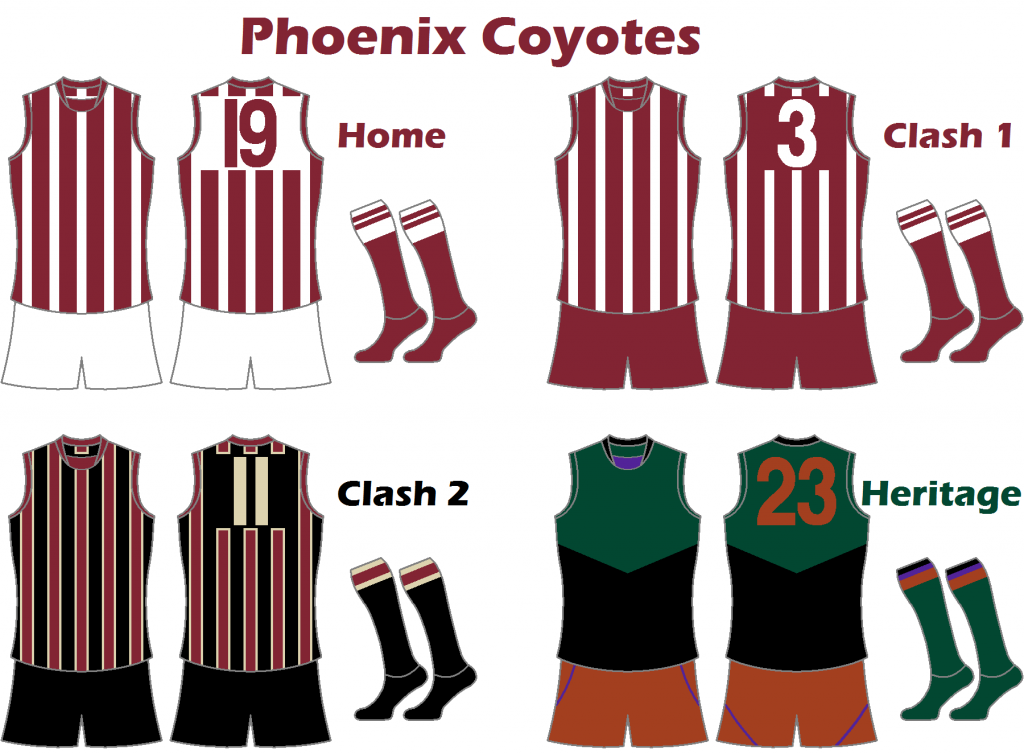
Phoenix Coyotes
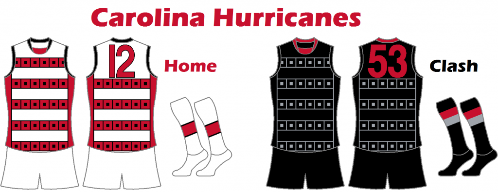
Carolina Hurricanes
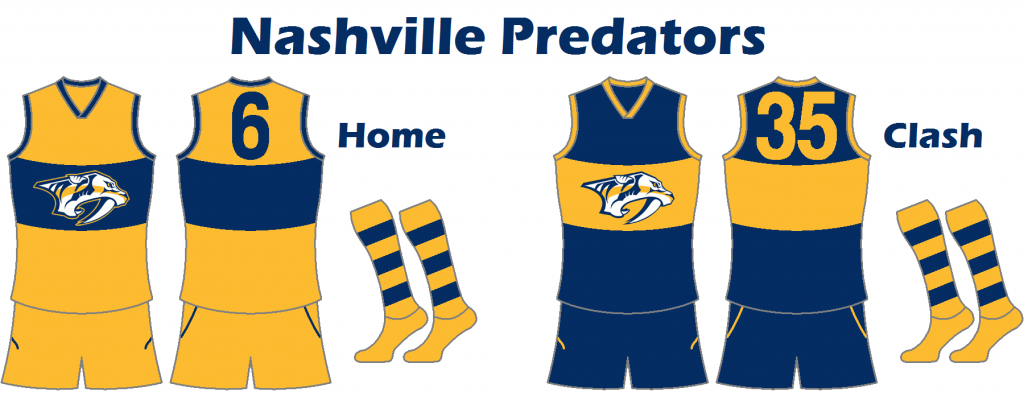
Nashville Predators
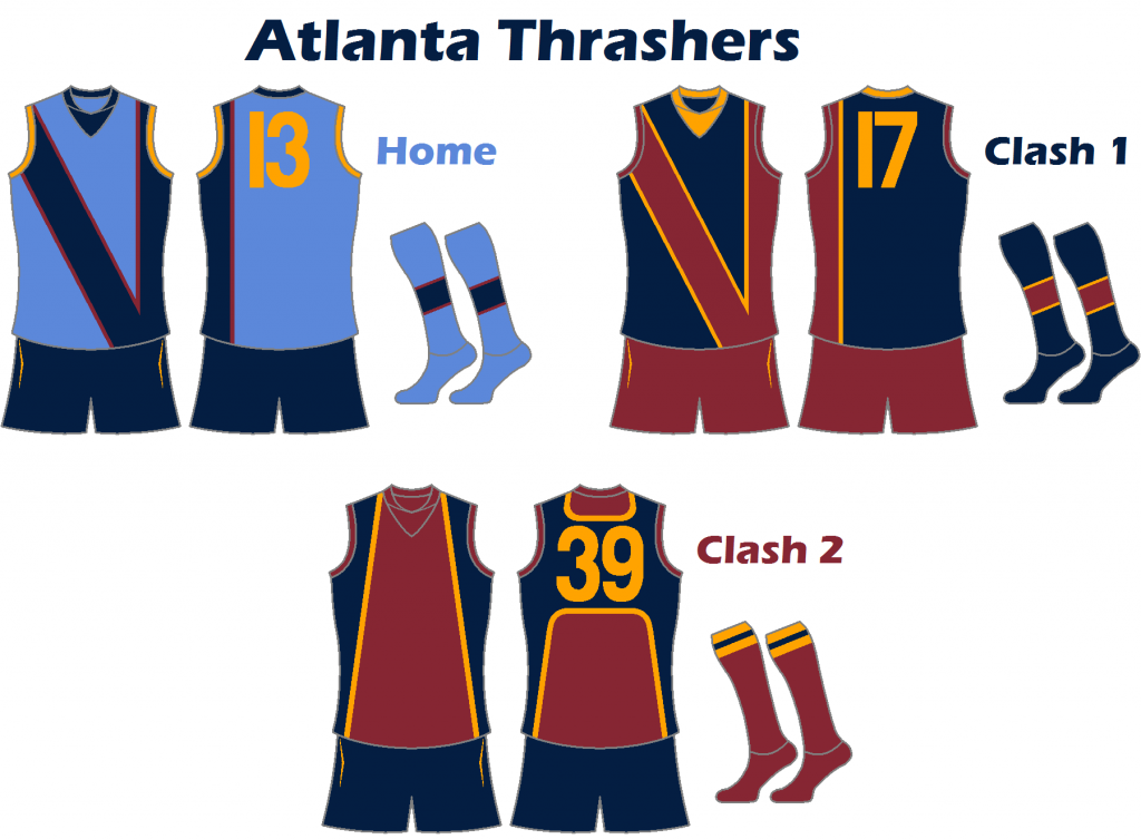
Atlanta Thrashers
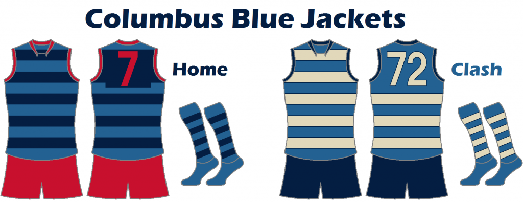
Columbus Blue Jackets
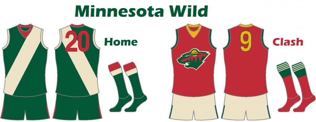
Minnesota Wild
Winnipeg Jets
Montréal Wanderers
Montréal Canadiens
Toronto Maple Leafs
Québec Bulldogs
Hamilton Tigers
Boston Bruins
Montréal Maroons
Pittsburgh Pirates
New York Americans
Chicago Blackhawks
Detroit Red Wings
New York Rangers
Philadelphia Quakers
St. Louis Eagles
California Golden Seals
Los Angeles Kings
Minnesota North Stars
Philadelphia Flyers
Pittsburgh Penguins
St. Louis Blues
Vancouver Canucks
Buffalo Sabres
Atlanta Flames
New York Islanders
Kansas City Scouts
Washington Capitals
Cleveland Barons
Colorado Rockies
Edmonton Oilers
Hartford Whalers
Québec Nordiques
Winnipeg Jets
Calgary Flames
New Jersey Devils
San Jose Sharks
Ottawa Senators
Tampa Bay Lightning
Anaheim Ducks
Florida Panthers
Dallas Stars
Colorado Avalanche
Phoenix Coyotes
Carolina Hurricanes
Nashville Predators
Atlanta Thrashers
Columbus Blue Jackets
Minnesota Wild
Winnipeg Jets
")