Adelaide Crows New Logo Poll

Remove this Banner Ad

At first I thought WTF?! WHY?!
Then it grew on me, but then I started imagining it on t-shirts, and yeah, back to hating it! What colour are the t-shirts going to be next season? They can't be blue because you won't be able to see the Crow (not that that's a bad thing!)? Will they be red like the pre-season ones this season? There was a reason I didn't buy one of those....
 
Well, I've said this before but I'll put it on this poll thread: I hate the logo, my main problems being

1. It is unoriginal (Baltimore Ravens) and Americanised. It is essentially a copy of another team's logo, and it diminishes the unique identity and character of our club.

2. It seems likely to lead to one of those horrible Hawthorn/Port white away jumpers. Freo and Carlton have done OK with "strong" designs that have traditional roots. But this logo will look terrible on a white jumper.
 

Log in to remove this ad.

Well, I've said this before but I'll put it on this poll thread: I hate the logo, my main problems being

1. It is unoriginal (Baltimore Ravens) and Americanised. It is essentially a copy of another team's logo, and it diminishes the unique identity and character of our club.

2. It seems likely to lead to one of those horrible Hawthorn/Port white away jumpers. Freo and Carlton have done OK with "strong" designs that have traditional roots. But this logo will look terrible on a white jumper.

I understand your concern but in reality most things we've done since WWII is American culture. We copy everything they do from clothes, music, sport, the way we communicate, or whatever. So what's new? Nothing.
 
The other really bad thing about the logo is how undefined it looks when it is small basically looks like a blue blob, go and look at the AFL site and pretend you have never seen it before and you will have no idea what the logo is supposed to be.

Considering that the AFL site contains the most traffic, it seems to be a poor choice from a marketing perspective.
 
I understand your concern but in reality most things we've done since WWII is American culture. We copy everything they do from clothes, music, sport, the way we communicate, or whatever. So what's new? Nothing.
So - what - it's no big deal?

Consider, for example, Carlton and Collingwood: off the top of my head probably the two clubs with the most distinctively "Australian Football" logos. (As opposed to e.g. Port Adelaide and Essendon, whose logos IMHO rank among the least "distinctively Australian Football" like)

The EPL is overflowing with distinctly English logos. Arsenal, Liverpool, Tottenham - even Manchester United, arguably the most famous and widely supported sporting club in the world, has maintained its traditional "English Football Club" logo.

Which category of club do we want to be? Arsenal/Man U/Carlton/Collingwood?

Or "Marketing United" ?

To me it's no big deal. If this logo had appeared when we were formed no one would be screaming up and down like now. I've said on another thread most businesses evolve with updating logos, jumpers, etc.

But one thing most people get confused about is naming so called traditional clubs like Colingwood or Manchester United in topics like this. With United this current logo has only been in existence since 1998. Before that, that one lasted only 20 years. Sure they might look similar but they changed never the less. For a traditional club that's owned by an American organisation and it's major sponsor is a club partly responsible for the economic slowdown.

As for Collingwood, the only thing that hasn't changed it the magpie (which is a type of Crow). In the 1980s they didn't have the back 'shield around it or the Australian flag or the black and white flag. They have tinkered with it.

As for marketing united as you say, well all the EPL sides have again tinkered with their strips for marketing reasons.
 
I think you crows have a cool new logo!!!!

Would like to see richmond change theres, oh wait we did, WALLACES FACE isn't on it anymore!!!!
 
To me it's no big deal. If this logo had appeared when we were formed no one would be screaming up and down like now. I've said on another thread most businesses evolve with updating logos, jumpers, etc.
You are arguing about change. I (and others) are arguing about the merits of the change.

It is a mistake (and a deflection) to say that people who oppose a new logo are just opposing change.

Not all change is bad.
Not all change is good.

Sometimes the change sucks.

But one thing most people get confused about is naming so called traditional clubs like Colingwood or Manchester United in topics like this. With United this current logo has only been in existence since 1998...
I didn't say those clubs had never changed their logos. I said they have maintained logos that are traditional (for their code / country, and with a clear relationship to the previous logo), and that uniquely identify their club.

The new AFC logo is none of these. It has no Australian character, it has no Australian Rules Football character, it has no relationship to any previous logo used by the club. Meh - I'm banging on....

The AFC changing its logo to an imitation of the Baltimore Ravens is like Manchester United changing their logo to a red and black version of the Melbourne "Demon" logo.
 
You are arguing about change. I (and others) are arguing about the merits of the change.

It is a mistake (and a deflection) to say that people who oppose a new logo are just opposing change.

Not all change is bad.
Not all change is good.

Sometimes the change sucks.

I didn't say those clubs had never changed their logos. I said they have maintained logos that are traditional (for their code / country, and with a clear relationship to the previous logo), and that uniquely identify their club.

The new AFC logo is none of these. It has no Australian character, it has no Australian Rules Football character, it has no relationship to any previous logo used by the club. Meh - I'm banging on....

The AFC changing its logo to an imitation of the Baltimore Ravens is like Manchester United changing their logo to a red and black version of the Melbourne "Demon" logo.

No I'm not arguing about change at all.

What I'm confused about is all the world is going to end comments.
It's a bloody logo FFS. Now if you don't like it fine but to say it has no Australian character then I could say every team with tigers or lions logos also has no Australian character because there is no indigenous animals.
 
did not like the new logo at first but after driving past the new facility at AAMI everyday I recon it looks fantastic :thumbsu:
 
No I'm not arguing about change at all.
I posted about clubs that had maintained the traditional style of logo, and you pointed out that those clubs had made changes to those logos over the years, as though that was the point. Yes, you were arguing about change. :)
What I'm confused about is all the world is going to end comments.
You must be confused, because I don't see any "world is going to end" comments here. Just reasonable opinion on the merits of the logo.
It's a bloody logo FFS. Now if you don't like it fine
Actually, as a logo, out of the context of our club, I don't particularly dislike it. My main reasons for disliking it are those I have stated
1. I fear it will be used in an awful Hawthorn-like white away jumper, and
2. It is an unoriginal lift from an American football team that has nothing to do with the history or Australian Rules tradition of our club.
but to say it has no Australian character then I could say every team with tigers or lions logos also has no Australian character because there is no indigenous animals.
It's a matter of form and style, not content. It's perfectly possible for Brisbane, for example, to have a Lion logo in a style that is in keeping with Australian Rules traditions. And they did, until recently. :)
 
I wasnt too keen on the logo when i first saw it, however, after going to see the new facility and looking at the huge new logo outside on the wall, i've done a complete turnaround and now i think it looks awesome.
 

(Log in to remove this ad.)

All the clubs logos look s**t up the top. Take a look at the Swans logo for example, there is no way anyone who doesn't already know what it is could figure it out.
 
It looks like the design cartoonist was told teradactyl instead of crow.
They should have spent all of that time and effort in re-designing the home guernsey...it looks like a licorice allsort
 
It looks like the design cartoonist was told teradactyl instead of crow.
They should have spent all of that time and effort in re-designing the home guernsey...it looks like a licorice allsort

Yeah we got about 12 years in and decided our home jumper wasnt very good, so lets adopt a design that some little girl ripped off.

Oh wait that was the port flogs.
 
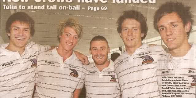
like there are not enough issues with the logo anyway, but i really hope that
this is either a) my copy of the 'tiser or b) some optical illusion from the light at the airport or c) and rather unsurprisingly, an indication of Reebok's quality .....

but purple!!!

svgcpl.jpg


why couldn't they have just made the thing navy like the navy stripes and the word 'reebok'
 
like there are not enough issues with the logo anyway, but i really hope that
this is either a) my copy of the 'tiser or b) some optical illusion from the light at the airport or c) and rather unsurprisingly, an indication of Reebok's quality .....

but purple!!!


why couldn't they have just made the thing navy like the navy stripes and the word 'reebok'

snap, i thought the same thing, and Im not convinced it's the image quality :eek:

Looking forward to the memebers survey next year.

"In your opinion the clubs new branding and merchandise is:- excellent, good, average, below average, poor....... or effing shocking."

Edit: nah its the 'tiser
http://www.afc.com.au/portals/52/adelaide_shop.htm
 
like there are not enough issues with the logo anyway, but i really hope that
this is either a) my copy of the 'tiser or b) some optical illusion from the light at the airport or c) and rather unsurprisingly, an indication of Reebok's quality .....

but purple!!!

svgcpl.jpg


why couldn't they have just made the thing navy like the navy stripes and the word 'reebok'
B (look at the difference between Craig and Talia, one's leaning back exposing it too the light, the other is leaning forward covering it from any light)
btw, Gunston and Talia are kinda hot :eek:
 

Remove this Banner Ad

Back
Top