


- Moderator
- #3,626
Essee Cross I think that's honestly just a misprint, no computers back in those days. Here's some other sources, some old, some recent


Follow along with the video below to see how to install our site as a web app on your home screen.
Note: This feature may not be available in some browsers.
Looks great Mero great job!Dates are now included on the Uniforms pages.
Please review to see if there are any inconsistencies with Home and Pre-VFL/AFL pages as these are correct, and the dates I've used are only using the file name, which in some cases is possibly incorrect.
Looks great Mero great job!
Just a question re: Richmond - How come the straight sash jumper is not on the home jumpers page but is listed in the all uniforms page? Is this an oversight?
Couple of extra small changes with the Brisbane Lions Jumpers:
The Home jumper 1997-99, 2001 did not have BBFFC on the back (Introduced in 2002)
The heritage jumper in 2003 did have BBFFC on the back of it (The 2005 one without it I believe is correct).


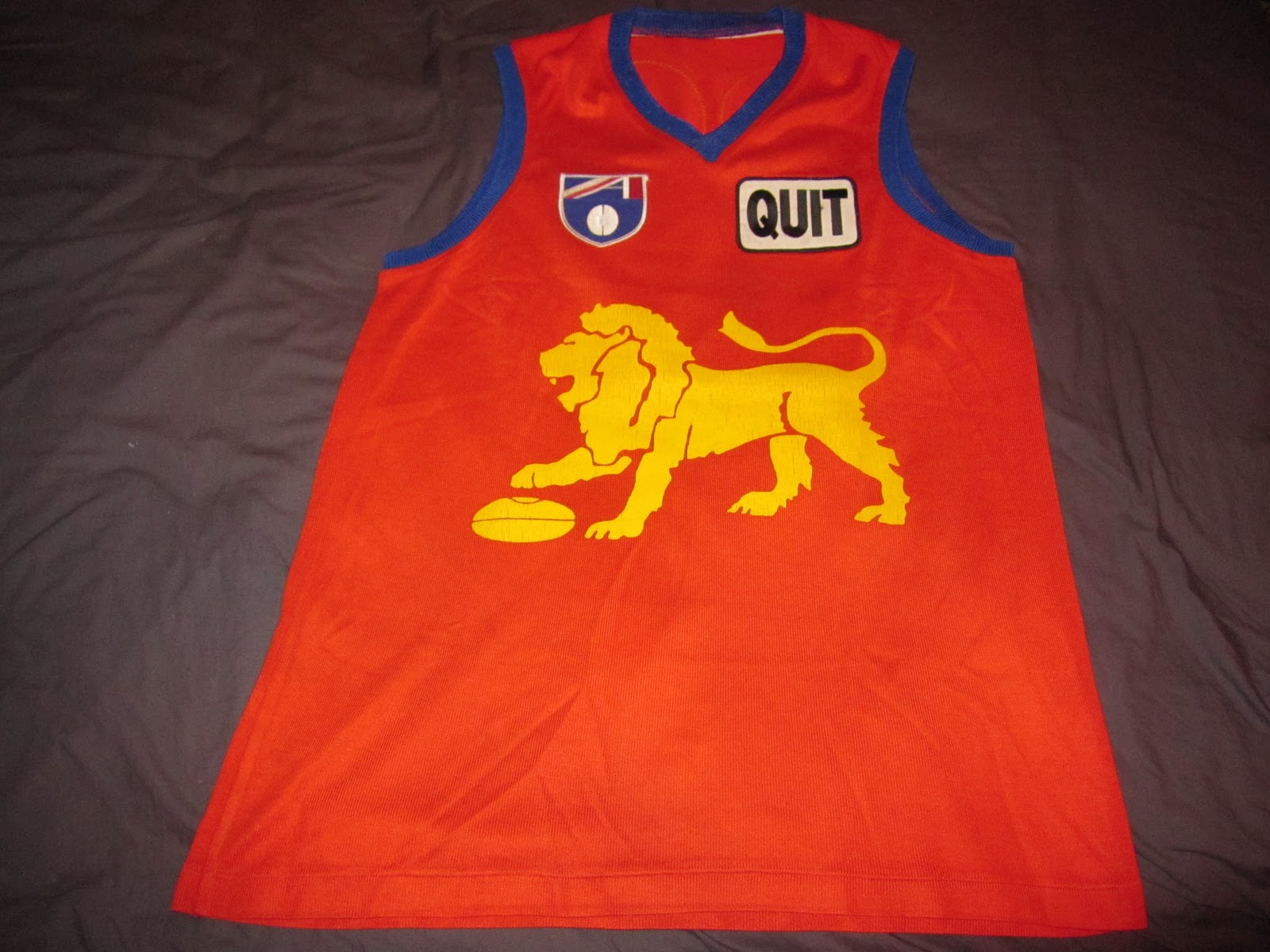
Just clearing up the WA section again
No videos of 1994 WA action, but this swan design wasn't seen on the years before. Plus SGIO is sponsor instead of Pepsi
View attachment 35686
Yeah, I had included that at one point.Mero,
From browsing old footy records it looks as if Collingwood used the 'magpie in a circle' logo (very similar to Port Adelaide Magpies) in 1995-6. This is not on your website.
What I believe it should read:
-1994: shield logo
1995-6: circle logo
1997-: emblem with Australian flag on right
Yeah, I had included that at one point.
I even still have the vector file I made.
However I took it down because I found they used that at the same time as also using the oval/flag one, which came in in 1991 after the premiership.
Yes, the Footy Record used it, but there have been a few cases where the Footy Record did not adopt a logo the club had.
What defines what the official logo is then?
Geelong was using a GFC shield years before you have it listed as official. To me this seems like a similar thing. Clearly Collingwood was still using the standard Marbold shield up until the end of 1994.
No idea what happened there, but fixed now.

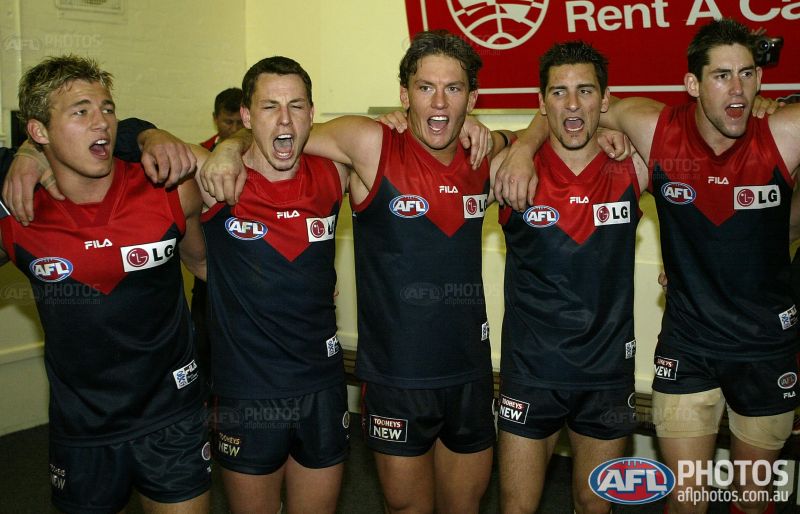
Hmmm interesting. Have you got any pics or info, I'd genuinely like to hear more about this.Melbourne first used this jumper in 2002, although not all players liked it and used the 2001 design. You've got it from 2005 onward.View attachment 35784
Hmmm interesting. Have you got any pics or info, I'd genuinely like to hear more about this.
Players preferring other jumpers, why was it they preferred this jumper.


Melbourne first used this jumper in 2002, although not all players liked it and used the 2001 design. You've got it from 2005 onward.View attachment 35784
Hmmm interesting. Have you got any pics or info, I'd genuinely like to hear more about this.
Players preferring other jumpers, why was it they preferred this jumper.
Dont remember the exact reason but had something to do with how it sat on the neck. I could be wrong as it was 11 years ago but I do remember reading it somewhere. Ill try and find the reference but I dont like my chances.
What defines what the official logo is then?
Geelong was using a GFC shield years before you have it listed as official. To me this seems like a similar thing. Clearly Collingwood was still using the standard Marbold shield up until the end of 1994.
Armstrongs was the new 2002 template which was already used by Essendon, Geelong etc, and the Yze and Woewodin one is the 2001.This photo is from the 2002 second elimination final. Armstrong is wearing a different collar to Woewodin, Yze and White


Looks nice NMHi Mero,
Since the introduction of the new FJ logo, which looks great. I have thought that www.footyjumpers.com needs some renovations for the new logo to fit better, and look much more at home.
So, after I finished my exams today, I wanted to do something productive, so I made a sample of what the website could potentially look like.
Home Page:
Pretty much the same, I've just changed the colour scheme.
VFL/AFL Club Jumpers Page:
Scrapped the logos on the note pad and the table which the logos and text are in.
Club Jumpers Example Page (Fitzroy):
Made it visually better with on the side, basic club information, and next to the text, the most recent jumper in that category worn by the club.
List of Club Home Jumpers:
Essentially the same as the Club Jumpers example page.
Jumper example page:
When you click on the image, this page opens. It has the details of what has changed.
I will do other pages later.
Thoughts?
Hi Mero,
Since the introduction of the new FJ logo, which looks great. I have thought that www.footyjumpers.com needs some renovations for the new logo to fit better, and look much more at home.
So, after I finished my exams today, I wanted to do something productive, so I made a sample of what the website could potentially look like.
VFL/AFL Club Jumpers Page:
Scrapped the logos on the note pad and the table which the logos and text are in.
List of Club Home Jumpers:
Essentially the same as the Club Jumpers example page.
Thoughts?
Looks good! All I would change is the logo for the shop. Take away the blue box, make the light blue text dark blue, and the white letter sky blue. It looks out of place in just a dark blue box in the middle of nowhereHi Mero,
Since the introduction of the new FJ logo, which looks great. I have thought that www.footyjumpers.com needs some renovations for the new logo to fit better, and look much more at home.
So, after I finished my exams today, I wanted to do something productive, so I made a sample of what the website could potentially look like.
Home Page:
Pretty much the same, I've just changed the colour scheme.
VFL/AFL Club Jumpers Page:
Scrapped the logos on the note pad and the table which the logos and text are in.
Club Jumpers Example Page (Fitzroy):
Made it visually better with on the side, basic club information, and next to the text, the most recent jumper in that category worn by the club.
List of Club Home Jumpers:
Essentially the same as the Club Jumpers example page.
Jumper example page:
When you click on the image, this page opens. It has the details of what has changed.
I will do other pages later.
Thoughts?
