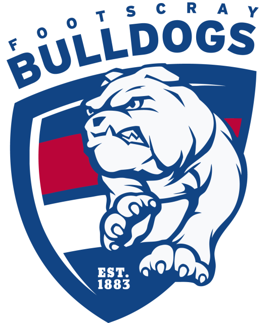
News New Western Bulldogs logo?

Remove this Banner Ad

Log in to remove this ad.

The logo was lodged in IP Australia a while ago but they had never used it as an official logo. Perhaps it was a secondary logo used only within the club.
It will be the official logo
 
Touch it up a little bit - Est. instead of Since, hind legs for the Dog and a proper shield, and it'll be perfect.

I didn't mind Robodog, but the logo should've gone with the guernsey.
 
The logo isn't showing up on my computer. Has it been removed from the site? Can I see it elsewhere?
get_tmi_image.pl
 
Cool logo. It probably should have come along with the return to the classic guernsey design, but better late than never.
 
Its just OK. I much prefer the type of bulldog that appears in Costa's re-do.
I find the new one above to be busy and the type looks like a little bit of an afterthought.
 

(Log in to remove this ad.)

The type needs to be integrated into the shield.
I'd love to see a mock-up with that done, along with it being a proper shield, the dog having hind legs and the since being changed to Est. Just makes it a more timeless logo despite the cartoon dog.
probably see that bulldog on the jumper as a pre-season jumper at some stage
Similar to Richmond/North preseason and training jumpers in recent times?
 
Played around with it a bit and this is the best I could come up with without changing the logo completely. I tried to incorporate the type into the shield but couldn't get it to look good.

29e3yoz.png
 
Played around with it a bit and this is the best I could come up with without changing the logo completely. I tried to incorporate the type into the shield but couldn't get it to look good.

29e3yoz.png
Nice work, definitely an improvement.

I think the main thing that I don't like about it is just all the white. A purely white dog with thick dark lines on a dark shield just doesn't work to my eyes, especially since it's randomly hanging off the sides (and has two freakin' legs but we'll overlook that).

Nice to see you changed the 'since' as well.
Cheers.

Agreed - the bulldog needs some colour. I think the lines are too harsh too (I guess it does make it look a bit more fierce though). I would've liked to see more fluent, curved lines that are easy on the eye. Similar to this style:

bulldogs.jpg
 
Cheers.

Agreed - the bulldog needs some colour. I think the lines are too harsh too (I guess it does make it look a bit more fierce though). I would've liked to see more fluent, curved lines that are easy on the eye. Similar to this style:

bulldogs.jpg
Yeah, that style could work really well. Even some shading on the dog may make it look better - there isn't really much less white on North's kangaroo but the shading makes it look relatively balanced.
 
So s**t. It looked dated and passé when it leaked two years ago. Sports design is in a pretty good place right now. The Bulldogs have good, complementary colours, plenty of elements and ideas to play with... they've got more potential than plenty of sides but'll end up with something totally 2008 and totally naff.

Robodog is pretty simple and a kind of cool use of space and their jumper. It doesn't make a lot of sense now they've changed the jumper... but I like it.
 
Played around with it a bit and this is the best I could come up with without changing the logo completely. I tried to incorporate the type into the shield but couldn't get it to look good.

29e3yoz.png
Heaps better.

Like the text being angled, doesn't look as awkward and disjointed as it did.
 

Remove this Banner Ad

Back
Top