Hey all, been a while since I've uploaded anything. I have been working and stuff, so I haven't had much time to do stuff with the template. However; I have made my shorts longer after Mero suggestion, and I have have modernized the collar because I found that the 'sponsor' logo looked awkward with the old collar and Geelong hoops. All the guernseys use an identical template, with side panels and shoulder panels added to all teams.
Here is a full set of 2015 home kits for each club. Some sponsors may be wrong (I only used Google as a reference), however, I tried to edit the sponsor logos so as they were as close to the version on the guernsey as possible and in as high a resolution as possible. Also, I'm aware some guernseys aren't an exact copy (e.g. Essendon sash not reversing after side panel; Melbourne logo above sponsor; North Melbourne middle stripe not broken under collar), but I chose this look because of my own personal preferences. I was tempted to do white a St. Kilda collar and cuff, but resisted Anyway, here they are:
Adelaide:
Brisbane:
Carlton:
Collingwood:
Essendon:
Fremantle:
Geelong:
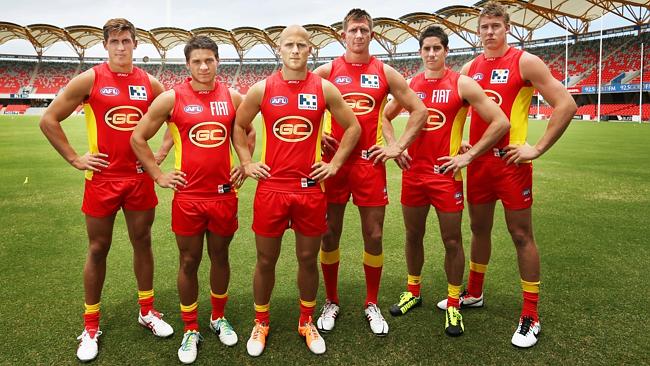
Gold Coast:
Greater Western Sydney:
Hawthorn:
Melbourne:
North Melbourne:
Port Adelaide:
Richmond:
St. Kilda:
Sydney:
West Coast:
Western Bulldogs:
Here is a full set of 2015 home kits for each club. Some sponsors may be wrong (I only used Google as a reference), however, I tried to edit the sponsor logos so as they were as close to the version on the guernsey as possible and in as high a resolution as possible. Also, I'm aware some guernseys aren't an exact copy (e.g. Essendon sash not reversing after side panel; Melbourne logo above sponsor; North Melbourne middle stripe not broken under collar), but I chose this look because of my own personal preferences. I was tempted to do white a St. Kilda collar and cuff, but resisted
Anyway, here they are:Adelaide:

Brisbane:

Carlton:

Collingwood:

Essendon:

Fremantle:

Geelong:

Gold Coast:

Greater Western Sydney:

Hawthorn:

Melbourne:

North Melbourne:

Port Adelaide:

Richmond:

St. Kilda:

Sydney:

West Coast:

Western Bulldogs:

Last edited: