- Thread starter
- #26
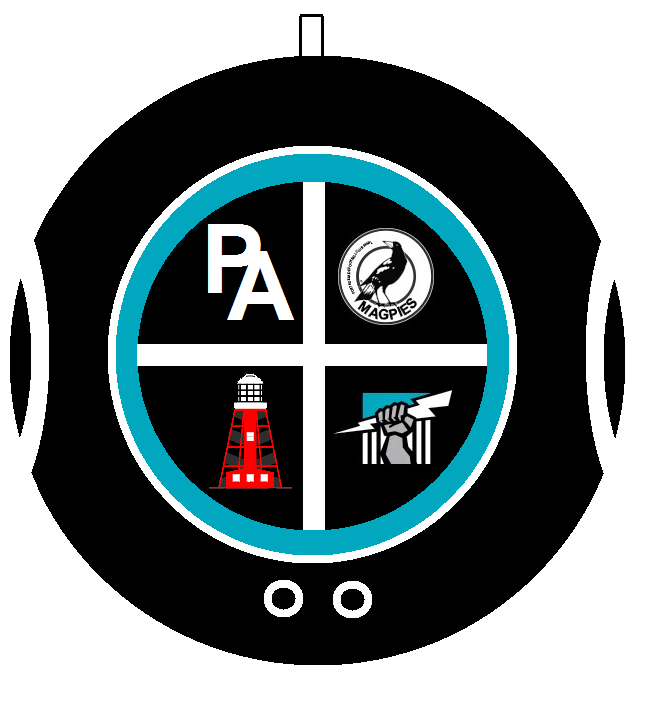
Things that could go into a quadrant.Why not make it a roundel and split it into for sections in the middle.
Top left cockle shell diver helmet
Top right Alberton league logo or something to with the ports?
Bottom left a magpie
Bottom right power lightning bolt
Writing around the roundel should be.
PORT ADELAIDE FOOTBALL CLUB with 1870 at the bottom
- Port Lighthouse/ Birkenhead Bridge
- Magpie/Magpie wing/Magpie feather
- PA Monogram
- Ship
- 1870
- Wharf Pylon
- White/Teal Chevron
- So many