- Thread starter
- Moderator
- #26
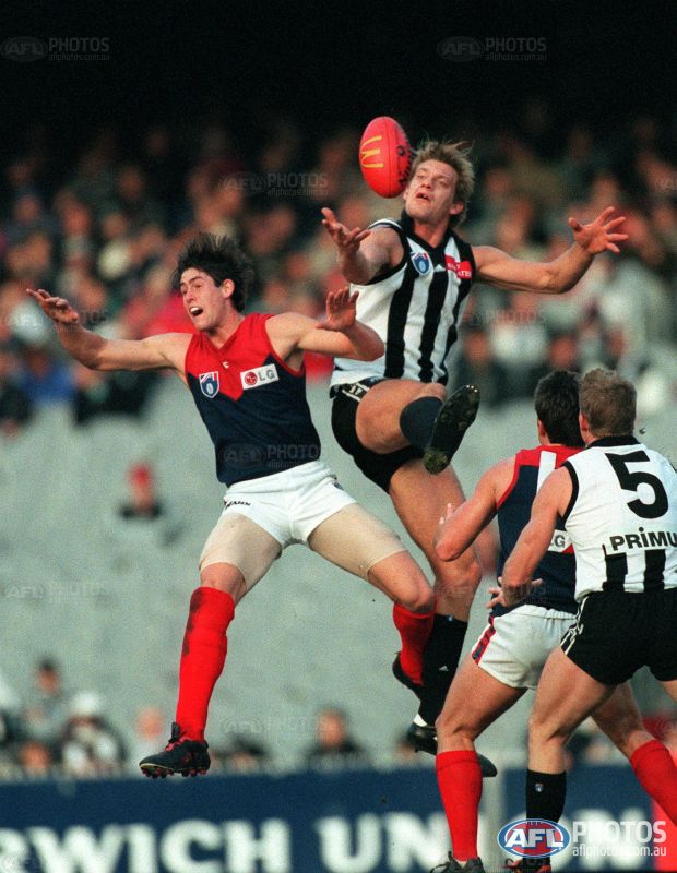
MELBOURNE
Pre-2001

Clash rating: 2/10 – Really nice match-up this, it's a shame we haven't seen it over 15 years now. The white looks really great as a contraster to the navy and red.
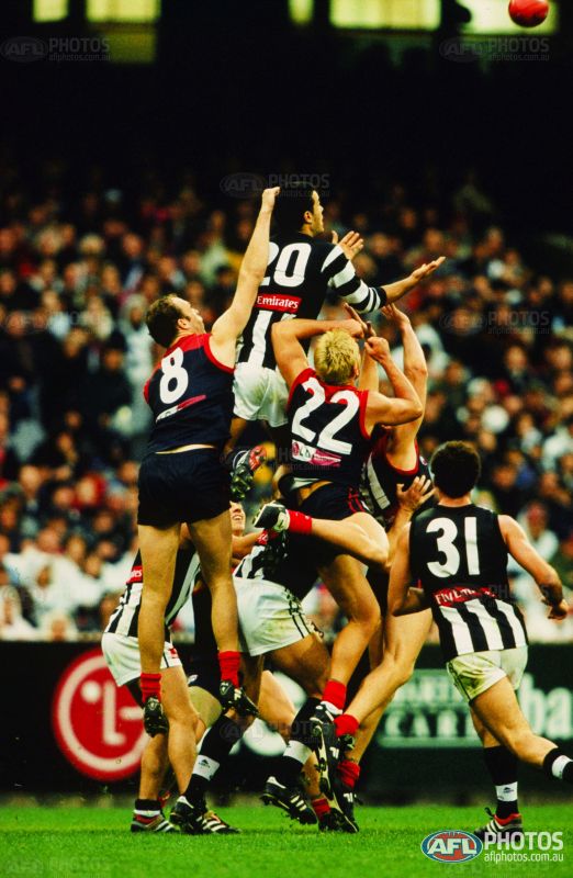
Post-2001
Clash rating: 7.5/10 – The culprit is the black back once more, again there's two teams with white numbers on a dark base and it provides so little differentiation compared to its predecessor.
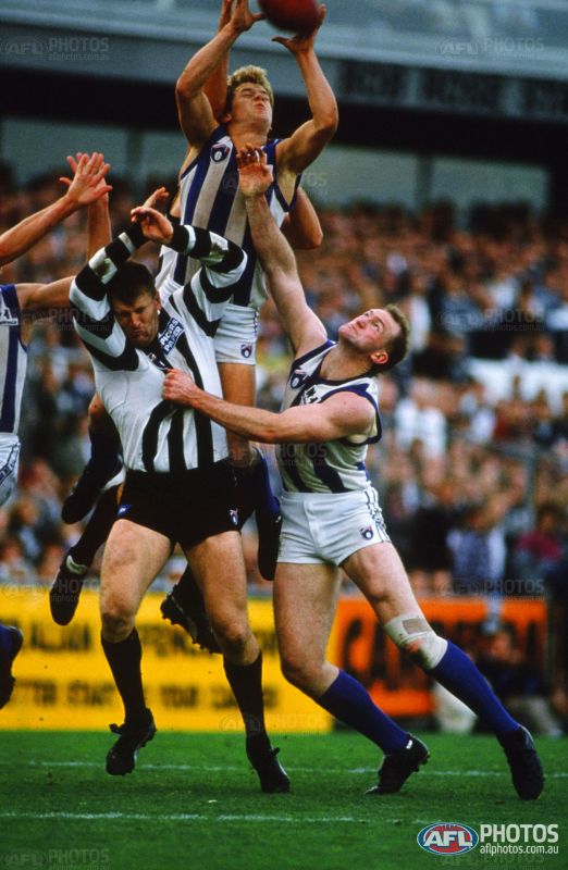
NORTH MELBOURNE
Pre-2001
Clash rating: 9/10 – Only slightly more tolerable than the Geelong clash. People love to use this match-up as the main reason why clash jumpers were brought in. These teams rarely wore home jumpers against each other from the mid-90s onwards, in fact they often both wore alternate jumpers against each other.
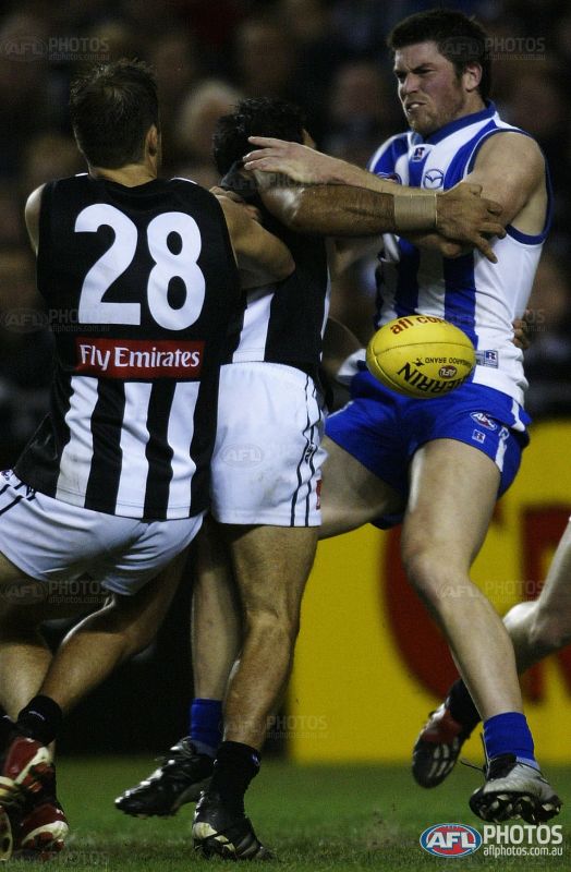
Post-2001
Clash rating: 5.5/10 – There really isn't a whole lot of problems particularly in 2015 when these two sides meet. The black back in this case helped the differentiation dramatically and North's royal blue is vivid enough that both teams can wear their home jumpers without any issues. It's still not an ideal contrast given the stripe similarities, but definitely more optimal than the previous situation.
PORT ADELAIDE
Pre-2001
Clash rating: 4/10 – Again, Port's myriad of away jumpers means that finding these two in a traditional outfit would be difficult, not until 2008 did I locate one on AFL Photos. The white vs black base works well here, but loses (or should I say gains) points for the Power's number panel which means that both teams feature black numbers on a white background.
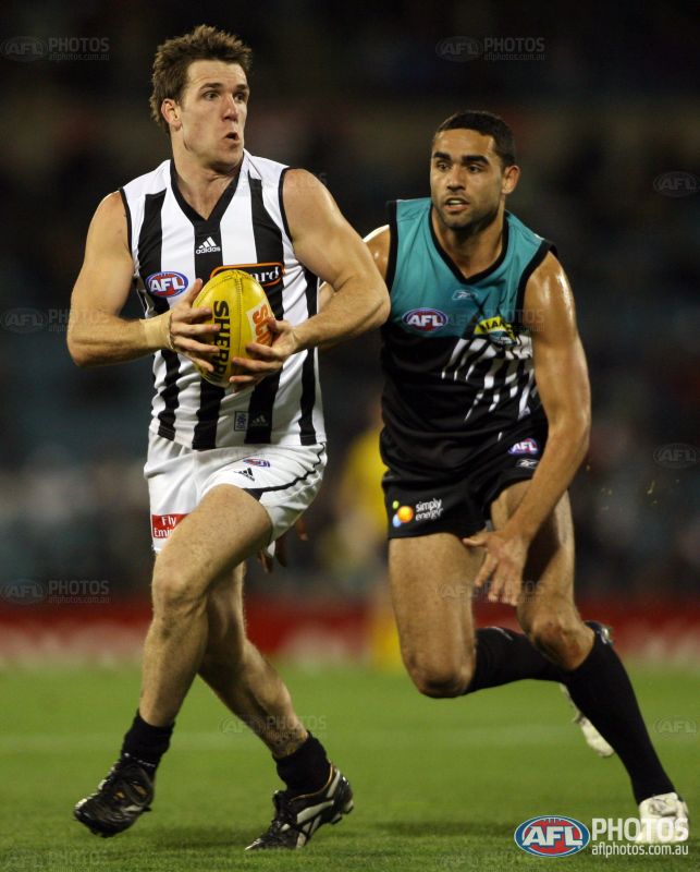
Post-2001
Clash rating: 7/10 – Bad, but in my opinion, not as bad as what it was made out to be. The black base actually works in Collingwood's favour in terms of the numbers contrasting, but the lop-sided nice of the Port design meant the black base was never truly going to work. The training jumper debacle the next year should never have happened, though.
RICHMOND
Pre-2001
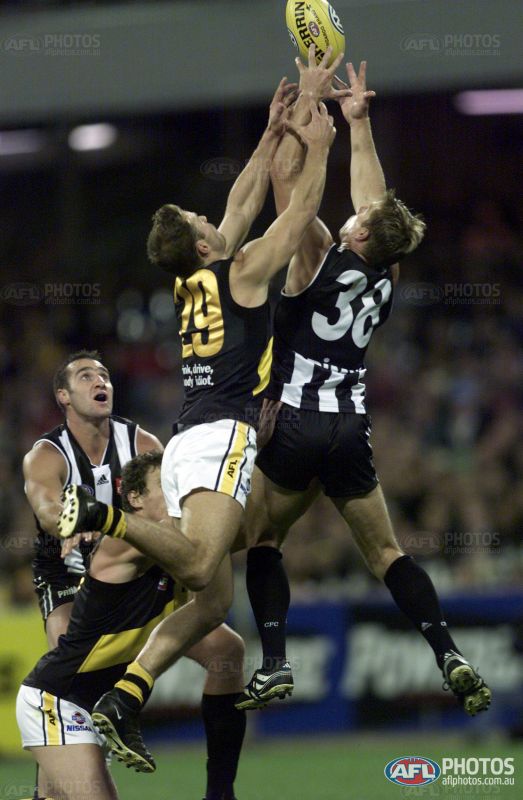
Clash rating: 2.5/10 – Gets the same rating as the corresponding Essendon match-up given the Tigers and Dons' guernsey similarities. The Pies always wore their away strip against the Tigers in the late 90s hence this was the best picture I could find.
Post-2001
Clash rating: 8/10 – Another shocker, it really didn't help that at the time the Tigers had an all-black back (with metallic gold numbers!) which meant that the view from behind was difficult to decipher. I would have given it an 8.5 if not for those gold numbers; a worse clash than Essendon at the time in my opinion. Nowadays I would have them about the same.
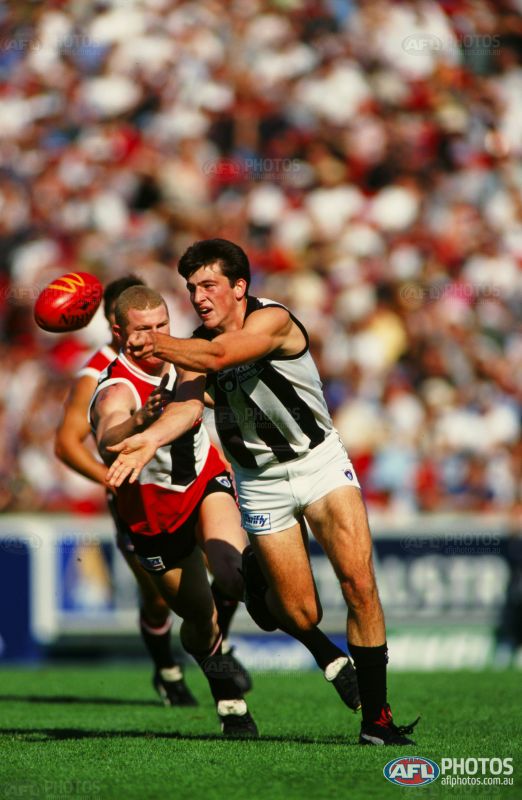
ST KILDA
Pre-2001
Clash rating: 3/10 – The Saints' home 'crusader' strip of the time provided few worries against Collingwood's white guernsey, given the former's black and red back and the fact that you could call it a predominantly red jumper. The only similarities are that middle black and white front of the guernsey which pushes it up from a 2.5 to a 3 for mine. From a wide angle there were no issues here.
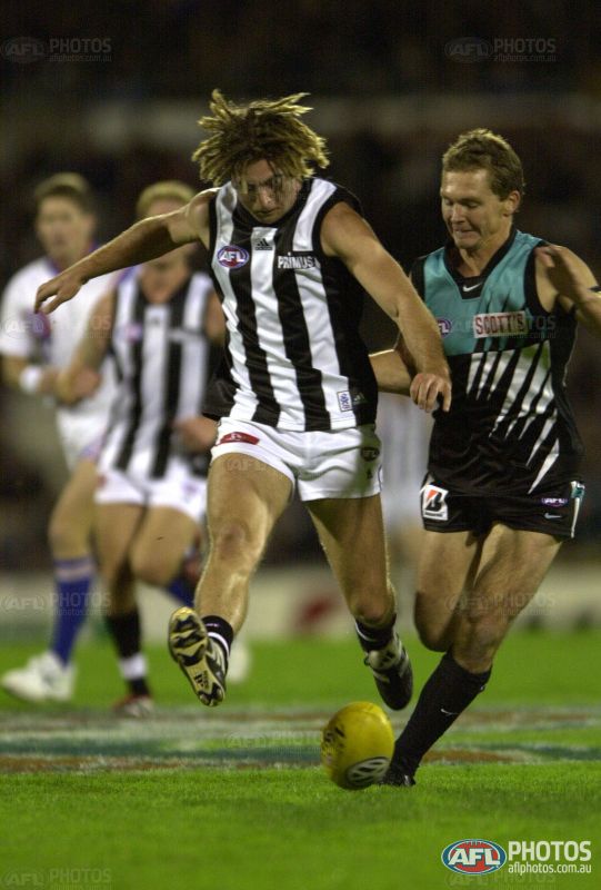
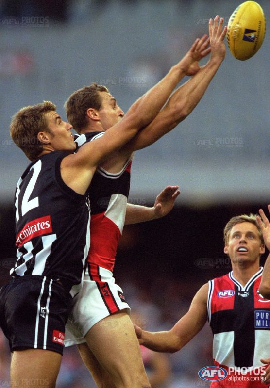
Post-2001
Clash rating: 7/10 – The Pies are actually wearing their 'swooping magpie' strip in this 2001 Ansett Cup game but being a side-on shot you can't tell the difference anyway (bar the cuffs). The move to the black back works against Collingwood's favour as again there are now two sides with a white number on a dark base; the only saving grace being that the bottom half of the Saints' back is red. There is still plenty of black and white on the front of St Kilda's jumper but the majority red makes it tolerable hence this match-up only gets a 7. It was St Kilda's revert back to their traditional tri-panel the following season that made the clash even worse, with its all-black back. I give that particular match-up an 8.5 clash rating. People do seem to forget (until Mero raised it) that St Kilda wore the crusader/'hot cross bun' at the time of Collingwood adopting the darker kit, and the clash was not as prominent.
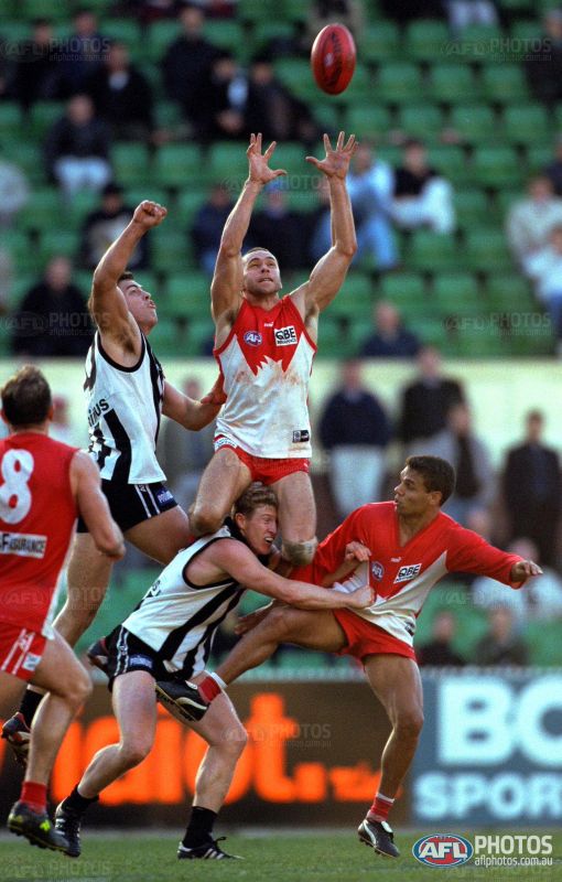
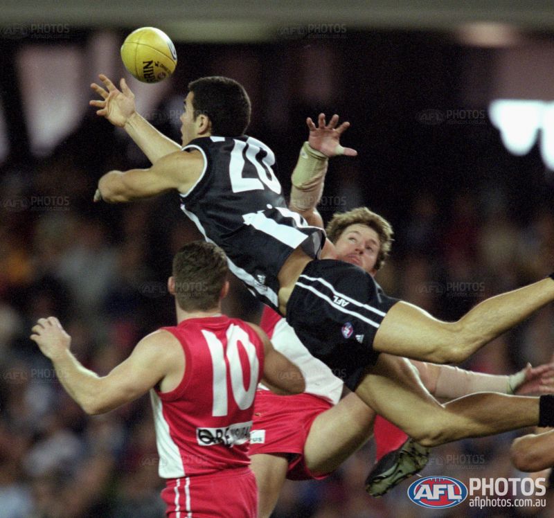
SYDNEY
Pre-2001
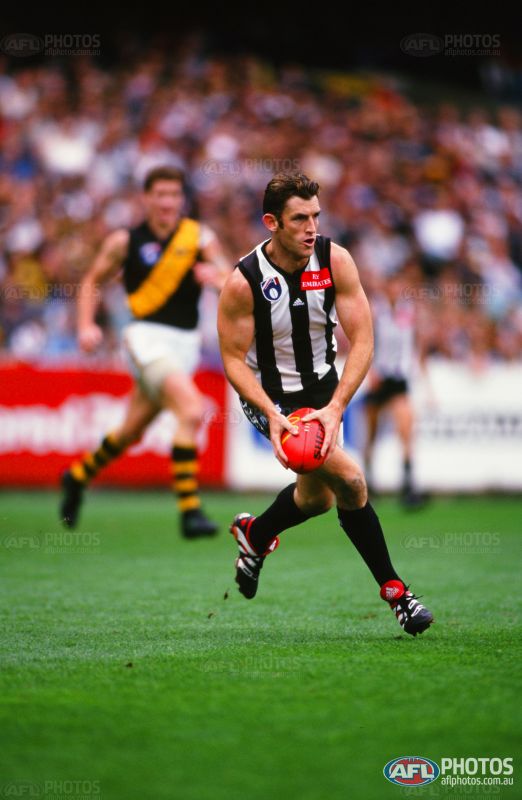
Clash rating: 6/10 – A bit of a lesser-known clash, this one, as there is just way too much white going on for an optimal contrast. The backs of the guernseys are fine, but this shot in particular highlights the inefficiencies of the matchup. Thankfully the AFL usually always had the Swans in red shorts to try and avoid making any clashes even worse.
Post-2001
Clash rating: 2/10 – One of the few instances where the dark jumper actually improved the spectacle. Yes, both teams now had white numbers, but black and red are so far apart as colours that the contrast between them just looked really nice. This is a matchup I love seeing every year.
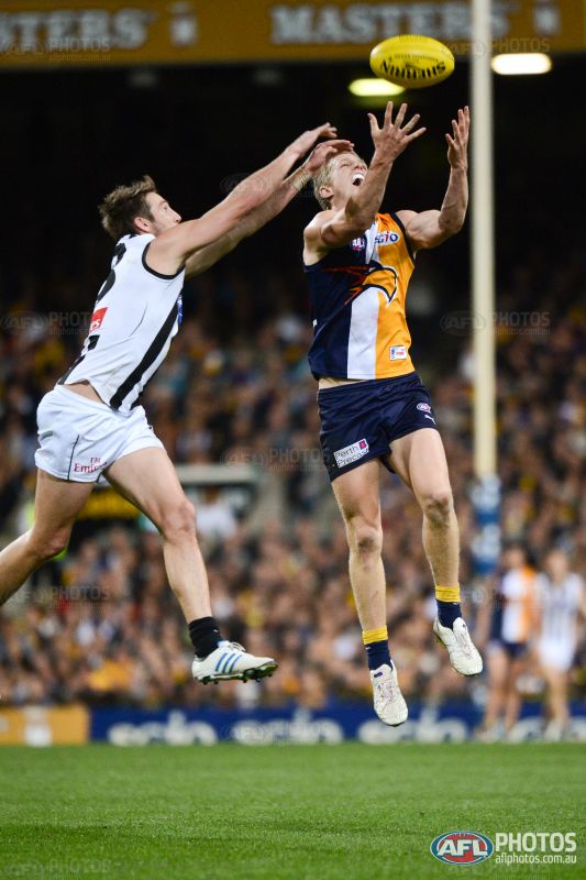
WEST COAST
Pre-2001
Clash rating: 2.5/10 – The Eagles had just moved to the controversial new tripanel design at the turn of the millennium, but never once got to wear that in a match against the Pies (but there was white vs ochre on two occasions!) Hence this is the best picture to describe a potential match-up, from a game in 2012. Similar to the matchup with white vs navy wings (which we should be seeing again in 2016, after a 17-year absence), the Pies' light strip stands out well against the Eagles' navy and the added yellow provides good contrast.
Post-2001
Clash rating: 6/10 – The yellow still provided plenty of differentiation, but the two dark backs coupled with lots of white on the front of each guernsey meant that the dark-based Collingwood home jumper again created more of a clash than its predecessor.
WESTERN BULLDOGS
Pre-2001
Clash rating: 1/10 – Heaps of differentiation here with the predominantly royal blue base and the splashes of red; it's a pretty awesome match-up actually and comes equal first out of this entire study as to the guernseys I find the most contrasting. The blue being particularly bright compared to say, Melbourne's navy, means that there is never any confusion.
Post-2001
Clash rating: 2/10 – Still a great matchup, the only change in rating being to the fact that both teams now have white numbers on a dark(er) base. I think this proves that the Bulldogs – with or without 'Robodog' – have a great versatile uniform that looks superb against most sides.
Pre-2001
Clash rating: 2/10 – Really nice match-up this, it's a shame we haven't seen it over 15 years now. The white looks really great as a contraster to the navy and red.
Post-2001
Clash rating: 7.5/10 – The culprit is the black back once more, again there's two teams with white numbers on a dark base and it provides so little differentiation compared to its predecessor.
NORTH MELBOURNE
Pre-2001
Clash rating: 9/10 – Only slightly more tolerable than the Geelong clash. People love to use this match-up as the main reason why clash jumpers were brought in. These teams rarely wore home jumpers against each other from the mid-90s onwards, in fact they often both wore alternate jumpers against each other.
Post-2001
Clash rating: 5.5/10 – There really isn't a whole lot of problems particularly in 2015 when these two sides meet. The black back in this case helped the differentiation dramatically and North's royal blue is vivid enough that both teams can wear their home jumpers without any issues. It's still not an ideal contrast given the stripe similarities, but definitely more optimal than the previous situation.
PORT ADELAIDE
Pre-2001
Clash rating: 4/10 – Again, Port's myriad of away jumpers means that finding these two in a traditional outfit would be difficult, not until 2008 did I locate one on AFL Photos. The white vs black base works well here, but loses (or should I say gains) points for the Power's number panel which means that both teams feature black numbers on a white background.
Post-2001
Clash rating: 7/10 – Bad, but in my opinion, not as bad as what it was made out to be. The black base actually works in Collingwood's favour in terms of the numbers contrasting, but the lop-sided nice of the Port design meant the black base was never truly going to work. The training jumper debacle the next year should never have happened, though.
RICHMOND
Pre-2001
Clash rating: 2.5/10 – Gets the same rating as the corresponding Essendon match-up given the Tigers and Dons' guernsey similarities. The Pies always wore their away strip against the Tigers in the late 90s hence this was the best picture I could find.
Post-2001
Clash rating: 8/10 – Another shocker, it really didn't help that at the time the Tigers had an all-black back (with metallic gold numbers!) which meant that the view from behind was difficult to decipher. I would have given it an 8.5 if not for those gold numbers; a worse clash than Essendon at the time in my opinion. Nowadays I would have them about the same.
ST KILDA
Pre-2001
Clash rating: 3/10 – The Saints' home 'crusader' strip of the time provided few worries against Collingwood's white guernsey, given the former's black and red back and the fact that you could call it a predominantly red jumper. The only similarities are that middle black and white front of the guernsey which pushes it up from a 2.5 to a 3 for mine. From a wide angle there were no issues here.
Post-2001
Clash rating: 7/10 – The Pies are actually wearing their 'swooping magpie' strip in this 2001 Ansett Cup game but being a side-on shot you can't tell the difference anyway (bar the cuffs). The move to the black back works against Collingwood's favour as again there are now two sides with a white number on a dark base; the only saving grace being that the bottom half of the Saints' back is red. There is still plenty of black and white on the front of St Kilda's jumper but the majority red makes it tolerable hence this match-up only gets a 7. It was St Kilda's revert back to their traditional tri-panel the following season that made the clash even worse, with its all-black back. I give that particular match-up an 8.5 clash rating. People do seem to forget (until Mero raised it) that St Kilda wore the crusader/'hot cross bun' at the time of Collingwood adopting the darker kit, and the clash was not as prominent.
SYDNEY
Pre-2001
Clash rating: 6/10 – A bit of a lesser-known clash, this one, as there is just way too much white going on for an optimal contrast. The backs of the guernseys are fine, but this shot in particular highlights the inefficiencies of the matchup. Thankfully the AFL usually always had the Swans in red shorts to try and avoid making any clashes even worse.
Post-2001
Clash rating: 2/10 – One of the few instances where the dark jumper actually improved the spectacle. Yes, both teams now had white numbers, but black and red are so far apart as colours that the contrast between them just looked really nice. This is a matchup I love seeing every year.
WEST COAST
Pre-2001
Clash rating: 2.5/10 – The Eagles had just moved to the controversial new tripanel design at the turn of the millennium, but never once got to wear that in a match against the Pies (but there was white vs ochre on two occasions!) Hence this is the best picture to describe a potential match-up, from a game in 2012. Similar to the matchup with white vs navy wings (which we should be seeing again in 2016, after a 17-year absence), the Pies' light strip stands out well against the Eagles' navy and the added yellow provides good contrast.
Post-2001
Clash rating: 6/10 – The yellow still provided plenty of differentiation, but the two dark backs coupled with lots of white on the front of each guernsey meant that the dark-based Collingwood home jumper again created more of a clash than its predecessor.
WESTERN BULLDOGS
Pre-2001
Clash rating: 1/10 – Heaps of differentiation here with the predominantly royal blue base and the splashes of red; it's a pretty awesome match-up actually and comes equal first out of this entire study as to the guernseys I find the most contrasting. The blue being particularly bright compared to say, Melbourne's navy, means that there is never any confusion.
Post-2001
Clash rating: 2/10 – Still a great matchup, the only change in rating being to the fact that both teams now have white numbers on a dark(er) base. I think this proves that the Bulldogs – with or without 'Robodog' – have a great versatile uniform that looks superb against most sides.