Navigation
Install the app
How to install the app on iOS
Follow along with the video below to see how to install our site as a web app on your home screen.
Note: This feature may not be available in some browsers.
More options


You are using an out of date browser. It may not display this or other websites correctly.
You should upgrade or use an alternative browser.
You should upgrade or use an alternative browser.
Workshop Design Adelaide Football Club Logo
- Thread starter 1990crow
- Start date
- Tagged users None
fancyscum
Radical Crommunist
If port want to be China's team then it only makes sense...

In all seriousness though, I was thinking about taking on this as a bit of an off-season project the other day. Would love to see what the talent on this board can produce.
In all seriousness though, I was thinking about taking on this as a bit of an off-season project the other day. Would love to see what the talent on this board can produce.
- Sep 8, 2011
- 10,990
- 10,956
- AFL Club
- West Coast
This is really good.If port want to be China's team then it only makes sense...
In all seriousness though, I was thinking about taking on this as a bit of an off-season project the other day. Would love to see what the talent on this board can produce.
Dr Dolphin
Debutant
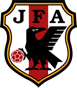
Looks cool. But why does it have three legs?
fancyscum
Radical Crommunist
Because it is just an adaptation of the Japanese national soccer team's logo. They call it Yatagarasu, the three-legged crow.Looks cool. But why does it have three legs?
fancyscum
Radical Crommunist
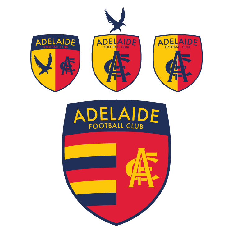
Originally I only planned to create a vector version of the monogram today (which I am happy to give out if anyone wants) but of course I wanted to use it on something straight away, so I put together some european style shields, in a modern style of course. I tried to keep it to simple, symbolic elements; the monogram, the WFAO crow and the hoops. Taking inspiration from the Austin Crows logo which has a half and half shield like this at the back.
In the end I wasn't to sure about including the WFAO crow on the shield itself, I like it above the shield but I think this messes with the proportions. but overall I think that the hooped one looks best, I can imagine it looking great on the gold jacket.
This isn't my final design, more just something to get an actual design in this thread.
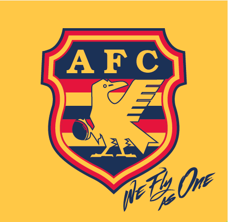
Austin Crows nailed it.


- Thread starter
- #8
Love the ideas.Originally I only planned to create a vector version of the monogram today (which I am happy to give out if anyone wants) but of course I wanted to use it on something straight away, so I put together some european style shields, in a modern style of course. I tried to keep it to simple, symbolic elements; the monogram, the WFAO crow and the hoops. Taking inspiration from the Austin Crows logo which has a half and half shield like this at the back.
In the end I wasn't to sure about including the WFAO crow on the shield itself, I like it above the shield but I think this messes with the proportions. but overall I think that the hooped one looks best, I can imagine it looking great on the gold jacket.
This isn't my final design, more just something to get an actual design in this thread.
And if you read into its meaning, it's a bit of a touchy subject to reuse it. The Japanese believe it to be a symbol of divine intervention on Earth. To use it as a simple club logo in Australia is debatable, similar to us on this board designing Aboriginal artwork without any knowledge of the meaning behind itBecause it is just an adaptation of the Japanese national soccer team's logo. They call it Yatagarasu, the three-legged crow.
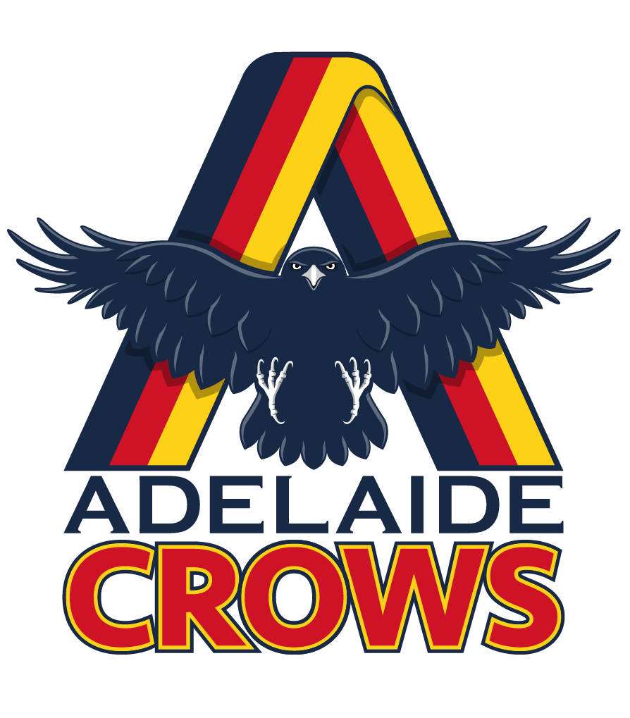
I did this a few months ago for laughs. It needs some tinkering, but haven't had the time.
fancyscum
Radical Crommunist
I've never said that I'm a perfect person, nor pretended to be someone that I'm not. I've said and done things I regret and the contents of this week old design are one of them. Anyone who knows me, knows this insensitivity doesn't reflect who I am. I did it, I was wrong and I apologise.And if you read into its meaning, it's a bit of a touchy subject to reuse it. The Japanese believe it to be a symbol of divine intervention on Earth. To use it as a simple club logo in Australia is debatable, similar to us on this board designing Aboriginal artwork without any knowledge of the meaning behind it
#makeFJGDgreatagain
Seriously though it was a shitpost I made at 10:30 on a monday night. If the mods think that it is culturally insensitive or offensive then I'm happy to take it down.
My friend, I'm not trying to have a go at you. Nothing of the sort. All I'm saying is that using images like that can be a bit of a grey area. I'm guilty of doing it myself. Personally, I like the design. It's a very clever use of the image and (perhaps unintentionally) the meaning behind it.I've never said that I'm a perfect person, nor pretended to be someone that I'm not. I've said and done things I regret and the contents of this week old design are one of them. Anyone who knows me, knows this insensitivity doesn't reflect who I am. I did it, I was wrong and I apologise.
#makeFJGDgreatagain
Seriously though it was a shitpost I made at 10:30 on a monday night. If the mods think that it is culturally insensitive or offensive then I'm happy to take it down.
I did this a few months ago for laughs. It needs some tinkering, but haven't had the time.
Did you draw that Crow yourself? Because that is insanely good! Thats exactly what I'd like to see, something in the mould of the Austin Crows without being exactly the same and I think you've nailed it. Brilliant job! The "A" ribbon in the background is an interesting addition, and the font could probably be improved. But man, that Crow...!
fancyscum
Radical Crommunist
I'm not a big fan of having white/grey on the crow given they aren't our colours and the drop shadows don't work for me either. It has potential but it's just not quite there yet.I did this a few months ago for laughs. It needs some tinkering, but haven't had the time.
Yeah its all my work.Did you draw that Crow yourself? Because that is insanely good! Thats exactly what I'd like to see, something in the mould of the Austin Crows without being exactly the same and I think you've nailed it. Brilliant job! The "A" ribbon in the background is an interesting addition, and the font could probably be improved. But man, that Crow...!
I was just trying a few things out, which is where the A came from. The type were 5min jobs just to finish it off, as I was obviously only focused on the crow itself.
The shadows and highlights are how you do these types of designs, particularly with an animal like a crow that is all one colour. I can assure you it doesn't work if you attempt it with red or yellow. It's why the current logo uses the same.I'm not a big fan of having white/grey on the crow given they aren't our colours and the drop shadows don't work for me either. It has potential but it's just not quite there yet.
fancyscum
Radical Crommunist
I understand that shadows and highlights are needed for a logo like this, but drop shadows (what I was actually talking about) aren't, it looks tacky and gives makes this more of an illustration and less of a logo.Yeah its all my work.
I was just trying a few things out, which is where the A came from. The type were 5min jobs just to finish it off, as I was obviously only focused on the crow itself.
The shadows and highlights are how you do these types of designs, particularly with an animal like a crow that is all one colour. I can assure you it doesn't work if you attempt it with red or yellow. It's why the current logo uses the same.
As for the white and grey, there isn't any on the current logo so I'm not sure what you are talking about there. The current logo uses red and yellow for the eyes and I don't see why yellow wouldn't work on the talons and beak.
Almost as if I'm a Graphic Illustrator isn't it?I understand that shadows and highlights are needed for a logo like this, but drop shadows (what I was actually talking about) aren't, it looks tacky and gives makes this more of an illustration and less of a logo.
As for the white and grey, there isn't any on the current logo so I'm not sure what you are talking about there. The current logo uses red and yellow for the eyes and I don't see why yellow wouldn't work on the talons and beak.
No highlights? Ok cool.
Yellow beak and talons make it look like a budgie.
fancyscum
Radical Crommunist
Okay, I dismissed your patronising tone in your last post but I'm not particularly happy with copping it again. I'm not in the mood for getting in an argument because that really isn't allowed on here and I wouldn't want to disrespect a long standing bigfooty graphic illustrator like yourself.Almost as if I'm a Graphic Illustrator isn't it?
No highlights? Ok cool.
Yellow beak and talons make it look like a budgie.
I simply suggested that I believe (I am simply expressing my opinion) that I would want my footy club's logo to be in my footy clubs colours, not relying on colours from outside that colour palette to the extent that you have.
There was no patronising tones intended in my first post, I was simply stating the need for the design choices that I made, citing that I did nothing that the current design hasn't done. You disputed it, and I pointed out that you were mistaken.Okay, I dismissed your patronising tone in your last post but I'm not particularly happy with copping it again. I'm not in the mood for getting in an argument because that really isn't allowed on here and I wouldn't want to disrespect a long standing bigfooty graphic illustrator like yourself.
I simply suggested that I believe (I am simply expressing my opinion) that I would want my footy club's logo to be in my footy clubs colours, not relying on colours from outside that colour palette to the extent that you have.
My design, my decisions. I'll think again before contributing next time.
chicken Caesar
Senior List
Love that top middle one with the crow on top. Please send this to the club. I know people have different opinions on graphic design but I find it pretty embarrassing companies get paid big money to dish out the current crap that is suppose to represent a footy club and even more embarrassed that clubs give these tacky cartoon designs the green light when there are armatures coming up with relatively simple designs like this that work so much better as a club emblem.Originally I only planned to create a vector version of the monogram today (which I am happy to give out if anyone wants) but of course I wanted to use it on something straight away, so I put together some european style shields, in a modern style of course. I tried to keep it to simple, symbolic elements; the monogram, the WFAO crow and the hoops. Taking inspiration from the Austin Crows logo which has a half and half shield like this at the back.
In the end I wasn't to sure about including the WFAO crow on the shield itself, I like it above the shield but I think this messes with the proportions. but overall I think that the hooped one looks best, I can imagine it looking great on the gold jacket.
This isn't my final design, more just something to get an actual design in this thread.
Personally I think Adelaide should change logo and go with something similar to the above designs.
fancyscum
Radical Crommunist
I wasn't asking you to go back and do it my way, if I came off as a dick in that respect, it wasn't my intention. I'm doing an austin crow based design of my own which I hopefully am happy with and feel free to get stuck into it if/when is posted. In fact I encourage you to, as this board needs more critical assessment in my opinion.There was no patronising tones intended in my first post, I was simply stating the need for the design choices that I made, citing that I did nothing that the current design hasn't done. You disputed it, and I pointed out that you were mistaken.
My design, my decisions. I'll think again before contributing next time.
fancyscum
Radical Crommunist
My only problem with the half and half shield with the monogram in the middle is that tiny bit of yellow on the right of the F and I think adding it to the one with the hoops makes it a bit busy.Love that top middle one with the crow on top. Please send this to the club. I know people have different opinions on graphic design but I find it pretty embarrassing companies get paid big money to dish out the current crap that is suppose to represent a footy club and even more embarrassed that clubs give these tacky cartoon designs the green light when there are armatures coming up with relatively simple designs like this that work so much better as a club emblem.
Personally I think Adelaide should change logo and go with something similar to the above designs.
fancyscum
Radical Crommunist
I tinkered a bit more today and came up with this, I think I still like the red one better this makes the hoops clearer.Originally I only planned to create a vector version of the monogram today (which I am happy to give out if anyone wants) but of course I wanted to use it on something straight away, so I put together some european style shields, in a modern style of course. I tried to keep it to simple, symbolic elements; the monogram, the WFAO crow and the hoops. Taking inspiration from the Austin Crows logo which has a half and half shield like this at the back.
In the end I wasn't to sure about including the WFAO crow on the shield itself, I like it above the shield but I think this messes with the proportions. but overall I think that the hooped one looks best, I can imagine it looking great on the gold jacket.
This isn't my final design, more just something to get an actual design in this thread.
The monogram just doesn't work anywhere, should be completely re-drawn.
Other than that, that's pretty good.
Other than that, that's pretty good.
fancyscum
Radical Crommunist
I'm not the biggest fan of it either, but it is our history and I tried to restrict myself to elements that fans identify with.The monogram just doesn't work anywhere, should be completely re-drawn.
Other than that, that's pretty good.
Similar threads
- Replies
- 8
- Views
- 536
