Preseason, that time of year.
Currently overseas and its below zero outside so what better way to spend my time than making the 3rd annual edition of this thread for myself and about 7 other people*
*slight exaggeration.
2015/16 thread - https://www.bigfooty.com/forum/threads/bigfooty-port-adelaide-logos-2.1131404/
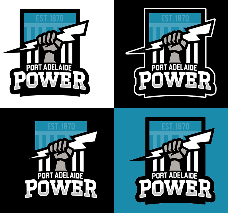
1. Official Club Logo

2. Secondary Logo
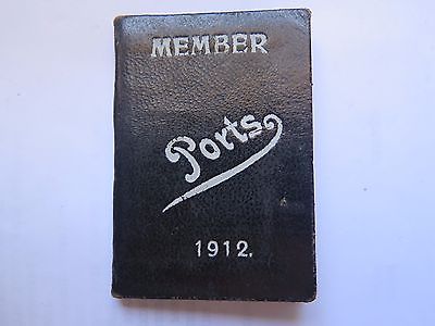
3. 1912 Membership Logo

4. stormy2

5. Quadzilla

6. Don_Kay
7. Dylan8
8. captain ebert
9. Suit

10. ChristopH

Currently overseas and its below zero outside so what better way to spend my time than making the 3rd annual edition of this thread for myself and about 7 other people*
*slight exaggeration.
2015/16 thread - https://www.bigfooty.com/forum/threads/bigfooty-port-adelaide-logos-2.1131404/
1. Official Club Logo

2. Secondary Logo

3. 1912 Membership Logo

4. stormy2

5. Quadzilla

6. Don_Kay

7. Dylan8

8. captain ebert

9. Suit

10. ChristopH


")