

Why does everything between these two teams turn into a s**t fight?
Navigation
Install the app
How to install the app on iOS
Follow along with the video below to see how to install our site as a web app on your home screen.
Note: This feature may not be available in some browsers.
More options
You are using an out of date browser. It may not display this or other websites correctly.
You should upgrade or use an alternative browser.
You should upgrade or use an alternative browser.
Workshop Design Adelaide Football Club Logo
- Thread starter 1990crow
- Start date
- Tagged users None
Greater Gattsby
♛ All Class ♛
- Oct 6, 2011
- 8,865
- 11,421
- AFL Club
- North Melbourne
- Other Teams
- Melbourne Victory | West Ham United
Both clubs reside in South AustraliaWhy does everything between these two teams turn into a s**t fight?
Good point, it's not like there's anything else to do in Adelaide.
Other than look at churches and complain about the drinking waterGood point, it's not like there's anything else to do in Adelaide.
")
Why does everything between these two teams turn into a s**t fight?
Don't know what it's like to be relevant in your own state?
fancyscum
Radical Crommunist
Our 'competent' marketing seems go alright...
Nope.Don't know what it's like to be relevant in your own state?
- Aug 21, 2007
- 31,651
- 98,920
- AFL Club
- Port Adelaide
- Other Teams
- Aston Villa, San Antonio Spurs
You surely can't have said that with a straight face? Absolutely no sane person would argue that Port have improved off field from where they were in 2014. In the statewide and national consciousness the Crows have blown Port out of the water over the last year; no unbiased person would deny that.
The buzz around the Port brand in Adelaide is non-existent these days whereas it was nauseating two years ago. I've hardly heard a peep about Port for the last two seasons whereas you couldn't shut people up during their heyday.
You're conflating all sorts of things that I wasn't talking about and reaching conclusions that are nothing to do with what we're talking about.
I specifically said marketing in that post. You've then talked about entire off-field performance, which isn't what i'm talking about at all. I'm talking about how the club presents itself audiovisually, which ranges from logos to uniforms to matchday presentation to marketing campaigns to social media.
Adelaide has traditionally been a horrendously bad club at this sort of stuff. You still have a terrible logo but you've shored up your away guernsey designs to have a really good uniform set overall and you're 'We fly as one' campaign is probably the best one you've run this side of 2000.
Port is still league leading in terms of audiovisual brand positioning and we've been phenomenal at it since Keith Thomas took the reins.
But since you've brought up overall off field performance, i'll remind you that you're still making significant financial losses every year. You announced a $1.3million loss for the previous financial year just over a month ago. You're certainly not the off-field powerhouse that the size of your supporterbase dictates you should be, and you've been unable or unwilling to leverage your enormous support to get a better deal out of the SANFL, which is why a similarly positioned club like West Coast falls ass-backwards into a giant vault of cash like Scrooge McDuck and Adelaide is posting losses.
The "buzz" you're talking about has nothing to do with brand positioning and everything to do with on-field performance. This should be really obvious.
- Aug 21, 2007
- 31,651
- 98,920
- AFL Club
- Port Adelaide
- Other Teams
- Aston Villa, San Antonio Spurs
Our 'competent' marketing seems go alright...
You have an enormous latent supporter base stemming from being the only side in the state and positioning yourself as a state side for 7 years and you're currently winning.
You're also playing in the best stadium in the country.
This is totally unrelated from how you present yourself visually which is what both Dylan and I were talking about and responding to.
We are in the footy graphic design section here aren't we guys?
You're conflating all sorts of things that I wasn't talking about and reaching conclusions that are nothing to do with what we're talking about.
I specifically said marketing in that post. You've then talked about entire off-field performance, which isn't what i'm talking about at all. I'm talking about how the club presents itself audiovisually, which ranges from logos to uniforms to matchday presentation to marketing campaigns to social media.
Adelaide has traditionally been a horrendously bad club at this sort of stuff. You still have a terrible logo but you've shored up your away guernsey designs to have a really good uniform set overall and you're 'We fly as one' campaign is probably the best one you've run this side of 2000.
Port is still league leading in terms of audiovisual brand positioning and we've been phenomenal at it since Keith Thomas took the reins.
But since you've brought up overall off field performance, i'll remind you that you're still making significant financial losses every year. You announced a $1.3million loss for the previous financial year just over a month ago. You're certainly not the off-field powerhouse that the size of your supporterbase dictates you should be, and you've been unable or unwilling to leverage your enormous support to get a better deal out of the SANFL, which is why a similarly positioned club like West Coast falls ass-backwards into a giant vault of cash like Scrooge McDuck and Adelaide is posting losses.
The "buzz" you're talking about has nothing to do with brand positioning and everything to do with on-field performance. This should be really obvious.
You seem to be the one "conflating things". Audiovisual does not equal marketing. In fact your post says you're only talking about marketing, but then you go on to list about 5 different genres, only one of which is marketing.
I don't think you realise that marketing is all about advertising products, selling these products, brand recognition, etc. Adelaide has been performing extremely well in these areas over the past year or so, whilst Port has gone backwards.
The "matchday presentation" you talk about is not marketing. Marketing is the image conveyed of the matchday presentation. Again, Port has gone backward in this area. Your marketing in relation to matchday was extremely successful for a couple of years, but the general populous in SA is no longer drawn in by the Port marketing in this regard, and in fact as I said previously it's become a bit of a laughing stock within professional circles here.
You have an enormous latent supporter base stemming from being the only side in the state and positioning yourself as a state side for 7 years and you're currently winning.
You're also playing in the best stadium in the country.
This is totally unrelated from how you present yourself visually which is what both Dylan and I were talking about and responding to.
We are in the footy graphic design section here aren't we guys?
I don't want to derail this thread anymore because I think a discussion on a potential new logo is very important, but I suggest you go and look up the difference between marketing, audiovisuals, graphic design etc. I think you're getting the concepts muddled.
- Aug 21, 2007
- 31,651
- 98,920
- AFL Club
- Port Adelaide
- Other Teams
- Aston Villa, San Antonio Spurs
You seem to be the one "conflating things". Audiovisual does not equal marketing. In fact your post says you're only talking about marketing, but then you go on to list about 5 different genres, only one of which is marketing.
We're on the graphic design board. I was responding to a post about the Adelaide logo and whether it should be more old timey looking or more modern. You told me I was wrong and that Adelaide had been performing very well off field over the past couple of years.
Which isn't what I was talking about at all.
I don't think you realise that marketing is all about advertising products, selling these products, brand recognition, etc. Adelaide has been performing extremely well in these areas over the past year or so, whilst Port has gone backwards.
Marketing is entirely about selling a product. In football, more people turn up when you win. That's true for every single side. However in this thread and in this section, we aren't talking about on-field performance, we're talking about how a club positions it's brand outside of on-field performance.
Adelaide is now competent in those areas after being horrendous under Trigg.
The "matchday presentation" you talk about is not marketing. Marketing is the image conveyed of the matchday presentation. Again, Port has gone backward in this area. Your marketing in relation to matchday was extremely successful for a couple of years, but the general populous in SA is no longer drawn in by the Port marketing in this regard, and in fact as I said previously it's become a bit of a laughing stock within professional circles here.
lol "laughing stock in professional circles". Oh no! What will we do to regain the respect of the professional circles?!?!?!
Which "professions" are these specifically?
Our matchday presentation was and is the envy of the league, and people have tried to copy it since we set the benchmark on the move to Adelaide Oval. What's important is that our supporter base is engaged with what we're doing, and they absolutely are. There's no wow factor because we've been doing it well for 4 years, but it's still absolutely doing it's job of making Port Adelaide supporters feel engaged at home games.
Worrying about "professional circle" Crows supporters that might not like us is what made us completely dilute our brand a decade ago, which caused a big section of our fanbase to disengage. Football marketing 101 is to engage your core fans first and worry about everything else later.
I don't want to derail this thread anymore because I think a discussion on a potential new logo is very important, but I suggest you go and look up the difference between marketing, audiovisuals, graphic design etc. I think you're getting the concepts muddled.
We're in the footy graphic design section. We don't usually discuss on-field performance in this section and overall there has been a healthy level of respect between the prominent Port supporters and the prominent Crows supporters here because of that. I posted my opinion regarding how the Crows should be positioning their brand under the assumption that that level of respect would be maintained.
You entered the thread, quoted my post and started a dick measuring contest without anything to say about the topic at hand. If you want to enter into dick measuring contests, go to the main board or bay 13. If you want to speak about how teams present themselves visually, stay here and post about that.
Freight Train
Once hit the sign at the Mercantile Mutual Cup
- Moderator
- #113
We're on the graphic design board. I was responding to a post about the Adelaide logo and whether it should be more old timey looking or more modern. You told me I was wrong and that Adelaide had been performing very well off field over the past couple of years.
Which isn't what I was talking about at all.
Marketing is entirely about selling a product. In football, more people turn up when you win. That's true for every single side. However in this thread and in this section, we aren't talking about on-field performance, we're talking about how a club positions it's brand outside of on-field performance.
Adelaide is now competent in those areas after being horrendous under Trigg.
lol "laughing stock in professional circles". Oh no! What will we do to regain the respect of the professional circles?!?!?!
Which "professions" are these specifically?
Our matchday presentation was and is the envy of the league, and people have tried to copy it since we set the benchmark on the move to Adelaide Oval. What's important is that our supporter base is engaged with what we're doing, and they absolutely are. There's no wow factor because we've been doing it well for 4 years, but it's still absolutely doing it's job of making Port Adelaide supporters feel engaged at home games.
Worrying about "professional circle" Crows supporters that might not like us is what made us completely dilute our brand a decade ago, which caused a big section of our fanbase to disengage. Football marketing 101 is to engage your core fans first and worry about everything else later.
We're in the footy graphic design section. We don't usually discuss on-field performance in this section and overall there has been a healthy level of respect between the prominent Port supporters and the prominent Crows supporters here because of that. I posted my opinion regarding how the Crows should be positioning their brand under the assumption that that level of respect would be maintained.
You entered the thread, quoted my post and started a dick measuring contest without anything to say about the topic at hand. If you want to enter into dick measuring contests, go to the main board or bay 13. If you want to speak about how teams present themselves visually, stay here and post about that.
scorcho with the left right goodnight.
Oh boy. I thought this board was the one place I was safe from SA s**t-fighting, but it likes to rear its ugly head in this thread. Can we keep it out please?
Crows fans:
A Port supporter commenting in this thread doesn't immediately mean they're trying to be aggressive. Actually read their content and respond if you feel the desire, but no more "well at least we're better than Portz" crap.
Port fans:
Of course your opinions are welcome in here, but please be mindful of the subject matter and ensure your tone and content is respectful and not just trying to take a dig at your rivals.

Last edited:
Spanna_
The secret ingredient is crime
Ironic that there's a team in Adelaide called the Power when the state that it's located in always loses it.
Ironic that there's a team in Adelaide called the Power when the state that it's located in always loses it.

We're on the graphic design board. I was responding to a post about the Adelaide logo and whether it should be more old timey looking or more modern. You told me I was wrong and that Adelaide had been performing very well off field over the past couple of years.
Which isn't what I was talking about at all.
Your direct quote was: "The crows marketing has been unquestionably garbage since the 90s". How is that not what you were talking about? Yes, you intertwined it with reasoning as to how the Crows' logo should look, but you can't expect to make a statement such as that on an open forum and not expect any rebuttal.
Marketing is entirely about selling a product. In football, more people turn up when you win. That's true for every single side. However in this thread and in this section, we aren't talking about on-field performance, we're talking about how a club positions it's brand outside of on-field performance.
We're in the footy graphic design section. We don't usually discuss on-field performance in this section and overall there has been a healthy level of respect between the prominent Port supporters and the prominent Crows supporters here because of that. I posted my opinion regarding how the Crows should be positioning their brand under the assumption that that level of respect would be maintained.
Dylan was the first person to bring up on-field success in this thread, not me nor anyone else. His assertion that the Crows' off-field improvement "would almost entirely be put down to the on field" is hardly a show of respect towards the Crows' recent performance.
You entered the thread, quoted my post and started a dick measuring contest without anything to say about the topic at hand. If you want to enter into dick measuring contests, go to the main board or bay 13. If you want to speak about how teams present themselves visually, stay here and post about that.
Again, you (and Dylan) were the first people in this thread to raise the Crows vs Port dynamic, not me nor anyone else:
Dylan - "Why? The other SA team is a genuine embodiment of South Australian football history. It'd be a perfect point of difference now that Port's identity has been solidified with the One Club merger and pushing 1870 at every turn. Adelaide suit modern perfectly. Right now they're floating somewhere between the two and it's a mess."
You - "Trying to position themselves as a historical club wont fly and it'll lead to getting absolutely pantsed by their biggest rival on their basic brand positioning."
I think everyone is more than happy to have a discussion about the Crows logo. It's a regular topic of conversation on the Crows board itself and certainly warrants addressing. However when Port supporters such as yourself and Dylan make inflammatory comments about the Crows' marketing and compare it to Port's marketing in this thread, you can't expect those comments to remain unrebutted and accuse anyone who rebuts them as going off topic.
- Aug 21, 2007
- 31,651
- 98,920
- AFL Club
- Port Adelaide
- Other Teams
- Aston Villa, San Antonio Spurs
When someone provides rebuttal to the arguments this post might be relevant. You didn't. You claimed that the Crows were a better performing team off field than Port over the past couple of years, which wasn't what either of us argued.Your direct quote was: "The crows marketing has been unquestionably garbage since the 90s". How is that not what you were talking about? Yes, you intertwined it with reasoning as to how the Crows' logo should look, but you can't expect to make a statement such as that on an open forum and not expect any rebuttal.
Dylan was the first person to bring up on-field success in this thread, not me nor anyone else. His assertion that the Crows' off-field improvement "would almost entirely be put down to the on field" is hardly a show of respect towards the Crows' recent performance.
Again, you (and Dylan) were the first people in this thread to raise the Crows vs Port dynamic, not me nor anyone else:
Dylan - "Why? The other SA team is a genuine embodiment of South Australian football history. It'd be a perfect point of difference now that Port's identity has been solidified with the One Club merger and pushing 1870 at every turn. Adelaide suit modern perfectly. Right now they're floating somewhere between the two and it's a mess."
You - "Trying to position themselves as a historical club wont fly and it'll lead to getting absolutely pantsed by their biggest rival on their basic brand positioning."
I think everyone is more than happy to have a discussion about the Crows logo. It's a regular topic of conversation on the Crows board itself and certainly warrants addressing. However when Port supporters such as yourself and Dylan make inflammatory comments about the Crows' marketing and compare it to Port's marketing in this thread, you can't expect those comments to remain unrebutted and accuse anyone who rebuts them as going off topic.
When someone provides rebuttal to the arguments this post might be relevant. You didn't. You claimed that the Crows were a better performing team off field than Port over the past couple of years, which wasn't what either of us argued.
I'm guessing you're not quoting my earlier posts because they disprove your point? I directly referenced the Crows marketing in my first post in this thread. Your statement was that our marketing was extremely poor and has now become slightly more competent (whilst making a comparison to Port), I replied that your statement was one year too late, and that our marketing (and performance off-field) had now eclipsed Port's. I'm not sure what kind of rebuttal or evidence you're looking for because you provided no evidence to back up your original statement, but the proof is in the pudding and the Crows have seen an increase in nearly all areas over the past couple of years, which can at least partly be attributed to their improved marketing.
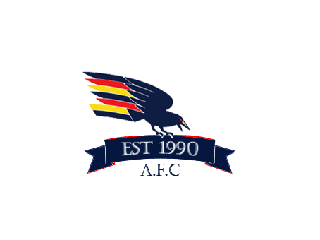
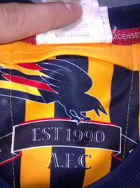
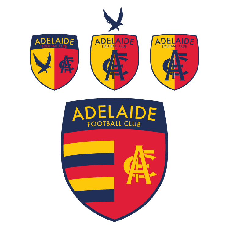
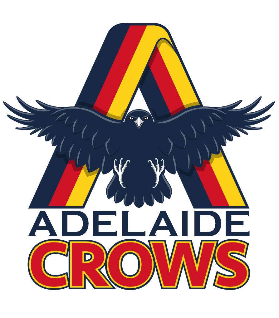
I think the one area that we could stand to improve dramatically still is our logo. We've done a great job transforming our image off the field the past couple of years - the new clash guernseys, the #weflyasone slogan etc. The raptor head logo is one of the only ugly reminders of the old regime remaining at the club. In order to fully complete our transformation into this new era, we need a logo that fully encapsulates the club and one that will stand the test of time.
The only options I can think of that fulfill that are the following:
Option 1 - The AFC shield or at least the AFC insignia:
Option 2 - The #weflyasone Crow on the yellow/gold background:

Option 3 - The Crow introduced at the start of last year on the training guernseys:
Head shot:

Full body:
Option 4 - A modified old crow logo as featured on the GPS pocket of old match-worn guernseys:
- Aug 21, 2007
- 31,651
- 98,920
- AFL Club
- Port Adelaide
- Other Teams
- Aston Villa, San Antonio Spurs
I'm guessing you're not quoting my earlier posts because they disprove your point? I directly referenced the Crows marketing in my first post in this thread. Your statement was that our marketing was extremely poor and has now become slightly more competent (whilst making a comparison to Port), I replied that your statement was one year too late, and that our marketing (and performance off-field) had now eclipsed Port's. I'm not sure what kind of rebuttal or evidence you're looking for because you provided no evidence to back up your original statement, but the proof is in the pudding and the Crows have seen an increase in nearly all areas over the past couple of years, which can at least partly be attributed to their improved marketing.
I think the one area that we could stand to improve dramatically still is our logo. We've done a great job transforming our image off the field the past couple of years - the new clash guernseys, the #weflyasone slogan etc. The raptor head logo is one of the only ugly reminders of the old regime remaining at the club. In order to fully complete our transformation into this new era, we need a logo that fully encapsulates the club and one that will stand the test of time.
The only options I can think of that fulfill that are the following:
Option 1 - The AFC shield or at least the AFC insignia:
Option 2 - The #weflyasone Crow on the yellow/gold background:
Option 3 - The Crow introduced at the start of last year on the training guernseys:
Head shot:
Full body:
Option 4 - A modified old crow logo as featured on the GPS pocket of old match-worn guernseys:
I said that the crows had improved to competent. That is a massive improvement from where they were. Nobody is denying that there has been significant improvement.
I'm not sure how you can argue that you've gone ahead of us in branding when you still have a bottom 3 logo. You've claimed that your branding has surpassed ours, I'm scoffing at that claim. In the Koch era we've been a branding behemoth.
- Aug 21, 2007
- 31,651
- 98,920
- AFL Club
- Port Adelaide
- Other Teams
- Aston Villa, San Antonio Spurs
As for the logos, there are several good options there. A full bodied crow of some description is probably what I would consider ideal.
Austin Crows logo goes alright.
Power Raid
We Exist To Win Premierships
Originally I only planned to create a vector version of the monogram today (which I am happy to give out if anyone wants) but of course I wanted to use it on something straight away, so I put together some european style shields, in a modern style of course. I tried to keep it to simple, symbolic elements; the monogram, the WFAO crow and the hoops. Taking inspiration from the Austin Crows logo which has a half and half shield like this at the back.
In the end I wasn't to sure about including the WFAO crow on the shield itself, I like it above the shield but I think this messes with the proportions. but overall I think that the hooped one looks best, I can imagine it looking great on the gold jacket.
This isn't my final design, more just something to get an actual design in this thread.
I love the middle one on the top row
very bold and very classy
Power Raid
We Exist To Win Premierships
I did this a few months ago for laughs. It needs some tinkering, but haven't had the time.
I love it but when I see A Crows it is too close to A holes.
It's a fish bowl in Adelaide
- Sep 8, 2011
- 10,990
- 10,957
- AFL Club
- West Coast
The old Crow was so good. No need have changed.
Similar threads
- Replies
- 8
- Views
- 537
