

JohnWrongmire
Draftee
- Aug 26, 2017
- 2
- 19
- AFL Club
- Sydney
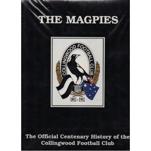
Not sure if they're getting new jumpers, but Collingwood will have a new logo for next year


Last edited by a moderator:
Follow along with the video below to see how to install our site as a web app on your home screen.
Note: This feature may not be available in some browsers.
That looks great, hope you don't live up to your username.Not sure if they're getting new jumpers, but Collingwood will have a new logo for next year
i wish they just go back to their normal oneNot sure if they're getting new jumpers, but Collingwood will have a new logo for next year
I like the idea but does the execution look a little...off to anyone else?Not sure if they're getting new jumpers, but Collingwood will have a new logo for next year
Not sure if they're getting new jumpers, but Collingwood will have a new logo for next year
")
Yeah like the elements are just whacked together "let's smack a white outline here and there"I like the idea but does the execution look a little...off to anyone else?
Something about it. Maybe a graphic designer can have a word about why there's something slightly off about it. The wreath maybe? The rounded edges of the outline versus the pointed edges of the wreath. The width of the white outlines is also inconsistent.I like the idea but does the execution look a little...off to anyone else?
Something about it. Maybe a graphic designer can have a word about why there's something slightly off about it. The wreath maybe? The rounded edges of the outline versus the pointed edges of the wreath. The width of the white outlines is also inconsistent.
I like the shield with the wreaths but it just looks out of place with the magpie. Maybe its time to make a more modernized version of the magpie.Yeah.
The outlines are really bad, like it's just a photoshop stroke surely. The linework in general for the magpie isn't good.
I'd hope if a club as big as Collingwood was going to change a logo they'd used for 25 years, it would be a bit more impressive than a remixed, poorly executed anniversary logo.
Magpie on shield on wreath is a reasonable enough brief but this isn't great
Tbf their current logo is a rehashed 100th anniversary logo.Yeah.
The outlines are really bad, like it's just a photoshop stroke surely. The linework in general for the magpie isn't good.
I'd hope if a club as big as Collingwood was going to change a logo they'd used for 25 years, it would be a bit more impressive than a remixed, poorly executed anniversary logo.
Magpie on shield on wreath is a reasonable enough brief but this isn't great
The outlines are really bad, like it's just a photoshop stroke surely.
Photoshop for a vector logo?
Yeah, all the corner outlines are curved, not necessarily a bad thing. Depends what you're going for. The Magpie in general could use a tidy up but the club just might think it's safer not to mess with it.I do all my vector logos in photoshop
I'm not sure how else to describe it. Look at the right end of the tail. The black comes to a point and the white curves around it. That was probably okay in 1993 when the Magpie was first drawn. It just looks cheap now.
It looks like the sort of thing that wins an online competition for 'design Collingwood's 2018 logo' amongst people who are not professional designers.
Something like this forum.You mean this forum?
