Chief
~ Shmalpha ~
- Thread starter
- Admin
- #226
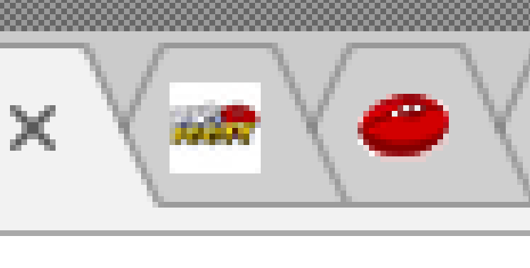
I don't get the search thing?On desktop and ipad.
Difficult to distinguish read threads on ipad and open threads also when doing a search (both), names come up but difficult to see shading on which to select.
View attachment 420988
View attachment 420989
The unread is in a different font and bolded - does it look a lot different on the screen?
Mac browsers seem to be messing with the font bolding. We will keep going until we work out how to allow for that.