- Moderator
- #126
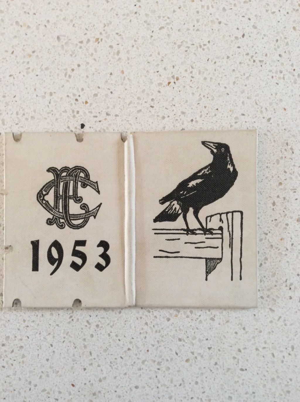
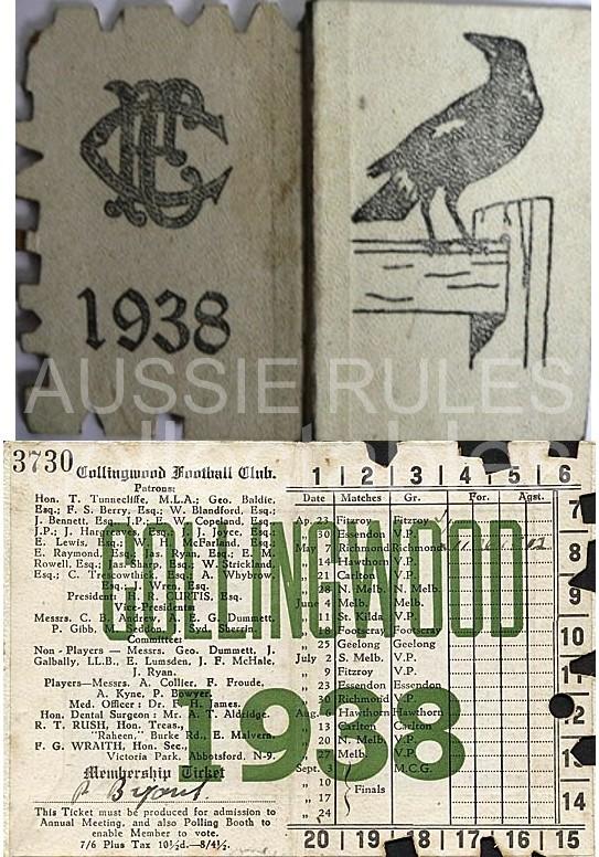
These dip s**t comments on the latest post are a good indicator of why nothing should be left to the supporters. Everyone screaming "it looks too much like Carlton" should be aware that A) it looks nothing like Carlton, three letters can be assembled in completely different ways as seen, and B) we've been using this monogram since at least the 1950s and I'm rapt it's being brought back in a permanent capacity.