


That second pic is interesting. On that one the CFC is clearly sublimated as it is on the women's, though the one in-store has it raised.
Navigation
Install the app
How to install the app on iOS
Follow along with the video below to see how to install our site as a web app on your home screen.
Note: This feature may not be available in some browsers.
More options
You are using an out of date browser. It may not display this or other websites correctly.
You should upgrade or use an alternative browser.
You should upgrade or use an alternative browser.
News New Jumpers For 2018 - All Changes In OP
- Thread starter Red Crow
- Start date
- Tagged users None
- Status
- Not open for further replies.
- Banned
- #2,702
Even before 2018 Nike was heat pressing on the Carlton monogram, it just had fake stitch on and looked more authentic
The new apparel manufacturer will just print it into the guernsey, and imo that is better than heat pressing it on
The new apparel manufacturer will just print it into the guernsey, and imo that is better than heat pressing it on
- Banned
- #2,703
looks heat pressed to meThat second pic is interesting. On that one the CFC is clearly sublimated as it is on the women's, though the one in-store has it raised.
looks heat pressed to me
Looking closely at the pics on Twitter the PI's appear to have a sublimated CFC (looks totally flat and you can see the grey 'shading'). It's utterly bizarre as they're selling raised-logo versions in the shop.
- Banned
- #2,705
Yeah I think you’re right. I think the monogram and the Nike tick are sublimated and the rest is heat pressed although now I’m confusedLooking closely at the pics on Twitter the PI's appear to have a sublimated CFC (looks totally flat and you can see the grey 'shading'). It's utterly bizarre as they're selling raised-logo versions in the shop.

http://www.aflphotos.com.au/galleri...n:AFL 2018 Portaits - Carlton&image_id=568185
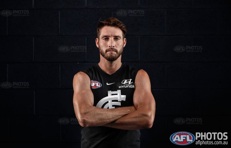
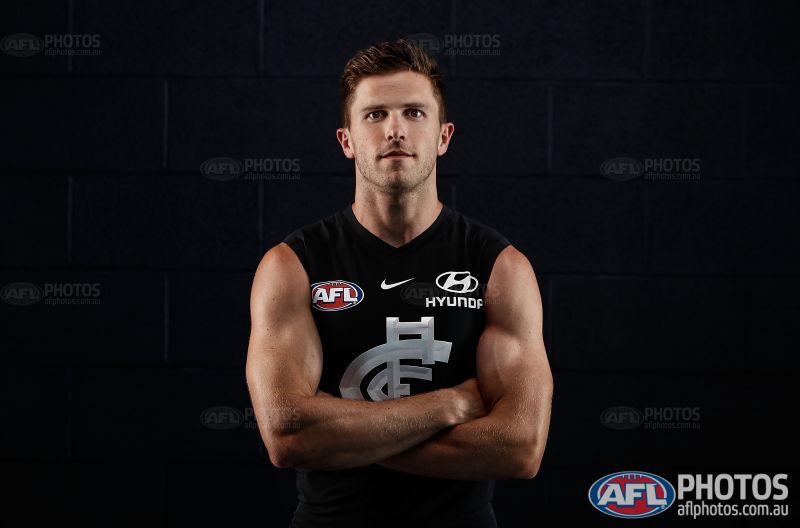
It looks to me like it's sublimated on Thomas (obvious grey) and raised on Murphy (seems to be a different fabric and catches the light the way it does in the shop). Why they'd create two versions is beyond me.
- Apr 30, 2015
- 13,618
- 24,444
- AFL Club
- West Coast
Dale Thomas is still playing?
It looks to me like it's sublimated on Thomas (obvious grey) and raised on Murphy (seems to be a different fabric and catches the light the way it does in the shop). Why they'd create two versions is beyond me.
- Banned
- #2,708
looking heat pressed here
So cheapo
So cheapo
New shorts have a white stripe. What happened to Mercury as the shorts sponsor?
- Sep 8, 2011
- 11,011
- 11,012
- AFL Club
- West Coast
Carlton should leave Nike now, that’s horrid version of a truly great guernsey
On iPhone using BigFooty.com mobile app
On iPhone using BigFooty.com mobile app
- Jul 9, 2010
- 24,163
- 26,536
- AFL Club
- Fremantle
There's two types of heat press in my opinion.
There's the style on soccer shirts, which are on player issues more than actual retails, and work because there's less friction/stitching and it looks pretty good.
And there's the style we see in the AFL where it's generally a last minute change. This one looks bad because it's always in a box (can't think of an example where it wasn't) and you get glossiness, a lack of integration, ugly colours etc etc.
These ones aren't in boxes, are they? They're the soccer style where everything is more like a sticker with the press ending directly around each shape. If so I'd say this is just easier for Nike as they use it for everything except NBA, and I'd assume that printing isn't done at the same place.
Klim
Brownlow Medallist
- Sep 17, 2013
- 12,532
- 10,363
- AFL Club
- Sydney
New shorts have a white stripe. What happened to Mercury as the shorts sponsor?
Carlton FC said:CUB is now the official beer and cider partner of the Carlton Football Club and Mercury Hard Cider will be the Blues’ official shorts partner for the remainder of the 2017 season.
There's two types of heat press in my opinion.
There's the style on soccer shirts, which are on player issues more than actual retails, and work because there's less friction/stitching and it looks pretty good.
And there's the style we see in the AFL where it's generally a last minute change. This one looks bad because it's always in a box (can't think of an example where it wasn't) and you get glossiness, a lack of integration, ugly colours etc etc.
These ones aren't in boxes, are they? They're the soccer style where everything is more like a sticker with the press ending directly around each shape. If so I'd say this is just easier for Nike as they use it for everything except NBA, and I'd assume that printing isn't done at the same place.
Yep, it's the same as the way the AIA is presented on the current Spurs shirt. Each individual letter in the sponsor/s is separate, not in a square block. I have no issue with it.
Just find it odd that some of the monograms don't seem to be raised on the PIs . Just saw the retails in Rebel and they're raised, same as in the Club shop.
The beveling on the CFC monogram is a terible look.
- Banned
- #2,715
Heat press dont last in AFL (a contact sport) can’t wait to see these stickers peeling off a few weeks into the seasonThere's two types of heat press in my opinion.
There's the style on soccer shirts, which are on player issues more than actual retails, and work because there's less friction/stitching and it looks pretty good.
And there's the style we see in the AFL where it's generally a last minute change. This one looks bad because it's always in a box (can't think of an example where it wasn't) and you get glossiness, a lack of integration, ugly colours etc etc.
These ones aren't in boxes, are they? They're the soccer style where everything is more like a sticker with the press ending directly around each shape. If so I'd say this is just easier for Nike as they use it for everything except NBA, and I'd assume that printing isn't done at the same place.
Jack Stevens
#2 Ticket Holder
That's true for rushed sponsor cover ups and grand final badges. This is different, this is more of an embossment than the plastic coverups we're used to seeing in the AFL.Heat press dont last in AFL (a contact sport) can’t wait to see these stickers peeling off a few weeks into the season
If anything this is a throwback to stitched on badges on woollen jumpers. Yeah sure, it's a bit unusual and full sublimation works well for a contact sport like Aussie Rules, but I think this is Nike trying something different rather than cost cutting.
That said, I could be wrong. I'll hold judgement until we get a better look at them in action, or someone gets their hands on a PI.
Mero
Norm Smith Medallist
Hanlon's razor :- Never attribute to malice that which is adequately explained by stupidity.
Heardy_101
LET'S GO BRANDON
Crows tried to rig their pole and failed. So they quietly stuck with the same design.People were raving about the Prospect of the 90s kit returning as the clash here, and it was open shock when people found out the homer was leading. We actually had the dumb situation where the north board was voting for the homer and people on here were voting 90's
And it was the same with the crows when they had their vote
Bad design is bad design
- Oct 27, 2016
- 5,948
- 10,672
- AFL Club
- Collingwood

- Other Teams
- Packers, Raptors, Renegades
To me it looks alright but by no means is it necessary.
Fizzler
BBTB
- Dec 26, 2013
- 12,765
- 16,359
- AFL Club
- Port Adelaide
- Other Teams
- OKC, Coburg, Werribee, Storm, QPR
Is the AFL logo heat pressed on Carlton’s jumpers? If so I think that should be the final straw and they should leave Nike.
- Sep 8, 2011
- 11,011
- 11,012
- AFL Club
- West Coast
I wonder how many washes the heat pressed monogram lasts on the retail versions...
On iPhone using BigFooty.com mobile app
On iPhone using BigFooty.com mobile app
- Banned
- #2,722
Nike is leaving AFL. If it were up to Carlton they’d stay with em foreverIs the AFL logo heat pressed on Carlton’s jumpers? If so I think that should be the final straw and they should leave Nike.
- May 25, 2009
- 4,014
- 2,765
- AFL Club
- Port Adelaide
Where did you hear that?Nike is leaving AFL.
- Jul 9, 2010
- 24,163
- 26,536
- AFL Club
- Fremantle
The main issue with heat pressing is through washing and general wear rather than tackling and contests.
I remember years ago, I got the Arsenal strip for the first season at Emirates (one of our best ever) and the 'Fly Emirates' started cracking within a few days, I don't know if I even washed it more than once or what. The club put something out on the website six months later and sent out a replacement to everyone (with the new fonts and patches; this was when it went from the sort of gothic font to the bubbly sort) and gave me a gift voucher to cover shipping.
And that was Nike. So I raise Mero's razor and mention Murphy's Law.
Which Carlton are very well used to.
Marc Murphy's law: if a number one pick can turn out pretty average, it will.
- Status
- Not open for further replies.
Similar threads
- Replies
- 3
- Views
- 609
- Replies
- 8
- Views
- 560
- Replies
- 175
- Views
- 14K
