

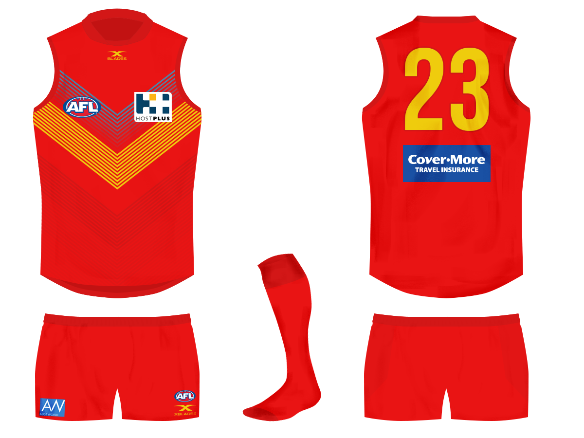
sort of like this but with white instead of blue?
Can we take out the logo? I reckon these would be a nice guernsey
Follow along with the video below to see how to install our site as a web app on your home screen.
Note: This feature may not be available in some browsers.
LIVE: Richmond v Melbourne - 7:25PM Wed
Squiggle tips Demons at 77% chance -- What's your tip? -- Team line-ups »
sort of like this but with white instead of blue?
Can we take out the logo? I reckon these would be a nice guernsey
Yeah maybe, I guess it looks different on. May wearing the one he’s got on I think it looks good.sort of like this but with white instead of blue?
Phark off the blue and invert the colours, mainly gold guernsey make the red V solidsort of like this but with white instead of blue?
That could be interestingPhark off the blue and invert the colours, mainly gold guernsey make the red V solid
Phark off the blue and invert the colours, mainly gold guernsey make the red V solid

I'm not sure why that looks less s**t than the other gold mockups I've seen, but I can get on board with this. Looks great.
Exactly as I pictured it, My Man well done
i don't think we're far off. the base is there, just need slight tweaks. a slight colour adjustment and revamped logo would definitely lead to a better guernsey. ditch one of the primary colours (probably blue, since it doesn't even feature on our home guernsey - would then lead to a new song since we couldn't sing "red gold and blue" anymore), and either modernise the logo or get some form of monogram involved to replace the sticker logo on the front of our guernsey. i reckon the club is too scared to do anything about it too soon into our history, but it needs to happen.Any news of a rebrand still happening? GC still has potential to be a strong brand just needs:
- better guernsey,
- A new song
- New logo
- Colours adjustment?
Not sure whether a major rebrand or just a minor rebrand is what’s required.
Like that a lotAnother bigfooty design. Probably my favourite so far:
View attachment 566806
YukAnother bigfooty design. Probably my favourite so far:
View attachment 566806
Another bigfooty design. Probably my favourite so far:
View attachment 566806
Correct. GC's red and yellow just doesn't work for me. Not necessarily burgundy, but a darker red definitely needed.I feel like that the Suns guernsey needs more of a burgundy red? The best selling strips seem to incorporate darker colours.
Don’t mind seeing itI feel like that the Suns guernsey needs more of a burgundy red? The best selling strips seem to incorporate darker colours.
Here you goI feel like that the Suns guernsey needs more of a burgundy red? The best selling strips seem to incorporate darker colours.

Correct. GC's red and yellow just doesn't work for me. Not necessarily burgundy, but a darker red definitely needed.
Back to Gold Coast, I honestly don't see why they can't rip off this design, but where the Bulldogs have their hoops placed.
Great colours that work well with the white.

Good pickup, actually looks really good!

Yes, but it's more traditional than what you have, it addresses the darker shades of red and yellow and it looks like a footy jumper, not a training jumper.It’s like the doggies stripes but
no hoops, chevrons, sash or stripes really narrows it down with the traditional designs!We are called the suns. We should be yellow or gold as main colour IMO. The eagles and tigers look great when wearing their clash jumpers and we would too if it was our main jumper.
We can keep our red and blue as our other colours. Darken the red but not to maroon. And darken the blue perhaps (altho i like sky blue and think our clash should be mostly sky blue)
To the design. Well. I like traditional designs also. But not hoops. Not chevrons and not a sash or stripes.
I think a twin vertical stripe design - off centre.
So all yellow base.
And the twin stripes of sky blue and dark red.
Clash would be sky blue with twin stripes of yellow and dark red.
Kinda like this but with the twin stripes joined ( no gap).no hoops, chevrons, sash or stripes really narrows it down with the traditional designs!


