Discussion NAFL Jumpers That Never Were

Remove this Banner Ad

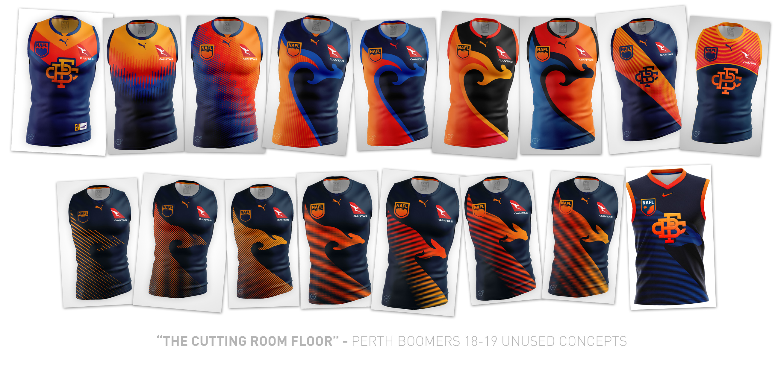
Here's the two other designs which were battling it out for my main design element.

Was pretty tough picking between my current one and the gradient v below but I went with what I've got not mainly because I wanted a cleaner look. Depending on how I do this season I might bring the bottom one back.

upload_2018-10-28_21-22-33.png

upload_2018-10-28_21-22-55.png
 
30655172827_2e486c6e44_o.jpg


The design process started pretty immediately during the finals series last season, after realising I wasn't going to be in the top four designs for the season, and I was feeling pretty dejected about the design I'd put forward. Really wanted to change things up so ditched the purple and gold and went down the Ochre-style route. It was a tough balancing act throughout the design process, I wanted a really unique design that wasn't a complete rip-off of the Ochre.

Hit a bit of a road block at the seventh design (the wave-roo), and thought the roo shape wasn't the path to go down. After a while of playing around with sash elements and the monogram, I went back to the roo shape idea, but with a gradient line/sash idea in mind, similar to Nike's efforts for the 2018 Poland football kit. After weeks of tinkering, ended up with the design that you see in the 18/19 NAFL competition.

So, just for anyone interested, this is how most of my designs come to fruition - drafting from up to six months out from the competition, and just trial and error until something sticks.
How'd you create the shape for the roo in the end?
 

Log in to remove this ad.

How'd you create the shape for the roo in the end?

Manually using Illustrator. There's a whoooooooole other cutting room floor of the roo shape development. Took so long to come up with a sleek shape I was happy with, and a head that looked "not-soft".
 
Manually using Illustrator. There's a whoooooooole other cutting room floor of the roo shape development. Took so long to come up with a sleek shape I was happy with, and a head that looked "not-soft".
The original roo looks somewhat like an indigenous design of a Kangaroo (#6 in particular with the colours) which could've been good for a community kit :)
 
The original roo looks somewhat like an indigenous design of a Kangaroo (#6 in particular with the colours) which could've been good for a community kit :)

Fair point but also probably something I wouldn’t want to touch. I’m not indigenous so I don’t really have the right to make artwork and say it’s an indigenous design.
 
Just realised I forgot about these as well! These were me hitting a point of “f**k, now I’ve literally just remade the Ochre with a kangaroo”.

The roo shape remained though, and ultimately became the basis for the shape in the final design, as well as the basic colour set and colour balance.

2F0360F9-A288-4A53-AFA8-55D88D39952C.jpeg
 
Finally found the two drawings I did at school the day after I submitted my NAFL bid. Was cleaning out my locker and bam.

46002422_1240094619473840_3380132703536939008_n.jpg 45885794_351016415465850_69391544628543488_n.jpg

I was keen on keeping that chevron design from the very start it was just a matter of making it not look generic and add some spice. Don't be surprised if some of these designs make a comeback in the next few season of NAFLR
 
Last edited:
Finally found the two drawings I did at school the day after I submitted my NAFL bid

View attachment 583591 View attachment 583592

I was keen on keeping that chevron design from the very start it was just a matter of making it not look generic and add some spice. Don't be surprised if some of these designs make a comeback in the next few season of NAFLR

Glad to know I'm not the only one who scribbles down jumper designs at school - I've done that for quite a few designs. I'm sure some of the older members of the board have done the same thing at work?
 
45894549_272932900079186_7000920417602895872_n.jpg

Like Nato and Sparkle, I too drew my concept for Ringwood at school on some paper. I initially wanted to go for a Melbourne City-type identity and use some low key and effective design elements however I guess I couldn't come up with something.
I then started scribbling the shape the fire of a rocket has, turned in to a chevron and the rest is history...
 

(Log in to remove this ad.)

Glad to know I'm not the only one who scribbles down jumper designs at school - I've done that for quite a few designs. I'm sure some of the older members of the board have done the same thing at work?
I keep my old school slate handy;). I worked on the Volcanoes Away design on the agenda during a particularly boring meeting earlier this year
 
Glad to know I'm not the only one who scribbles down jumper designs at school - I've done that for quite a few designs. I'm sure some of the older members of the board have done the same thing at work?
Sometimes when I'm out and don't have any paper and I've come up with something I'll just get Snapchat out and squiggle the basic concept so I don't forget my idea. I went with this process for my 2016/17 Alice Springs Pirates home jumper that would go on to win the NAFL Reserves, so it's definitely worthwhile to just get the basic concept down so you can build on it in the future. I find that the level of success that I have in competitions is in proportion to the amount of time I spend on designing the identity. For that Reserves premiership and the Can-Am title, I think I went through three or four templates and basic designs before I finally got to what I wanted. It's certainly rewarding if you start with those early sketches and rough outlines and develop them further.
 
QC1RQv5.png


Now that the Community Rounds are out the way, here are two unused concepts from the cutting room floor. Always had the idea of the pride kangaroo from the moment Community Round was decided on, but honestly expected more teams to go down that route and wanted to do something unique. Still think I made the right call, tbh.
I reckon your Community Round jumper is an all time great. Colours looked fantastic.
 
draft home.png

Reasons for rejection: too similar to last season and probably too black.

I was a bit lost, so I looked back at my first Busso design with the jetty/prison bars, combined the two and ended up with what was presented this season.

1st.png
 
I had 2 unused concepts this year, with a fair bit of concept development work on the way that I didn't capture.

I did originally do a pride flag hypno for the community, but I thought it was a bit much and moved away from my core identity a bit too much

cnSOX0L.jpg


I also tried to work a W for Waikato into my home, which as you can so was only ever a quick paintbrush test. Still unsure whether I should have gone further with this idea, I thought it became a bit busy but it might have worked.

uaH7Lu5.jpg
 

Remove this Banner Ad

Back
Top