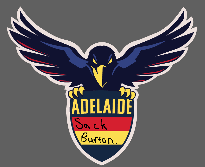
Adelaide Logo Redesign: 2018

Which logo do you prefer?


  • Total voters
    92
  • Poll closed .

Remove this Banner Ad

I like the style a lot.

Whenever I come back to the thread there's something about it I don't like at first glance though.

I think it's the size of the head in relation to the wings. But it may also be the claws. Dunno. I'd be interested to see a slightly smaller head or larger wings. It's a bit stumpy or something. It's more obvious on my phone than at larger size.

There's a lot to like though, one of the best efforts I've seen.
Thanks for the feedback - I do see where you’re coming from, especially on the phone. I’ll have a go at balancing the head with the wings a bit more (although it may throw everything off balance even more!). The ‘stumpy’ effect might be the shield, which is still pretty underdeveloped.
 

Log in to remove this ad.

Thanks for the feedback - I do see where you’re coming from, especially on the phone. I’ll have a go at balancing the head with the wings a bit more (although it may throw everything off balance even more!). The ‘stumpy’ effect might be the shield, which is still pretty underdeveloped.
I thought that before the shield, and yeah I did figure it may put everything off balance.

I think the large head makes my brain think I'm looking at something that's meant to be cute, or at least aimed at kids. Whereas the style is quite hard.
 
I like the style a lot.

Whenever I come back to the thread there's something about it I don't like at first glance though.

I think it's the size of the head in relation to the wings. But it may also be the claws. Dunno. I'd be interested to see a slightly smaller head or larger wings. It's a bit stumpy or something. It's more obvious on my phone than at larger size.

There's a lot to like though, one of the best efforts I've seen.
Yeah I see what you’re saying about the head now, if that could be a bit smaller it’ll be pretty much spot on for me.

Love the work you do in the the thread by the way Dank, great stuff.
 
Yeah I see what you’re saying about the head now, if that could be a bit smaller it’ll be pretty much spot on for me.

Love the work you do in the the thread by the way Dank, great stuff.
I just did a hatchet job which I wont post because its hatchet job, and its danks design but I think shrinking the head works.

Also Dank Academy matching the style of claws with the beak will also help.

And thats enough arm chair critiquing for one day I reckon. Sorry!
 
I just did a hatchet job which I wont post because its hatchet job, and its danks design but I think shrinking the head works.

Also Dank Academy matching the style of claws with the beak will also help.

And thats enough arm chair critiquing for one day I reckon. Sorry!
Haha that’s great - thanks for the critiquing! Hopefully can nail this sucker
 
Looking much better. Would be cool to see our heritage crest being used instead of the plain shield and update it to follow the same style you've used for the crow.
Cheers. I’d be keen to update the heritage shield - no way in hell that sloppy monogram is staying on there, though!
 

(Log in to remove this ad.)

I said it the other night so I need to take back my shield again....
But somebody get this man a shield.
Heck, I could see the Crows running out through this on a super large and impressive banner. It's not a logo, it's a piece of art. Have you tired showing you designs to the club>
Haha thanks, much appreciated! In fairness the logo has been a group effort in terms of input and ideas, though... just shows how effective Big Footy can be when people give decent, thoughtful feedback and ideas *optimistic music plays*

I haven't sent anything to the club, actually... would be keen to share them, just need to feel like they're 'right', although I now feel comfortable that this is better than the current logo.

Great work so far, this is way better than the current logo.

Hope you don't mind but i made a few minor changes to your design that I think makes it ready to send to the club

x5ukAE3.png
 
Looking good

The crow looks lot sharper now which improves it a lot.

Am I the only one who sees a middle parted haircut similar to the old bowl cut many of us would have sported back in school?

Personally id also change the blue highlight in the tings to a darker colour or not at all
That middle part is a throwback to the club's 90s roots ;)
Yeah I'm still not convinced on the state of those parts either, but they definitely needs to be there to give 'shape' to the wings.
Thanks for the feedback
 
Looking great but I think theres something not right with the position of the head? I cant quite put my finger on it but it looks a touch like a kookaburra, a bit stumpy.
 
Back
Top