

- Jun 18, 2016
- 51,637
- 98,985
- AFL Club
- West Coast
- Other Teams
- Perth Scorchers
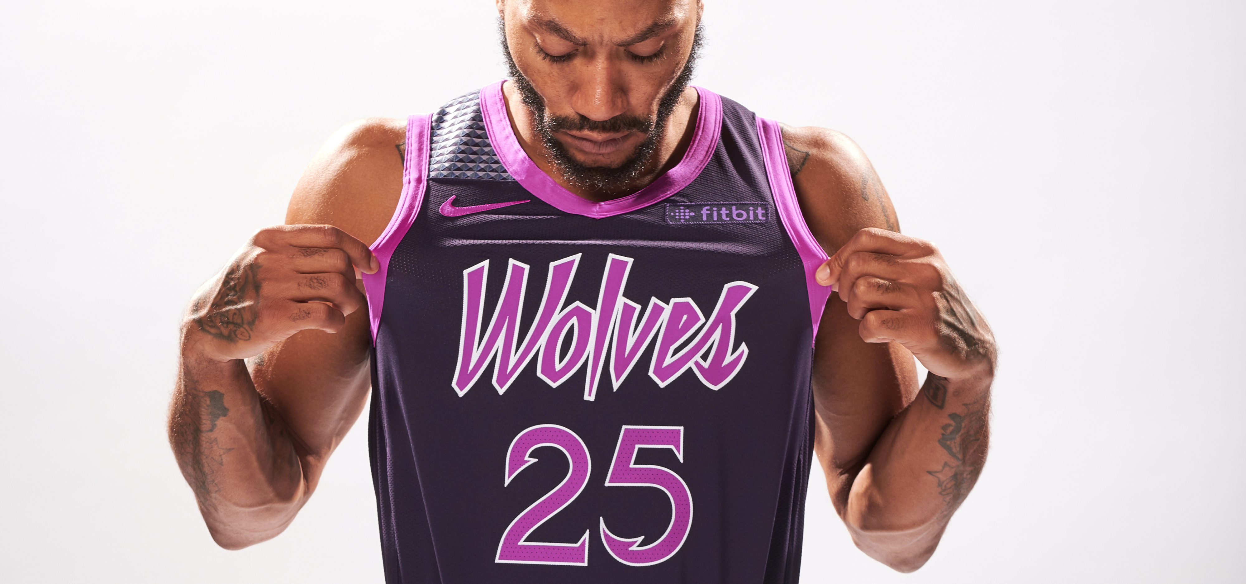
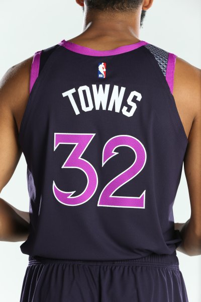
Minnesota Timberwolves Prince-inspired City jersey

Follow along with the video below to see how to install our site as a web app on your home screen.
Note: This feature may not be available in some browsers.
LIVE: Richmond v Melbourne - 7:25PM Wed
Squiggle tips Demons at 77% chance -- What's your tip? -- Team line-ups »

Yeah and black is so over used with some of the jerseys.I'd like to see some more colour in the Chicago and Detroit jerseys but the base designs tie very nicely into the theme. The rainbow is seriously the best thing the Nuggets ever did - works with any colour!
I don't mind it so much with Detroit but red racing stripes on navy would have looked brilliant. As for Chicago, go the sky, red and white. It's the damn flag!Yeah and black is so over used with some of the jerseys.
I agree. Should embrace Pink be damned if it is percieved as a 'female colour'. No other professional sports team (in the US atleast) has pink in it so it would really be unique. White with pink and blue for the home, pink with white and blue for away, and something like their city jersey for alternate. Its a great colour scheme, hope they embrace it more.I don't really rate any of the city jerseys. A lot just don't work or they're really really boring. I don't mind Milwaukee's because it's pretty unique but it's not especially nice looking. It's a shame because the Utah Jazz one was great.
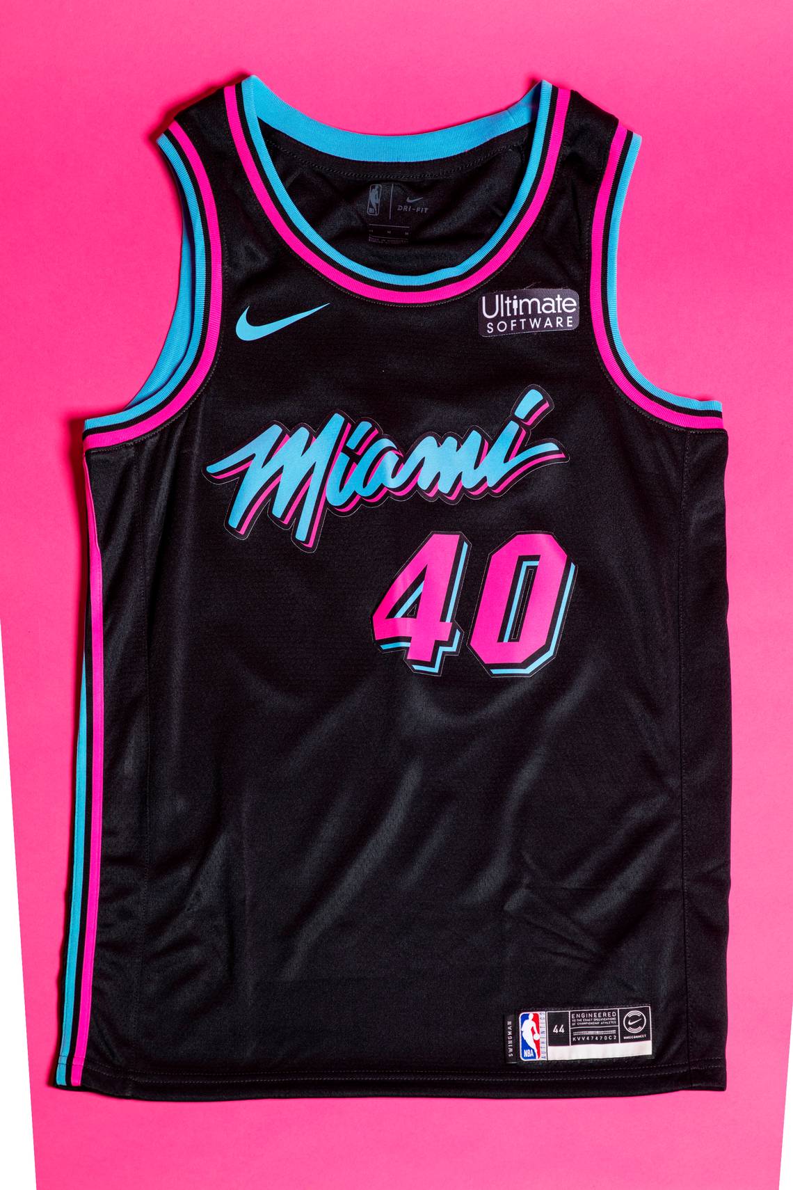
Miami need to rebrand. I know the old typeface, the black with red singlet is associated with success but I always thought it looked so bogan. People love the new vice 80s look and it's really unique. Plus there's a simple home, road colourway and plenty of options with alternatives. It makes a heap of sense.
Atlanta need to work off white, yellow, and red. The Dallas Mavericks need to stop looking like a car brand and bring back the classic green and blue logo and unis. Houston Rockets have a shitty lame look and logo. Magic, Thunder, and Kings all look plain bad or plain dull.
Can't wait for the Raptors to release their city jersey. Last years one was a bit meh but i really love the black and gold. Hopefully the can do something a bit more interesting.
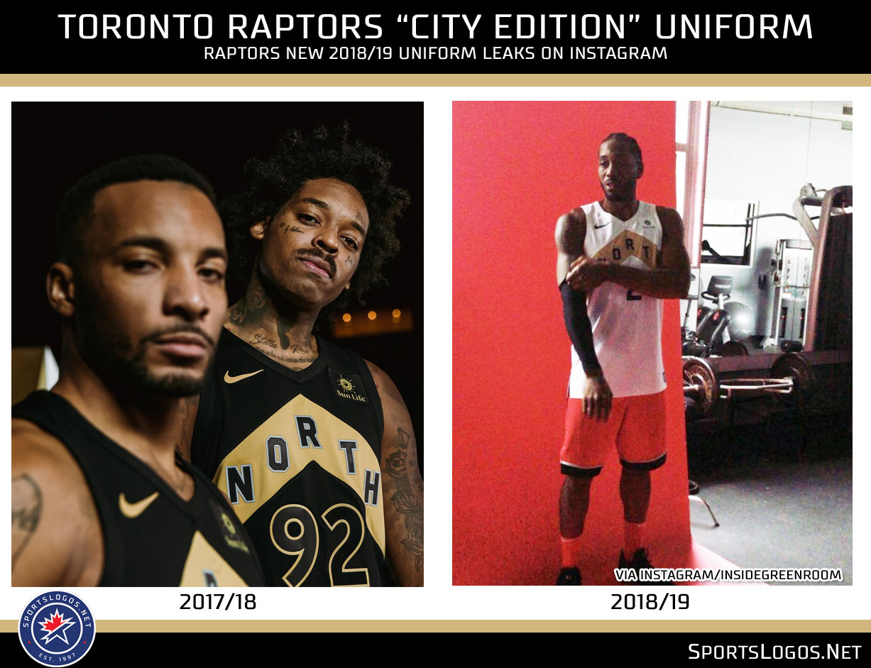
Oh that looks nice cant wait to see that red and white chevron one.It's the same design as last year but with a white base instead of black. Their "Earned" jersey will be red base with a white chevron.


Contrary to popular opinion, I rate the Clippers City Uniform as the best in the NBA. It’s the Clippers best uniform in recent memory, and arguably in franchise history. Surprised that neither LA team has used a plain LA word mark, and it’s probably bold that the (historically) weaker team from LA was the first to do it, but it’s big and strong and looks great.
View attachment 583586
Honouring the 1984 Olympic Team which was the Clippers first season in LA from memory.
View attachment 583587 View attachment 583588
I really like the Miami one (I have it at #2 FWIW) but something about the Utah one just doesn’t do it for me. Maybe it’s the shorts, maybe it’s them beating OKC in the first round 4-2 last season, I don’t know.I’m definitely a fan - not sure I’d say it’s the best when Miami and Utah are spitting fire but it’s definitely up there. Love the inspiration and how they’ve executed it, very classy.
View attachment 584956
To be launched tomorrow
EDIT: I'm not 100% certain this is the logo but I'm relatively confident it is. SE Melbourne Phoenix is definitely the name
Just don’t get why they can’t be Melbourne Phoenix. Not like melbunited have copyright over Melbourne


