Workshop Cricket Kit Designs/Discussion

Remove this Banner Ad

Ironically, Kmart now sells Big Bash licenced gear stuff

Big coup for Kmart actually. I think they hit there stride in the late '90s - early '00s and lost a lot of that when they ditched the name brands at the start of the '10s. Getting into the BBL is a great start at hitting a perfect mix between trusted brands and affordable prices
 

Log in to remove this ad.

Big coup for Kmart actually. I think they hit there stride in the late '90s - early '00s and lost a lot of that when they ditched the name brands at the start of the '10s. Getting into the BBL is a great start at hitting a perfect mix between trusted brands and affordable prices
It isn't selling the onfield or off field gear it is more so supporter ranges like what the NBL does at Kmart.
 
It isn't selling the onfield or off field gear it is more so supporter ranges like what the NBL does at Kmart.

Yes, but getting an actual brand name like the BBL is big. I'd be much more keen to buy BBL supporter gear from Kmart (like what they used to do for the AFL 15-20 years ago) rather than their homebrand Active & Co.
 
I agree that there has been better jerseys than this years, but I wouldn't go as far as saying that they're all templatey crap. There's a standardised feel across the league because of its size and the fact that only one manufacturer is used, but all the designs are pretty unique.
You can't on one hand say there is a 'standardised feel' and then in the same sentence claim that the current designs are 'pretty unique'. Sure the league is small and there is only one manufacturer, but it was the same back in BBL 1 but the teams all had distinctly different designs that weren't all "just slap the logo on the front below the sponsor".

I'd start saying they're all the same if there was one design that's been recoloured, although each team gives the jersey their own feel
Look at the three bbl 08 jerseys that Nato posted on the last page and explain to me how they all have their own feel and aren't just one design that has been re coloured.

BBL01 uniforms were probably the worst sports uniforms I have ever seen in my opinion. They looked like cheaply made, knock-offs you'd buy for $15 at Kmart. The Stars one especially oh God.
I simply don't get how you can draw that conclusion, they are decent designs for the Big Bash. T20 is meant to be loud, exciting, in your face stuff and the early BBL team designs reflect that. The shirts at the moment are quite conservative in comparison and lack character, you're not designing for a team with history, they are new franchises playing a game that is just a couple of years older than them.

As for being cheaply made, I think that they should really be let off the hook for the heat pressed logos for the sponsors (the franchise logos were sublimated) given that these clubs were brand new and just signing up sponsors late in the piece. The actual fabric isn't too bad, it has a nice stretch to it like an authentic sports jersey would.
 
You can't on one hand say there is a 'standardised feel' and then in the same sentence claim that the current designs are 'pretty unique'. Sure the league is small and there is only one manufacturer, but it was the same back in BBL 1 but the teams all had distinctly different designs that weren't all "just slap the logo on the front below the sponsor".


Look at the three bbl 08 jerseys that Nato posted on the last page and explain to me how they all have their own feel and aren't just one design that has been re coloured.

There is a standardised feel because they all have the same template, and the side panels and sleeves are always black, what makes the designs unique is what happens after that. Each team adds something of their own to the front of the jersey - the Renegades have the R on a camouflage style red, the Hurricanes take a minimalist approach by using a dark version of their logo on a light background, and the Thunder don't use their logo at all, opting for a light to dark gradient.

I would be prepared to call the jerseys recolours if they were just simple templates like this in club colours, but they're not. There's something different with every one

Screen Shot 2018-12-14 at 5.27.35 pm.png
 
There is a standardised feel because they all have the same template, and the side panels and sleeves are always black,
yes, that's right.

what makes the designs unique is what happens after that. Each team adds something of their own to the front of the jersey - the Renegades have the R on a camouflage style red, the Hurricanes take a minimalist approach by using a dark version of their logo on a light background, and the Thunder don't use their logo at all, opting for a light to dark gradient.
I mean, I wouldn't exactly call these logo applications (or lack thereof) 'pretty unique' when you look at the different designs that came before them.

I would be prepared to call the jerseys recolours if they were just simple templates like this in club colours, but they're not. There's something different with every one
They are simple templates (as you have stated in the first part of your post) and they all are differentiated by their franchise colour and whether they have slapped their logo on the front of the shirt and if there is a subtle pattern behind it. Sounds pretty unique to me!
 
BBL01 uniforms were probably the worst sports uniforms I have ever seen in my opinion. They looked like cheaply made, knock-offs you'd buy for $15 at Kmart. The Stars one especially oh God.
141952.jpg

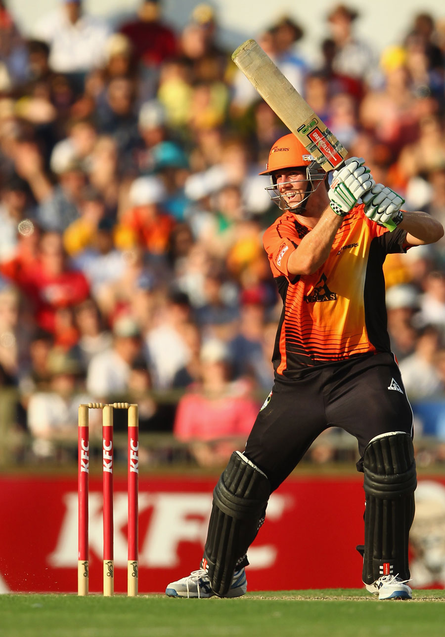
Never. Diss. The. Spikes.

Also how about that Gray Nicholls Evo Strike?
 
BBL01 uniforms were probably the worst sports uniforms I have ever seen in my opinion. They looked like cheaply made, knock-offs you'd buy for $15 at Kmart. The Stars one especially oh God.

3AF05F96-50F3-400C-8931-8FF6664EA97F.jpeg

your opinion is wrong and you should feel bad.
 
b8f43cf41f0894280bd3b6a5a54ecbb5.jpg

Also I have this version of the shirt from the 2013 CLT20. Jealous?
140822_CLT20.ashx

I would be, but aside from having an OG BBL01 jersey, I also have an extremely limited edition heritage jersey from last season.

017B5319-42CA-4E80-B5A0-C2D90C74108E.jpeg
 

(Log in to remove this ad.)

BBL kits are awful. Every team just follows the same single colour plus black/grey formula without fail. The traditional state team colour combos leave them for dead. Design elements generally don’t go too far beyond a big tacky logo either.

Even that Scorchers shirt looks a bit off. It’s definitely the best of a bad bunch (by a long way) but the raglan sleeves cut into the design way too much and having no collar on a cricket shirt will never look right in my eyes. But at least it’s trying something beyond “I’m green! You’re purple!” with the spikes and Ochre vibes.
 
I simply don't get how you can draw that conclusion, they are decent designs for the Big Bash. T20 is meant to be loud, exciting, in your face stuff and the early BBL team designs reflect that. The shirts at the moment are quite conservative in comparison and lack character, you're not designing for a team with history, they are new franchises playing a game that is just a couple of years older than them.
It's just personal opinion, beauty is in the eye of the beholder. I'm just comparing the uniforms of BBL01 to now and it's clear to me that there is a big quality jump. Now I'll go back a bit on what I said, not ALL the uniforms were completely horrible. The Scorchers one was probably the best of the bunch, but if you look at Hobart's, I think they had a black collar but white sides? Idk something like that it just seemed like they were rushed which they probably were and that's not their fault. So just summing up, it's more or a disdain for the presentation more than the designs.
 
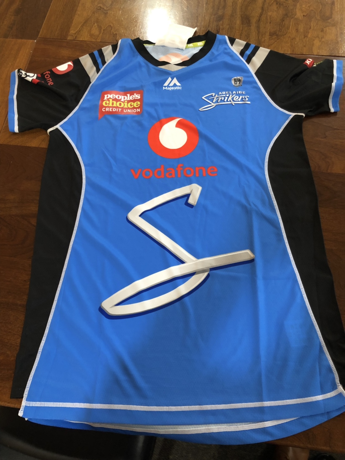
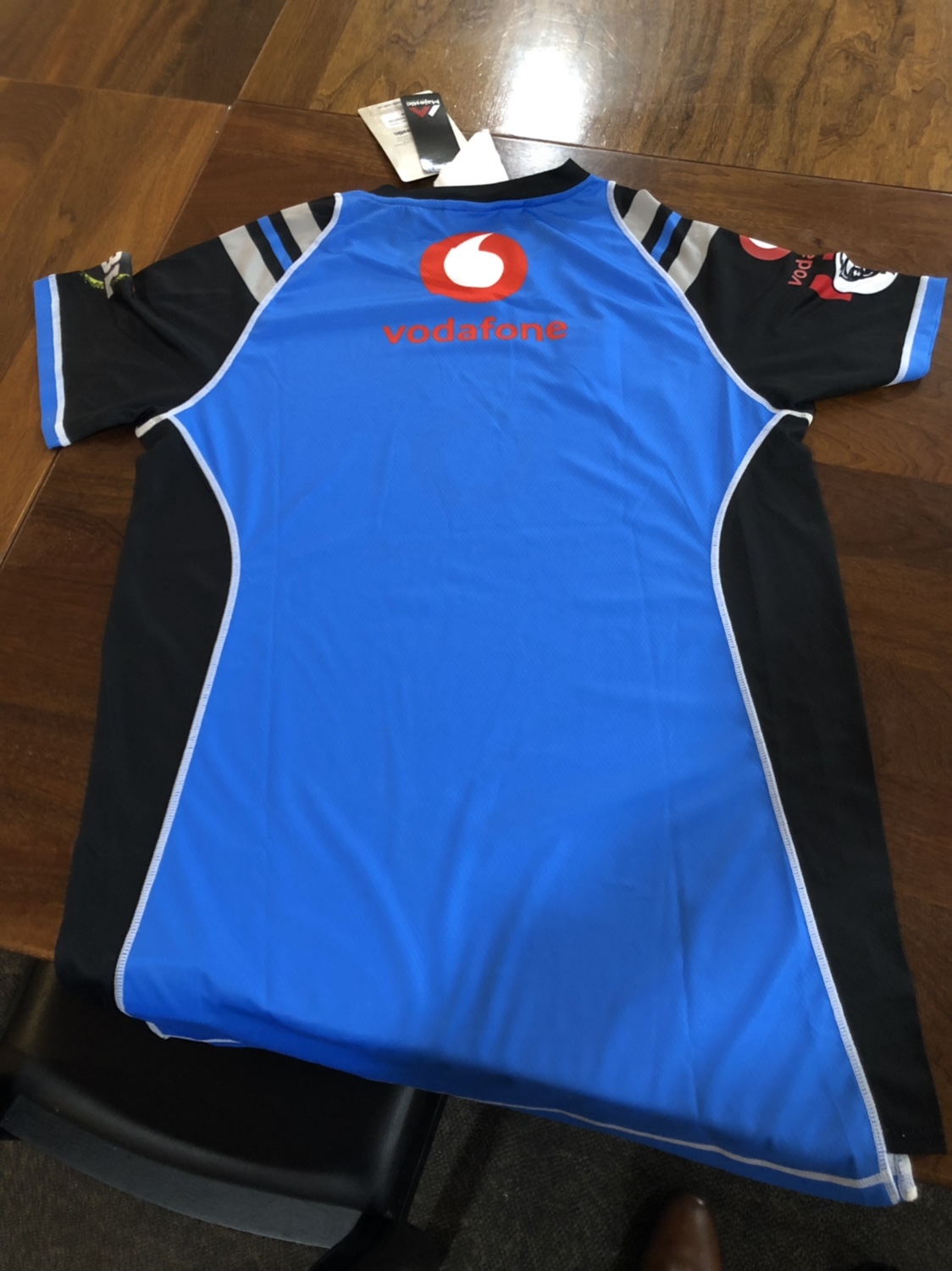
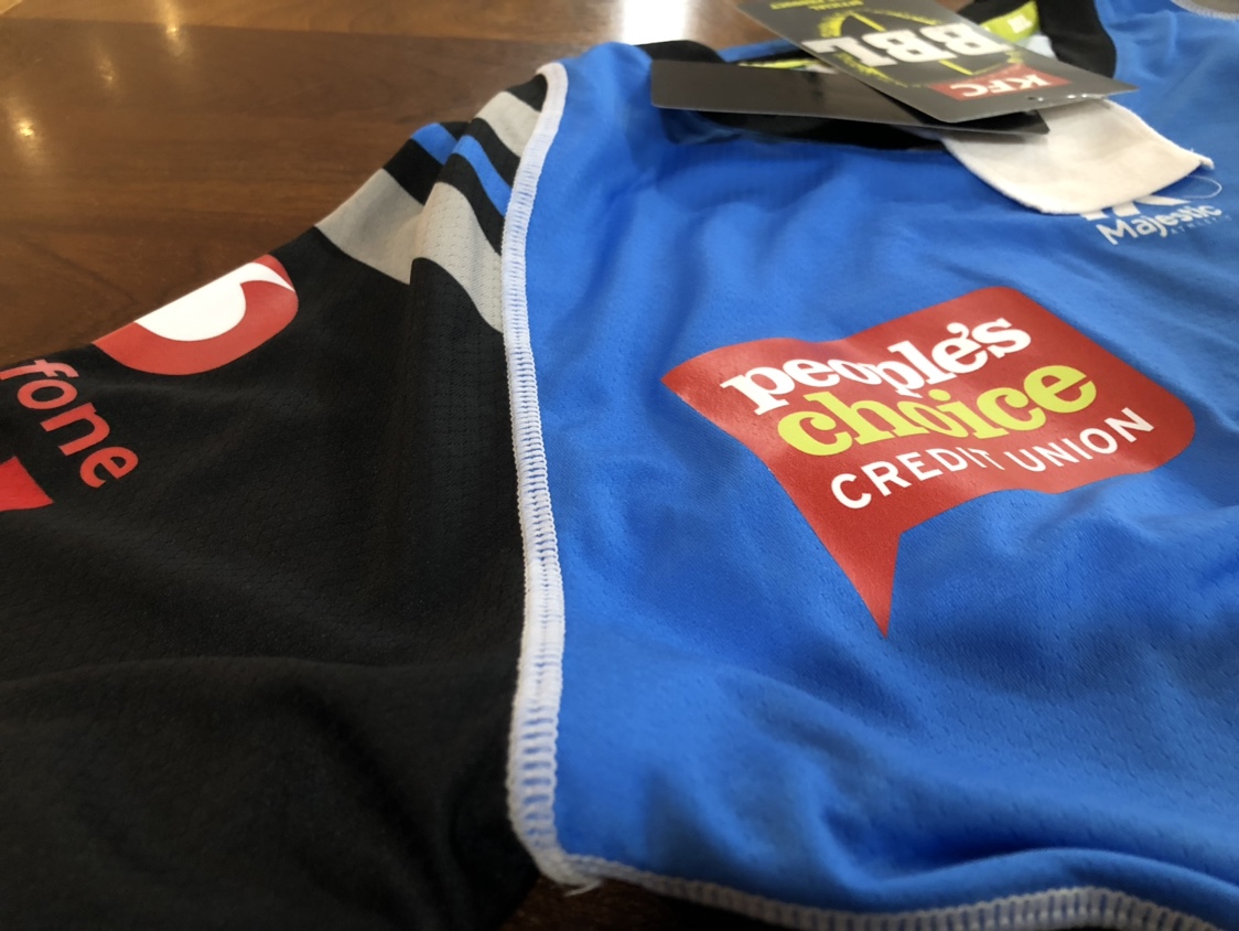
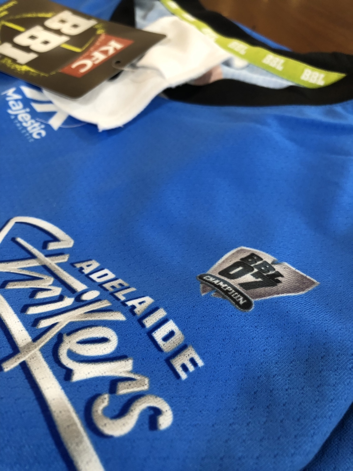
Got a player issued Strikers shirt for anyone interested in taking a closer look.

Bit bizzare that some of the logos are sublimated and some are heat pressed. Especially that the front Vodafone is sublimated but the sleeve is heat pressed.

GPS pocket looks like it would bump around a bit because it’s a flap, not secured to the shirt.

Do dig the small 07 premiers badge tho

e59d598b176614fb51220bf9412847fa.jpg

1324cdecf836c72ef864af9abe793640.jpg
5909b564876c1b1cd836b54d2676fc07.jpg
1ec9c9f540110d579e0adf2e7b1fa6a1.jpg
The way I see it is that with this season sponsors being added to the sleeves, the Strikers were hoping/planning for a separate sponsor to come on board as a sleeve sponsor but that never happened and last minute, Vodafone decided to chip in and come to the party as a sleeve sponsor as well. That would have been after the shirts were manufactered hence why the Vodafone sleeve sponsor and People's Choice sponsor are both heat pressed.
 
Got a player issued Strikers shirt for anyone interested in taking a closer look.

Bit bizzare that some of the logos are sublimated and some are heat pressed. Especially that the front Vodafone is sublimated but the sleeve is heat pressed.

GPS pocket looks like it would bump around a bit because it’s a flap, not secured to the shirt.

Do dig the small 07 premiers badge tho

e59d598b176614fb51220bf9412847fa.jpg

1324cdecf836c72ef864af9abe793640.jpg
5909b564876c1b1cd836b54d2676fc07.jpg
1ec9c9f540110d579e0adf2e7b1fa6a1.jpg
Got a second one of those?
 
Got a player issued Strikers shirt for anyone interested in taking a closer look.

Bit bizzare that some of the logos are sublimated and some are heat pressed. Especially that the front Vodafone is sublimated but the sleeve is heat pressed.

GPS pocket looks like it would bump around a bit because it’s a flap, not secured to the shirt.

Do dig the small 07 premiers badge tho

e59d598b176614fb51220bf9412847fa.jpg

1324cdecf836c72ef864af9abe793640.jpg
5909b564876c1b1cd836b54d2676fc07.jpg
1ec9c9f540110d579e0adf2e7b1fa6a1.jpg

I'm still curious why Vodafone went with the red logo rather than the white. Will be interesting to see how well it looks on TV tonight, but I would have thought the white would have both made the logo stand out more and fit the aesthetic of the Strikers jersey much better.

Also, is there much difference between a retail and a PI cricket (especially BBL) jersey? The retail BBL|08 Renegades jersey I bought and have been wearing looks quite similar in terms of stitching and material
 

Remove this Banner Ad

Back
Top