- Apr 30, 2015
- 13,616
- 24,442
- AFL Club
- West Coast
A win's a win I guess.If the Docker supporters can muster enough votes for WCE, this might be their Grand Final for 2019.
Follow along with the video below to see how to install our site as a web app on your home screen.
Note: This feature may not be available in some browsers.
A win's a win I guess.If the Docker supporters can muster enough votes for WCE, this might be their Grand Final for 2019.
Dockers jumper is a bit of a mess as I do not even identify a singular look of this jumper when I even think of them.
I'm with you. Freo's rebrand was a success, though I do miss the anchor being incorporated into the design. The red and green elements made it too busy.Our old one was a mess, especially changing the away jumper to a different garish design every year, but I don't know how anyone could consider our new jumper anything but simple and sleek.
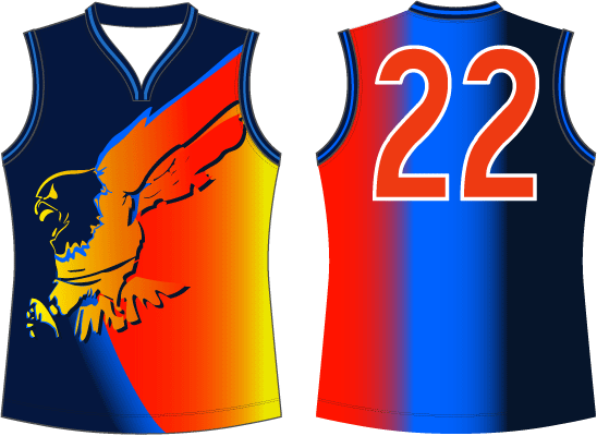
Even Jako hated it.Too young to remember these?
View attachment 617390
It was so strange, I was living overseas at the time. When I left the eagles had a good looking jumper and then I tune in to watch some highlights and they are wearing a rainbow... why they changed to that I’ll never know. Was it just 1 season?Even Jako hated it.
It was a couple I think. That was the away jumper, with the tri-panel as the home. No wings jumper at allIt was so strange, I was living overseas at the time. When I left the eagles had a good looking jumper and then I tune in to watch some highlights and they are wearing a rainbow... why they changed to that I’ll never know. Was it just 1 season?
No doubt some young marketing guru telling the board “this is what the young kids want.” The same marketing gurus who had the final say on the suns and giants jumpers.It was a couple I think. That was the away jumper, with the tri-panel as the home. No wings jumper at all
All these years later I still can't understand how it happened. Thankfully the #returnthewings campaign was a resounding success and we got back to our original jumper and ditched the navy blue from our colours as an added bonus!
A hundred per cent it was some marketing dipsh!t. Or dipsh!ts.No doubt some young marketing guru telling the board “this is what the young kids want.” The same marketing gurus who had the final say on the suns and giants jumpers.
I will be forever grateful that horrendous heap of semi-digested skittle spew is long dead. That jumper was worse than Ben Cousins' drug history.Too young to remember these?
View attachment 617390
Let’s be honest which jumper is worst should be the least of your concerns at the moment.Crows. Licorice allsorts is all I ever think, when I see it. Still 27 years later does not look like a football jumper to me. Hawks colours are horrible combination but still looks a football jumper so avoids being worst on that front.
Dockers jumper is a bit of a mess as I do not even identify a singular look of this jumper when I even think of them.
Eagles jumper has had change in design. Not a traditional football jumper but colour combination at least looks ok.
Brisbane Bears original jumper would be in race for worst jumper but thankfully that jumper went in late 80's.

Truly odd thing to say about a clubs colours. I guess from our point of view we kinda want opposition teams and supporters not to be happy with seeing our colours.Pre-expansion teams, then it’s crows without a doubt.
That jumper says to me some designer, who knows nothing about small children, was tasked with coming up with something that “the kids” will be into. It’s terrible.
Worse though is the Suns. Also makes me want to order large fries, and I’m trying to knuckle down on a healthy eating phase.
GWS has me confused. The Couldabeeners had it spot on. Their entry into finals footy a few years back throws into very sharp relief the fact that whatever they came up with, that is by no measure at all a footy jumper whatsoever.
Where did I comment about club colours?Truly odd thing to say about a clubs colours. I guess from our point of view we kinda want opposition teams and supporters not to be happy with seeing our colours.
I wonder if that's driving the votes for the Hawks. I've never seen the issue with brown and gold.
Yeah but its not just about that. Carlton have a classic, clean and dignified crest on the front, GC have this ugly post modern, multi coloured weak looking logo. Also White on navy blue is much more effective and strong than yellow with little bits of light blue and white on ketchup red.I'm seeing a lot of hate for GC's, and a lot of love for Carlton's over on the other thread. And yet both are essentially a plain guernsey with a logo on the front.
