Navigation
Install the app
How to install the app on iOS
Follow along with the video below to see how to install our site as a web app on your home screen.
Note: This feature may not be available in some browsers.
More options


You are using an out of date browser. It may not display this or other websites correctly.
You should upgrade or use an alternative browser.
You should upgrade or use an alternative browser.
Discussion Bad Graphic Design
- Thread starter Jones2ByrneJones
- Start date
- Tagged users None
Sparkle
Simpson for Strawberry
I'll be the nuffie here and ask how does 'Mission Win Now' mean Marlboro?
I'll be the nuffie here and ask how does 'Mission Win Now' mean Marlboro?
It doesn’t specifically. But Mission Win Now is an initiative of Marlboro (or Phillip Morris specifically) and if you look at the MW logo it has a similar shape to the Marlboro logo.
Sparkle
Simpson for Strawberry
It doesn’t specifically. But Mission Win Now is an initiative of Marlboro (or Phillip Morris specifically) and if you look at the MW logo it has a similar shape to the Marlboro logo.
Ah makes sense now. Cheers
DiamondGuy
Le goûter qui »BANG«
- Sep 25, 2013
- 972
- 2,265
- AFL Club
- Geelong
- Other Teams
- Norwich, St Kilda
Their mission is to sort the wheat from the chaff
We sorted the wheat from the chaff and rolled it flat to make our new taste sensation, part taco, part flatbread... the all new Mission Winnow.
The Black Fox
Debutant
- Aug 16, 2018
- 100
- 263
- AFL Club
- West Coast
Philip Morris have been doing this for years, subliminal logos which don't mention the name, but are in the shape of the logo. The barcode controversy from a few years back is a good example. It's very smart from them.
Just everything about Heppell:

Just everything about Heppell:
That was deliberately bad.


It's deliberate, otherwise logos/text would be centred in the blue.
TheHumanShoe
Team Captain
Received my Eagles membership year book today and they're using a lot of old logos throughout it.
I don't understand how that happens, especially with the Port logo.
I don't understand how that happens, especially with the Port logo.
caloschwaby
Whisper
- Jan 3, 2017
- 4,842
- 6,455
- AFL Club
- Collingwood

- Other Teams
- Celtics, Renegades, Packers
That old Collingwood logo is disgusting...Received my Eagles membership year book today and they're using a lot of old logos throughout it.
I don't understand how that happens, especially with the Port logo.
Sparkle
Simpson for Strawberry
That old Collingwood logo is disgusting...
Same goes for the white boxes around the logos. It's incredibly easy to find a transparent version, both in the main colours and in reverse. Not sure what went wrong here
TheHumanShoe
Team Captain
I went through the past 2 years and it's the same. White boxes on colour backgrounds and they're even using the old Carlton logo (the one in the navy box).Same goes for the white boxes around the logos. It's incredibly easy to find a transparent version, both in the main colours and in reverse. Not sure what went wrong here
I don't understand how this could happen, wouldn't the person who designs the books have up-to-date copies of logos?
caloschwaby
Whisper
- Jan 3, 2017
- 4,842
- 6,455
- AFL Club
- Collingwood
- Other Teams
- Celtics, Renegades, Packers
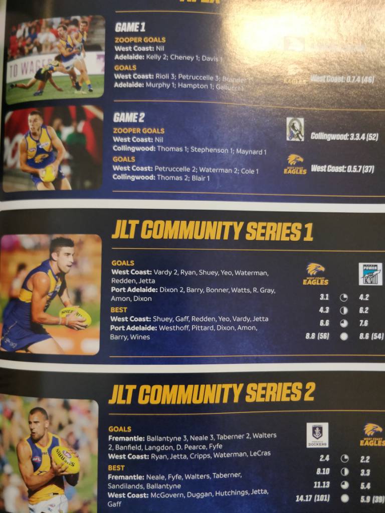
Also "Zooper Goals".
No.
No.
Javelin
All Australian
- Jun 6, 2013
- 849
- 1,116
- AFL Club
- West Coast
West Coast agree, because we didn't kick any!Also "Zooper Goals".
No.
- May 28, 2010
- 1,709
- 2,132
- AFL Club
- West Coast
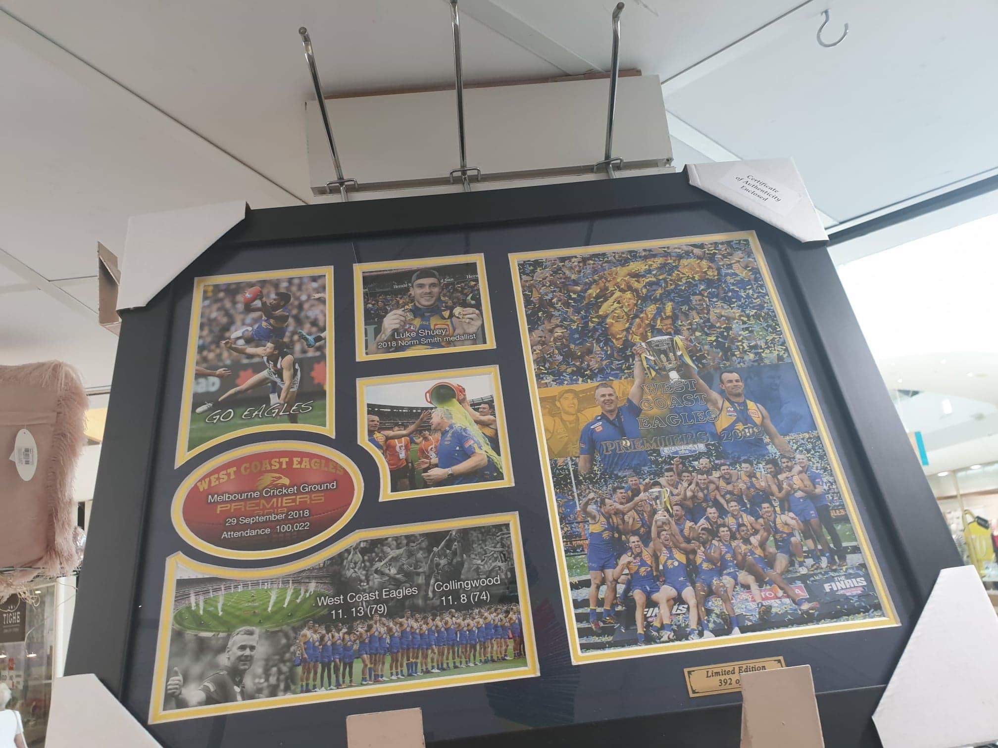
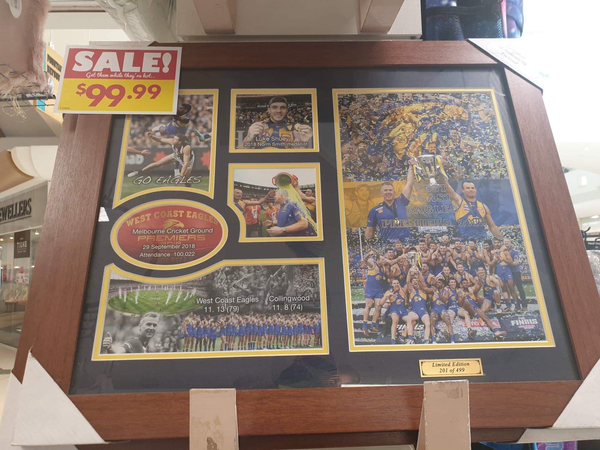
Continuing with the West Coast theme, a mate saw these for sale in Thingz Gifts.
Certificate of Authenticity Enclosed
- Oct 27, 2016
- 5,942
- 10,631
- AFL Club
- Collingwood
- Other Teams
- Packers, Raptors, Renegades
Makes me sorta glad we didn't win it knowing I'd see these monstrosities around ha... ha... haContinuing with the West Coast theme, a mate saw these for sale in Thingz Gifts.
- Aug 27, 2007
- 13,129
- 11,287
- AFL Club
- Fremantle
- Other Teams
- Everton_East Freo_Atalanta_Tranmere
I went through the past 2 years and it's the same. White boxes on colour backgrounds and they're even using the old Carlton logo (the one in the navy box).
I don't understand how this could happen, wouldn't the person who designs the books have up-to-date copies of logos?
Having worked in this environment it's pretty common to see misuse of logos (dark outlined text/objects on logos on dark backgrounds is a rookie mistake)
I usually just put all the 'old' versions of logos in a folder simply called 'old' and just keep the current ones in there
I've noticed even foxtel use old version of AFL/A-League clubs a lot. All it takes is for the club to be like 'look here guys. you have been using our old logo. please delete all versions on file and use the attached' and send them the various versions of the current logo in print/digital format
PLUS i know for a fact anytime a club (or any organisation) re-brands it logo, they send a new suite to all media outlets/clubs/associations etc that would use their logo and even in some cases a style guide
DiamondGuy
Le goûter qui »BANG«
- Sep 25, 2013
- 972
- 2,265
- AFL Club
- Geelong
- Other Teams
- Norwich, St Kilda
New, official MCG app:

Mr Wembley, it happened again!

Mr Wembley, it happened again!
DiamondGuy
Le goûter qui »BANG«
- Sep 25, 2013
- 972
- 2,265
- AFL Club
- Geelong
- Other Teams
- Norwich, St Kilda

Javelin
All Australian
- Jun 6, 2013
- 849
- 1,116
- AFL Club
- West Coast
At least it's not a transparency issue?
Similar threads
- Replies
- 8
- Views
- 535
