I thought Wines went over for this yesterday. Perhaps this photo was taken last week?Lions' red jumper with white shorts makes it to the season launch. Is this regular?
Navigation
Install the app
How to install the app on iOS
Follow along with the video below to see how to install our site as a web app on your home screen.
Note: This feature may not be available in some browsers.
More options
You are using an out of date browser. It may not display this or other websites correctly.
You should upgrade or use an alternative browser.
You should upgrade or use an alternative browser.
News New Jumpers For 2019 - All Changes In OP
- Thread starter Red Crow
- Start date
- Tagged users None
- Status
- Not open for further replies.
Appears to now be a double amputee
hitthepost
Norm Smith Medallist
He was late, the followup tweet has him actually in the shot
- Thread starter
- #2,555
He was late, the followup tweet has him actually in the shot
Heppell wasn’t, it was Joe Daniher who turned up late.
- Apr 30, 2015
- 13,616
- 24,442
- AFL Club
- West Coast
People hate on GC's jumper design, but I rate GWS's as worse. Its main design element is a letter of the alphabet! "Today's guernsey design is brought to you by the letter G".
And to make it worse, the clash has that crappy shadowing.
So much potential with the colours, such poor execution.
And to make it worse, the clash has that crappy shadowing.
So much potential with the colours, such poor execution.
caloschwaby
Whisper
- Jan 3, 2017
- 4,842
- 6,455
- AFL Club
- Collingwood

- Other Teams
- Celtics, Renegades, Packers
You could argue Carlton's main design element are letters of the alphabet tooPeople hate on GC's jumper design, but I rate GWS's as worse. Its main design element is a letter of the alphabet! "Today's guernsey design is brought to you by the letter G".
- Oct 27, 2016
- 5,942
- 10,631
- AFL Club
- Collingwood

- Other Teams
- Packers, Raptors, Renegades
The 'G' is meant to be a stylised version of NSW, with the little nook inside meaning to be the Sydney area. This wasn't apparent to me up until a few years ago so I imagine the average Joe who goes to the footy has no clue. I still think GC is much worse, at leat GWS actually do something with the G but GC is just boring.People hate on GC's jumper design, but I rate GWS's as worse. Its main design element is a letter of the alphabet! "Today's guernsey design is brought to you by the letter G".
And to make it worse, the clash has that crappy shadowing.
So much potential with the colours, such poor execution.
Last edited:
Sparkle
Simpson for Strawberry
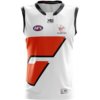
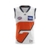
Compare it to last years:
Much better placement of the 'G' and a much more vibrant orange. Collars are a bit different too. Can't really complain.
View attachment 635723
It's still a very average design, but it's improved this year, especially when compared to last year
The 'G' is meant to be a stylised version of NSW, with the little nook inside meaning to be the Sydney area. This wasn't apparent to me up until a few years ago so imagine the average Joe who goes to the footy. I still think GC is much worse, at leat GWS actually do something with the G but GC is just boring.
I really don't mind the GWS design, because at least they've tried to do something with the placement of the orange, charcoal and the 'G'. Gold Coast is very boring and uninspired, and looks terrible on the field
- Sep 8, 2011
- 10,990
- 10,956
- AFL Club
- West Coast
Whilst I appreciate the G is NSW and used to like the jumper, I definitely think the Giants should change. It's getting dated now. I'd also ditch the white and go Orange and Charcoal only. There's been some good designs on the FJGD board that are "traditional" styled but have never been seen. I'd go down that route as opposed to choosing something thats been done already.
caloschwaby
Whisper
- Jan 3, 2017
- 4,842
- 6,455
- AFL Club
- Collingwood

- Other Teams
- Celtics, Renegades, Packers
I think GWS' home looks quite striking and iconic now. Vibrant Orange, Charcoal and White colour scheme work so well together, however their clash is just boring and uninspiring. Not quite sure how to get around this.
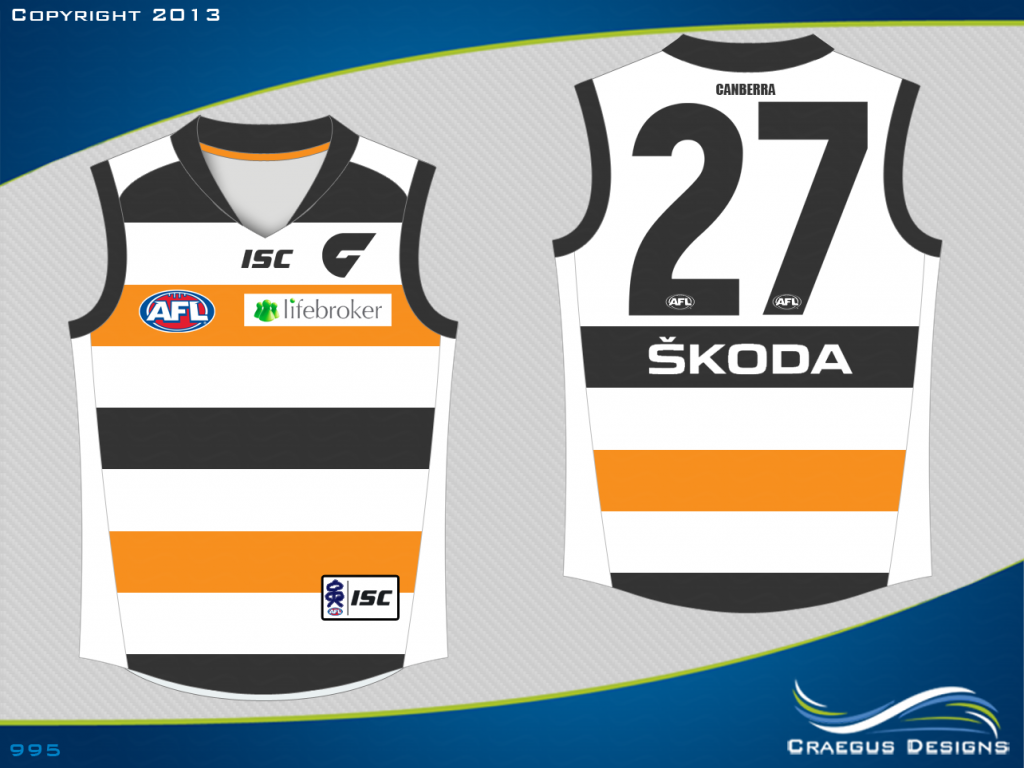
Can't remember if these were training guernseys or just prototypes, but I'm guessing you'd be more in favour of something like this?
Personally I think it's too similar to the Saints, but it's interesting to see how easily they could've gone down this path.

I think we can all agree that GC's guernsey is in a league of it's own in regard to uninspired guernsey design.
https://www.bigfooty.com/forum/threads/clash-of-the-jumpers-greater-western-sydney.1016013/page-2There's been some good designs on the FJGD board that are "traditional" styled but have never been seen. I'd go down that route as opposed to choosing something thats been done already.
Can't remember if these were training guernseys or just prototypes, but I'm guessing you'd be more in favour of something like this?
Personally I think it's too similar to the Saints, but it's interesting to see how easily they could've gone down this path.

I think we can all agree that GC's guernsey is in a league of it's own in regard to uninspired guernsey design.
caloschwaby
Whisper
- Jan 3, 2017
- 4,842
- 6,455
- AFL Club
- Collingwood

- Other Teams
- Celtics, Renegades, Packers
Or try this one our very own Craegus made years ago
fancyscum
Radical Crommunist
I know I've said this before when the GWS jumper topic has come up, but what do the Giants have to gain from using a traditional jumper design? They aren't a club with any long history and they aren't from a traditional football area, what they have the moment is a modern take on the old yoke design with a modern stylised G that is pretty recognisable at this point. Their clash needs an overhaul for sure (a white would look amazing as we have seen with past training jumpers) but their home is actually pretty good imo, it just needs a charcoal back on it to prevent clashes with the Swans.
Yep, and they should go in the same direction, something modern, embrace being a 21st century club.I think we can all agree that GC's guernsey is in a league of it's own in regard to uninspired guernsey design.
hitthepost
Norm Smith Medallist
Sydney have a white-backed jumper for this exact matchtheir home is actually pretty good imo, it just needs a charcoal back on it to prevent clashes with the Swans.
fancyscum
Radical Crommunist
Neither of them seem to like wearing their clashes though, a charcoal back solves this and mainly just makes the jumper look cleaner imoSydney have a white-backed jumper for this exact match
hitthepost
Norm Smith Medallist
It does but it Sydney's (and the AFL's) job to not clash with GWS in half those games so that GWS can wear what they want at home.Neither of them seem to like wearing their clashes though, a charcoal back solves this and mainly just makes the jumper look cleaner imo
Nobody should have to change their home strip for anyone.
fancyscum
Radical Crommunist
I probably should have made it clearer in my original post, but I reckon that it just looks crap having a different coloured back to the front of the guernsey, same with Sydney, who I think should have a white back.It does but it Sydney's (and the AFL's) job to not clash with GWS in half those games so that GWS can wear what they want at home.
Nobody should have to change their home strip for anyone.
Totally agree - it's the away teams job to avoid clashes, but GWS home jumper is clash enduring - just like the Eagles tripanel. A charcoal back would fix this. The women's team has a charcoal back.I probably should have made it clearer in my original post, but I reckon that it just looks crap having a different coloured back to the front of the guernsey, same with Sydney, who I think should have a white back.
They could use a charcoal based jumper as home, and orange as away. White clash probably only needed v hawks.
hitthepost
Norm Smith Medallist
That's very different to "should change their jumper to stop a clash"I probably should have made it clearer in my original post, but I reckon that it just looks crap having a different coloured back to the front of the guernsey, same with Sydney, who I think should have a white back.
With the TP jumper - not using colours similar to navy or yellow worked great. Red. Pink. Sky blue. White.Totally agree - it's the away teams job to avoid clashes, but GWS home jumper is clash enduring - just like the Eagles tripanel. A charcoal back would fix this. The women's team has a charcoal back.
With the GWS jumper it's similar - don't use colours close to orange charcoal. Use royal, white, sky blue, lime green.
I am yet to see a jumper or set of colours that has no clash solution. Nobody has a jumper equal parts all colours of the rainbow.
- Sep 8, 2011
- 10,990
- 10,956
- AFL Club
- West Coast
I think GWS' home looks quite striking and iconic now. Vibrant Orange, Charcoal and White colour scheme work so well together, however their clash is just boring and uninspiring. Not quite sure how to get around this.
https://www.bigfooty.com/forum/threads/clash-of-the-jumpers-greater-western-sydney.1016013/page-2
Can't remember if these were training guernseys or just prototypes, but I'm guessing you'd be more in favour of something like this?
Personally I think it's too similar to the Saints, but it's interesting to see how easily they could've gone down this path.
View attachment 636030
I think we can all agree that GC's guernsey is in a league of it's own in regard to uninspired guernsey design.
No way, these stink it up!
- Oct 27, 2016
- 5,942
- 10,631
- AFL Club
- Collingwood

- Other Teams
- Packers, Raptors, Renegades
I think a colour scheme which would've fit the Giants much better would be Red and Green. When used correctly these colours can look great together and would appeal to Rabbitohs supporter base.
hitthepost
Norm Smith Medallist
Which is probably the exact reason they didn't use them - taking directly the colours of an opposition code team on its home turf wouldn't have gone down well. And supporters of other teams may not have jumped on the Giants. I know one or two people who don't like the Strikers coz they look like NSW so imagine how much stronger those feelings would be when footy is involved!I think a colour scheme which would've fit the Giants much better would be Red and Green. When used correctly these colours can look great together and would appeal to Rabbitohs supporter base.
- Oct 27, 2016
- 5,942
- 10,631
- AFL Club
- Collingwood

- Other Teams
- Packers, Raptors, Renegades
True, didn't really think of it that way.Which is probably the exact reason they didn't use them - taking directly the colours of an opposition code team on its home turf wouldn't have gone down well. And supporters of other teams may not have jumped on the Giants. I know one or two people who don't like the Strikers coz they look like NSW so imagine how much stronger those feelings would be when footy is involved!
- Status
- Not open for further replies.
Similar threads
- Replies
- 3
- Views
- 607
- Replies
- 8
- Views
- 535
- Replies
- 175
- Views
- 14K


