- Jun 9, 2015
- 12,051
- 9,274
- AFL Club
- St Kilda
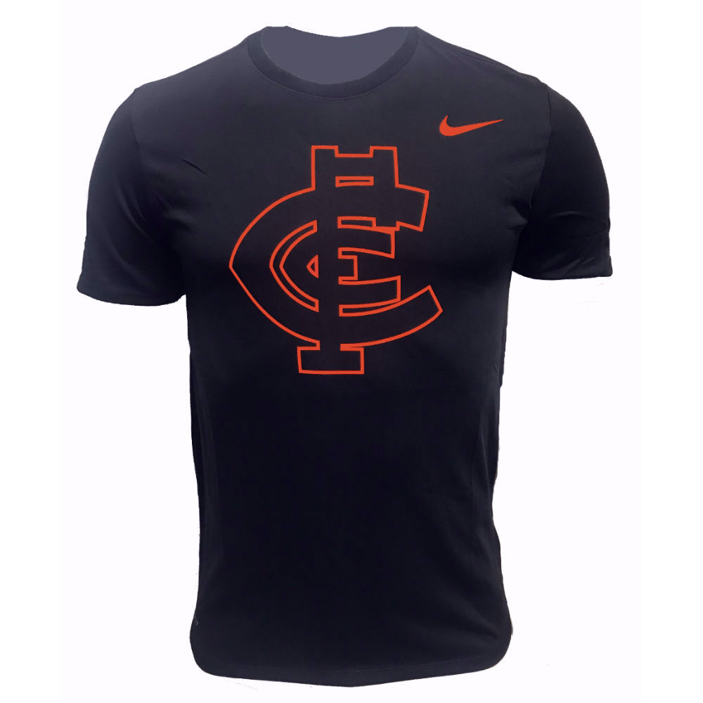
Was at an SANFL game during round one and someone had a Carlton hat on with this logo on it. May have been a members cap?Are Carlton with Nike in 2020? Perhaps this is what we'll see next year?

Follow along with the video below to see how to install our site as a web app on your home screen.
Note: This feature may not be available in some browsers.
Was at an SANFL game during round one and someone had a Carlton hat on with this logo on it. May have been a members cap?Are Carlton with Nike in 2020? Perhaps this is what we'll see next year?
TBH if the Bombers were gonna do a third stip they should go for the grey in their logo (probably the lighter one)
I think this is also being sold in the club shop..Was at an SANFL game during round one and someone had a Carlton hat on with this logo on it. May have been a members cap?
what even?
That implies that they could win the flag this year without Rance, Martin's *s and Cothin's hair.It's a legitimate jumper idea for 2020
EUREKA!
Have we struck gold Governor?
Go home everybody, it was just a metal can
any PB in a storm I suppose, but this doesn't float my boat I'm afraid
Go home everybody, it was just a metal can
Probably looked better in your head, hey?
any PB in a storm I suppose, but this doesn't float my boat I'm afraid
I see where you’re coming from, but the majority of Port fans (on here at least) would be thrilled to drop teal for the PBs, myself included.Really? I actually quite like it. It keeps teal, it uses prison bars, and it looks good
I see where you’re coming from, but the majority of Port fans (on here at least) would be thrilled to drop teal for the PBs, myself included.
I can see why you guys are keen to drop teal, but from a neutral perspective there's no way it'd happen (the AFL (and especially Collingwood) won't want two teams in black and white). If the PB's are to come back, then teal will need to be used
Pretty much this, I’m nowhere near being anti-teal, but teal had better stay at least 50 feet away from the PBs.A decent chunk of our supporter base actually like the teal anyway so we’d have a hard time dropping it irrespective of outside opinions on the matter. And that’s fine, we could use the traditional PBs AND still retain teal as one of our colours. It’s not an either/or proposition and there’s no need to awkwardly wedge teal into a classic monochrome design when it already appears on every other guernsey we have. All that’s required is for some common sense to prevail.
not even in the form of the current port logo?Pretty much this, I’m nowhere near being anti-teal, but teal had better stay at least 50 feet away from the PBs.
I’d prefer a monochrome or black and white version of the logo, but I’d accept the logo on thete.not even in the form of the current port logo?
It was a derogatory term invented by Norwood fans as they believed Port fans belonged in prison. Pappagallo do you remember who mentioned 5is on the Port board by any chance?Just a query for Port supporters, how far back does the name 'Prison Bar' come from? Has it been around forever or was it conceived later in the clubs history?>
REH I thinkIt was a derogatory term invented by Norwood fans as they believed Port fans belonged in prison. Pappagallo do you remember who mentioned 5is on the Port board by any chance?

welcome to big footy broView attachment 662567
𝗡𝗘𝗪 ISC CROWN GOLD & BLACK SPECIAL EDITION GUERNSEYS // WITH MATCHING NEW ERA CAP
The distinct gold and black colours are to acknowledge our partnership with Crown, as well as to commemorate the WA state colours, while also sticking with tradition on our beloved wings design.
On iPhone using BigFooty.com mobile app
, big fan of the design too. Ive seen it on the west coast fb groupwelcome to big footy bro