Muunky Tuunk Man
Cancelled
*Moving post from other thread.*
Don't want to turn this thread into Davy Jones locker room but these are pretty simple.

I love that second logo. That is sensational!
Follow along with the video below to see how to install our site as a web app on your home screen.
Note: This feature may not be available in some browsers.
*Moving post from other thread.*
Don't want to turn this thread into Davy Jones locker room but these are pretty simple.
Of all the threads on BF, this Minor topic of logos has highlighted to me that certain individuals appear fine to effortlessly disregard tradition and the heritage of Port Adelaide for what I do not know.. The magpie emblem for Port Adelaide is NOT that insignificant in this new age and not just attached to the Port Magpies. It is part of who we are. The logo, the colors are just 2 things that link the club in the two competitions together.
As a traditionalist, I find some flippant comments on this thread disrepectful to our proud tradition. Discussing appropriate logos that represent who we are as a united club while suggesting removal of the logo that has always represented us. What irony. What ********.
. I'm out of here. I've had enough of BF. Signing off.good luck. Have fun. See you at Alberton this week. (Sarcasm intended).
Strange post to username differential.Of all the threads on BF, this Minor topic of logos has highlighted to me that certain individuals appear fine to effortlessly disregard tradition and the heritage of Port Adelaide for what I do not know.. The magpie emblem for Port Adelaide is NOT that insignificant in this new age and not just attached to the Port Magpies. It is part of who we are. The logo, the colors are just 2 things that link the club in the two competitions together.
As a traditionalist, I find some flippant comments on this thread disrepectful to our proud tradition. Discussing appropriate logos that represent who we are as a united club while suggesting removal of the logo that has always represented us. What irony. What ********.
. I'm out of here. I've had enough of BF. Signing off.good luck. Have fun. See you at Alberton this week. (Sarcasm intended).

Just needs a magpie st on the wharf or flying over.I have always had this idea in my head as a favourite, partly because i think it is the best way to blend the old and the new (teal and lightning bolt motifs) without it feeling forced or tacky.
Anyone who looks at it instantly knows the story of our club and the bars
5 mins in photoshop:
View attachment 675059
Port Adelaide is stronger than Port IMO.
If you say you go for Port, do you get the you support Port Power back from them?
I hate that we had to run with Port Power for 3 years to differentiate ourselves from Port Magpies. Both should have been Port Adelaide. In the AFL we should have been Port Adelaide or just Port, but not Port Power. But nobody in the history of a national sporting competition in the world that I'm aware of was forced to split into 2 and go thru the his BS, so we learnt on the job and made a few errors in the early days.
Nah, Port is fine. Ever heard anyone talk about 'the Dockers'? They're always Freo or Fremantle.
Nah, Port is fine. Ever heard anyone talk about 'the Dockers'? They're always Freo or Fremantle.
EFA and Pappagallo can get on another merch swindle.Ports
I have always had this idea in my head as a favourite, partly because i think it is the best way to blend the old and the new (teal and lightning bolt motifs) without it feeling forced or tacky.
Anyone who looks at it instantly knows the story of our club and the bars
5 mins in photoshop:
View attachment 675059
EFA and Pappagallo can get on another merch swindle.
Power lines?Unify as the Port Adelaide Birdstrike
Port Adelaide is stronger than Port IMO.
If you say you go for Port, do you get the you support Port Power back from them?
I hate that we had to run with Port Power for 3 years to differentiate ourselves from Port Magpies. Both should have been Port Adelaide. In the AFL we should have been Port Adelaide or just Port, but not Port Power. But nobody in the history of a national sporting competition in the world that I'm aware of was forced to split into 2 and go thru the his BS, so we learnt on the job and made a few errors in the early days.
Mate, my personal definition of ‘very difficult’ equates to ‘impossible’.I think its more of a case of it being a very difficult thing to sort out, so whilst that's happening have some hors d'ouerves.
Soccer in Europe has divisions with promotion and relegation. We don't have that here. Therefore over there, with only so many viable colour variations and combinations, you can't exactly turn around and say nope, only Juventus is going to wear black and white vertical stripes. This is Australia though, and a different code, and we only have a national competition with 18 fixed teams, no relegation or promotion system and we almost never have such a system in the AFL. And even in Aussie rules lower leagues, is there two teams that wear the jumpers with the same predominant feature in the same colours? in our case it's the black and white bars obviously.
I'm all for wearing OUR wharf pylons, since they differ from Collingwoods bars but holy crap man some of you people act as if before 1902 our players were running around stark naked on the field.
But I also think if this is a rebrand of the logo by the club, then they should go a step or two further.
No problem. I am not good at drawing. The final product is irrelevant. Someone more talented than me can make a better job. I am more interested on its premises.
I was trying to point a direction. I was aiming at our beginning, something that could give us a sense of "foundation" which would allow us moving forward. I was focusing on unity, something that could gives a sense of "togetherness" which would allow us embrace diversity and expand our brand.
I wanted something that could simultaneously fit into: (a) 1870 and our glorious SANFL past; (b) 1997 and our move to the AFL; (c) 2010 and the "One Club" movement; (d) 2015 and our community work and Chinese endeavor; and (e) beyond and anything that we might do from now on.
That "Port Adelaide 1870" black-and-white roundel was the best idea I had.
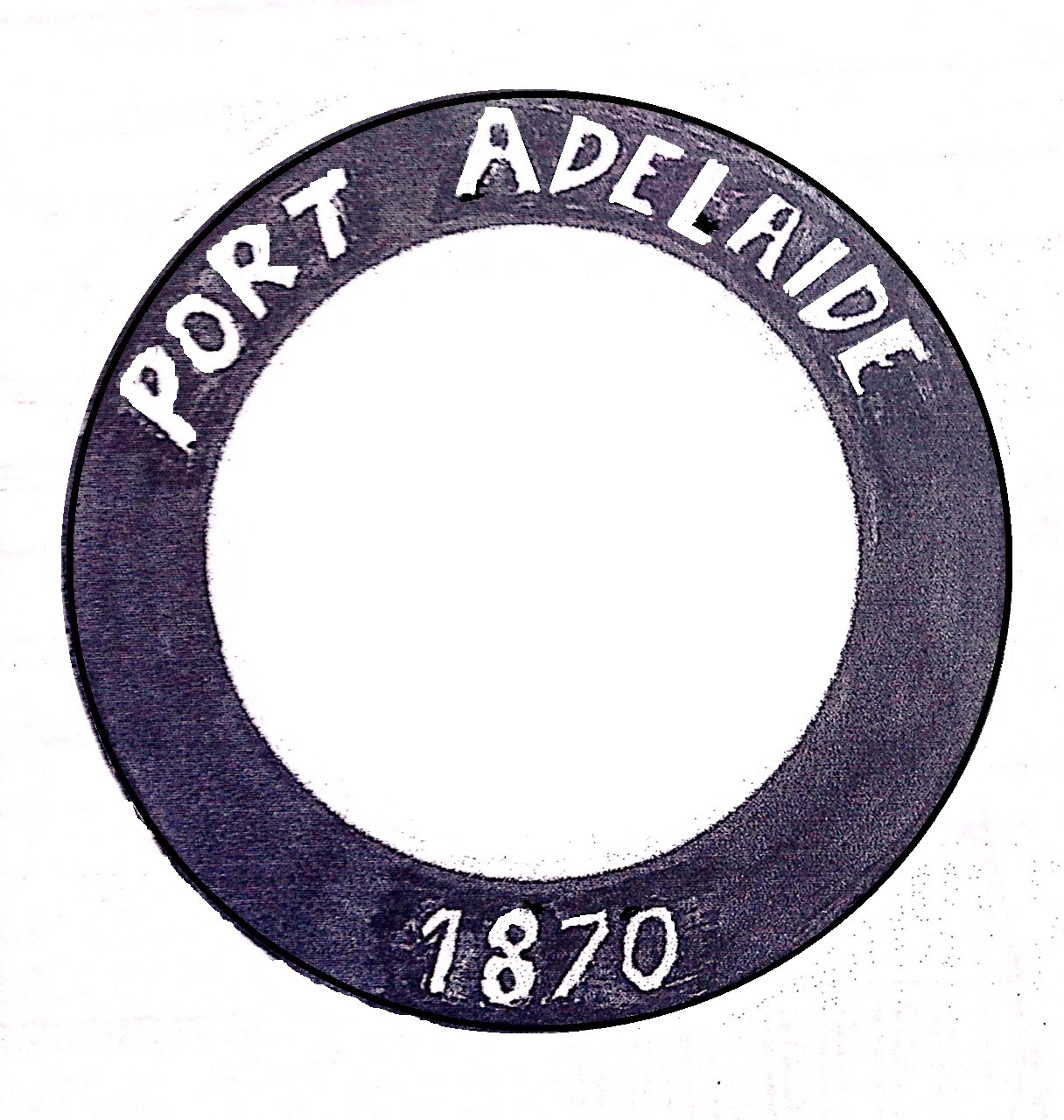
I like the idea of the roundel perhaps being adapted into a ship's wheel"I believe that the common identity for everything related to PAFC should be based on the colours black and white. Even though the club and both teams, each would have its own logo, they would all have something in common: a black roundel with 'Port Adelaide 1870' inscript in white letters.
The roundel is simple, and its possibilities are endless. Anything that PAFC could possibly think about doing, it would be able to use the roundel as a kind of signature. It accepts anything in the middle, be it drawing, text, or colour."
Your comment reminded me of this badge:I like the idea of the roundel perhaps being adapted into a ship's wheel