Butters Made Me Do It
Drinking tea
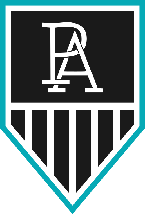
tbh i feel like the stronger move would be to just go with the monogram
Follow along with the video below to see how to install our site as a web app on your home screen.
Note: This feature may not be available in some browsers.
I like it.
If you try and incorporate more it gets cluttered.
If you incorporate less then what do you run with?
It's clearly Port Adelaide.
It's clearly the logo of an older club.
It's got the wharf.
It's even got the chevron subtly.
tbh i feel like the stronger move would be to just go with the monogram
Of course, but the club is trying to give every impression of honouring our history, including the Prison Bars, except actually going out and fighting for the right to wear them. This dancing Homer ‘all things to all people’ fits their MO perfectly.tbh i feel like the stronger move would be to just go with the monogram
If the club is to change, the change needs to be strategic, and it needs to be executed well.
This is neither. This is a design by committee.
Too much 'stuff' to appease the masses.
Not enough, 'is this really needed in our logo'?


That's gross.
They have literally just gone the PA merch seems to sell. That must be what the members want. Let's jam it into Homer's car.I have no doubt you won't be alone.
That doesn't make it good, nor does it make it a smart move by the club.
If the club is to change, the change needs to be strategic, and it needs to be executed well.
This is neither. This is a design by committee.
Too much 'stuff' to appease the masses.
Not enough, 'is this really needed in our logo'?
The only identifiable thing that is Port Adelaide is the PA monogram which is a merch device designed for us by a cap manufacturer.
If this is the dirction to head in, why convolute it with additional elements?
Why a shield/crest shape?
Why the bars?
Why not, a well crafted PA monogram (not the one currently used) that elevates above all else to represent Port Adelaide.
Lol. No it's not. It is literally a brand new thing.
It's not as 'faux' as the Crows heritage monogram, but it's close to it.
It does. Why does the logo need to have a wharf in it?
Or a reference to the PB guernsey?
Think about that. Think about the why, not the what.
An 'happy' accident that's too subtle to mean anything.

Damn, the mock-up I saw was completely different, it even had a magpie, piping shrike my ass...
View attachment 734819
Damn, the mock-up I saw was completely different, it even had a magpie, piping shrike my ass...
View attachment 734819


It looks like something done by someone learning the ropes on the Footy Jumpers board. Well done, you've ticked some boxes, but there is zero imagination in it whatsoever. We have so much squandered potential in our how we brand ourselves and this would make that situation much, much worse.
The PA monogram doesn't sit well on anything else. It's a cap logo, and it's designed as a cap logo, where it sits on it's own. That's what it's for. The designer of this hasn't for a second considered what any element of this logo is for.
More importantly understand this - you are only as good as your client.
This is probably something I forget and something that bomberclifford has reminded me of in the past as well when I criticise aspects of our branding.
It's still disappointing, but absolutely the blame lays at the feet of the people signing off on this. I'll wait and see with the 2020 celebrations as a whole, but it's another thing to be disappointed with.
Developing a solid brand identity is done via a thorough process, not going in with preconceived ideas, and a clear understanding of what the current state of play is in terms of what’s working and what’s not.
My hunch is the PA is the most likely answer to what I anticipate the criteria to be. However, I don’t have all the info to say that with certainty.
Dropping “Power” is a MASSIVE decision and not something to be done lightly. My fear is that I don’t think anyone at the club has even considered what the long term ramifications are of making random changes to the brand image based on what supporters say in surveys. We’ve got accountants and ex-footballers making decisions on brand that are so off the mark it’s not funny.
The sad thing is that there are at least five Port supporters, and paid up members, who are serious brand strategists and designers, all based here in Adelaide. The club hasn’t approached any of them.
I doubt they even know they exist.
Can you re do this with 75% of the teal as black outside part of the logo and leave the remainder as teal. I reckon a black outline with a bit of teal inside will look a lot better than making the teal so prominent.
It's gross but still an improvement on the current one yikes