Navigation
Install the app
How to install the app on iOS
Follow along with the video below to see how to install our site as a web app on your home screen.
Note: This feature may not be available in some browsers.
More options
You are using an out of date browser. It may not display this or other websites correctly.
You should upgrade or use an alternative browser.
You should upgrade or use an alternative browser.
Resource Gold Coast Suns Rebrand
- Thread starter 1990crow
- Start date
- Tagged users None
- Thread starter
- #177
Thicker “rays”?
- Thread starter
- #179
Like the V shape but would be good to see in the shape of a sun/circle.
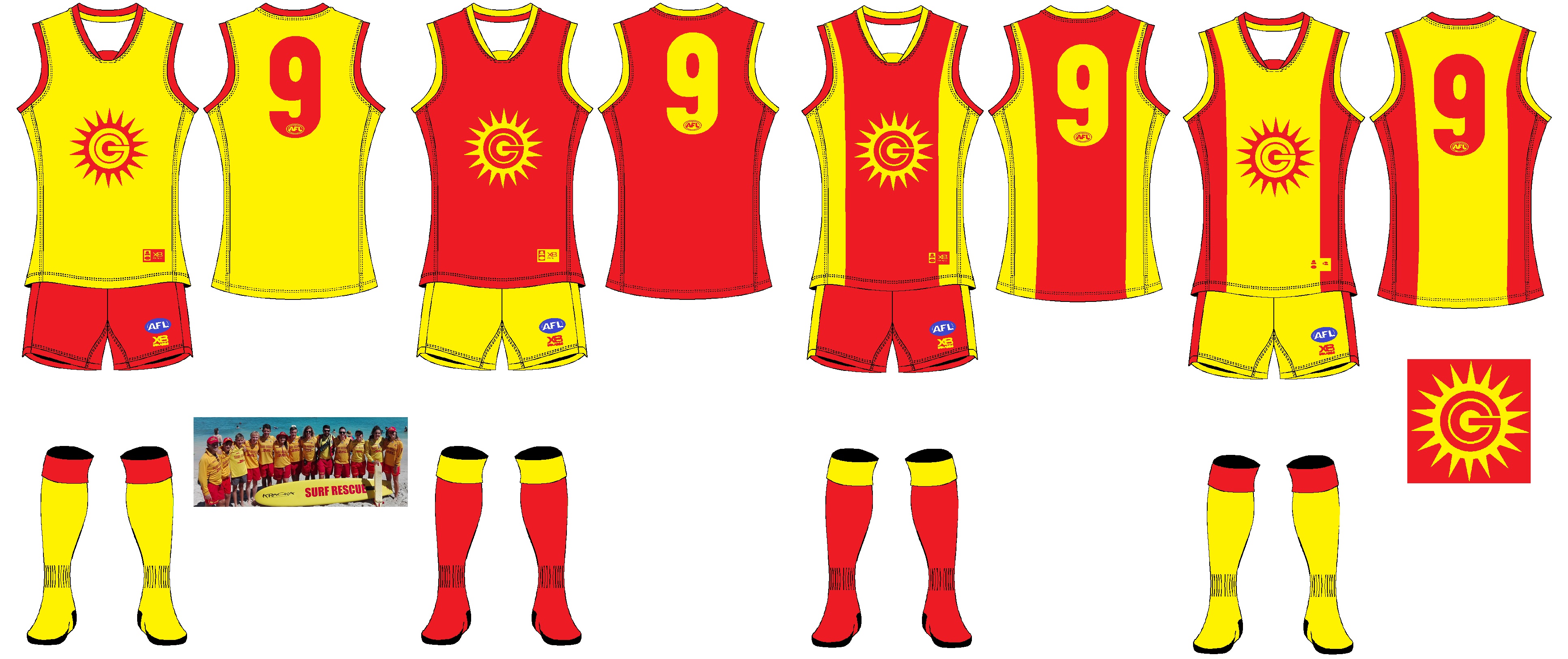
I did these four designs in the one style that is different from the one I usually use. The first two use the Lifesaving Uniform as inspiration, with a gold jumper with red shorts, and reverse for a clash uniform. The second two are my design for a new uniform.
- Oct 27, 2016
- 5,942
- 10,636
- AFL Club
- Collingwood

- Other Teams
- Packers, Raptors, Renegades
Awesome monogram you've got there.
I did these four designs in the one style that is different from the one I usually use. The first two use the Lifesaving Uniform as inspiration, with a gold jumper with red shorts, and reverse for a clash uniform. The second two are my design for a new uniform.
I'd suggest toning the brightness of the yellow down to match that of the lifesaver yellow colour but apart from that great kit.
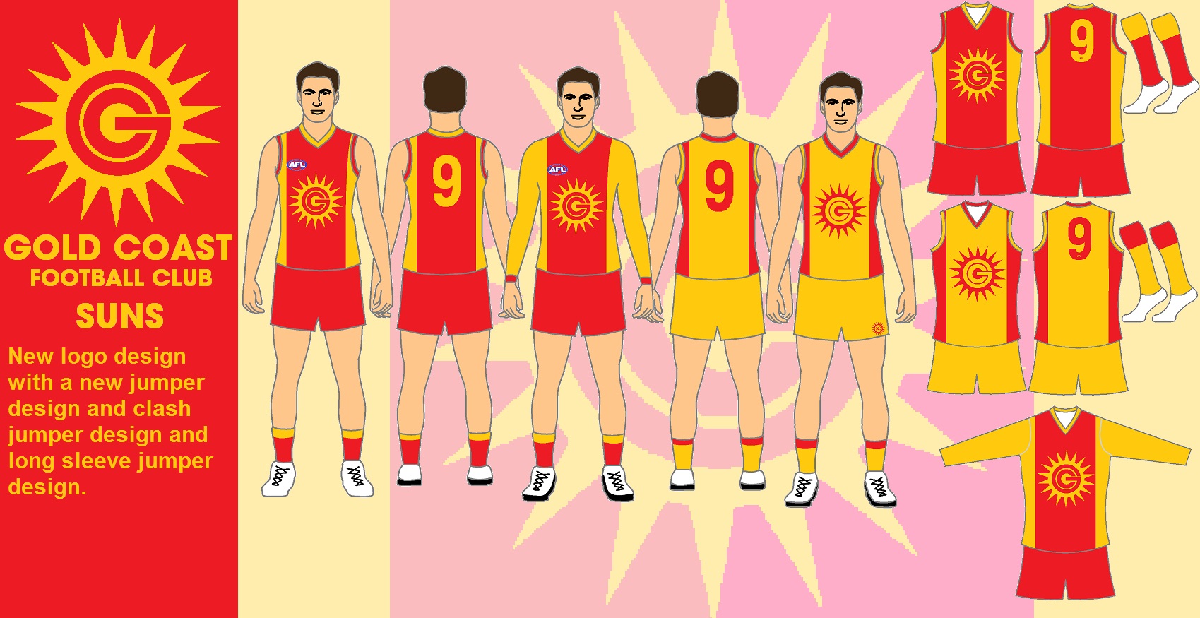
Here is my design done on my template in a less bright gold. I also included a long sleeved version as well. The middle red bit of the jumper is meant to simulate a lifesavers club colours which use to be worn as a tied on the sides shirt which ironmen use to wear in the 1970's and 1980's. I think it is better than the plan one colour design with logo. There is more happening on the jumper than just the logo, and creates a jumper which is different from all others in the league.
- Thread starter
- #183
Too similar to what they already have. Which sucks.
Here is my design done on my template in a less bright gold. I also included a long sleeved version as well. The middle red bit of the jumper is meant to simulate a lifesavers club colours which use to be worn as a tied on the sides shirt which ironmen use to wear in the 1970's and 1980's. I think it is better than the plan one colour design with logo. There is more happening on the jumper than just the logo, and creates a jumper which is different from all others in the league.
The jouneyman
Team Captain
- Mar 11, 2018
- 459
- 333
- AFL Club
- Collingwood

Looks great, I'd also like too see the Ray's swamped too the bottom part of the jumper
Too similar to what they already have. Which sucks.
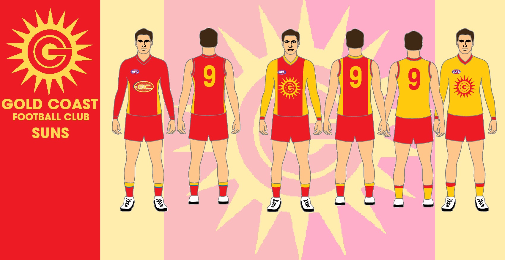
I thought I would reply to this one with the comparison of the current home, my rebranded home jumper and the other rebranded home jumper, also in the long sleeve jumpers. The current home jumper has little gold side panels on them which go up to under the arms. This allows the long sleeve jumper to be red sleeves. My rebrand has gold right up the sides and the arm holes.
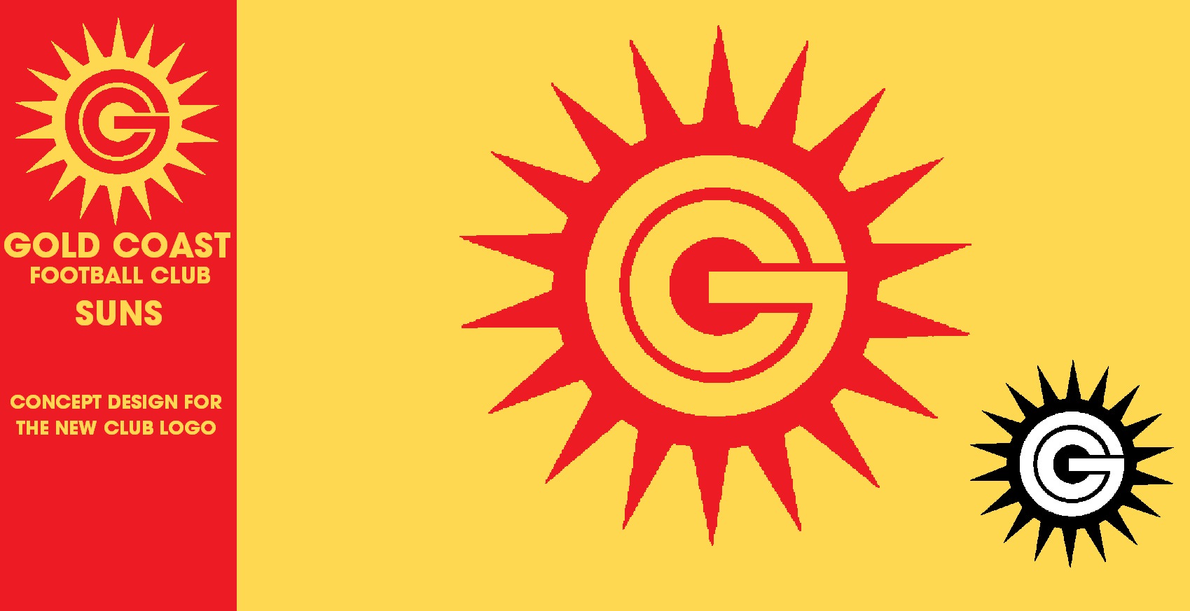
The logo is simple, G C standing for Gold Coast, and a sun to represent the suns.
- Thread starter
- #186
Great logo. Just not keen on the design sorry.
I thought I would reply to this one with the comparison of the current home, my rebranded home jumper and the other rebranded home jumper, also in the long sleeve jumpers. The current home jumper has little gold side panels on them which go up to under the arms. This allows the long sleeve jumper to be red sleeves. My rebrand has gold right up the sides and the arm holes.
The logo is simple, G C standing for Gold Coast, and a sun to represent the suns.

Deadpool
All Australian
- Jun 3, 2015
- 689
- 809
- AFL Club
- Gold Coast
The white line is certainly appropriate.Gold Coast rebrand. Trying something a bit different. View attachment 738502View attachment 738503View attachment 738504
i can live with the "GC" wordmark in the middle of our ugly logo, maybe if it was blended in a bit like this?
HOME

AWAY

CLASH OPTION 1

CLASH OPTION 2

home guernsey
red on yellow = surf life saving flag
away guernsey
yellow on red = surf life saving outfit
clash guernseys
yellow = beach, blue = ocean/sky

HOME

AWAY

CLASH OPTION 1

CLASH OPTION 2

home guernsey
red on yellow = surf life saving flag
away guernsey
yellow on red = surf life saving outfit
clash guernseys
yellow = beach, blue = ocean/sky
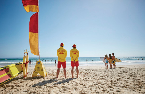
to change to what colours instead?Let's just stop with the Lifeguard colours altogether, please
Rubber Arm
AFL Sucks
Sky blue and yellow to represent the beach and water (if West coast are okay with that, if not, green to represent the Queenslands tropics
can I hear the full story as to why that is? hahaYellow and Orange are our colours.
End of story.
i'd like blue and yellow, you're right i don't think west coast would be too happy though. gold coast is nowhere near the tropics, we do have rainforests to the west. may as well switch to green to get on the front foot before we move to tassie in 5 years hey!Sky blue and yellow to represent the beach and water (if West coast are okay with that, if not, green to represent the Queenslands tropics

Orange? Red dude. In our club songYellow and Orange are our colours.
End of story.
Rubber Arm
AFL Sucks
give him a break, he was close. 
- Oct 27, 2016
- 5,942
- 10,636
- AFL Club
- Collingwood

- Other Teams
- Packers, Raptors, Renegades
Awesome stuff there! How about making one with charcoal (or black) and gold, similar to Vegas Golden Knights colour scheme?i can live with the "GC" wordmark in the middle of our ugly logo, maybe if it was blended in a bit like this?
HOME
View attachment 738849
AWAY
View attachment 738850
CLASH OPTION 1
View attachment 738851
CLASH OPTION 2
View attachment 738852
home guernsey
red on yellow = surf life saving flag
away guernsey
yellow on red = surf life saving outfit
clash guernseys
yellow = beach, blue = ocean/sky

Similar threads
- Poll
- Replies
- 5
- Views
- 460
- Replies
- 14
- Views
- 900
- Replies
- 6
- Views
- 728
- Poll
- Replies
- 2
- Views
- 977
- Replies
- 19
- Views
- 1K
- Replies
- 41
- Views
- 2K


