Prediction New Club Logo

Remove this Banner Ad

View attachment 739733

I like the basic idea.
If someone was to use the font from my avatar, remove the sky chevrons, simplify the lighthouse (remove the lightning bolt) without making it look like a penis and possibly remove the EST and just leave it as 1870 I'd be happy.

Things I like about it: the silver outlines, the teal water, the wharf pylons, the wording of Port Adelaide FC,

How does it look on the jumper, nfi, but on a letterhead I'd be happy.

Others I am happy with:

- the monogram by itself - I think it would look good on the jumper
- the use of Ports instead of Power


Way too complicated, won't work down small either.

One of these logos works as a logo should, the other doesn't.


739822
 
Way too complicated, won't work down small either.

One of these logos works as a logo should, the other doesn't.


View attachment 739822
But the one on the right incorporates the image of some random lighthouse that is completely unrelated to Port Adelaide so is better than that obscure one on the left.
 

Log in to remove this ad.

“Ports” is something I’ve seen a bit on here lately but i never known anyone in person actually refer to the club as that. Is this something new?


On iPhone using BigFooty.com mobile app
I've spent the last 30 years in the outer saying Carn Ports. Though I hate the use of that old school, terrible font 'Ports'
 
In reference to my comments about a redrawn PAFC monogram and a custom typeface for the Port Adelaide brand, check out this extension of the White Sox brand identity that included a redraw of their famous wordmark.


Redrawn script.

white_sox_alternate_logo.png


Applied to player uniform

white_sox_alternate_uniform_02.jpg


Development sketches

white_sox_alternate_logo_process.jpg
 
Just curiously, what are your favourite sports club logos?


See post above re White Sox

Baseball does sports branding particularly well. They get the balance right between traditional nostalgia and merch-able graphics that create team/club brands that are easily identifiable.

I think the San Antonio Spurs branding is also pretty good. Great use of black and silver and a unique name/icon symbol.
 
“Ports” is something I’ve seen a bit on here lately but i never known anyone in person actually refer to the club as that. Is this something new?


On iPhone using BigFooty.com mobile app
You haven't listened much to John Cahill then. Or your memory is fading. I remember as a teenager first picking up him regularly using Ports, but he also used Sturts, Norwoods, Norths etc.
 

(Log in to remove this ad.)

See post above re White Sox

Baseball does sports branding particularly well. They get the balance right between traditional nostalgia and merch-able graphics that create team/club brands that are easily identifiable.

I think the San Antonio Spurs branding is also pretty good. Great use of black and silver and a unique name/icon symbol.
It's funny you say that about the ChiSox though, as no club has rebranded more (seemingly) in their history!
They have always had to be that way as they are up against solid brands in the Cubs and Bears.

They are very much the Port to the Cubs 'Crows', even down to the supposed demographics.
My particular fave ChiSox logo is this one...
740461

My least favourite is their famous
740462

My favourite retro one is:
740464
 

Attachments

  • 1567649576383.png
    1567649576383.png
    219.3 KB · Views: 110
Post #43 16th May
If you were starting a new football team in Port Adelaide, it had never had one, what would be the image that represents the Port today?

Post #44
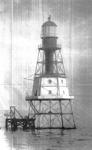
The lighthouse.

Post #564 WAM delivers a concept
ok so this is an idea I've had since I heard about a new logo or whatever we're going to do. This is an extremely rough knock up I just did in 15 minutes but you get the general idea. Lighthouse, wharf pylons, an ode to the black diamond corner etc


View attachment 738993

I like the concept. Would get rid of the silver waves.

But it reinforces the wharf pylon concept behind our jumper and why it's unique and special, compared to vertical black and white stripes that 100's of professional clubs all around the world have and thousands of semi pro and amateur clubs wear around the world.

I like the lighthouse and all the imaginary and analogies about a beacon of light, radiates safety, security, stability etc

In 30 years time when the Port will be redeveloped and gentrified, the Lighthouse will still be there at the centre piece of the wharf area. Like the club, been there for 150 years, will be there for 150 more years.

The lighthouse arrived in South Australia in April 1867, having been prefabricated in England and shipped to Australia in pieces. It was erected at the entrance to the Port River and was first lit on January 1st 1869.

The teal representing the water of the Port River is something I have for a longtime thought that if we had to bastardised the traditional jumper, it would be that the bottom 5-10% would have teal, either a straight line or wave type shape and could tuck that part of the jumper into your shorts if a player, or pants if a fan.

I've never been a fan of teal. The 2000 move from PMS 321 to PMS 320 colour, with more blue in it, was an improvement, but so much merchandise has various shades of Chinese manufacturing green teal to blue teal. The official guernsey has it right, but does come up different shades on TV. My preference would have been PMS 319, or PMS 312 if we were going to stay in that area of the colour chart. See

In the early naughties I said to my mate D_One they should have used a different shade of blue to represent the waters of the Port River. His response was, you can't do that, nobody wants dirty brown as the colour of a footy jumper!
 
Last edited:
Post #43 16th May


Post #44


Post #564 WAM delivers a concept


I like the concept. Would get rid of the silver waves.

But it reinforces the wharf pylon concept behind our jumper and why it's unique and special, compared to vertical black and white stripes that 100's of professional clubs all around the world have and thousands of semi pro and amateur clubs wear around the world.

I like the lighthouse and all the imaginary and analogies about a beacon of light, radiates safety, security, stability etc

In 30 years time when the Port will be redeveloped and gentrified, the Lighthouse will still be there at the centre piece of the wharf area. Like the club, been there for 150 years, will be there for 150 more years.

The lighthouse arrived in South Australia in April 1867, having been prefabricated in England and shipped to Australia in pieces. It was erected at the entrance to the Port River and was first lit on January 1st 1869.

The teal representing the water of the Port River is something I have for a longtime thought that if we had to bastardised the traditional jumper, it would be that the bottom 5-10% would have teal, either a straight line or wave type shape and could tuck that part of the jumper into your shorts if a player, or pants if a fan.

I've never been a fan of teal. The 2000 move from PMS 321 to PMS 320 colour, with more blue in it, was an improvement, but so much merchandise has various shades of Chinese manufacturing green teal to blue teal. The official guernsey has it right, but does come up different shades on TV. My preference would have been PMS 319, or PMS 312 if we were going to staff in that area of colour. See

In the early naughties I said to my mate D_One they should have used a different shade of blue to represent the waters of the Port River. His response was, you can't do that, nobody wants dirty brown as the colour of a footy jumper!

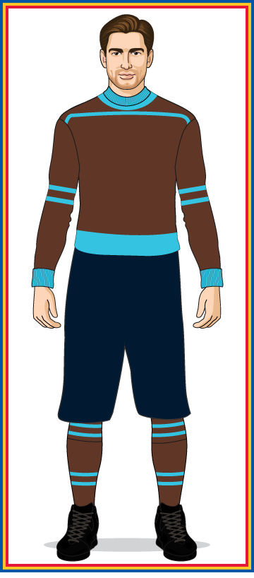
Some of my faves are brown.

Cleveland, St Pauli, Old school Penrith!
 
Some of my faves are brown.

Cleveland, St Pauli, Old school Penrith!
would you want an all brown jumper with black and white chevrons?
 
Some of my faves are brown.

Cleveland, St Pauli, Old school Penrith!
Platense (ARG)
images

1200px-Escudo_del_Club_Alt%C3%A9tico_Platense.svg.png
 

Remove this Banner Ad

Back
Top