

- Oct 27, 2016
- 5,948
- 10,672
- AFL Club
- Collingwood

- Other Teams
- Packers, Raptors, Renegades

Follow along with the video below to see how to install our site as a web app on your home screen.
Note: This feature may not be available in some browsers.

")
thats strangeLove your work as always.
Love your work as always.
I'm blushinglove your work, as always
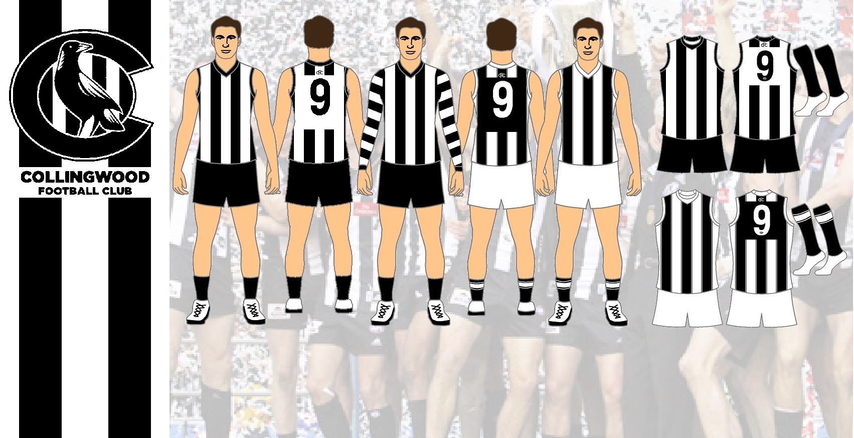
Idk I just wanted to put this in it's own area where I can refer back to instead of it getting lost in there.Nice jumpers but what happened to the Jumper Ideas for 2020 thread?
Can't really help you with that, maybe get some glasses perhaps?It’s all black and white.
I see no clash
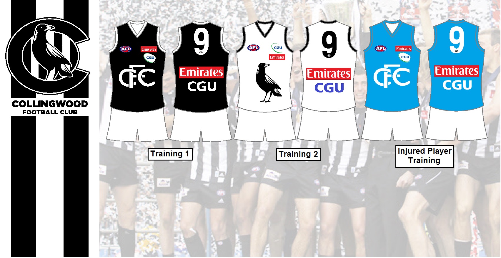
I disagree but I can see where you're coming at with the pinstripes. As for a gold clash, I was looking at doing a more realistic rebrand, I think if it was brought up in a meeting Eddie would throw up lol. The gold is more of an accent anyway, and I just think it wouldn't be proper for it to feature majorly on a jumper.I have to say, I've got a strong dislike for the pinstripes on the Collingwood kits, it looks a bit cheap to me. I reckon with printing technology the way it is now, it would be better to get into subtle textures, linework and the like, similar to how you did with the Yakka training top.
Also for the clash, IMO you should be maximising that gold as a strong 3rd colour used for highlights. Black Gold and White is such a winning combination, you'd be mad not to exploit that for a clash top instead of insisting on the b&w theme.
Can't really help you with that, maybe get some glasses perhaps?
I have to say, I've got a strong dislike for the pinstripes on the Collingwood kits, it looks a bit cheap to me. I reckon with printing technology the way it is now, it would be better to get into subtle textures, linework and the like, similar to how you did with the Yakka training top.
Also for the clash, IMO you should be maximising that gold as a strong 3rd colour used for highlights. Black Gold and White is such a winning combination, you'd be mad not to exploit that for a clash top instead of insisting on the b&w theme.
I disagree but I can see where you're coming at with the pinstripes. As for a gold clash, I was looking at doing a more realistic rebrand, I think if it was brought up in a meeting Eddie would throw up lol. The gold is more of an accent anyway, and I just think it wouldn't be proper for it to feature majorly on a jumper.
There is a clash with the Geelong jumper. I was where is the clash, Collingwood has vertical stripes while Geelong has horizontal stripes. but seeing players at different angles the jumpers do clash with the stripes being the same width as each other.That won’t help.
There’s stilll no clash.
That won’t help.
There’s stilll no clash.
Yeah i totally agree, something like the image attached, maybe not the gradient but have a pattern gradient which slowly fades the design would look sick. I'll try mock something up today.My only problem with the pies kit in general is that they never really look any different from each other. I know that's a symptom of the bars, but I'd like to see something bold come out of collingwood for a clash jumper or something. There have been a couple of attempts throughout the years, but nothing that has really hit me as top notch.
Something close to your yakka training jumper you knocked up. All white or all black, with more subtle bars. Would be pretty striking, white in particular. It might look ridiculous though, I have no clue.

So your idea of a clash is wearing bright pink jumper, cool. Sorry but I'd rather keep my team's identity rather than selling out.You people.
There is no clash designed, it’s the same as the other two.
So your idea of a clash is wearing bright pink jumper, cool. Sorry but I'd rather keep my team's identity rather than selling out.
Wasn't your teams identity basically lifted from port?So your idea of a clash is wearing bright pink jumper, cool. Sorry but I'd rather keep my team's identity rather than selling out.
