

I just saw that on reddit. It’s alright. I agree with Devo though. There’s way too much history with the current crest for it to be thrown by the wayside. Given how it removes some of the connotations with Christianity, I could see something like that becoming a secondary logo though.How about a whole new look? Here's my attempt.
View attachment 764124
Navigation
Install the app
How to install the app on iOS
Follow along with the video below to see how to install our site as a web app on your home screen.
Note: This feature may not be available in some browsers.
More options
You are using an out of date browser. It may not display this or other websites correctly.
You should upgrade or use an alternative browser.
You should upgrade or use an alternative browser.
Discussion Logos that need to be updated
- Thread starter acm21
- Start date
- Tagged users None
I personally think St Kilda's is one of the blandest logos I've seen, even for traditional shields. I don't see anything timeless or appealing about it, but I guess if their fans like it, that's the main thing.
- Mar 30, 2014
- 2,599
- 4,259
- AFL Club
- Brisbane Lions
- Other Teams
- Dolphins, Seattle Kraken
So I've been working on this other Saints design for the better part of two years.
I really wanted it to be a symbol of strength an unity, and wanted something unique that noone else had seen before.

I really wanted it to be a symbol of strength an unity, and wanted something unique that noone else had seen before.

I personally think St Kilda's is one of the blandest logos I've seen, even for traditional shields. I don't see anything timeless or appealing about it, but I guess if their fans like it, that's the main thing.
- May 23, 2016
- 713
- 836
- AFL Club
- St Kilda
- Other Teams
- Port Melbourne; Kalkee; Horsham Demons
You are welcome to think that, but the shield has an incredible story behind it and is nearly 90 years old, so I don't think it's going anywhere.I personally think St Kilda's is one of the blandest logos I've seen, even for traditional shields. I don't see anything timeless or appealing about it, but I guess if their fans like it, that's the main thing.
- Mar 30, 2014
- 2,599
- 4,259
- AFL Club
- Brisbane Lions
- Other Teams
- Dolphins, Seattle Kraken
Hey Rickee do you have any sources on the history of it? I'm interested!You are welcome to think that, but the shield has an incredible story behind it and is nearly 90 years old, so I don't think it's going anywhere.
Hey Rickee do you have any sources on the history of it? I'm interested!
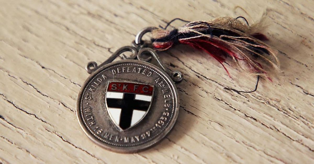
The day the crest was immortalised
A miraculous 15-man triumph over North Melbourne cemented St Kilda's crest in the club's identity forever.
The Saints’ triumph over North Melbourne at Junction Oval was to be engrained in the very ethos of the club, which saw them hold on to victory after ending the game with just 15 men on the field.
The match epitomised the underdog St Kilda’s never-say-die attitude, with one football reporter writing at the time:
The noble display, which was likened to “a battle rather than a game” in the Argus newspaper, warranted commemoration in the eyes of then St Kilda President, Fred Arlington-Burke, who commissioned medals for the players and coach in honour of the stirring victory.Nothing finer nor more inspiring than St Kilda's magnificent win against overwhelming odds has been witnessed at the seaside oval within living memory of the oldest member of the club. It was a superb exhibition of indomitable pluck, stamina and steadfastness of purpose.
Each medal was adorned with the St Kilda crest, cementing its place in the club’s identity forever
Is Carlton getting a new (old) logo too?
 search.ipaustralia.gov.au

Details view | IP Australia | Trade Mark Search
Australian Trade Mark Search is the Australian Government’s trade mark search system.
search.ipaustralia.gov.au

In my honest opinion, you can't have a historic marker of 'est. 1869' with thatEven though our logo is only a couple of years old, I would like to see a few minor changes made to it.
1. 'NORTH' needs to be smaller and 'MELBOURNE' needs to be larger.
2. The text needs to be flattened (remove the curve) and shouldn't protrude out from the shield as much it does.
3. I'd like to see 'est. 1869' inside the shield, near the bottom.
TheLoungeLizard
The world's most handsome man
Richmond doIn my honest opinion, you can't have a historic marker of 'est. 1869' with thatcrappylogo where the only focus for the design is to appeal to kids to support the club. It would just look out of place to me, personally..
Pretty good. I'm not big on the font choices though. I would also just have the top left flat, no need for it to be rounded.View attachment 759597
Tried my hand at a Essendon redesign, using just red and black. Happy with it but not sure what Essendon supporters will think.
- Mar 30, 2014
- 2,599
- 4,259
- AFL Club
- Brisbane Lions
- Other Teams
- Dolphins, Seattle Kraken
Even if it's nothing drastic, we could do with an update.
I saw this:
View attachment 756415
Looks so much better than our current one.
I get the grey is there to make the bomber more realistic, but it isn't a part of our colour scheme.
I actually really like the Bombers logo. It's clean, it's marketable, etc. In saying that, it does look good as just black and red!
But it's actually a good, classy logo compared to North's attempt. And a font with serifs to make it look that much classierRichmond do
")
If that was the purpose of the new logo they would've kept the previous one with the cuter kangaroo. It's supposed to resemble the Roo-sistance logo. I like it, it's stronger and angrier than the other one and "NORTH MELBOURNE" is front and centre instead of "KANGAROOS." It's simple and it looks good on merchandise.In my honest opinion, you can't have a historic marker of 'est. 1869' with thatcrappylogo where the only focus for the design is to appeal to kids to support the club. It would just look out of place to me, personally..
the club also uses this other logo for historical purposes and I prefer that to having one logo that has a foot in each camp.


Yes that's all well and good but the composition of the thing is still terrible. The kangaroo head is alright, I don't like the way they integrated it though, especially the left side of the kangaroo. So much empty space there.If that was the purpose of the new logo they would've kept the previous one with the cuter kangaroo. It's supposed to resemble the Roo-sistance logo. I like it, it's stronger and angrier than the other one and "NORTH MELBOURNE" is front and centre instead of "KANGAROOS." It's simple and it looks good on merchandise.
the club also uses this other logo for historical purposes and I prefer that to having one logo that has a foot in each camp.
View attachment 767621
The WordArt North text shaping is so unnecessary as well. Keep the font as it is - bold, but just text in a horizontal line. "North" bigger than "Melbourne".
And then that "shield"... Yikes.
Now put "Est. 1869" to prove my earlier point
Gcsuns_Gourami
Debutant
- Oct 13, 2019
- 79
- 68
- AFL Club
- Gold Coast
my favourite by far
Gcsuns_Gourami
Debutant
- Oct 13, 2019
- 79
- 68
- AFL Club
- Gold Coast
We need to find a new Gold Coast logo. I like the idea of a oval shape with GC in it and everything that we have now when there's no shading but in the past its been crap. And please decide, do we put suns belowit or not make up your mind
- Dec 18, 2014
- 3,987
- 10,955
- AFL Club
- North Melbourne
- Other Teams
- Pierce & Pierce, Stratton Oakmont
So I've been working on this other Saints design for the better part of two years.
I really wanted it to be a symbol of strength an unity, and wanted something unique that noone else had seen before.
View attachment 764406
Aside from the obvious Port resemblance, it also reminds me of São Paulo FC

- Oct 27, 2016
- 5,942
- 10,635
- AFL Club
- Collingwood

- Other Teams
- Packers, Raptors, Renegades
I don't think the GCS logo is too bad personally, it could be better but what I would do is focus on creating the identity with the jumper first and foremost, then let the logo come afterward once the foundation of an identity as been established.We need to find a new Gold Coast logo. I like the idea of a oval shape with GC in it and everything that we have now when there's no shading but in the past its been crap. And please decide, do we put suns belowit or not make up your mind
acm21
Club Legend
- May 7, 2019
- 2,694
- 1,395
- AFL Club
- Essendon
- Thread starter
- #46
I dont mind the gc logo as an overal concept, as long as there arent a lot of graphic design tricks being used (like the shading) For me i prefer the logo without the nickname, with the nickname being identified subliminally through the logo itself (or something broad that can be kinda easily worked out)We need to find a new Gold Coast logo. I like the idea of a oval shape with GC in it and everything that we have now when there's no shading but in the past its been crap. And please decide, do we put suns belowit or not make up your mind
O_Grinners17
All Australian
- Sep 15, 2018
- 680
- 3,297
- AFL Club
- Richmond

i know it's terrible
Spanna_
The secret ingredient is crime
 :b:") ig
ig acm21
Club Legend
- May 7, 2019
- 2,694
- 1,395
- AFL Club
- Essendon
- Thread starter
- #50
It suits the club to a tee. Afterall nobody really likes megaphonesView attachment 775254
i know it's terrible
