Prediction New Club Logo

Remove this Banner Ad

Maybe a good question for Matthew if this logo is only for next year.

Why not explore the opportunity we probably have not only in SA but within the ranks of PAFC members to develop a logo and brand for the future.

NB. The brand is Port Adelaide.
 
Nice mention of wharves and pylons by a couple of legends.

This is from the clubs Logo Q&A. Wonder if that will change. We're not being bullshited to, are we?


Will this logo be permanent?
The intent is for this to be a commemorative 150th anniversary logo to be used in 2020 only
Yet nothing on the logo or slogan refers to 150?
unless I’m missing something?
 

Log in to remove this ad.

Was going to post this Sunday night but forgot. This is the logo on the lectern that Timmy G, Koch and KT spoke from on Sunday at the launch.

With an all black background I reckon it looks pretty good. The teal is more blue than teal and against a lot of black it sits well. And no its not the lighting effecting my camera/picture, it was blue when I took this a metre or so away from the lectern.

And it looked a lot better than on the beer can photo that Chokito put on here Saturday. The shiny glare of that photo and the greener teal didn't look as good as it did on the lectern. Also the logo on the lectern looked better than when I had the beer can in my hand on Sunday and could see the logo on there.

I don't think it will sit as well against our white, silver or teal jumper and especially if placed over the teal and white chevrons where the blue is against those two colours. Or for the 150th anniversary baby blue and white hooped jumper. It looked good against the all black background of the top right of the Maggies jumper. They need to introduce a black border around the blue when its not sitting on a black background IMO.


1571312275753.png


I can't find decent close up photos of the logo on the 3 jumpers worn but you can see with the projection onto Hart's Mill building, the blue against a non black background doesn't come up as good as above.


1571317835931.png
 
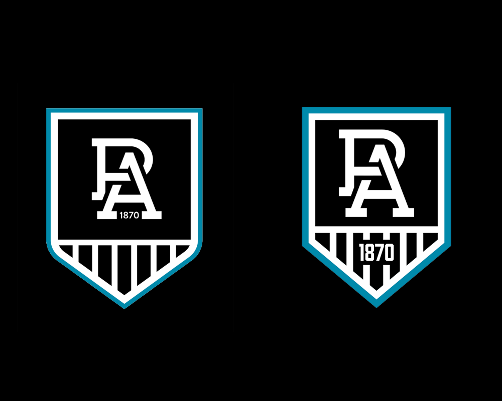
Was thinking about how annoying the 1870 being a total afterthought is. Tried to integrate it better and spent more than zero seconds thinking about the typography. Ended up creating a whole redo of the logo with shape edges, thicker lines and matching line weights.

1K3cNGO.png
 
Was thinking about how annoying the 1870 being a total afterthought is. Tried to integrate it better and spent more than zero seconds thinking about the typography. Ended up creating a whole redo of the logo with shape edges, thicker lines and matching line weights.

1K3cNGO.png

Jeeze the 1870 looks worse every time I see it, all aspects are just laughably bad (font, size, placement). I’d leave it out altogether but your effort already looks heaps better. I like how the square is a bit smaller too making the monogram more prominent.
 
Was thinking about how annoying the 1870 being a total afterthought is. Tried to integrate it better and spent more than zero seconds thinking about the typography. Ended up creating a whole redo of the logo with shape edges, thicker lines and matching line weights.

1K3cNGO.png
What if the 1870 was in the panel but underneath the PA? If the panel was rectangular the increased height might help to distinguish it from the Freo logo a little.
 

(Log in to remove this ad.)

Heads up for country folk regarding the PA Pirate Life beer.
I work away from home and currently interstate so I got my lovely wife to pick up a carton for me.

There is two sip and saves in lincoln only one knew anything about the PA beer.

She was told their allocation was two cartons so she got one held when they came in. Turns out they are only 16 packs :( and now I have half of the Port Lincoln allocation waiting for me when I get home.
I don’t think there will be much available outside of Adelaide.
If anyone else wants a carton in Lincoln, might pay to get down to Lincoln Cellars ASAP.

BFB2BB4A-68D1-4837-8F9F-9ACFE976914A.jpeg
 
.......
She was told their allocation was two cartons so she got one held when they came in. Turns out they are only 16 packs :( and now I have half of the Port Lincoln allocation waiting for me when I get home.
I don’t think there will be much available outside of Adelaide.
If anyone else wants a carton in Lincoln, might pay to get down to Lincoln Cellars ASAP.

View attachment 767104
From what I recall from Sunday, you can buy the cans in a 4 pack, so 4 x 4 makes sense compared to 4 x 6.
 
i'm thinking it could look good if you replicate the prison bars lace-up gap on the logo - by pushing the middle bars out, then place the 1870 vertically to replicate the stitching - can someone mock this up?
 
Was going to post this Sunday night but forgot. This is the logo on the lectern that Timmy G, Koch and KT spoke from on Sunday at the launch.

With an all black background I reckon it looks pretty good. The teal is more blue than teal and against a lot of black it sits well. And no its not the lighting effecting my camera/picture, it was blue when I took this a metre or so away from the lectern.

And it looked a lot better than on the beer can photo that Chokito put on here Saturday. The shiny glare of that photo and the greener teal didn't look as good as it did on the lectern. Also the logo on the lectern looked better than when I had the beer can in my hand on Sunday and could see the logo on there.

I don't think it will sit as well against our white, silver or teal jumper and especially if placed over the teal and white chevrons where the blue is against those two colours. Or for the 150th anniversary baby blue and white hooped jumper. It looked good against the all black background of the top right of the Maggies jumper. They need to introduce a black border around the blue when its not sitting on a black background IMO.


View attachment 766883


I can't find decent close up photos of the logo on the 3 jumpers worn but you can see with the projection onto Hart's Mill building, the blue against a non black background doesn't come up as good as above.


View attachment 766939


The teal outline seemed to be there for the home jumper, no outline for the pb, black outline instead of teal on the blue hoops.

45AF9473-75D5-4AE5-BFB7-2132602906F5.jpeg
 
From what I recall from Sunday, you can buy the cans in a 4 pack, so 4 x 4 makes sense compared to 4 x 6.
Makes sense except I was sure I saw a picture somewhere after the launch that showed a full 24 can sized carton wiith the full logo on it.

Not just the PA on one side and the proud past/bold future on the other.

Anyway I just wanted a bit of a keep sake so I’m not worried too much.
 
The teal outline seemed to be there for the home jumper, no outline for the pb, black outline instead of teal on the blue hoops.

View attachment 767153
Its there on the PB, but you can't pick it up in the photo.

Edit Screen shot of the legends looking at and talking about the logo and this is at the start with Bucky holding a PB jumper.


1571370160815.png
 
... Yes the logo is a dumpster fire and there is not much that can be done to save it. Maybe tomorrow I will jump on paint and fix it.
Youse will all love the logo when we win the flag next season with it on our guernsey.
 
The teal outline seemed to be there for the home jumper, no outline for the pb, black outline instead of teal on the blue hoops.

View attachment 767153
I wonder if the SANFL side will wear the same PB's, with a different comp logo.

I am assuming not due to sponsors etc.
 

Remove this Banner Ad

Back
Top