Navigation
Install the app
How to install the app on iOS
Follow along with the video below to see how to install our site as a web app on your home screen.
Note: This feature may not be available in some browsers.
More options

You are using an out of date browser. It may not display this or other websites correctly.
You should upgrade or use an alternative browser.
You should upgrade or use an alternative browser.
Workshop Jumper Ideas For 2020
- Thread starter Red Crow
- Start date
- Tagged users None
- Status
- Not open for further replies.

Here's a Gws concept I made I think the first one is better only a small difference (look at top right of G) but the black continuing I think looks better. View attachment 757416View attachment 757417
On LYA-L29 using BigFooty.com mobile app
that's a ripper
Javelin
All Australian
- Jun 6, 2013
- 849
- 1,116
- AFL Club
- West Coast
Eddie won't like that; there's a black and white stripe next to each other, so clearly it's too much like Collingwood's jumper

Fizzler
BBTB
- Dec 26, 2013
- 12,746
- 16,332
- AFL Club
- Port Adelaide
- Other Teams
- OKC, Coburg, Werribee, Storm, QPR
Pies Home and clash. Thoughts?


- Sep 8, 2011
- 10,984
- 10,942
- AFL Club
- West Coast
I like it. I was thinking something similar along that design but including a thin white outline of the stripes
Sent from my iPhone using BigFooty.com
Fizzler
BBTB
- Dec 26, 2013
- 12,746
- 16,332
- AFL Club
- Port Adelaide
- Other Teams
- OKC, Coburg, Werribee, Storm, QPR
On the clash? I somewhat agree but I feel simplicity is key with this one.I like it. I was thinking something similar along that design but including a thin white outline of the stripes
Sent from my iPhone using BigFooty.com
Fizzler
BBTB
- Dec 26, 2013
- 12,746
- 16,332
- AFL Club
- Port Adelaide
- Other Teams
- OKC, Coburg, Werribee, Storm, QPR
I should also note, expect to see those designs somewhat soon.
- Sep 8, 2011
- 10,984
- 10,942
- AFL Club
- West Coast
I should also note, expect to see those designs somewhat soon.
Problem is I have NFI how to do it. I just think of these things lel
Personally never been a fan of sidepanels for collingwood jumpers tbh (well apart from heritage - far out the 2017 one looked good)
If you want to you can start out with paint - pretty easy to pick up and do in a few mins.Problem is I have NFI how to do it. I just think of these things lel
Smeagle's tutorial: https://www.bigfooty.com/forum/threads/the-microsoft-paint-word-tutorial.660776/
All my templates, jumper elements etc are attached.
Attachments
- Jun 18, 2016
- 51,443
- 98,573
- AFL Club
- West Coast
- Other Teams
- Perth Scorchers
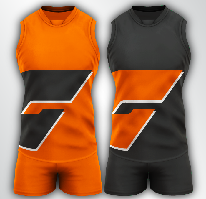
Not sold on these but GWS colour rush. Orange for Melbourne games against Essendon, Carlton, etc. Charcoal for away games to Sydney and Hawthorn.
DYLANROO18
Debutant

Poking around with my GWS set I posted a few pages back:

Last edited:


I'd love to see North wearing these 3 next year. Mostly the same as what we wore this year with a few key differences:
1. The stripes don't stop beneath the canterbury logo, the logo is inside the stripe now
2. The stripes extend to the back
3. Black numbers on the classic jumper, because that's how it always was
4. Club logo above the front sponsor
5. No more 150th imagery, for obvious reasons
Ideally, the white jumper would be used for home games, and the other two can alternate for away games.

also what if port just wore this. the black and white aren't touching so eddy can't get mad
- Oct 27, 2016
- 5,938
- 10,623
- AFL Club
- Collingwood

- Other Teams
- Packers, Raptors, Renegades
I would be fine with that, but not sure Port fans would be.View attachment 771409
also what if port just wore this. the black and white aren't touching so eddy can't get mad

Carlton clash idea i had. The yoke is a reference to the original Carlton VFL jumper, but inverted to make the jumper mostly white. maybe carlton supporters would be more amenable to the idea of a clash jumper if there's some history behind it? probably not, but I still wanted to put this idea to paper (digitally)
perhaps full white back?View attachment 772013
Carlton clash idea i had. The yoke is a reference to the original Carlton VFL jumper, but inverted to make the jumper mostly white. maybe carlton supporters would be more amenable to the idea of a clash jumper if there's some history behind it? probably not, but I still wanted to put this idea to paper (digitally)
- Aug 25, 2014
- 7,718
- 11,772
- AFL Club
- Richmond
This is cool, reminds me a bit of the Nar Nar Goon jumper:View attachment 772013
Carlton clash idea i had. The yoke is a reference to the original Carlton VFL jumper, but inverted to make the jumper mostly white. maybe carlton supporters would be more amenable to the idea of a clash jumper if there's some history behind it? probably not, but I still wanted to put this idea to paper (digitally)

perhaps full white back?
Designs completely cutting off at the shoulders is a pet peeve of mine, what about this?

I still prefer both sides of a jumper to match as much as they can, but here. just for you.
hitthepost
Norm Smith Medallist
This does also make the number much easier to read.Designs completely cutting off at the shoulders is a pet peeve of mine, what about this?
View attachment 772032
I still prefer both sides of a jumper to match as much as they can, but here. just for you.

Are the numbers more readable in white?
hitthepost
Norm Smith Medallist
Much better. I feel the back of a jumper should be one colour, or at least from the top of the number down. Having the colour go that far makes it feel like the jumper is backwards.
Much better. I feel the back of a jumper should be one colour, or at least from the top of the number down. Having the colour go that far makes it feel like the jumper is backwards.
It's kind of a dilemma. Making it all navy blue makes it useless as a clash jumper, making it all white will make Carlton supporters unhappy because they're the blues, not the whites
- Status
- Not open for further replies.
Similar threads
- Replies
- 726
- Views
- 78K
