- Thread starter
- Moderator
- #151
I must not have recognised his serious voice. Did you see it confirmed somewhere?
On ANE-LX2J using BigFooty.com mobile app
I can 100% confirm it is Teague.
Follow along with the video below to see how to install our site as a web app on your home screen.
Note: This feature may not be available in some browsers.
I must not have recognised his serious voice. Did you see it confirmed somewhere?
On ANE-LX2J using BigFooty.com mobile app
I can 100% confirm it is Teague.
Like was said above, it's probably gone the conservative route so early on in the partnership, keeping it pretty simple and safe. In all likelihood it will expand as it goes.Might come across as petty but compare this puma range to Richmond’s. Miles apart in terms of quality. Why are we settling for second best?
I 100% agree, and am really disappointed that our wonderful badge is now replaced with just the Monogram. Which really should be reserved purely for our Guernsey. I hope that it gains enough traction and Puma / Carlton can amend it for 2021Final thoughts on the new gear: it’s the little things that make all the difference. it’s undoubtably a step up in quality and range, if a touch underwhelming and safe from a design point of view. That there is now official kids apparel is a huge win, for instance, and is the biggest addition to an improvement in the overall offering.
I think the decision to forgo the Club’s offical wreathed logo for the monogram on all our supporter and team wear was made with the best intentions - as a point of difference between what we’ve had the last few years with Nike - but it doesn’t work and is a departure they’ll need to correct down the line.
Using the monogram on our apparel and supporter range shows a fundamental - if forgivable - misunderstanding of our brand and what ought to be used where.
the linked monogram is only as it is because textile manufacturing technologies of the day weren’t sophisticated enough to separate the letters. Simple. So the club compromised and it inadvertently became a (brilliant) symbol of Carlton. This monogram lived side-by-side with our official wreathed or corporate logo.
In the mid 2000s we moved away from the wreath and adopted the more basic and unimpressive ‘corporate-lite’ logo, only to see the error and return to the correct logo for our 150th year. It’s a bit frustrating we’ve again binned the best badge in the AFL so soon after.
Our apparel should always display our ‘badge’. It should always display the wreathed logo. sure it’s a quirk to have two active logos, but it’s part and parcel of our brand and the club’s story.

Spot on. The fanbase only intended the return of the ‘heritage’ monogram used from 1927-1997 to be on our guernseys. The wreathed logo ought to function as our symbol everywhere else, particularly on official club apparel.The Club misinterpreted the return of the old CFC almost right from the start. What was supposed to simply evoke the past and make the guernsey look stronger was seen to be what ‘we’ wanted everywhere, and it’s been popping up where it doesn’t belong ever since.
It’s seen on the trainer’s jackets below, but it’s seldom been used in this way (John Goold has the wreath on his dressing gown). Hopefully they revert back in the future.
View attachment 773100
I’m talking quality, not design. Dare I say it looks like heat-pressed logos and sponsors yet again. I hope i’m mistaken.Like was said above, it's probably gone the conservative route so early on in the partnership, keeping it pretty simple and safe. In all likelihood it will expand as it goes.
I told you I can't afford it at the moment...……...Hopefully getting my hands on the new polo soon enough.
er, anyone wanna say it?Might come across as petty but compare this puma range to Richmond’s. Miles apart in terms of quality. Why are we settling for second best?


If we're doing this, the previous rounded CFC was so much marketable, purely because you could very much distinguish the letters a little better and it's a bit cleaner.I am starting to warm to the new logo only because I think they're trying to create some brand awareness like a few other famous clubs. However, if they're going to pull it off they'll definitely need to up their merchandise game.
It could also be that they're trying to distance themselves from the dark days under the previous logo. View attachment 773303View attachment 773304View attachment 773305View attachment 773306View attachment 773307
On ANE-LX2J using BigFooty.com mobile app
Hopefully getting my hands on the new polo horse soon enough.
Might come across as petty but compare this puma range to Richmond’s. Miles apart in terms of quality. Why are we settling for second best?

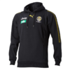
i have emailed the club with the below photo comparing it to the kmart knock off hoodies with heat pressed logos puma have made for us. difference in quality is astounding.
View attachment 774088
