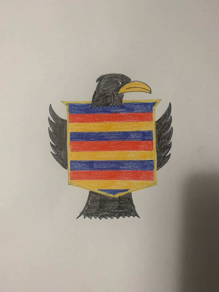
I’d rather win footy matches than stress about the logo and song but that said it seems to make perfect sense that the timing is spot on in 2021 for a makeover/rebrand or whatever it’s called.
12 months to bed in the new coach, footy dept, development of our younger list which will be enhanced next off season even further.
Season 2021 will be a more exciting time than the present.
Perhaps most significantly it should coincide with our new facility and the move to the city. I’d be using that shift as the time for the rebrand.


")