Navigation
Install the app
How to install the app on iOS
Follow along with the video below to see how to install our site as a web app on your home screen.
Note: This feature may not be available in some browsers.
More options
You are using an out of date browser. It may not display this or other websites correctly.
You should upgrade or use an alternative browser.
You should upgrade or use an alternative browser.
Adelaide Logo Redesign: 2018
- Thread starter Dank Academy
- Start date
- Tagged users None
SugarShane
C12 H22 O11
Black crow looks terrible and doesn't fit the main branding of the club, ie. our colours. Definitely needs to be navy.
Maccasback
Draftee
- Oct 30, 2019
- 2
- 2
- AFL Club
- Adelaide
Black crow looks terrible and doesn't fit the main branding of the club, ie. our colours. Definitely needs to be navy.
I don't agree it does not fit in with the branding of the club when the black crow has always been around. We're not talking about changing the jumper, black is not out of place with a logo/branding.
I'd like to see us use it more and we have been moving that way with the WFAO branding and the black crow graphics on the scoreboard on game day.


I happen to prefer a black crow, aesthetically and because I feel it looks more serious/menacing.
I reckon you can probably tell the age of people by the logo they prefer, I'd bet it was the logo the club had when they were a kid/first started caring about the club.
I don't think we even need a crow in our logo, I'd like us to focus on "Adelaide Football Club" and our colours more than the crow moniker. Let it just be a nickname like "The Bloods" for the Sydney.
I'd like us to go for a simple A or AFC. But not the Port or Carlton style logo with the letters stacked, we should stay clear of trying to make ourselves look like we are a hundred-year-old club with a hundred-year-old logo, that's not our story and it doesn't need to be, we shouldn't pretend to be.
Along the lines of the logos for the Pittsburg Pirates, Green Bay Packers or Boston Bruins.


an A or AFC with a very subtle crow somehow incorporated into the lettering, like a shadow.
The simpler the logo, the less cartoon imagery, the better it looks on clothing.
I don't think we even need a crow in our logo, I'd like us to focus on "Adelaide Football Club" and our colours more than the crow moniker. Let it just be a nickname like "The Bloods" for the Sydney.
I'd like us to go for a simple A or AFC. But not the Port or Carlton style logo with the letters stacked, we should stay clear of trying to make ourselves look like we are a hundred-year-old club with a hundred-year-old logo, that's not our story and it doesn't need to be, we shouldn't pretend to be.
Along the lines of the logos for the Pittsburg Pirates, Green Bay Packers or Boston Bruins.


an A or AFC with a very subtle crow somehow incorporated into the lettering, like a shadow.
The simpler the logo, the less cartoon imagery, the better it looks on clothing.
- Jan 6, 2018
- 10,660
- 12,193
- AFL Club
- Adelaide
- Other Teams
- Norwood
Could easily look to the LA Angels baseball for some inspirationI reckon you can probably tell the age of people by the logo they prefer, I'd bet it was the logo the club had when they were a kid/first started caring about the club.
I don't think we even need a crow in our logo, I'd like us to focus on "Adelaide Football Club" and our colours more than the crow moniker. Let it just be a nickname like "The Bloods" for the Sydney.
I'd like us to go for a simple A or AFC. But not the Port or Carlton style logo with the letters stacked, we should stay clear of trying to make ourselves look like we are a hundred-year-old club with a hundred-year-old logo, that's not our story and it doesn't need to be, we shouldn't pretend to be.
Along the lines of the logos for the Pittsburg Pirates, Green Bay Packers or Boston Bruins.
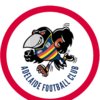
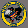
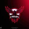
View attachment 774865View attachment 774866View attachment 774867
an A or AFC with a very subtle crow somehow incorporated into the lettering, like a shadow.
The simpler the logo, the less cartoon imagery, the better it looks on clothing.
I reckon you can probably tell the age of people by the logo they prefer, I'd bet it was the logo the club had when they were a kid/first started caring about the club.
I don't think we even need a crow in our logo, I'd like us to focus on "Adelaide Football Club" and our colours more than the crow moniker. Let it just be a nickname like "The Bloods" for the Sydney.
I'd like us to go for a simple A or AFC. But not the Port or Carlton style logo with the letters stacked, we should stay clear of trying to make ourselves look like we are a hundred-year-old club with a hundred-year-old logo, that's not our story and it doesn't need to be, we shouldn't pretend to be.
Along the lines of the logos for the Pittsburg Pirates, Green Bay Packers or Boston Bruins.
View attachment 774865View attachment 774866View attachment 774867
an A or AFC with a very subtle crow somehow incorporated into the lettering, like a shadow.
The simpler the logo, the less cartoon imagery, the better it looks on clothing.

Attachments
Burtonsgottago
Premiership Player
- May 5, 2019
- 4,405
- 4,441
- AFL Club
- Adelaide
I’d rather win footy matches than stress about the logo and song but that said it seems to make perfect sense that the timing is spot on in 2021 for a makeover/rebrand or whatever it’s called.
12 months to bed in the new coach, footy dept, development of our younger list which will be enhanced next off season even further.
Season 2021 will be a more exciting time than the present.
Perhaps most significantly it should coincide with our new facility and the move to the city. I’d be using that shift as the time for the rebrand.
Say what you want but I haven’t bought any Crows merchandise with the current logo because it looks so horrible and cheap.
That's a good point. But as kids get older they also turn into adults who tend to love tradition (gosh look at Port).I reckon you can probably tell the age of people by the logo they prefer, I'd bet it was the logo the club had when they were a kid/first started caring about the club.
I don't think we even need a crow in our logo, I'd like us to focus on "Adelaide Football Club" and our colours more than the crow moniker. Let it just be a nickname like "The Bloods" for the Sydney.
I'd like us to go for a simple A or AFC. But not the Port or Carlton style logo with the letters stacked, we should stay clear of trying to make ourselves look like we are a hundred-year-old club with a hundred-year-old logo, that's not our story and it doesn't need to be, we shouldn't pretend to be.
Along the lines of the logos for the Pittsburg Pirates, Green Bay Packers or Boston Bruins.
View attachment 774865View attachment 774866View attachment 774867
an A or AFC with a very subtle crow somehow incorporated into the lettering, like a shadow.
The simpler the logo, the less cartoon imagery, the better it looks on clothing.
I like this guy and you could have a lot of fun with him but he's only a gimmic. He shouldn't be our formal logo.
I agree, but our current monstrosity shouldn't be our formal logo either.I like this guy and you could have a lot of fun with him but he's only a gimmic. He shouldn't be our formal logo.
Should have mouldeds not screw ins I think.
Both the Boston Celtics and Toronto Raptors use the cartoon logo and a more formal logo well. Feel we could do the same. That would look great on a new era cap.I like this guy and you could have a lot of fun with him but he's only a gimmic. He shouldn't be our formal logo.
- Sep 21, 2004
- 36,993
- 25,767
- AFL Club
- West Coast
- Other Teams
- Norwood & Liverpool.
The cartoon running crow needs to be looking like its breaking through the circle.
Like have a thicker red circle with yellow and navy thin outlines then the crow slightly overlapping it.
On SM-G925I using BigFooty.com mobile app
Like have a thicker red circle with yellow and navy thin outlines then the crow slightly overlapping it.
On SM-G925I using BigFooty.com mobile app
I tried various size circles, and positioning; they didn't work well at icon size. Multi-coloured circle looked too garish.The cartoon running crow needs to be looking like its breaking through the circle.
Like have a thicker red circle with yellow and navy thin outlines then the crow slightly overlapping it.
On SM-G925I using BigFooty.com mobile app
My grandkids cannot get enough of it, they love the logo, Haven't met too many kids that don't like it. And when most of the merchadise sales are junior sizes, guess we are stuck with the logo for a while.Say what you want but I haven’t bought any Crows merchandise with the current logo because it looks so horrible and cheap.
They would.probably love the "Camry Crow" even more.My grandkids cannot get enough of it, they love the logo, Haven't met too many kids that don't like it. And when most of the merchadise sales are junior sizes, guess we are stuck with the logo for a while.
I am not sure he should be the proper logo, although that one with him in the circle is a pretty good logo (I love it), but we actually have a character that could work well with kids.
I have said before with AFC media he could even convert into a cartoon character.
Sent from my SM-G930F using Tapatalk
The carton charater is an Mascot ie Claude the Crow, the Logo is and has to seperate, cannot mix the two, for varied reasons.They would.probably love the "Camry Crow" even more.
I am not sure he should be the proper logo, although that one with him in the circle is a pretty good logo (I love it), but we actually have a character that could work well with kids.
I have said before with AFC media he could even convert into a cartoon character.
Sent from my SM-G930F using Tapatalk
Yes make a cartoon out of Cluade, but he cannot be our Logo. Does not work in the long run for a sporting organisation. Sure the marketing poeple on BF would be able to explian it better than me.
The logo will change eventially, but it will be designed to appeal to large partcentage of poeple who buy the mechandice. Mainly Kids.
And each generation has different views. Whether us old timers like it or not, they will pay a marketing team to do the sums.
Personnaly I am suprised they do not have 2 logos, the main logo ie coat of arms type, and one for the marketing sales.
Plus the Claude range which is and should be a seperate area.
- Sep 8, 2011
- 10,990
- 10,955
- AFL Club
- West Coast
The carton charater is an Mascot ie Claude the Crow, the Logo is and has to seperate, cannot mix the two, for varied reasons.
Yes make a cartoon out of Cluade, but he cannot be our Logo. Does not work in the long run for a sporting organisation. Sure the marketing poeple on BF would be able to explian it better than me.
The logo will change eventially, but it will be designed to appeal to large partcentage of poeple who buy the mechandice. Mainly Kids.
And each generation has different views. Whether us old timers like it or not, they will pay a marketing team to do the sums.
Personnaly I am suprised they do not have 2 logos, the main logo ie coat of arms type, and one for the marketing sales.
Plus the Claude range which is and should be a seperate area.
This idea about kids being the be all and end all is what’s ruining sport in Australia.
Should sport have Kid component - yes
Should they be the main target audience - No
Similar threads
- Replies
- 79
- Views
- 3K
- Poll
- Replies
- 581
- Views
- 20K
- Replies
- 2K
- Views
- 28K


