Discussion State of our jumper

Remove this Banner Ad

Agreed. Heaps better.

as supporters we want a sponsor logo that is unobtrusive and blends in.
But as a sponsor who throws in big dollars they want it to look as close to the original logo as possible. And hopefully for them it stands out like dogs balls.
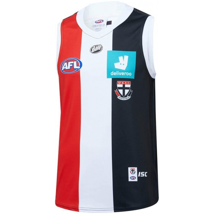
Despite the green square not looking great I think the actual jumper itself is pretty good.

I actually think the word Deliveroo is much more legible green on black than white out of green.
But what do I know, I only worked as an art director in advertising for 12 years? 🙄
 
Happy we kept the white collar but if that's the actual jumper it's not great.

What I'm confused about though is the collar template looking different to other ISC clubs? Feels like we'll only really know our final kit by the time we run out for the for our first game
 

Log in to remove this ad.

Happy we kept the white collar but if that's the actual jumper it's not great.

What I'm confused about though is the collar template looking different to other ISC clubs? Feels like we'll only really know our final kit by the time we run out for the for our first game

That template looks effectively like the 2013-15 ISC template - not sure why, and that image was apparently only available for a short period of time on the JD Sports site.

The original post and image from the Footy Jumpers and Graphic Design board is here:
I think they may have uploaded the wrong photo
The image had a broken link so I'm guessing it's been taken down.

Sorry about the quality, I had to use my phone because I'm in a bit of a rush.

View attachment 785996View attachment 785997
 
It's even better white on black.

Yes but green is their colour.
I could live with it that way. White out of black would blend in too much for their liking. I doubt that would ever happen.
The Big green square is just bloody terrible through - so I guess that’s what they’ll use 😳
 
Yes but green is their colour.
I could live with it that way. White out of black would blend in too much for their liking. I doubt that would ever happen.
The Big green square is just bloody terrible through - so I guess that’s what they’ll use 😳
Deliver Roo doesnt care about what looks the best. They want the most obvious, in your face logo possible.
Hence why they have gone with the massive square instead of the subtle text.
 
I couldn't care less about these types of things but my only question is why does the sponsor's logo sit above the crest? Is that the way it's always been? The crest is sacred and should sit at the top. Just a small thing.
 
Yeah... not flash but at least we get the logo on the jumper. A fair few teams don't even bother.

Collingwood seem to make sure theirs sits above the sponsor.
 
Hate Collingwood, but love the way they’re so protective of their brand. Wish we were the same.
Not even Pies are safe this year - They've tried replicating the adidas template from 2010, by just cutting a bit out of the top of the stripes and adding a random line at the back across the back stripes so...
 

(Log in to remove this ad.)

If the sponsors logo is too horrendous a lot of people simply won’t buy it. You’ve gotta at least make it look a little bit cool.
Personally I like a decent mid white stripe, hate it when too thin.


On iPhone using BigFooty.com mobile app
 
Smooth Criminal posted it on the FJGD board:
SK20JSY02M-FRONT__838577816.jpg SK20JSY02M-BACK__795994885.jpg


Last edited:
Smooth Criminal posted it on the FJGD board:
View attachment 788204View attachment 788205

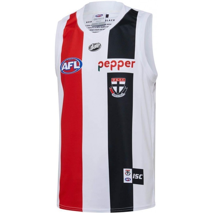
Clash jumper just beautiful. Tip of the cap to our resurgence of the 50's.
 
Smooth Criminal posted it on the FJGD board:
View attachment 788204View attachment 788205


Yes this is exactly what I wanted for the clash jumper!! Beautiful, I hated the one we used last season. Will definitely be purchasing one!
 

Remove this Banner Ad

Back
Top