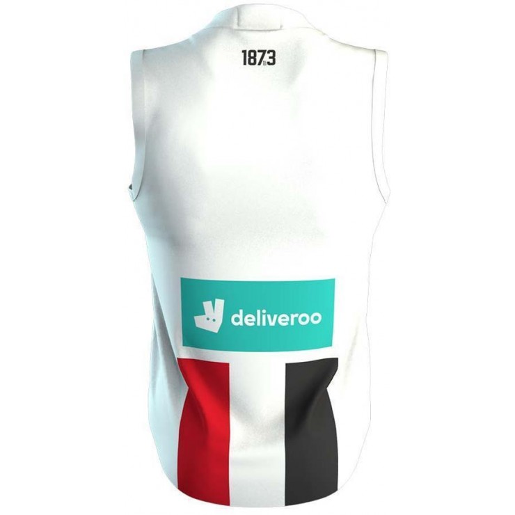
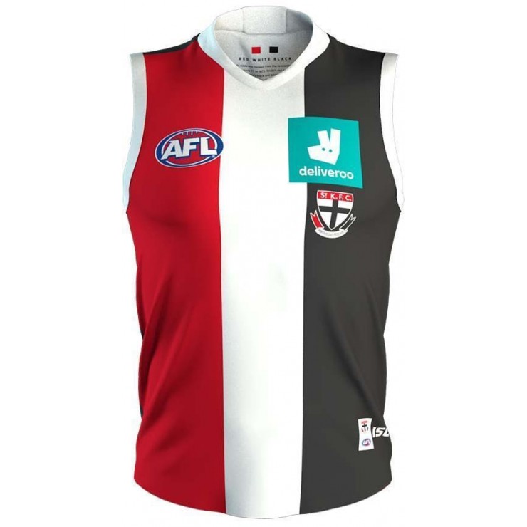
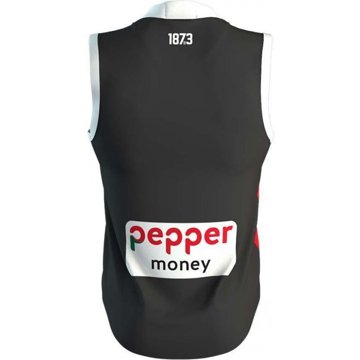
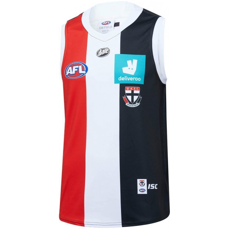
Shame about the Deliveroo box on the back being so large, but the clash is great. I actually like it more than most recent candy stripe effort.
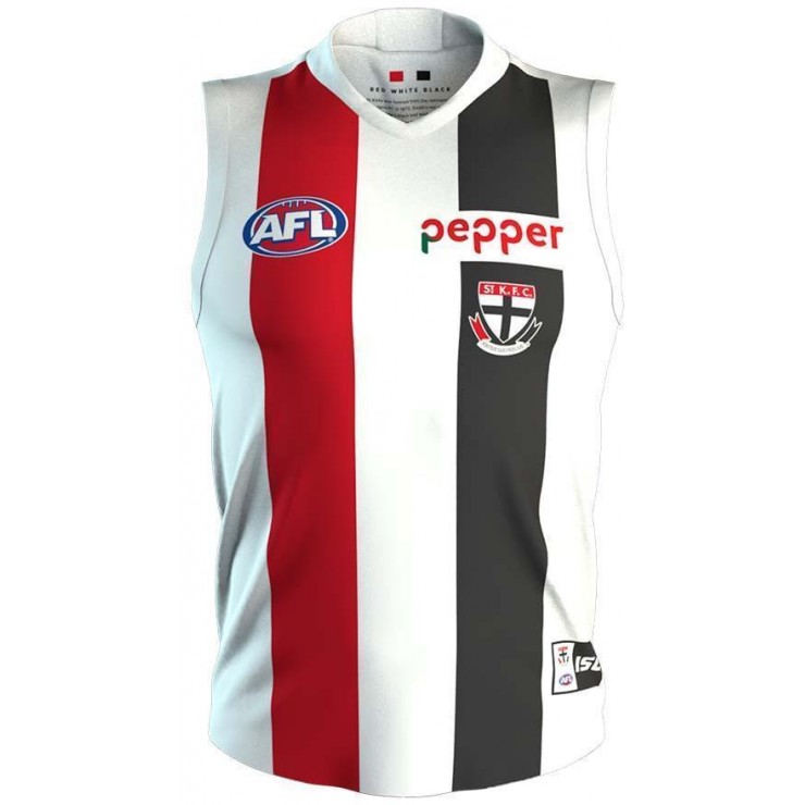
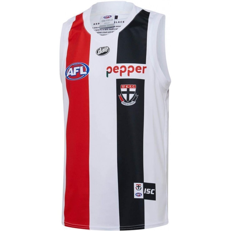
I may be completely imagining this, but was there a leak that feature the Pepper logo being on a red box? I feel like a red box would look better on the clash rather than the white box that just makes it look like the stripe is cut.
I may be completely imagining this, but was there a leak that feature the Pepper logo being on a red box? I feel like a red box would look better on the clash rather than the white box that just makes it look like the stripe is cut.